When it comes to house tours, sometimes I like to save the best part for last. But in the case of this fabulous beach house designed by Tamsin Johnson, I had to lead with my favorite part of the home, as it’s perhaps the best display of chic, restrained beach house whimsy that I have ever seen.
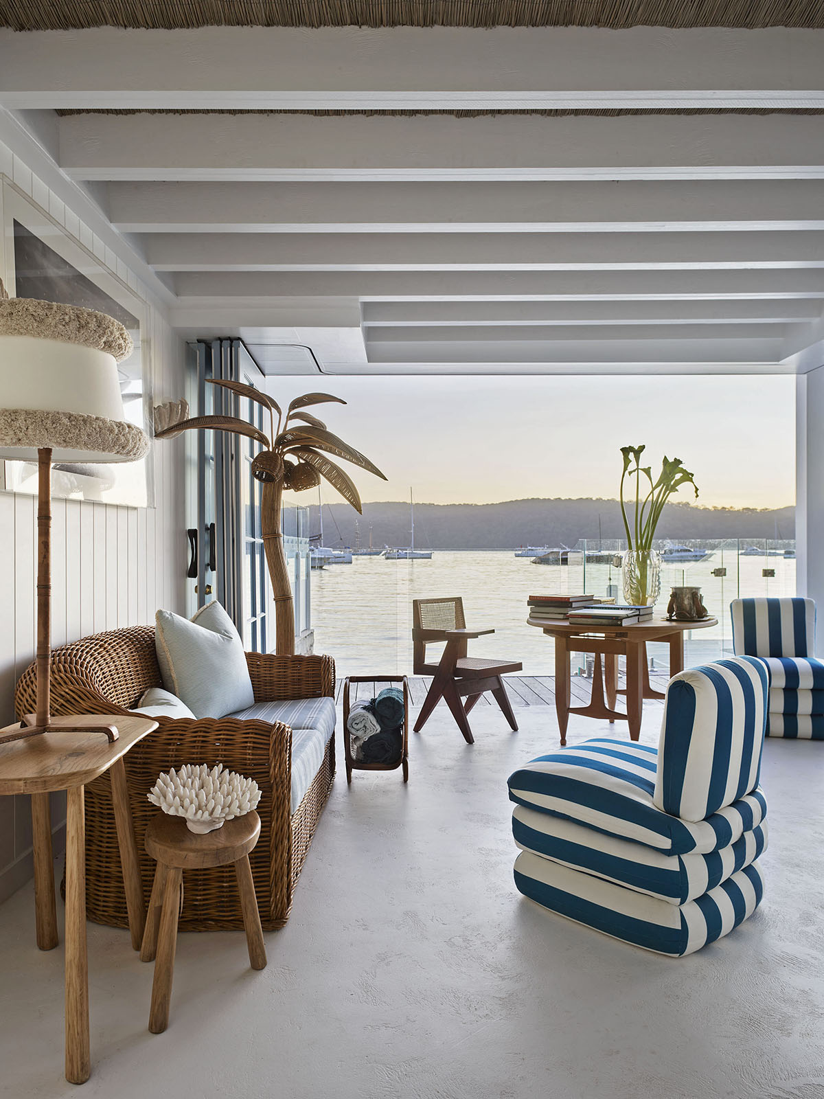
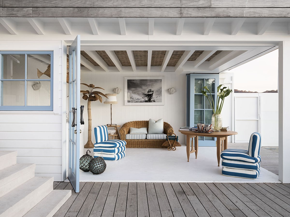
This indoor/outdoor room is literal perfection with its sparse furnishings, and an ideal mix of modern lines with classic beach materials and decor. And, of course, that palm tree! But the real cherry on top for me is the hilarious wicker fish light pendants, combined with crabs crawling on the wall behind the bar…
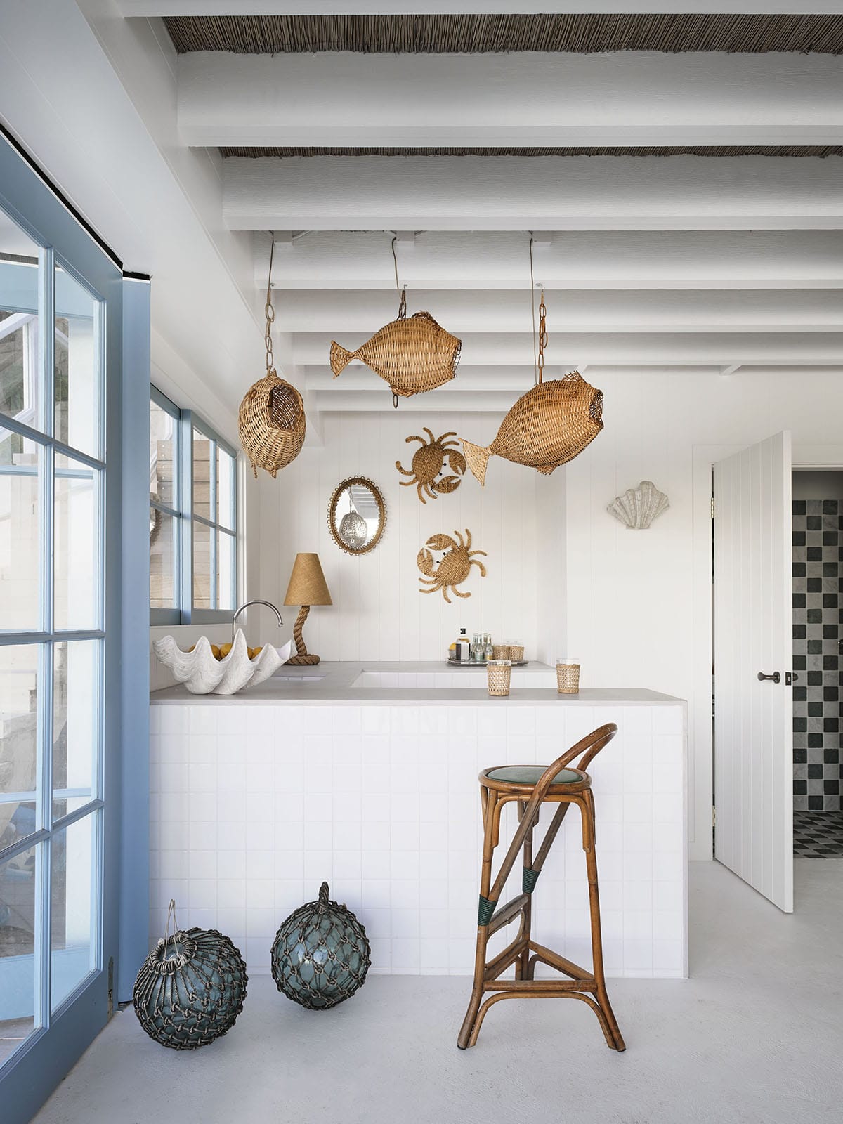
Because the rest of the space is so clean and minimal, this kitchy beach house decor totally works for me here!! I think I easily could have just shared this space with you all, and called it a day, but there’s much more goodness to be had, so let’s dive into the rest of the house, shall we?
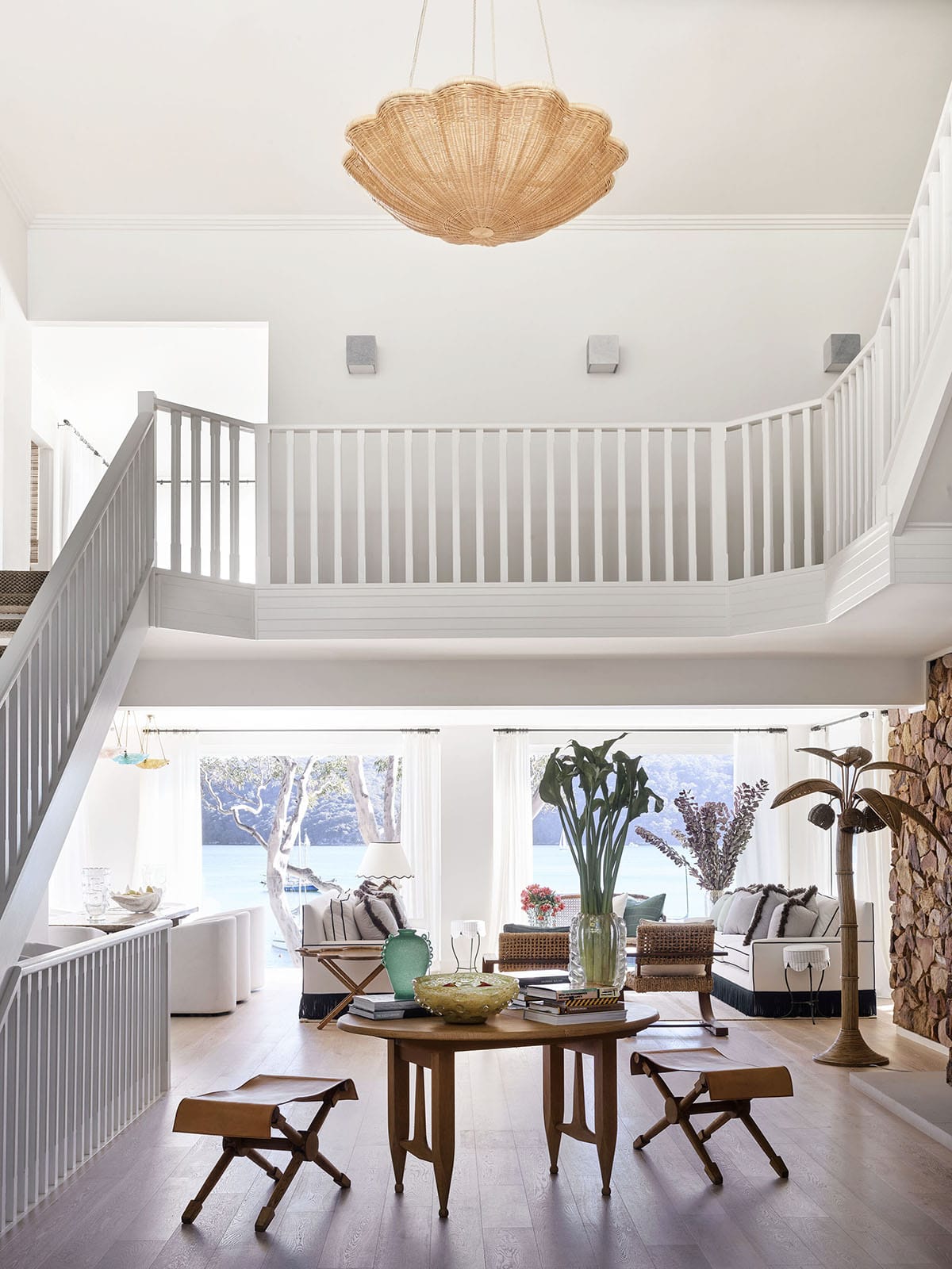
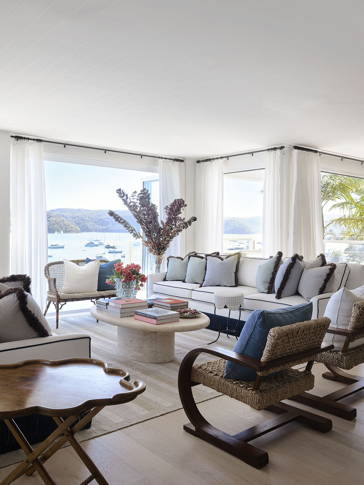
So, I have to say upfront that some of the interiors here are a bit more fussy than I typically enjoy. While I love most of the pieces, there are some elements that feel a bit too formal for me (for a beach house, especially!) and one of them is the over-use of pillows in this first living room (yes, I said first, because there are like… three total at least.) For someone who loves loves pillows, this is saying a lot.
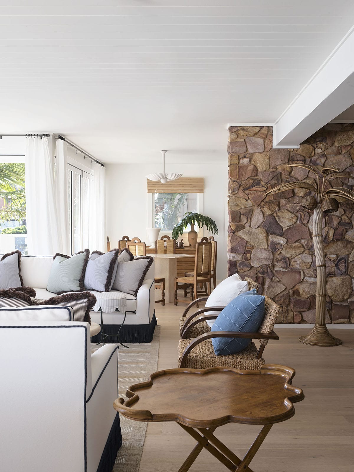
What I do love is the rope trim on the sofa, and even the fringe feels like a fun nod to the nautical! But paired with masses of pillows not only on the sofa but every other seating surface … it’s overkill for me. so I’m choosing to imagine the chairs and cane settee without them – and maybe a couple less on the sofa. Doesn’t it feel a bit more airy now? At least in your head?
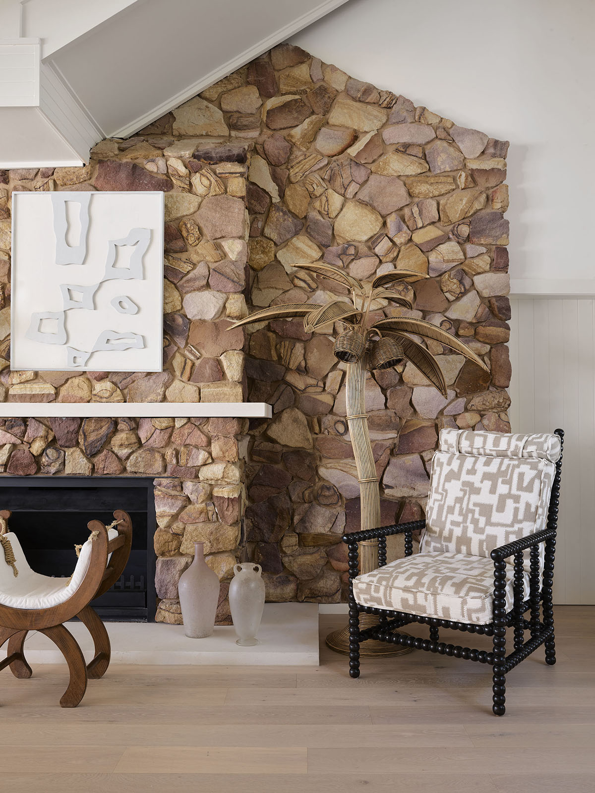
I also highly approve of that cute little accent stool, and the drama coming out of that breakfast nook behind … I can’t believe there’s not a single photo of that space on its own, because I would love another look. I adore that plaster pendant. Side note: the stone on the fireplace has a retro vibe, and I’m into it.
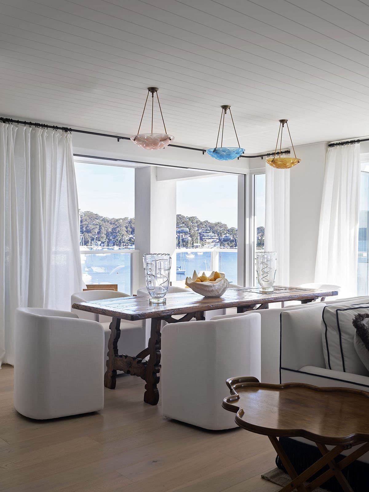
On the other side of the room is the formal dining space, and I adore how Tamsin used this trio of lights together as an unexpected moment. They feel a bit like candy colored jellyfish to me!? They’re definitely helping to lighten the mood around that heavy table!
Now off to the kitchen we go…
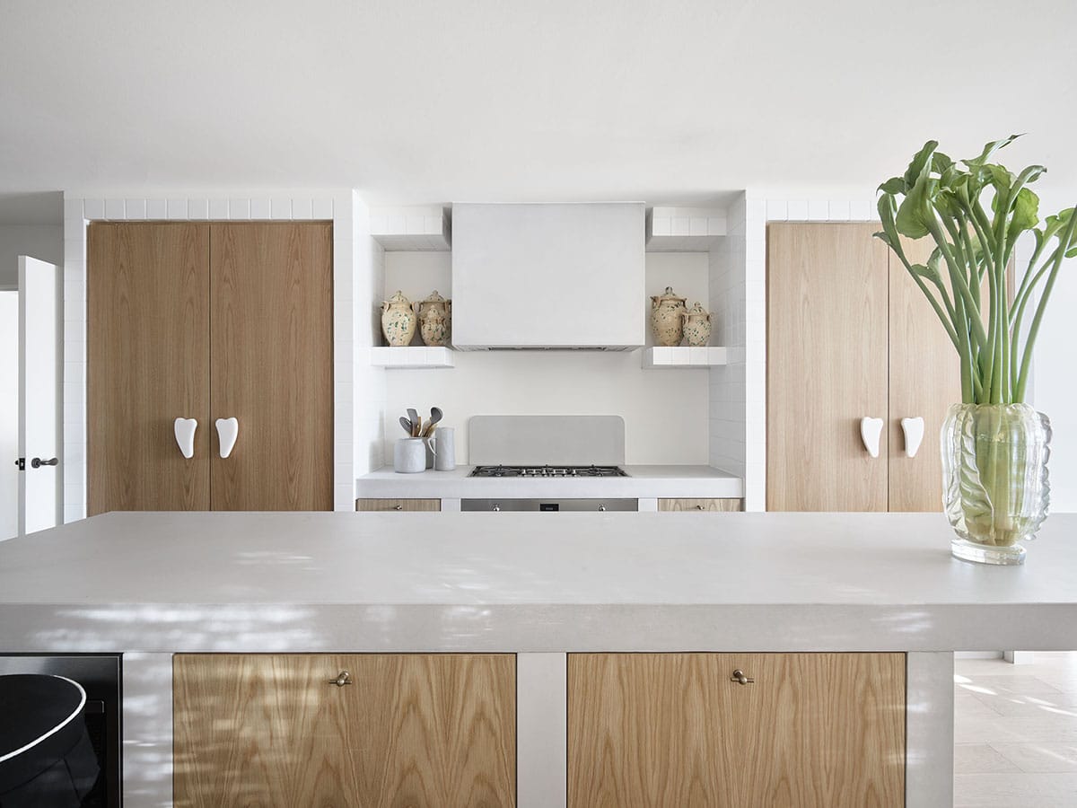
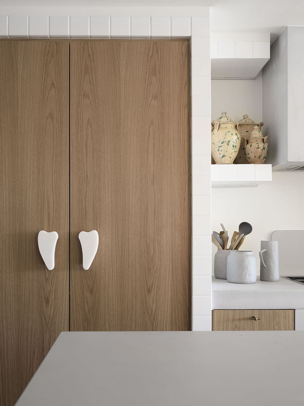
I spy with my stylist’s eye, a collection of Italian ceramic jars that I would desperately like for myself!! It’s a much-needed old world accent amongst this modern take on a Mediterranean style kitchen. But I do love how fresh and bright it all is! And, can we talk about those custom knobs on the big doors?? Gorgeous. I’m assuming one is as pantry and the other the refrigerator.
Now here comes the tricky part of this house tour because… the house is so big that the rest of the rooms are sort of a jumble to me! I usually like to walk you through a house in an order that makes sense, but we’re just gonna have to go for it with this one!
I’m guessing there may be a guest quarters somewhere, though, because there is another kitchen.
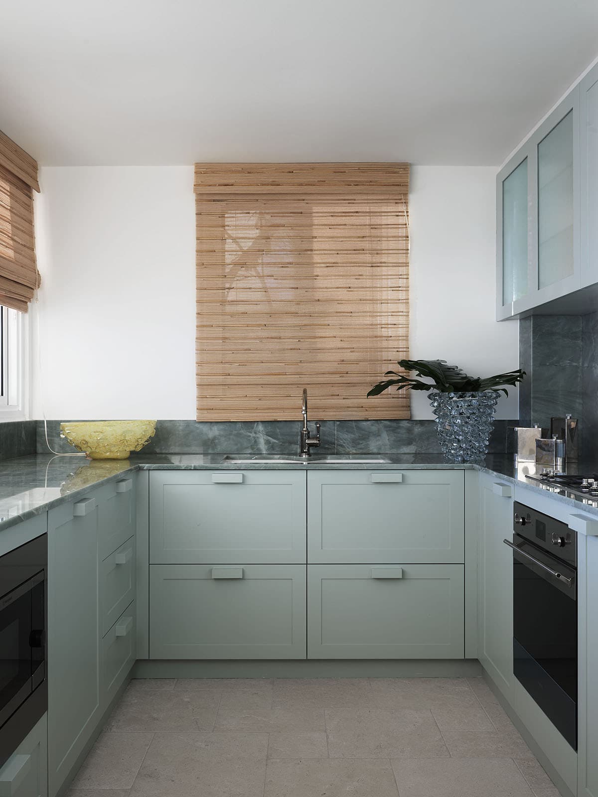
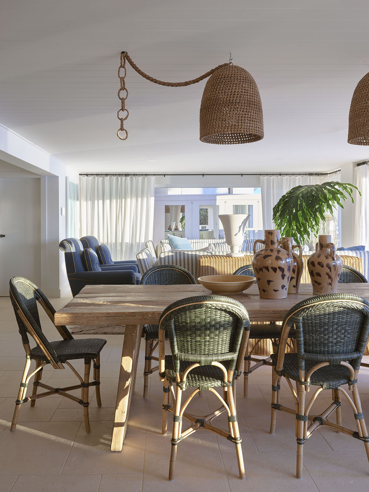
I love the colors in here and the way the green marble melts into the green cabinetry! The rest of the choices are a bit too cold for me, but I certainly wouldn’t be disappointed to have this kitchen on vacation. I’ll pretend it belongs to this dining and living room…
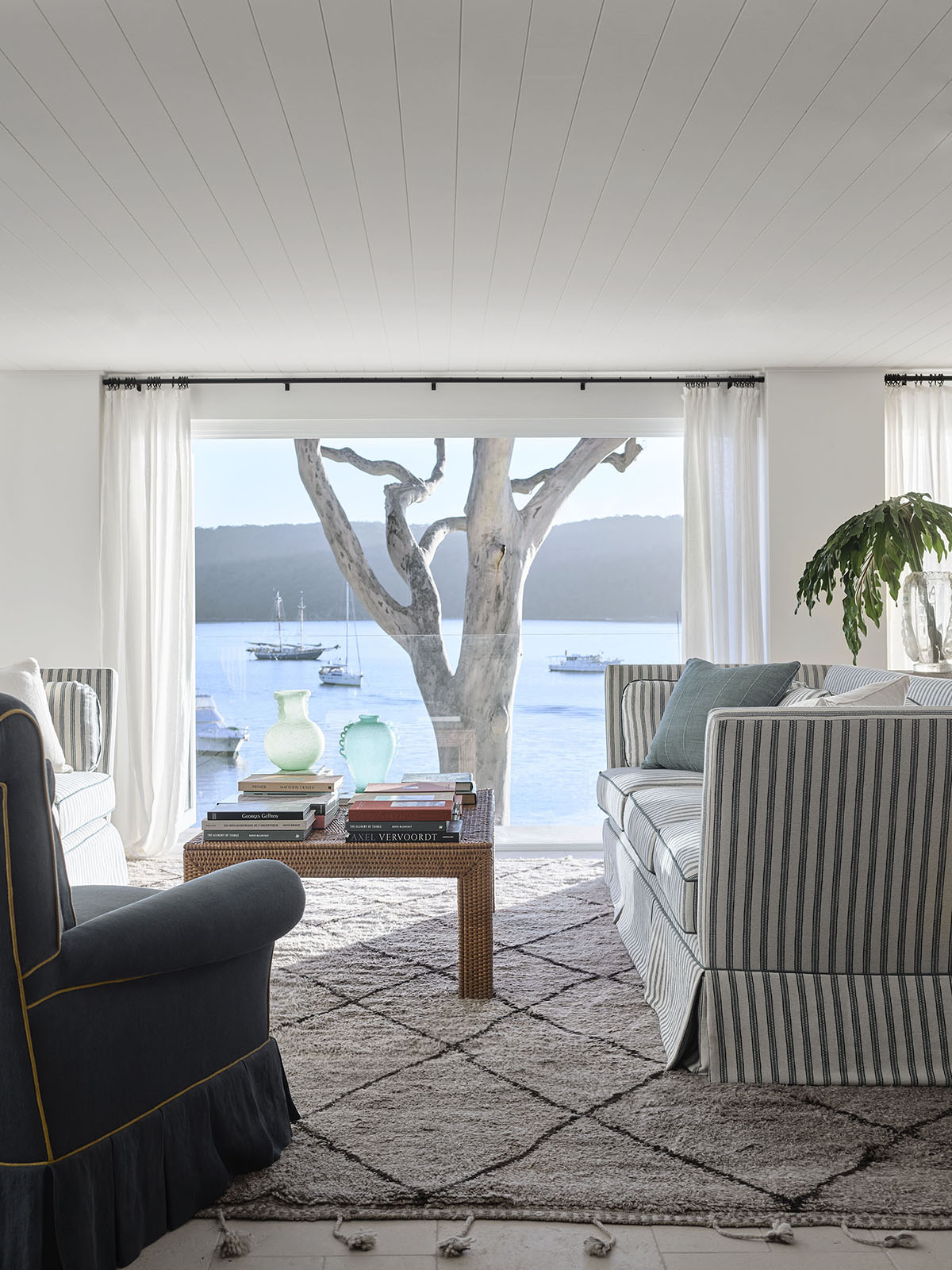
This bedroom…
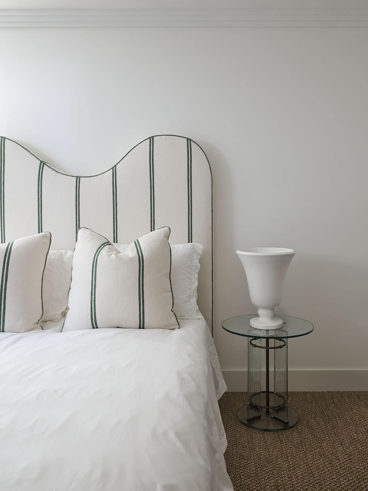
And this bath…
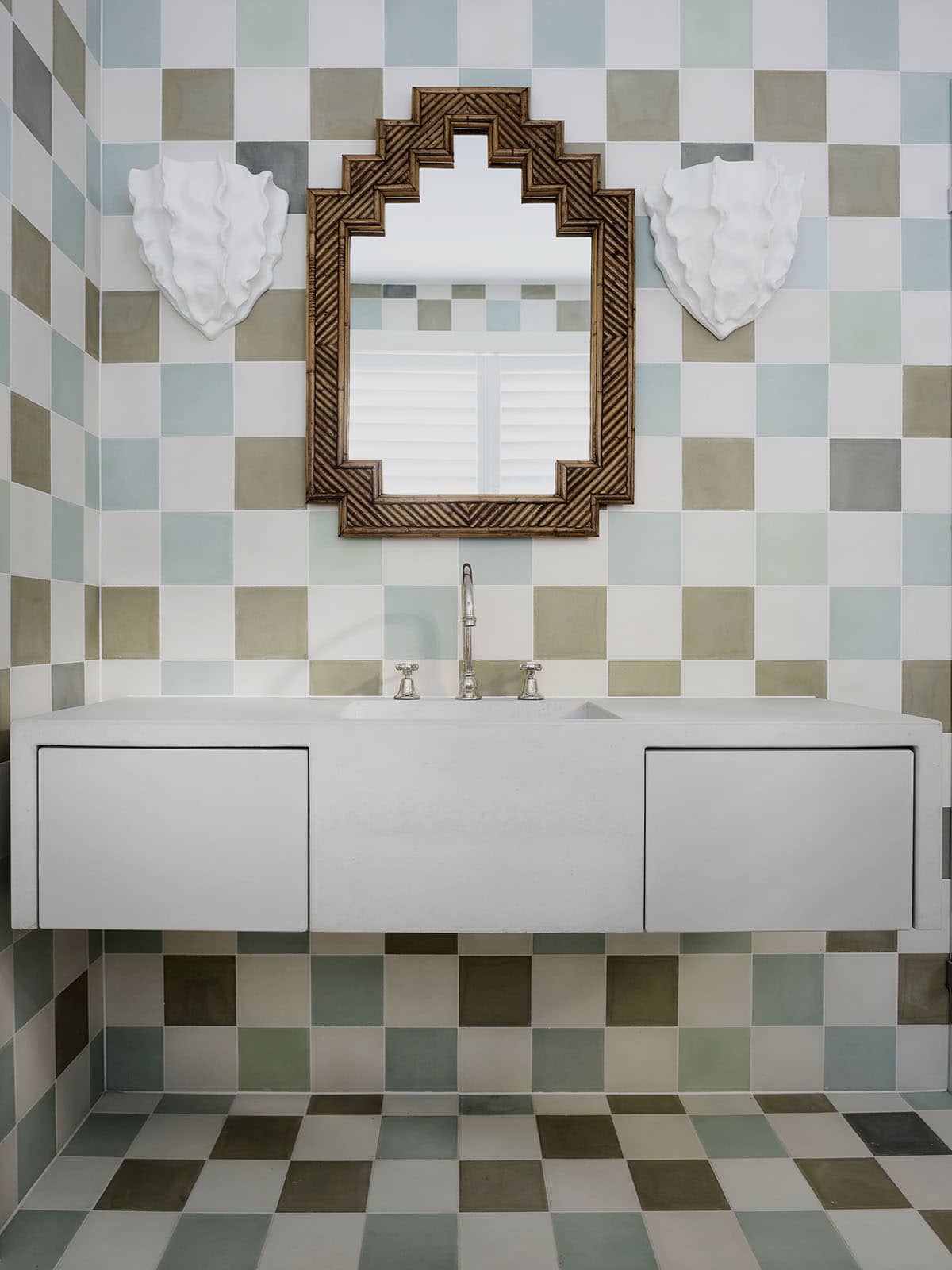
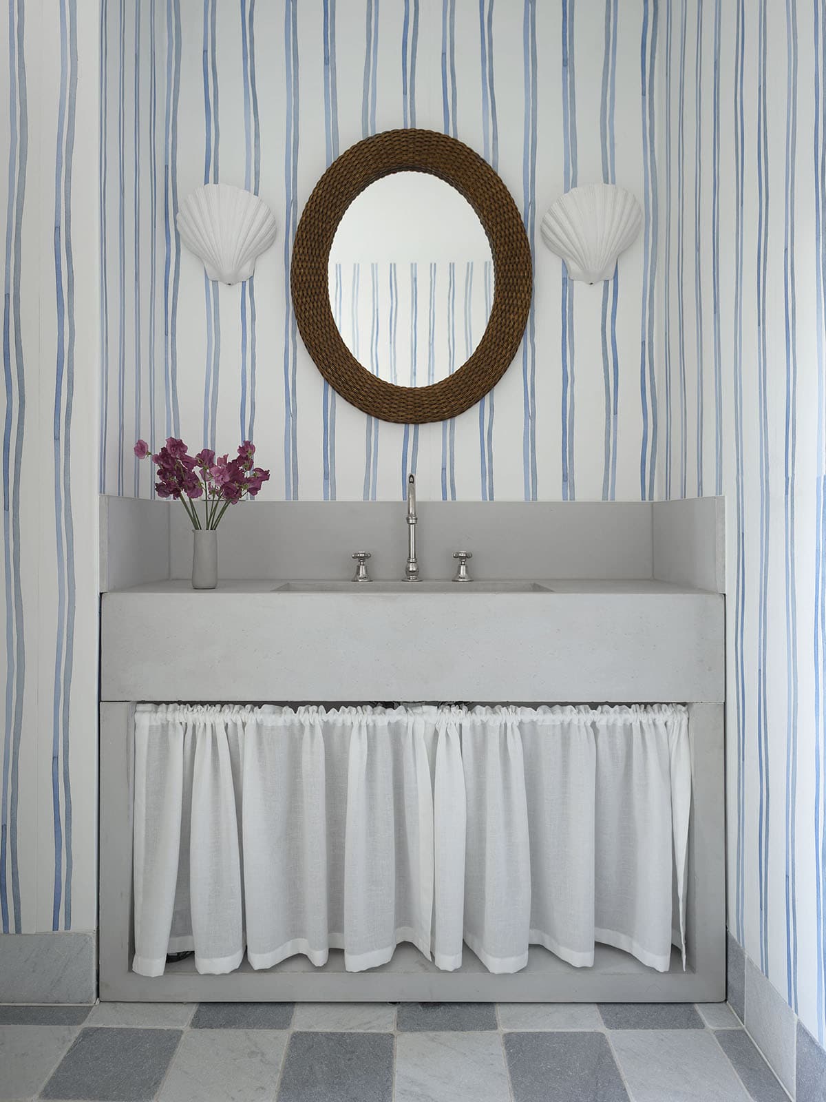
By the way – I think Tamsin does bathrooms better than most…
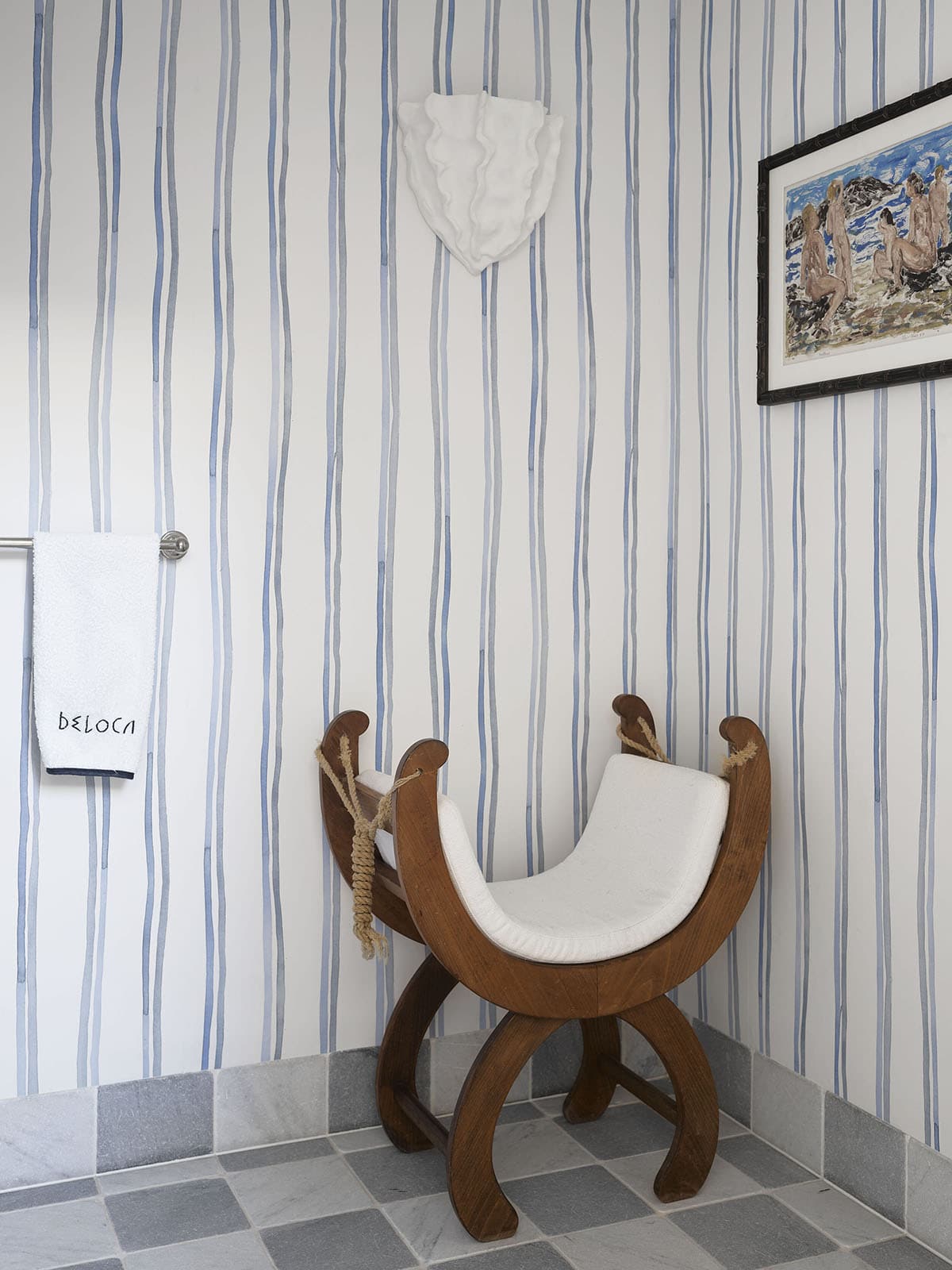
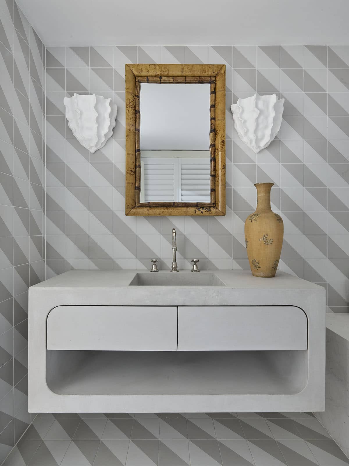
And now a quick peek at the main bedrooms…
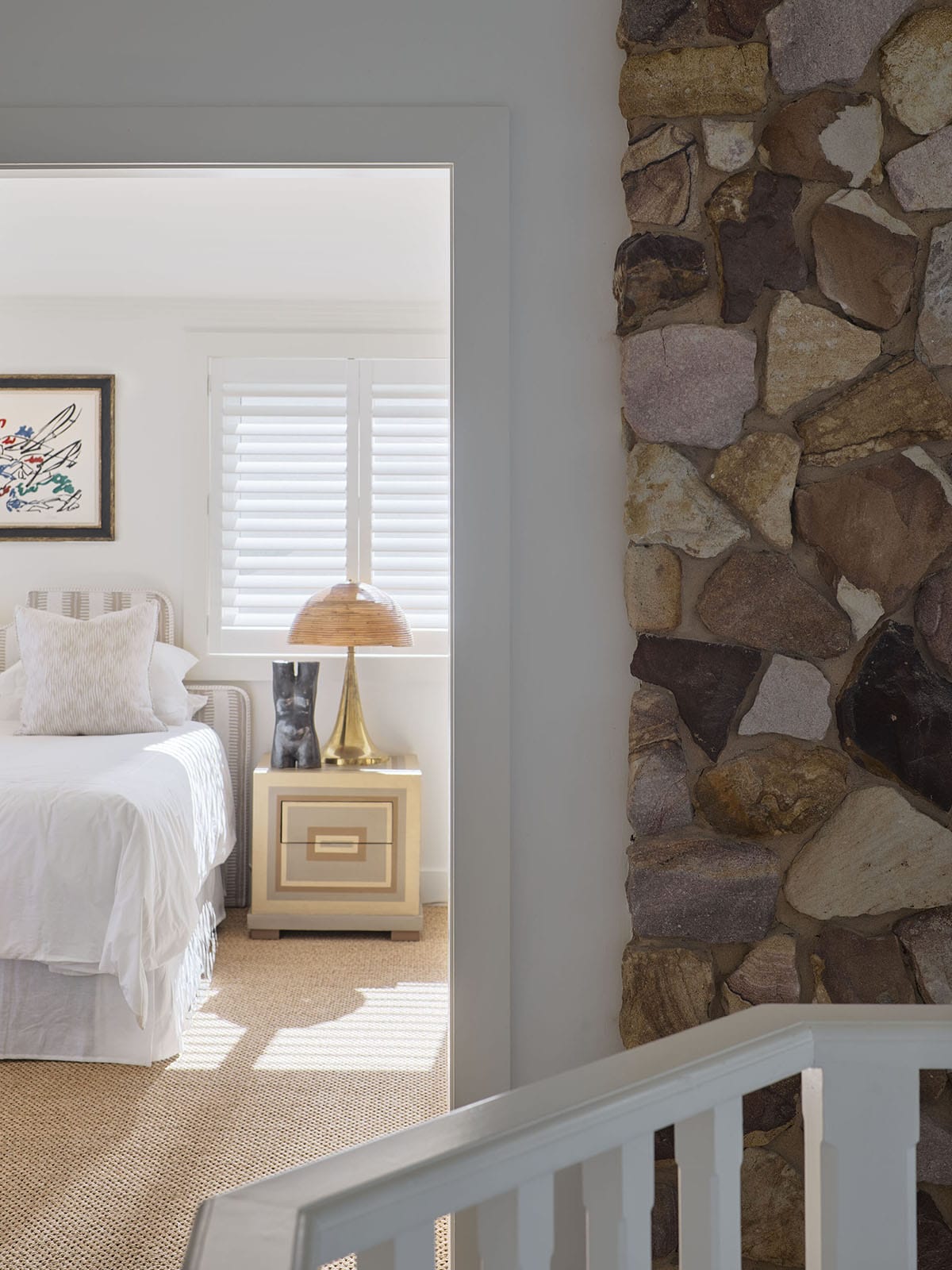
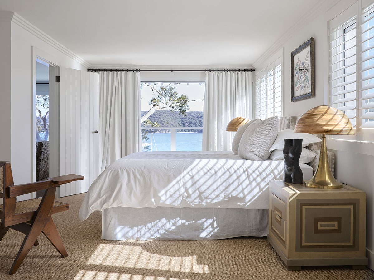
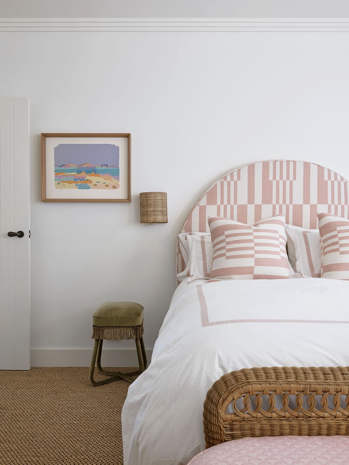
These nightstands are not my jam, but I will absolutely take everything else, especially that view! And I am definitely into the cheerful pink in the second bedroom…
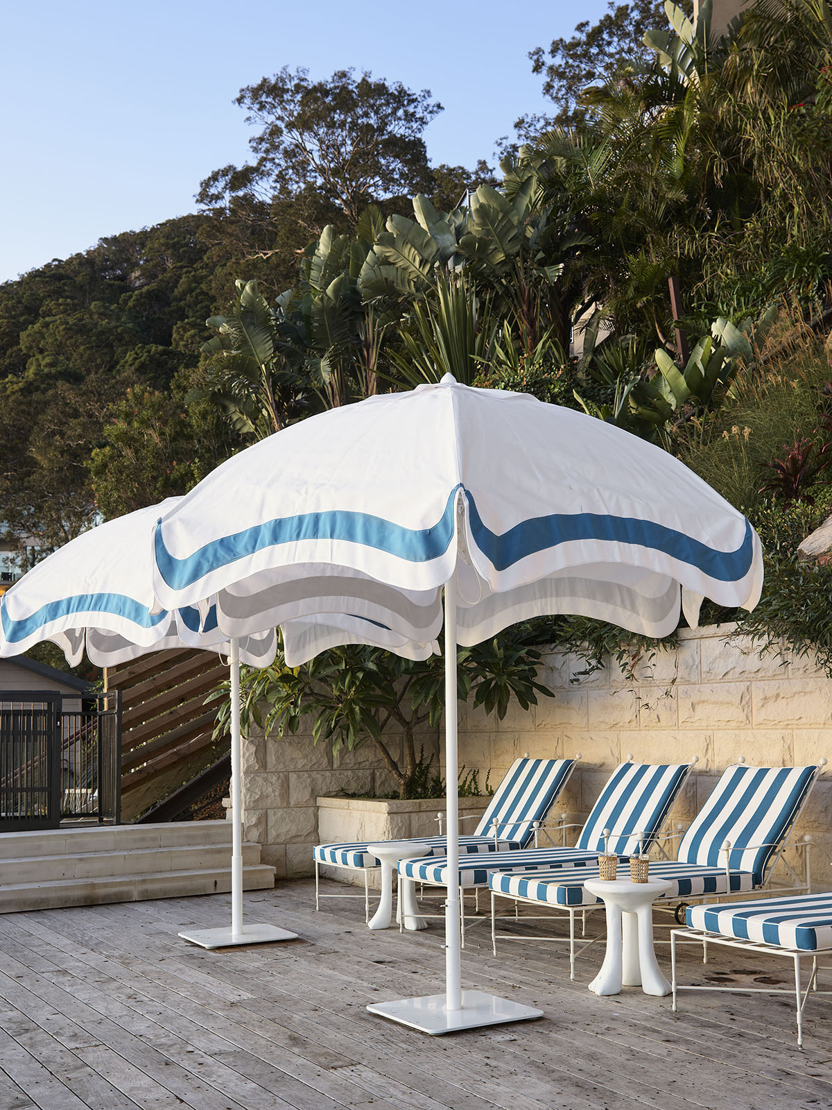
But mostly, I’d happily just lounge my day away right here, with a view of the sea.