
Somewhere in the course of the past year, our family switched from eating in the ‘formal’ dining room to our breakfast nook for most meals. Of course, this may have had something to do with the fact that we haven’t exactly been entertaining, but there is something about the ease and convenience of an eat-in kitchen that has become more and more appealing. So my question is – is it possible to have a dining space connected to the kitchen in a way that feels formal enough for guests, and comfortable enough for breakfast? Well, my friends, I think we’ve found it…
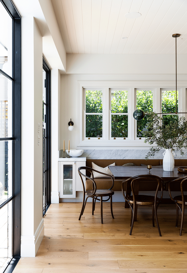
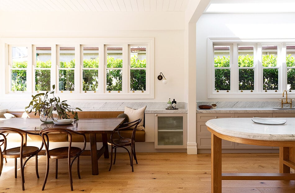
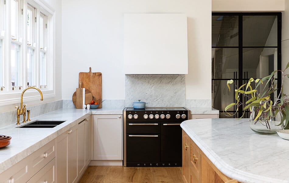
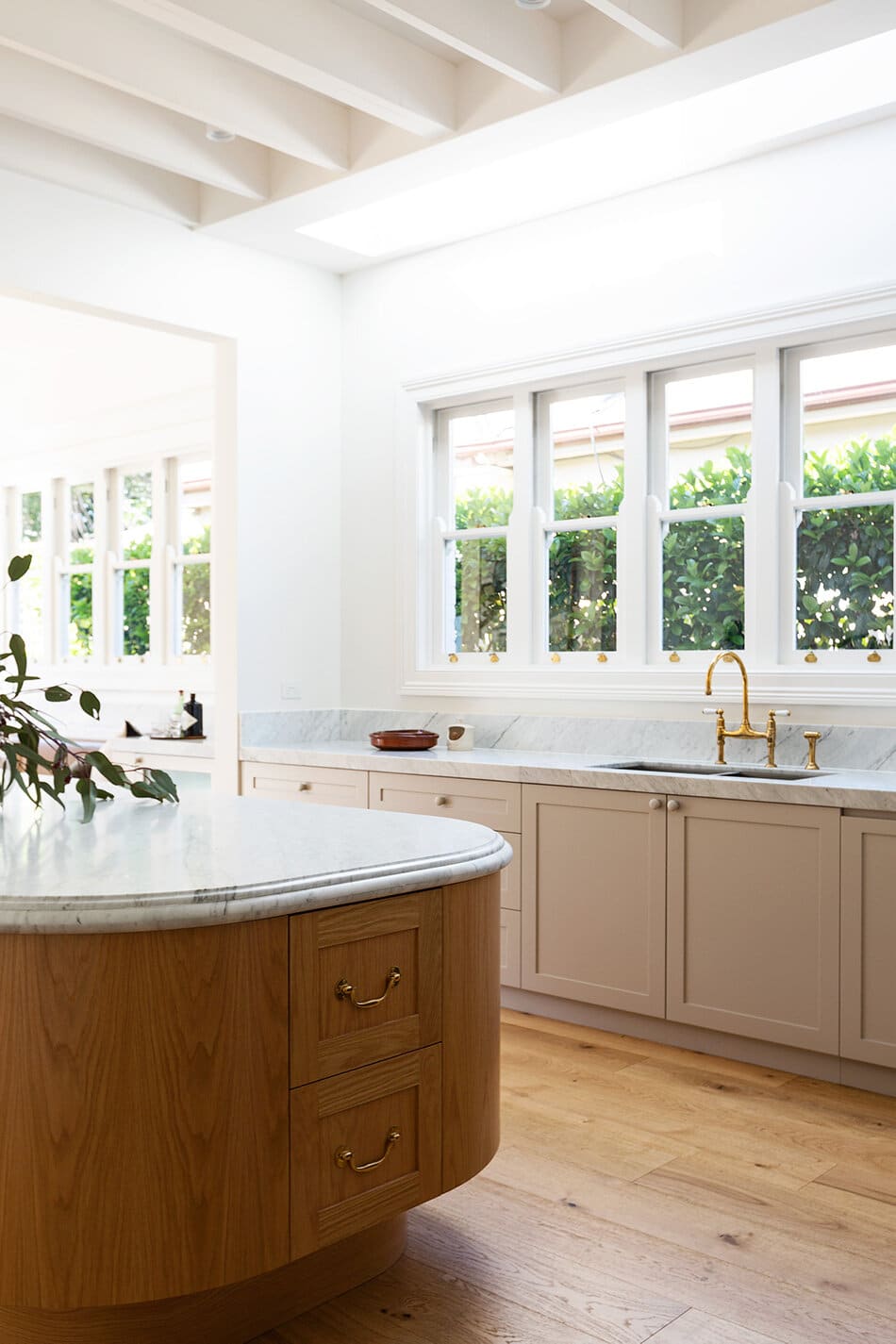
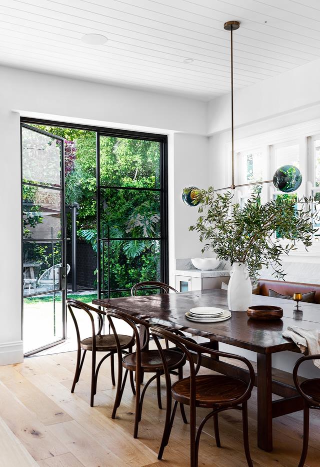
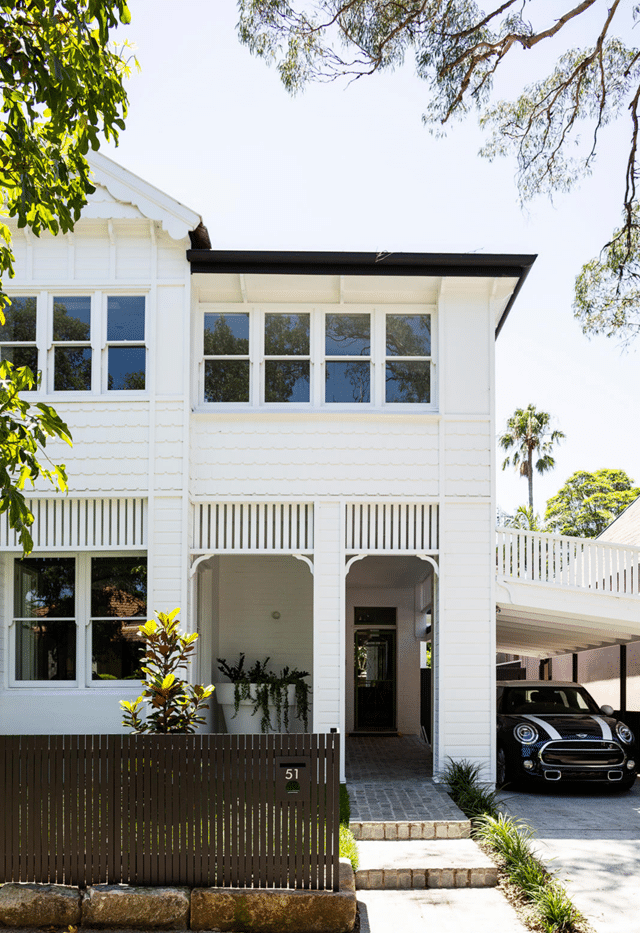
The renovation of this 19th century Victorian home, located in Sydney, (done by Smith + Levine) presents many beautiful details, preserved charm, and thoughtful design, but the kitchen – and adjoined dining nook – is by far my favorite room in the house. The way the two spaces transition seamlessly (notice how the backsplash and counter create one continuous line that connects the two!), while still having a hint of separation in the doorway is simply perfection. The two spaces also featured different ceiling treatments, and the dividing wall allows for that to happen without it feeling awkward.
But it’s the custom curved island that really tops things off for me as far as the kitchen goes. Mark my words, this is a trend that we’ll be seeing more of!
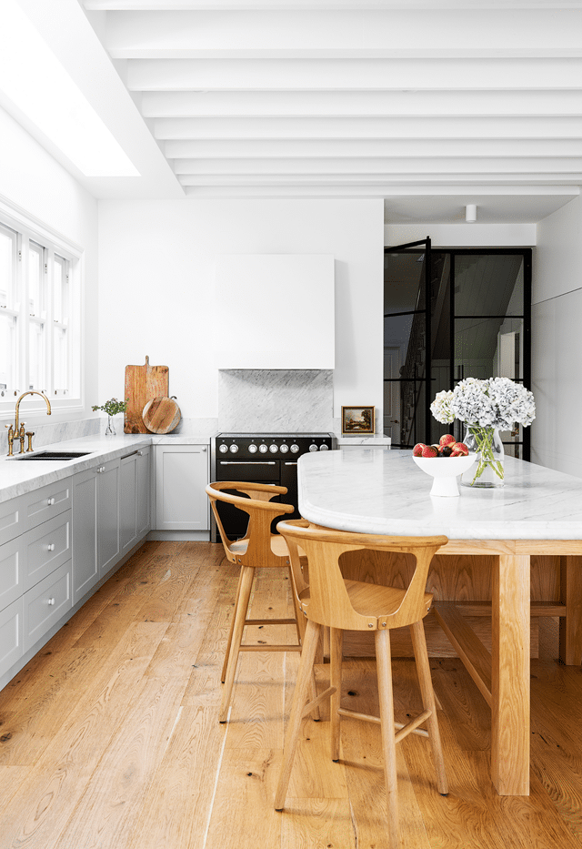
The traditional ogee edge and the use of different materials from the rest of the kitchen (brass hardware and oak!) lend to the furniture style of this piece, giving it the feel of a repurposed antique while being able to customize it to the space.
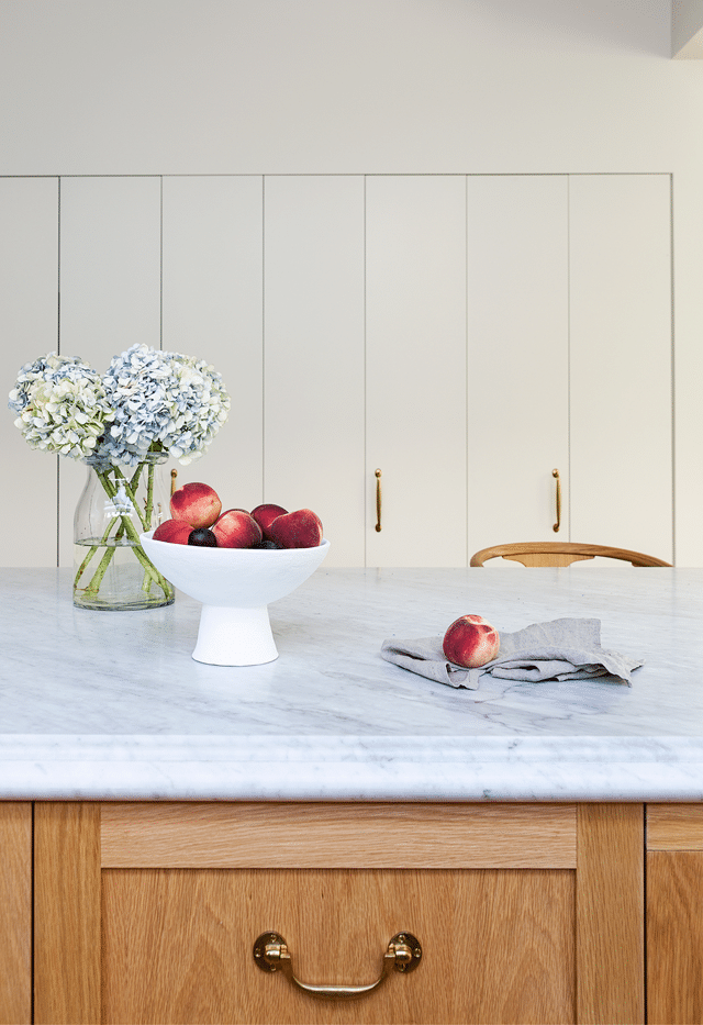
The cabinets, on the other hand, are painted Dulux ‘Heifer’ and make a lovely compliment to the oak while the modern edge matches the clean lines of the rest of the kitchen. The mix of traditional and new in every space in the house is really lovely.
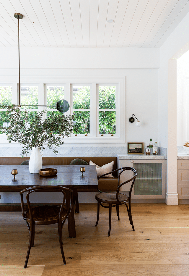
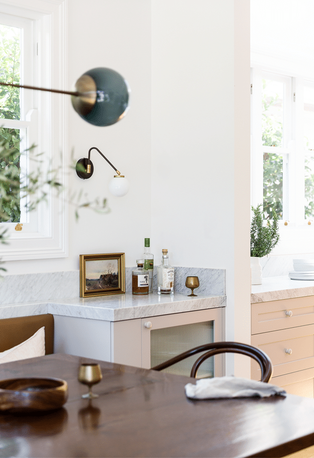
In the dining room, I love that the chose a contrasting darker wood finish for the table and chairs, along with the dark leather bench. It brings a bit of sophistication to the room while breaking up the sea of oak. The way the bench is built into the wall with more storage is also quite fantastic and functional.
As for the rest of the house… well, it’s got plenty of gorgeous architecture and details for you to bookmark.
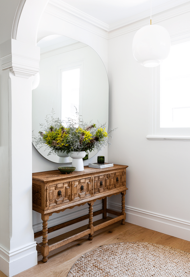
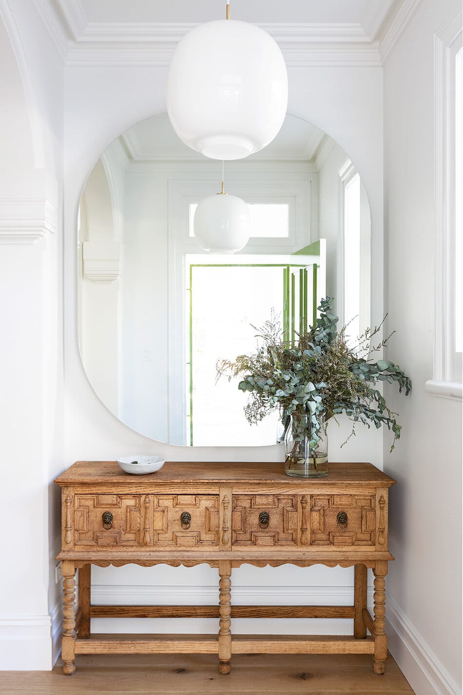
I always love an antique piece of furniture like this – especially in the entryway – to set the tone for a home. The massive mirror really fills the wall and creates the illusion of more space in the entry. It’s a bit on the large side for me, but I appreciate the way it functions. Also, if you look closely you can see that the front door is painted a lovely shade of green – wish we could have seen more of that little detail!
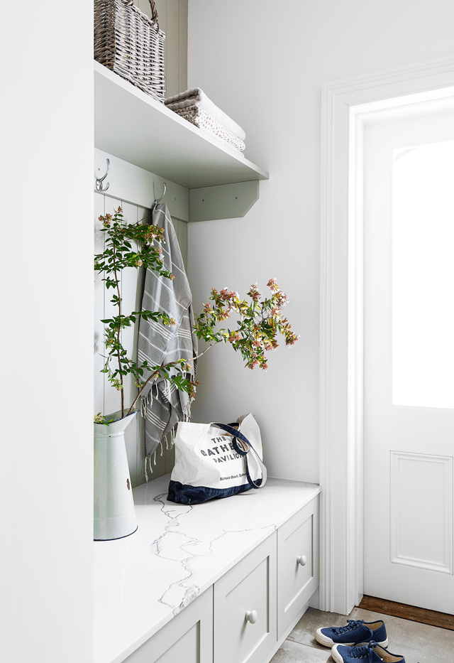
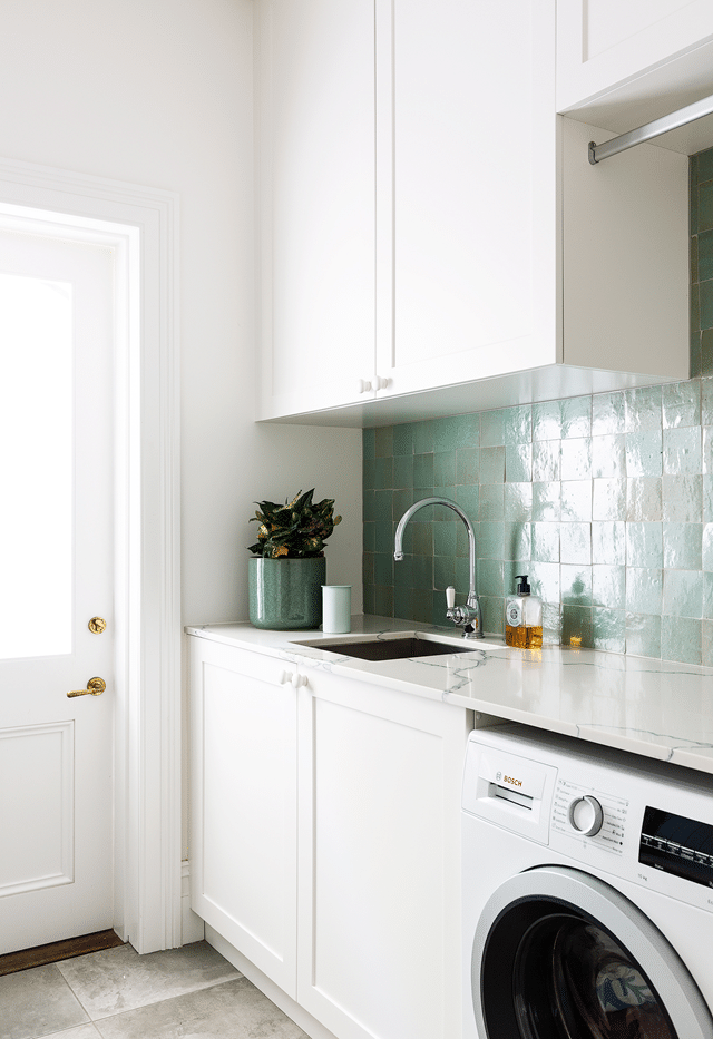
A secondary entry – which I’m guessing may be via the carport – exists through the laundry room, where more practical storage awaits. The bench top being a stone surface is so smart, as I imagine wet coats dripping onto the surface.
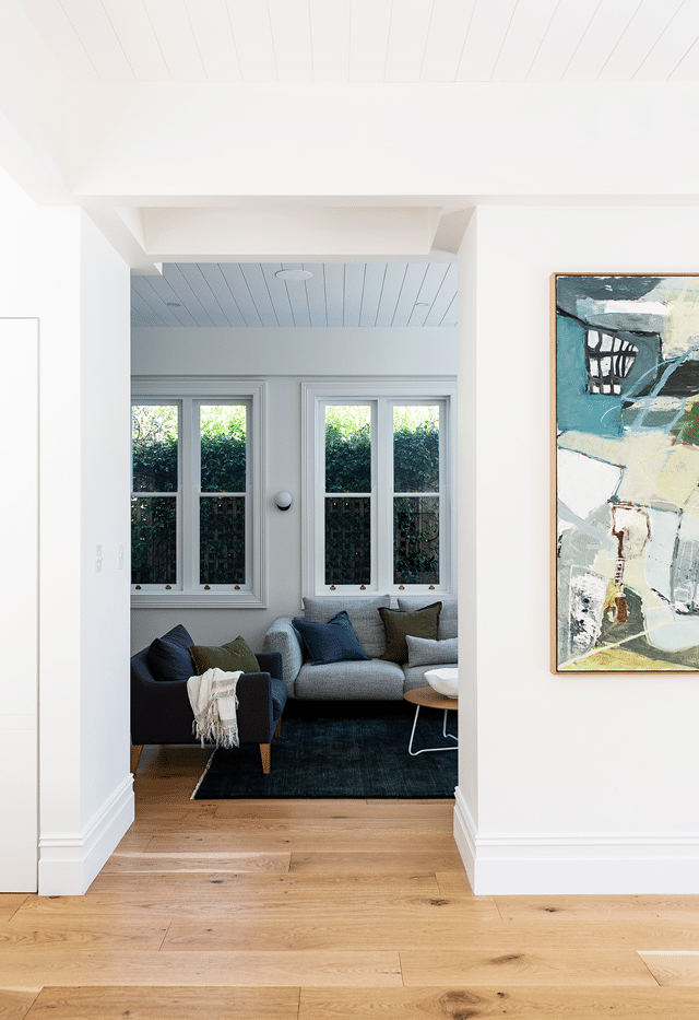
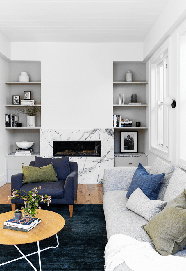
The living room is, sadly, my least favorite space. The furnishings are quite modern and the styling a bit cold for my taste, although it does look comfy. It’s tucked into a more narrow back section of the home, and I wish it had a few more antique accents or details to it.
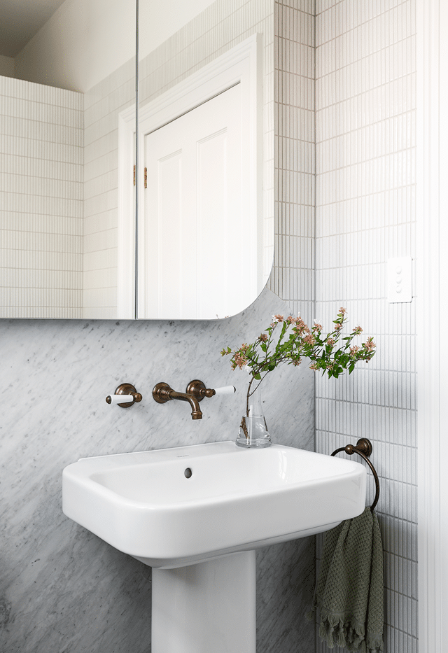
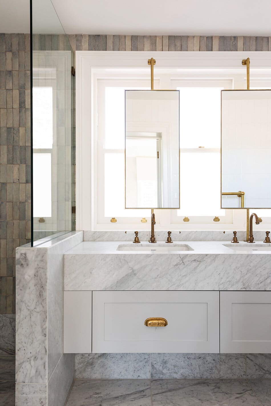
The bathrooms in the home are also more on the modern side, but the tiles are so gorgeous, I don’t really mind! There is the use of more traditional hardware fixtures to help balance it out, and I also adore the curved backsplash detail on the marble behind the sink!
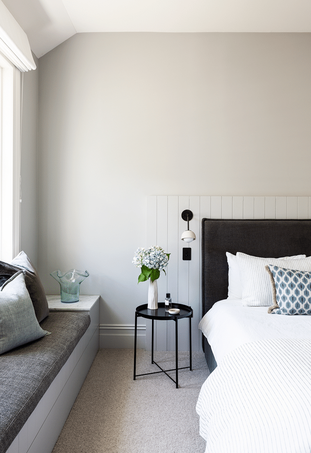
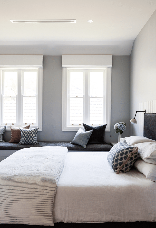
The custom details of the built in bench and the paneling behind the headboard in the main bedroom are nice touches. Again, though, I find myself wishing for a few more elements that reflect the warmth of the kitchen and dining room. To be fair, some of this could be the editing of these photos where the subtle creams in the linen bedding aren’t quite coming through. I do see how keeping these details uniform in color helps create one cohesive space, but one could also argue that it all sort of blends together. Which would you prefer??
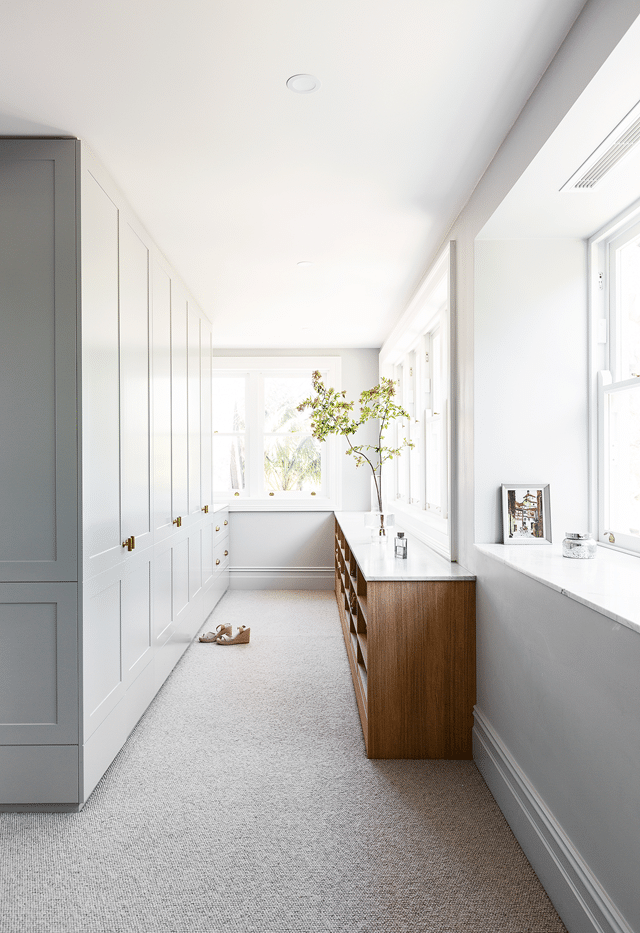
Here in the closet we do finally get a dose of some more wood in what looks to be the shoe storage area. I’d take this entire closet situation with all that natural light!
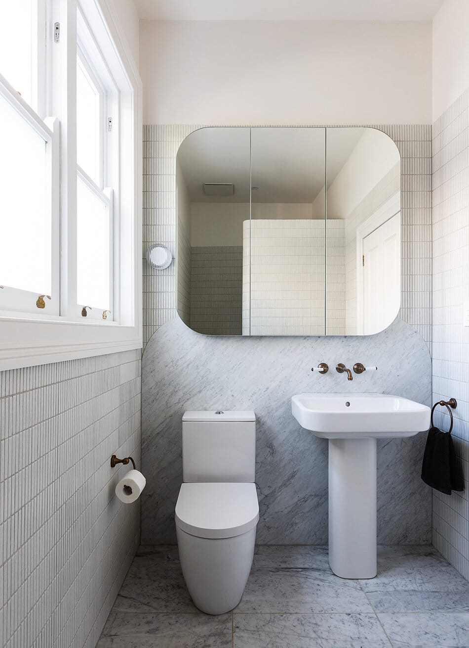
And then finally, we have the main bath. My goodness, this house has so many windows!! I always take note when designers come up with clever ways to float mirrors over windows, as it can be such a help in problem solving layout issues when designing bathrooms. I think it’s very well done here where the scale of the mirror mimics a slightly smaller version of the windows.
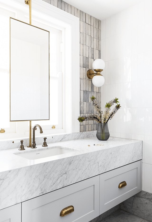
I also very much enjoy the mix of tile on the walls with the addition of a more creamy tone for warmth. Do I sound like a broken record yet?
Overall, I think the renovations to this home were a lovely improvement! I think we all know that I veer a bit more organic and classic than some of the rooms featured here, but that won’t stop me from appreciating what the designers and owners created. For more details on the home, the process and the designers, you can reference the original article on Home Beautiful.