
I’m not sure there is ANY color that is harder to pick when painting a room than white. The subtle nuances, undertones and vast number of options can overwhelm even the most seasoned designer. Other factors – like where your home is located, the style of the interior, and the type of natural light – also come into play. So where to start?
Well, having just gone through picking a white paint color from Sherwin-Williams to paint our entire basement, I figured it was the perfect time to share the my somewhat quick, mostly painless process for how to pick white paint for any room in your home.
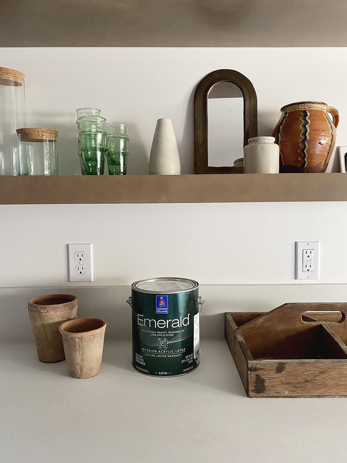
First off, this is the sneakiest little peek at the kitchen, mid-process of styling those shelves. I’m beyond excited to share the whole space with you, but you’ll have to wait just a bit longer for that! The color you see on the walls is the white that we finally selected from Sherwin-Williams – and it’s called Marshmallow.
But how did we arrive here? Many, many many samples.
Step One: Pick a general direction by considering your light and undertones. Before you even start looking at paint chips, it’s good to at least have an idea of what type of white you want in your space. For example: In our basement, I knew I’d have to go with a brighter white because it’s a dark space. I also knew I wanted something on the softer/warmer side. But subtle. In Seattle, our gray winters mean that I generally stay away from any blue undertones! If you have a super modern house, you may prefer a really clean white (a few undertones as possible!). But if your home gets a ton of direct sunlight, you may find that the bright whites are a bit too bright, and may want to choose a white with a lower reflective value.
How do you find out all this information? Many paint companies do the work for you, but I really love that Sherwin-Williams has this info right on their site, and on their paint chips. If you look up ‘Marshmallow’ you’ll see that it’s a pretty balanced white with the Red, Green and Blue undertones being listed as: R:238 G:233 B:224. So highest in the red (which means it’ll be warm) lowest in the blue (which is what I want!). It also lists its light reflective value at 82 out of 100. Bright – but not too bright!
If you want to see how this plays out in real life, here you go:
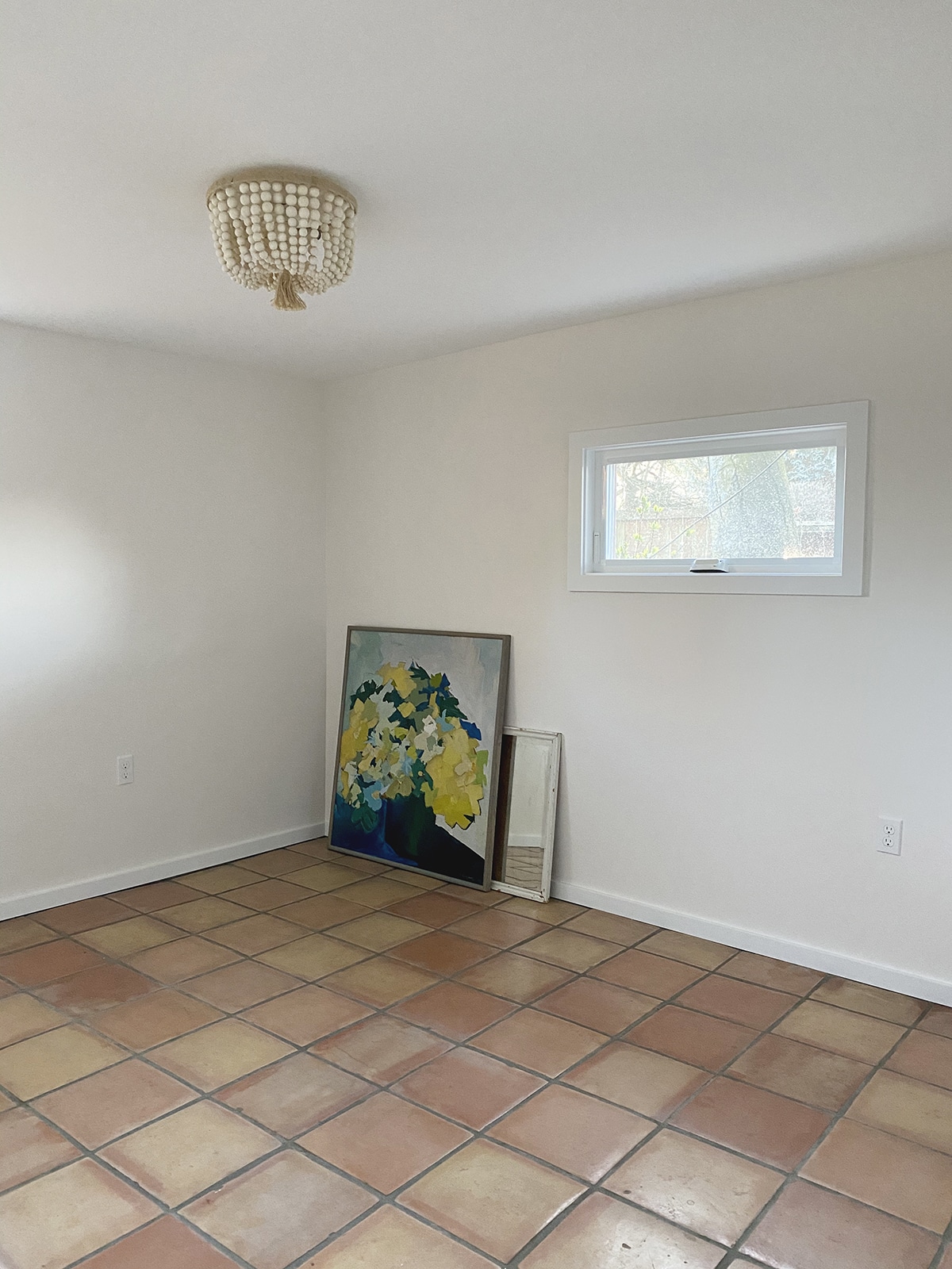
This is the guest room during the day with indirect sunlight. This tone is pretty true to color (despite the not so great iPhone pic – sorry!). You can see that it’s warm, but not overly.
Now look at it from the other angle, when the walls are picking up more direct sun…
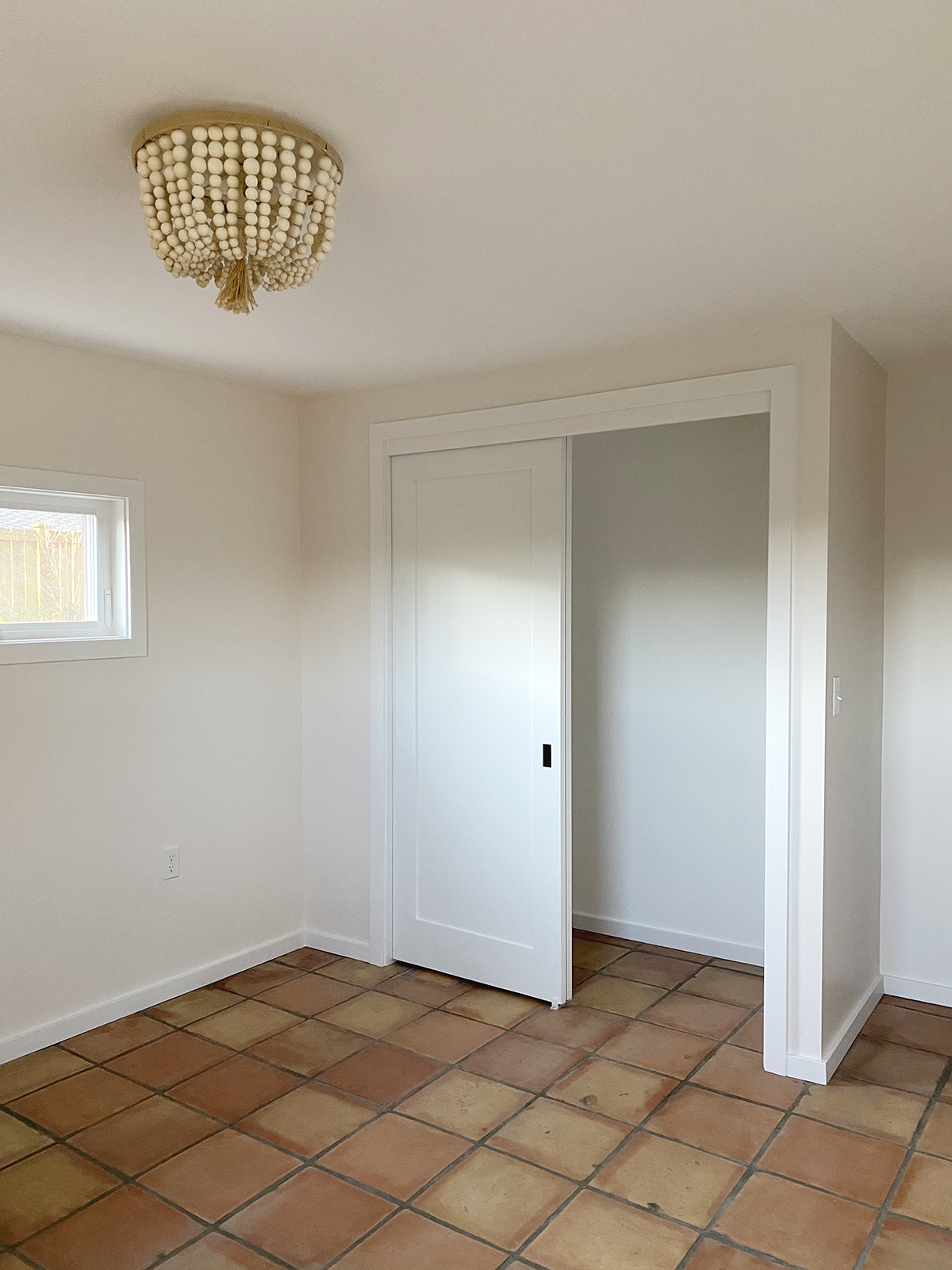
Do you see how it becomes a bit more pink? This is the red coming through, and it’s also from the walls reflecting the color of the floor, which is something else to consider! White reflects its environment, so it’s important to think through that when choosing a color. If you have a giant green hedge outside your window (like we do in other parts of the house) the paint will pick up the green. If you want to balance that, you’d want a red undertone. If you want to lean into it, you could do a green undertone, knowing that the white is going to appear even more green. Which leads us to step two.
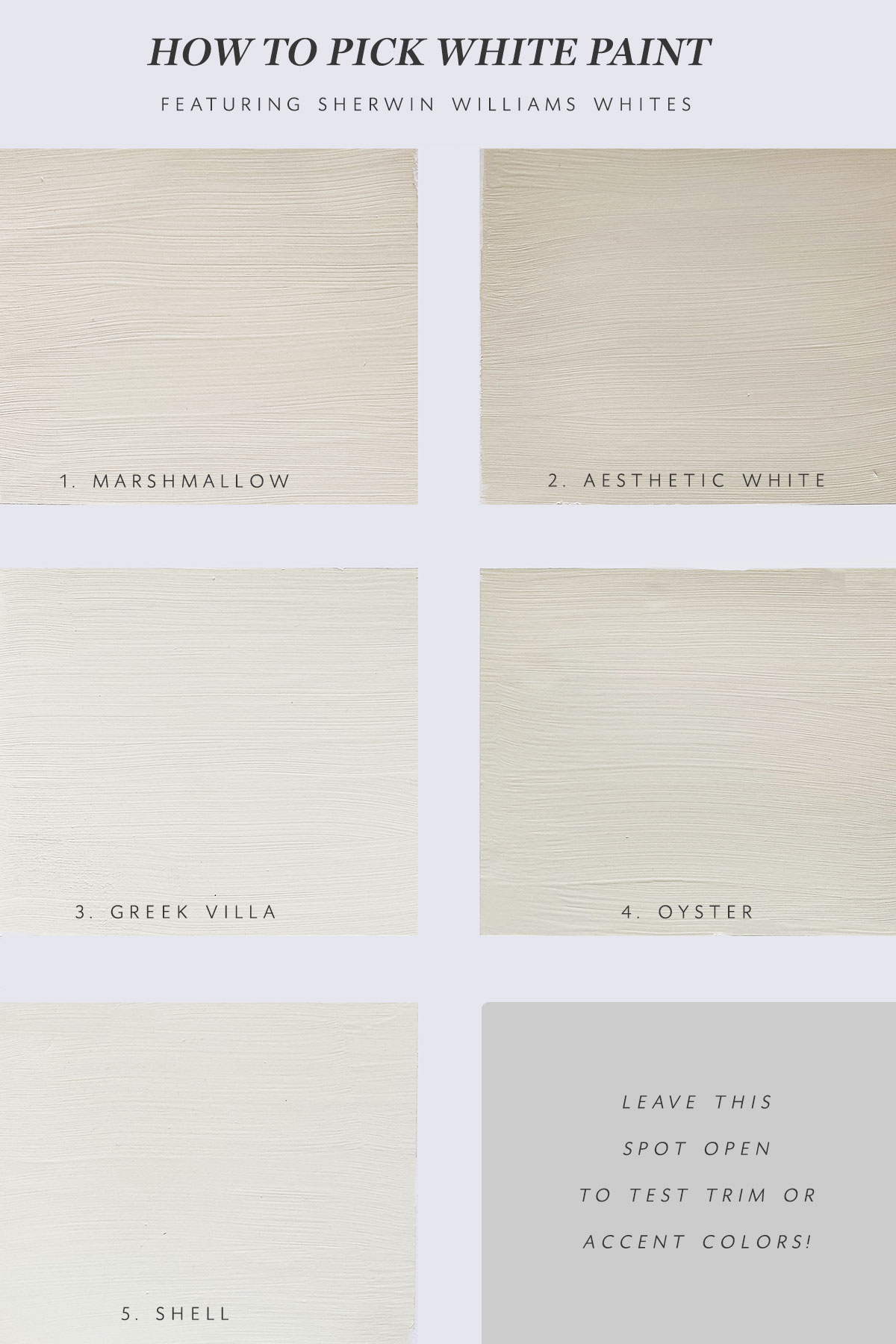
Step Two: Buy more paint samples than you think you’ll need. Seriously though. Never have I ever made a paint decision after sampling just two colors. I typically like to pick my top 4-5, and here’s why: I usually have one or two that I have a strong feeling about, but the I like to try one up or down on the paint strips (lighter or darker) depending on the mood. Or sometimes I jump one over to a slightly more warm or cool tone just to make sure that I have the right one.
Step Three: Test your paint – but NOT on your wall! Once I have all the paint samples, I get some white tagboard, and tape off squares to paint in each color. I like to go in order that I think I’ll like the colors (number one being my first pick, etc). That way, when you take the paint off, you generally end up with your top two being next to each other. I also like to use the sponge brushes because they require less coats (ie, they allow you to layer more paint on all at once). Let the paints totally dry, then peel the tape off!
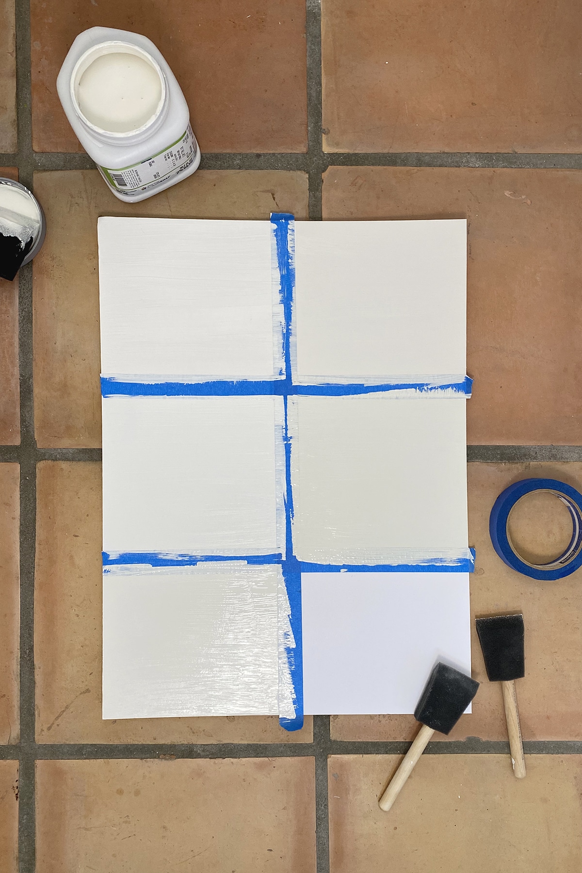
The reason I do this is because testing white – and especially white – on a wall is tricky because your brain can really trick you when you see white on top of any other color – even another white. Testing white on a bright white tagboard really helps show each color in its truest form, and gives white space between each sample. It makes it immediately clear what the undertones are. Putting this paint on a tagboard also allows you to move it around the room (or in our case, the entire basement!) so you can see how it looks in every light.
Now, before I go to the final step, I have to make one point here that is SO SO IMPORTANT. Do not pick a paint color for your home based on a blog post. What I mean by that is, please don’t look at this and say “Oh, I love Marshmallow, I’m going to do that in my house!”. Why? Because – as I mentioned earlier – there are so many nuances that play into how any color is going to show up in your home. The closest I ever get to recommending the same color to another friend is: They live in the same environment (in this case, they would live around Seattle, in a home that is similar in style, possibly with a lot of green surrounding them), they have similar light (measured by directional light – north, south, east or west – as well as natural light) and they are wanting to have a similar feel (soft and warm). Even then, I would always recommend a couple more options.
Ok, so with all that said…
Step Four: Pick your top two, and put them on the wall (if you need to!). The second I saw these colors on the tagboard, I knew that my two contenders were probably Marshmallow and Greek Villa. Aesthetic white would have been great for a really bright space, but in my basement, it felt too muddy. Oyster and Shell were both skewing too yellow for me. Once I had two colors, in large swatches, up on several walls, I could see how well Marshmallow transferred from room to room. I used the board to test the colors in the kitchen because the walls had already been demo’d (another reason I love this method!) and it worked great!
Step Five: Test your trims (again, if you need to!). We knew we were going to do white trim in the basement, but I did have a moment where I thought about a soft green trim. Leaving a spot open for testing trim colors (in smaller swatches) is always a good idea if you feel like you need it!
While some of these steps may seem like a no brainer, it’s the combination of considering the lighting, undertones and mood of your space with using the board to initially test all your colors next to each other that really makes this process so much easier!! And as always, if you have questions, put ’em in the comments – always happy to answer!