It’s finally feeling like spring around here and with that comes interior updates! This season we’re noting lots of new color trends that are 100% worth trying. After seasons of neutrals and tired grays, we’re more than happy to see actual color making it’s way back into the design sphere.
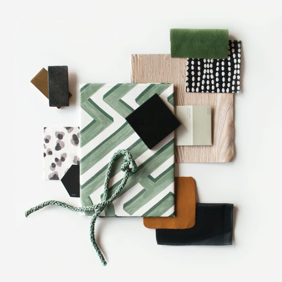
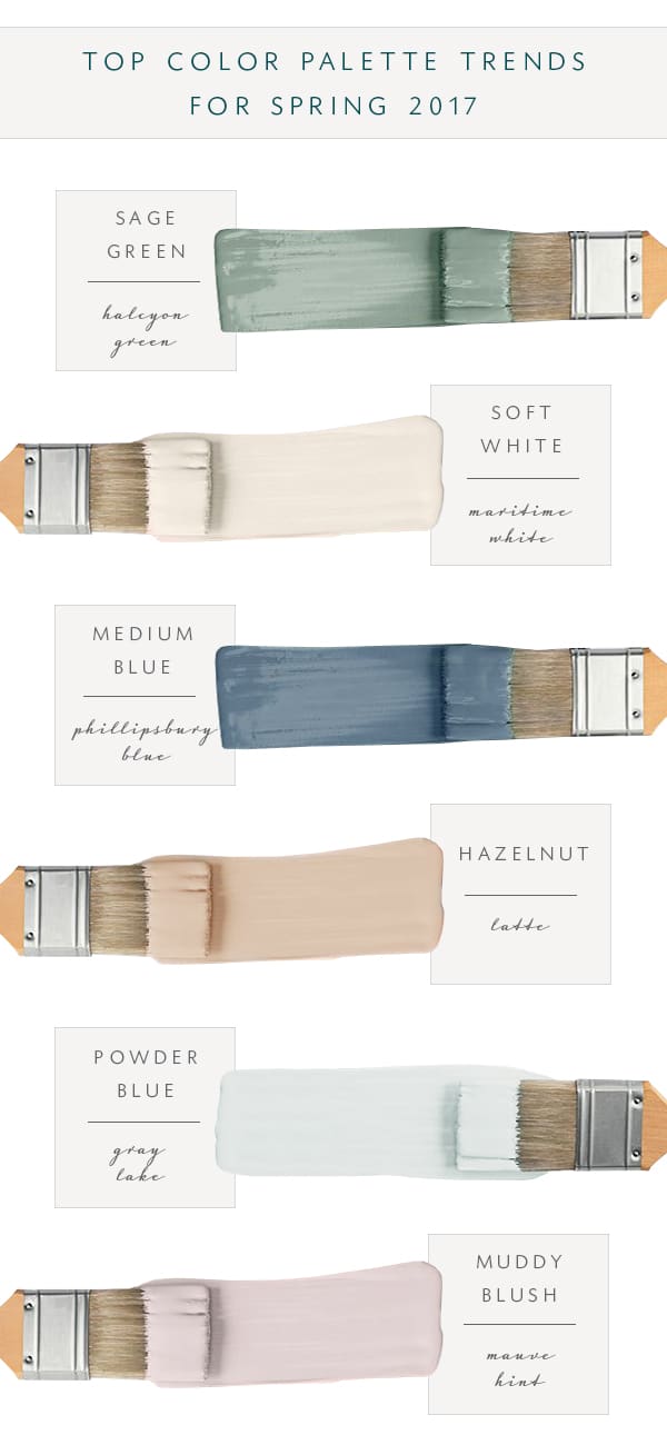
This season we’re predicting lots of barely there pastels, warmer neutrals, and bold, statement making hues.
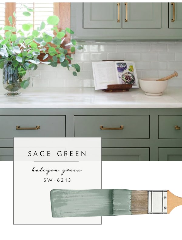
Sherwin Williams Halcyon Green (SW-6213)
Even after Pantone announced the color of the year (green), we’ve been seeing SO many different shades of this popular color. From deep hunter greens that look great in the fall and winter to the lighter sage greens that are perfect year-round, there’s certainly no shortage of inspiration when it comes to everyone’s favorite color. It’s safe to say this color trend will be sticking around quite awhile.
If you’re wondering what to pair this green palette with, try using it as a neutral. Many of the desaturated options pretty much go with anything, and remember – these colors don’t just apply to paint. If you’re looking to some accents to your home this spring and summer, bring it in with accessories, art, textiles, upholstery, and other decor.
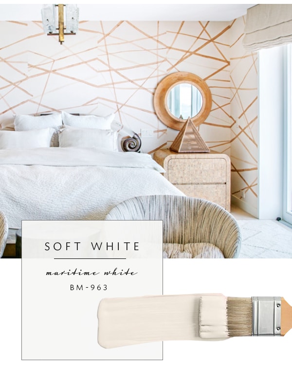
Benjamin Moore Maritime White (BM-963)
I’m tempted to say, gone are the days of bright, clinical white rooms! It’s a breath of fresh air to see trends leaning a little warmer into creamy whites. It’s so much softer and more welcoming too. It automatically makes a room feel inviting and cozy! Instead of the monochromatic gray rooms of 2016, this year we’re expecting warmer monochromatic spaces. Think creamy whites, organic wood tones, natural materials, and soft, luxe neutral textures.
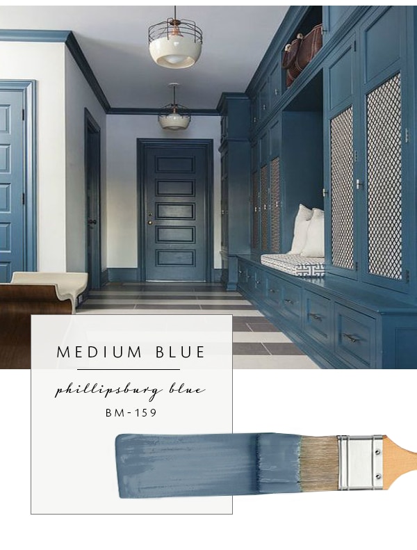
Benjamin Moore Philipsburg Blue (BM-159)
On the opposite end of the spectrum, we’re trading out navy colors for this medium blue counterpart. In general, a way to think about the trend that color is going towards at the moment is that it’s a bit more grey, less jewel tone.
I love the way this blue was applied in the image above, which highlights another new trend: Rather than painting the wall, try the reverse! Trim, architectural features, and doors are the highlight when painted a unique color. It feels fresh, yet timeless. If you’re not feeling quite as bold, find a medium blue that is a bit less saturated but of the same value.
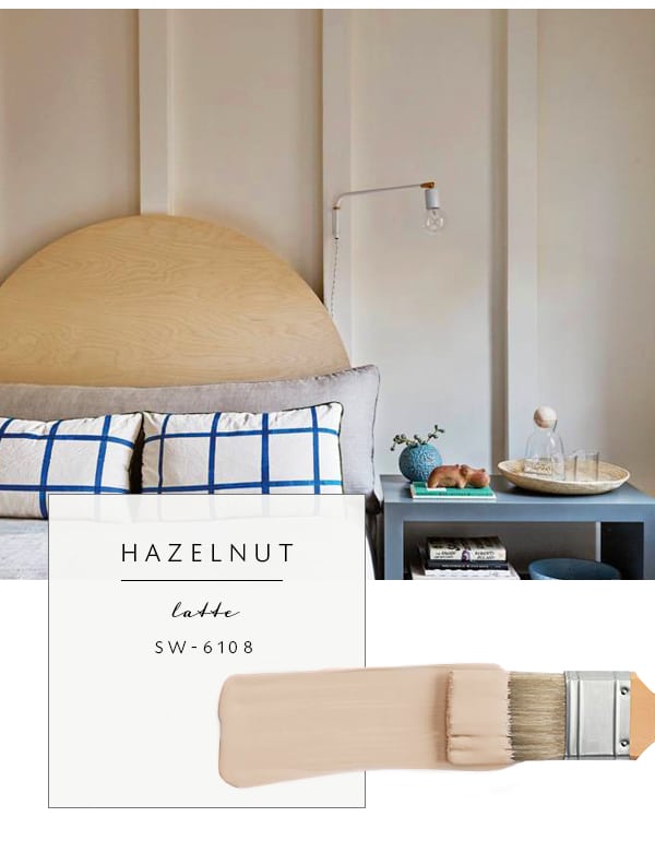
Sherwin Williams Latte (SW-6108)
Just like bright whites being replaced by creamier colors, we’re noticing the same pattern with tan and gray. If you’re tired of cool gray (or gray anything for that matter), make the transition to greige, beige, taupes, and tans. We’re calling it the hazelnut trend… again- super warm and inviting! If you’re in search of that “homey feeling”, the first step is adding warmth to your palette. Along that same line – warm greys in a ‘mushroom’ tone that aren’t as peachy will give you the same effect.
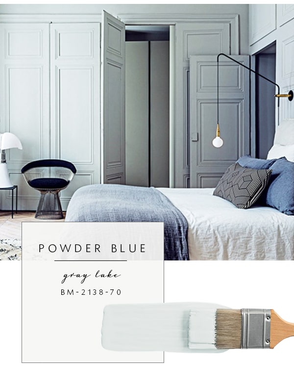
Benjamin Moore Gray Lake (BM-2138-70)
Powder blue might be the best color of spring and summer! It’s pigmented without being overwhelming. There’s something about a light, refreshing palette that just works and feels like spring. Don’t be fooled by this versatile color- it’s not just for nautical or coastal homes. We’re seeing this color used in a variety of spaces and it works well in nearly any situation. This barely there color goes a long way, so don’t be tempted to go too much towards the baby blue variety – you’ll end up with walls that look like they’re meant for a nursery instead of a sophisticated living room.
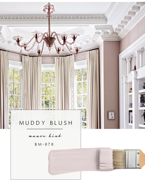
Benjamin Moore Mauve Hint (BM-878)
Blush has been around for a bit, but it’s holding steadfast. This spring, instead of using true pastel pinks, make it a little muddier. By muddy, we mean less saturated (dirty pink). I’m willing to bet we’ll see a trend towards mauve and rusty tones as 2017 progresses. It’s feminine, dramatic, and fun! If you have a classical space or intricate trim like the image above, this is a lovely way to take things in a modern direction… juxtaposition at it’s finest.
Will you be among the first to hop on these new color trends? I just bought a couple gallons of paint myself… can you guess which color? Bring on spring, fresh palettes, and all the color inspiration we can find!