While I may shy away from too much color, pattern and texture are another story. In this tonal, layered study, we get plenty of both, which makes it immediately more interesting than your average living space.
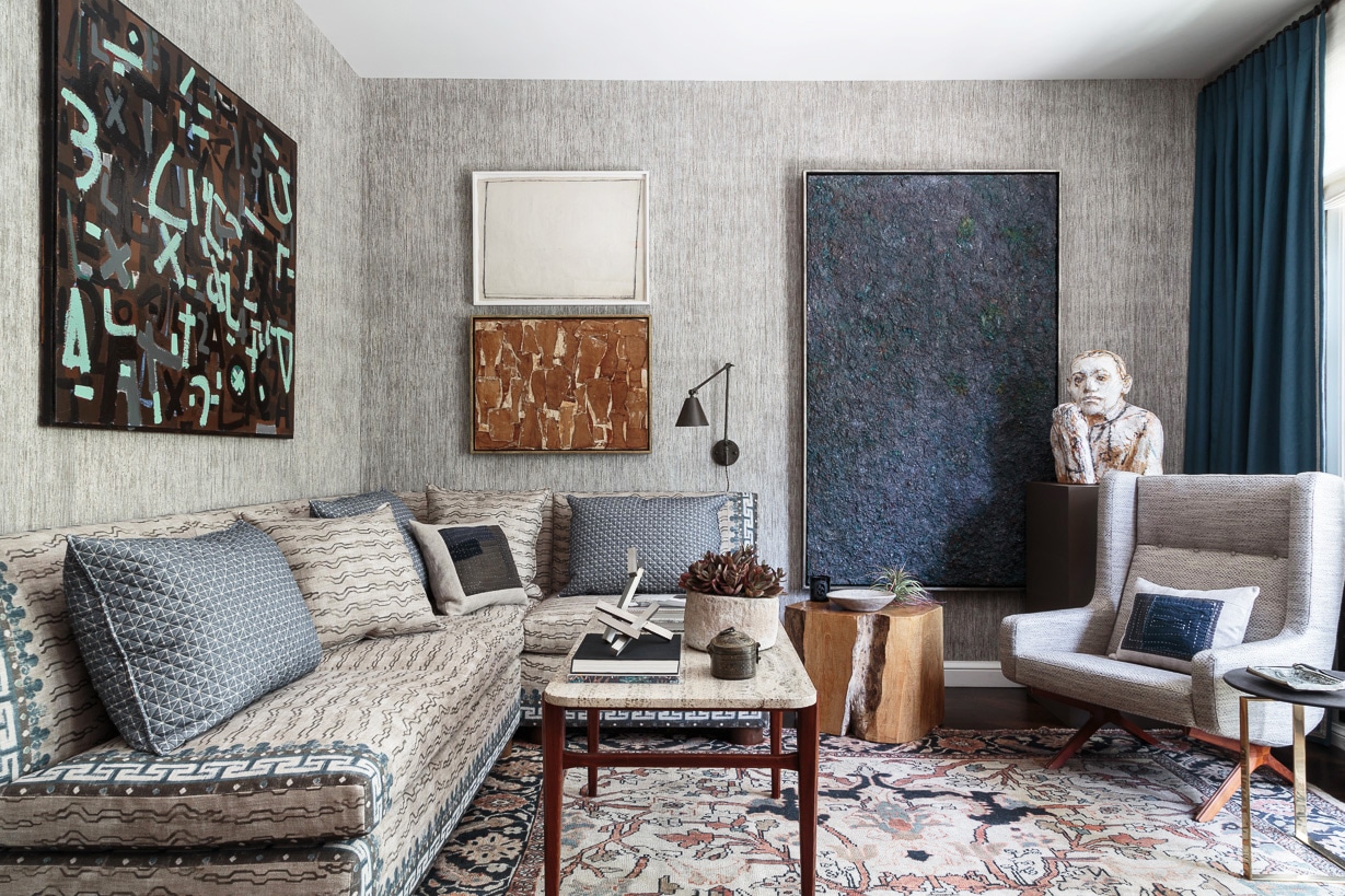
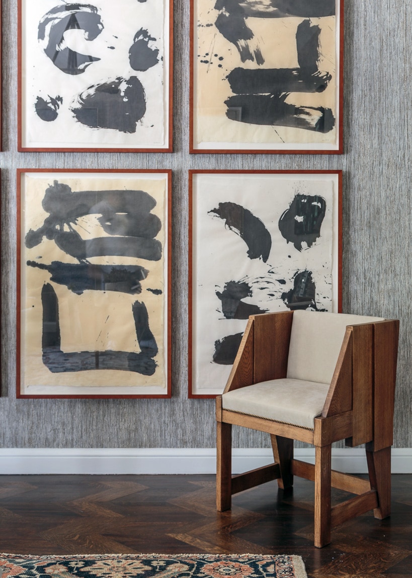
The mix of a rich, French blue with warm wood tones is always a classic, but I especially like it her where mid-century, modern, and antique come together in complete harmony thanks to a tonal palette. And how about all this artwork!? It is perfectly placed. Having installed many walls myself I can tell you that this is no easy feat.
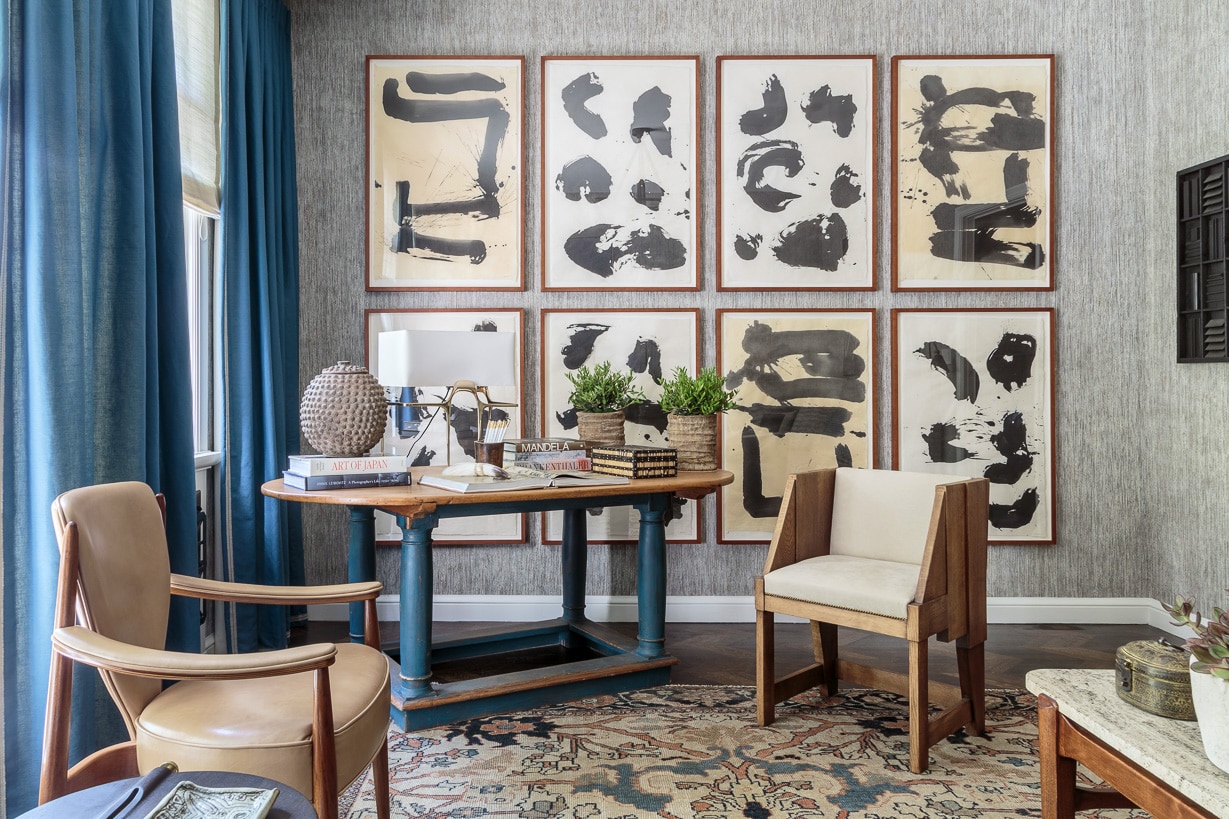
Designed by Stephan Jones Interiors for the San Francisco Showhouse, I have to say I’m quite impressed by the use of scale and furniture placement in what could otherwise feel like a very busy room. I mean – you literally have three chairs, a small settee, a desk, coffee table and two side tables in here. That’s almost more than I have in my own living room. Keeping the center of the room open and making each corner unique, the layout really helps open things up – as does the wall of windows.
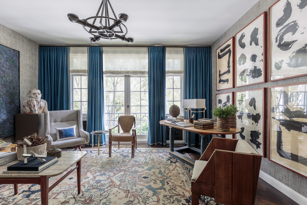
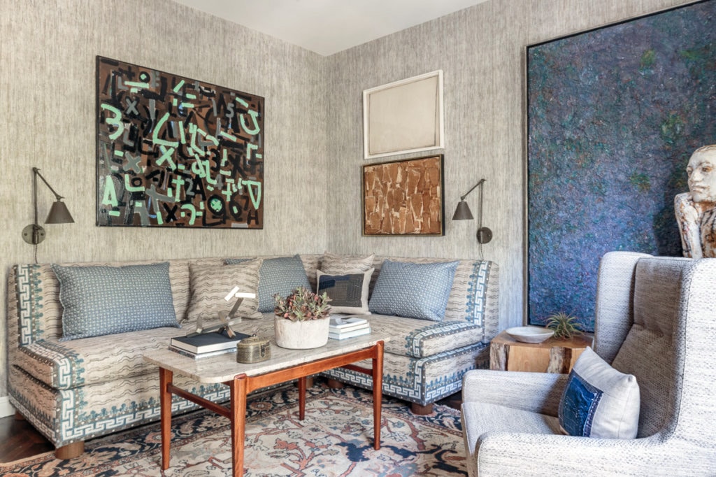
The art brings so much to a space that’s already bursting with visual delights, but I think it all works.
When I saw this room, it immediately brought to mind another showhouse favorite from Cloth & Kind (see it here!) that used the same Zak & Fox fabric treatment that resides on this custom settee. Obviously, it’s become a decorator favorite.
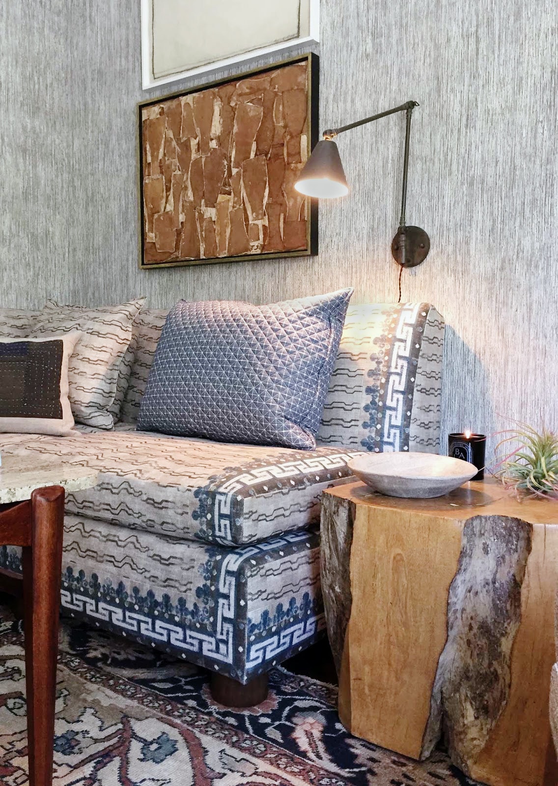
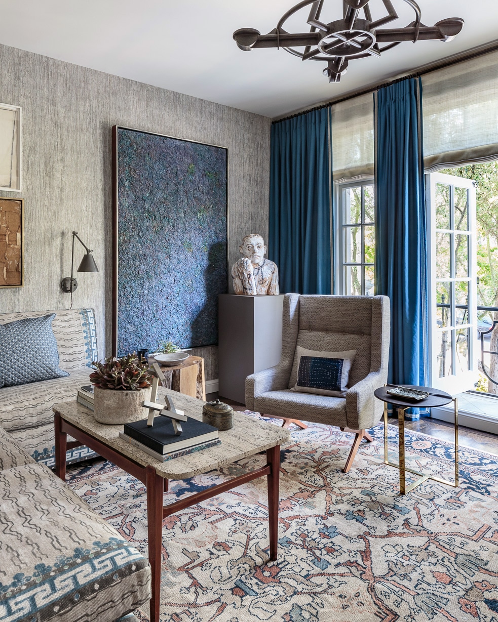
And if it’s all a bit much for your eyes, a quick swap out to a more neutral or large-scale patterned rug would probably go a long way in fixing that. But, whenever I see spaces like this I can’t help but think it’s high time one of our sofas get a new treatment – with loads of lovely pattern!