Poland might be one of the most underrated countries for design, as far as I’m concerned. While I’ve never been (still on the bucket list!), from what I’ve seen online, where it may lack in quantity, it makes up in quality.
Case in point? This stunning, inventive, but historically respectful prewar apartment in Warsaw. I love the midcentury style, with Parisian flair. The real show-stopper (and how I first discovered the home) is the kitchen… so let’s start there.
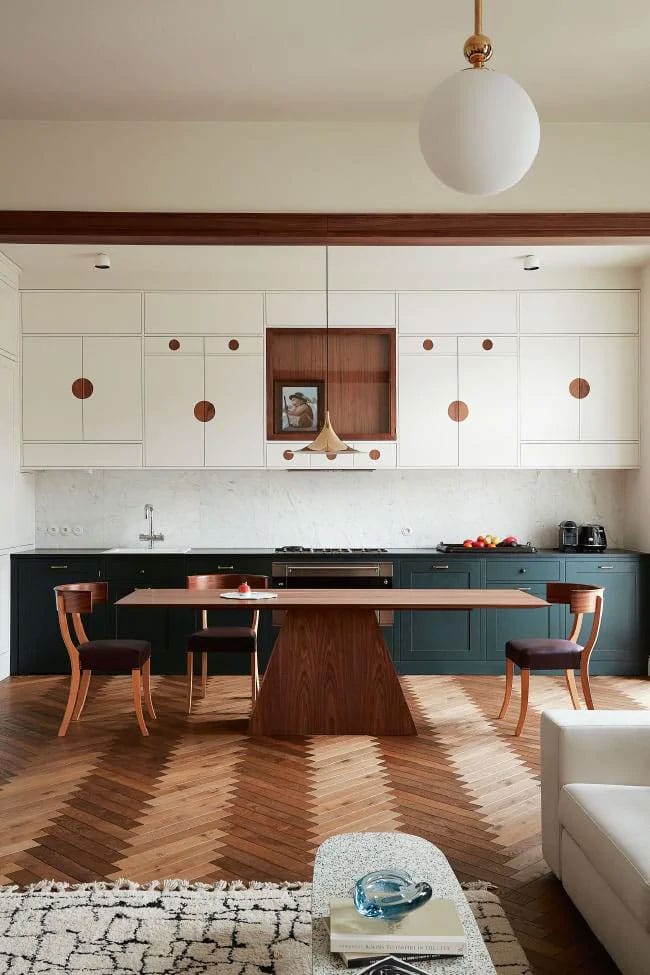
While I love a well-designed kitchen, it seems even more essential in an open floor plan to have a kitchen that feels as decorative as it does functional. I love how the lower cabinets feel almost like a buffet or wet bar versus an actual kitchen, while the uppers lend some really fun detail to the room! It feels more like a work of art than storage! And visually, it compliments the other side of the space so well…
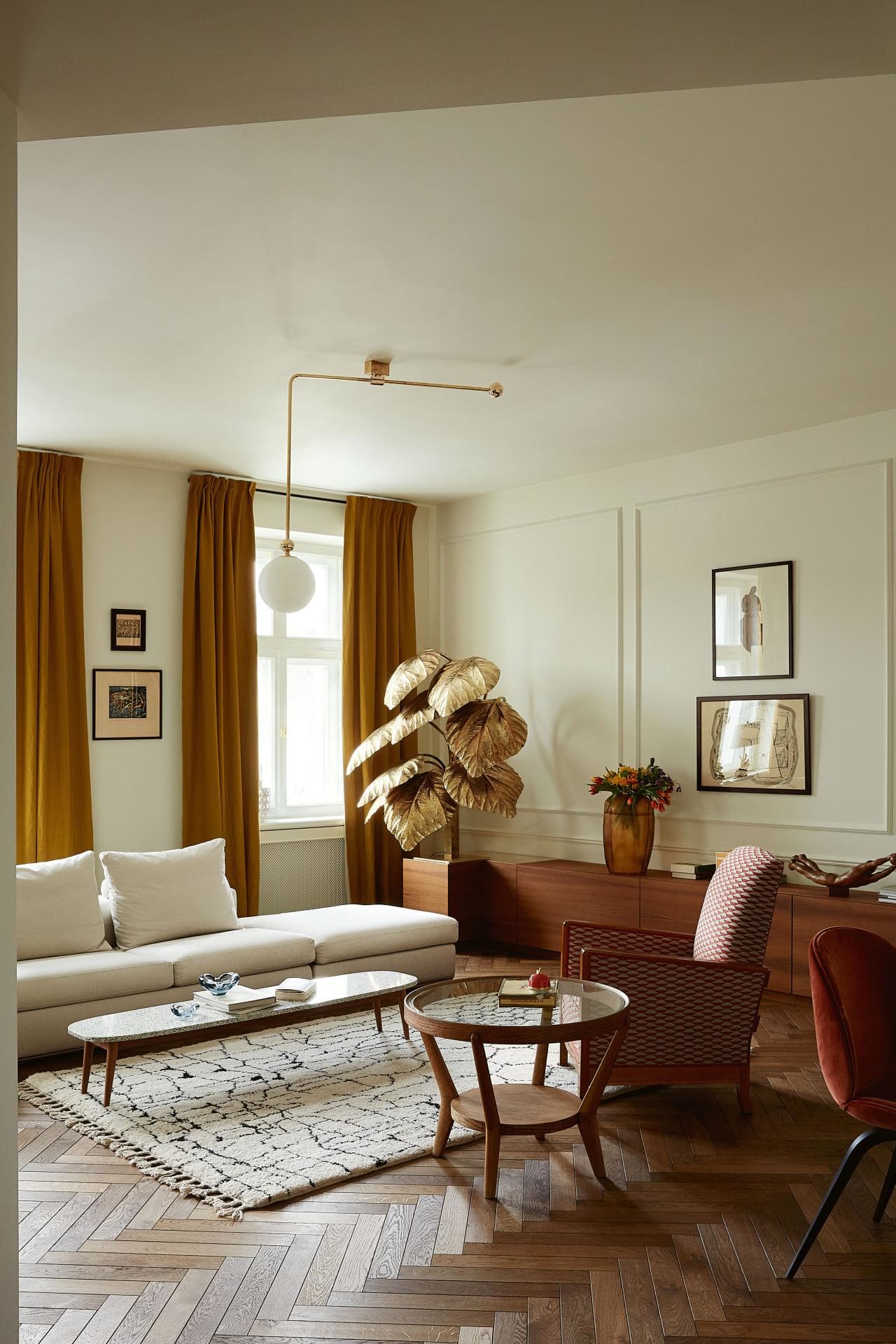
This petite sitting area is balanced by another custom piece – that full length credenza that wraps around the back wall. The perfect counterpart to the kitchen cabinets on the opposite side. The scale of everything in this room is so essential to its success here. Items are all low to the ground, somewhat petite, and have been carefully selected to not overwhelm the small space. I love all the breathing room. Even the walls aren’t overcrowded with larger art! And all the warm tones are just so welcoming.
Also, if you were wondering how on earth to elegantly incorporate a crazy vintage brass tree into your space. Well, know you know. This one, I believe, is actually a newer take on this vintage style.
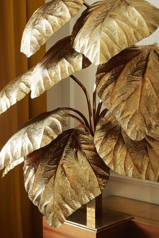
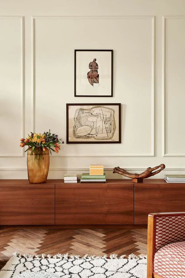
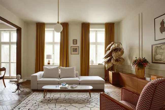
The mix of mid-century into a historical home is always a favorite look of mine. But here, it feels particularly perfect, with a slight Parisian slant and definitely a higher end style. I like that everything is kept rather minimalist, but certainly not boring!
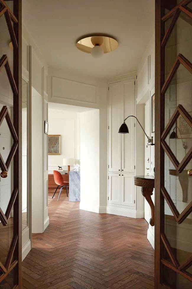
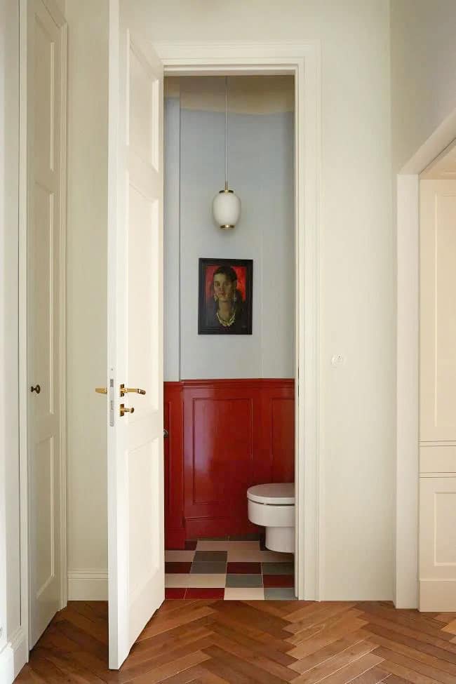
I’m a firm believer that smaller spaces should retain a common color scheme – at least in all the public areas – so I appreciate how this tiny powder room below is pulling in the red from the living room and pairing it with a cooler powder blue that reminds me of the marble used in the desk above!
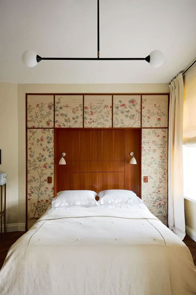
Even the master bedroom keeps within the style of the rest of the home. I’m so curious to see how those built-ins above the bed open up! It looks like a small cabinet to hide books and personal effects. The lack of bedside tables would kill me (I have a real fear of not having a glass of water and chapstick next to me at night) but perhaps that’s one of those things that was removed for the photo and they really have something they use?
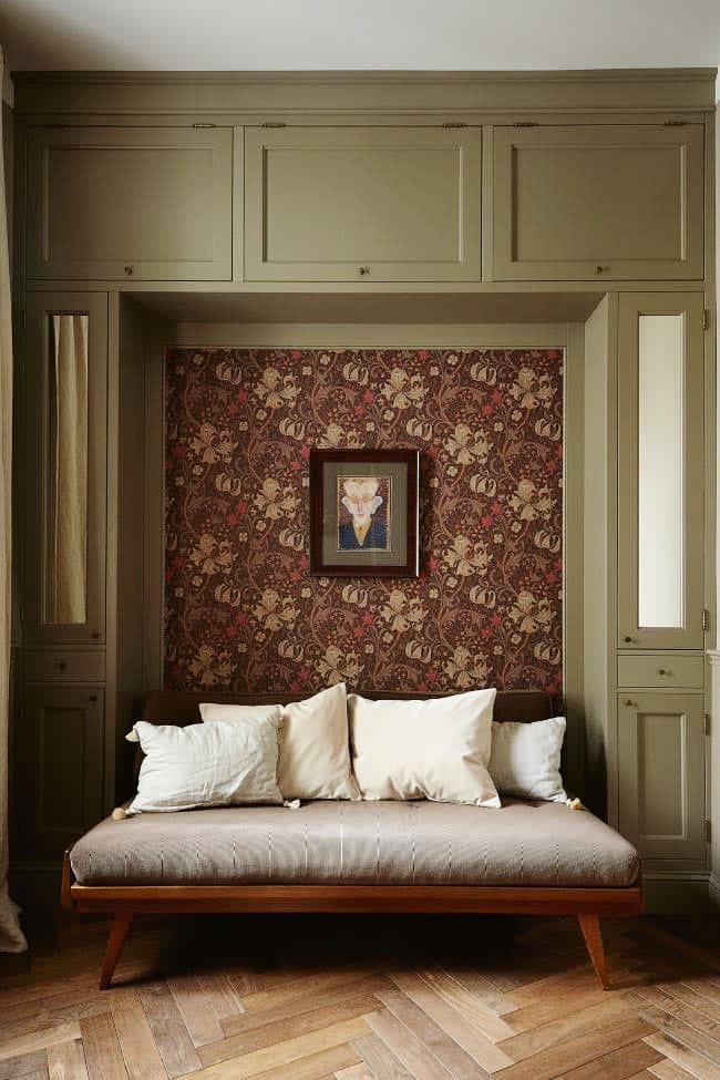
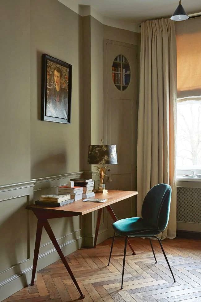
Last but certainly not least – this perfect olive green study. Getting the color just right for a room like this is no joke! It’s probably much lighter than it looks here, as the room seems rather dark. They’ve also used another design trick that I love: having the curtains sort of blend into the wall color. And that granny-chic wallpaper moment is perfect for a small space of this room.
To get the look? Mimic the warm tones of this home with golden woods, burgundies, and cream. Add touches of mid-century art and portraits, keep the style minimal, and splurge on the lighting!
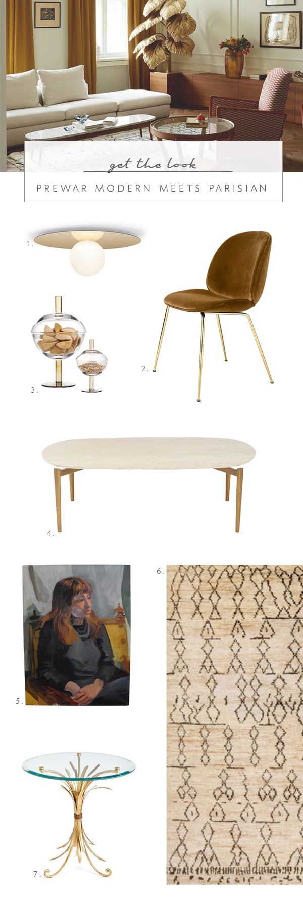
1 brass disc flush mount light | 2. velvet ‘beetle’ dining chair | 3. mid-century inspired glass canisters | 4. travertine coffee table | 5. vintage mid-century portrait | 6. moroccan style rug | 7. ‘wheat’ side table
[show_shopthepost_widget id=”3275609″]