You know when you meet someone in person and they’re just not quite as awesome as you’d hoped they’d be? That’s kind of how I feel about our living room. In my online life there’s style oozing from my fingertips. But the reality is that the inside of our home isn’t matching that persona. Let’s just say that last week’s intro post to our One Room Challenge ‘plan’ was severely lacking on in before photos for a good reason. It’s not the most gorgeous space in the world (obviously, or we wouldn’t be making it over!).
To quickly recap – other than a few minor updates since moving in with my fiancé, we really haven’t done much to this space. Like most couples, our current home is a patchwork of leftovers between his and hers, so, brace yourself. Because I think it’s really important to get a sense of the layout before I start asking for your advice on a few tricky areas, I want to walk you through the whole space…
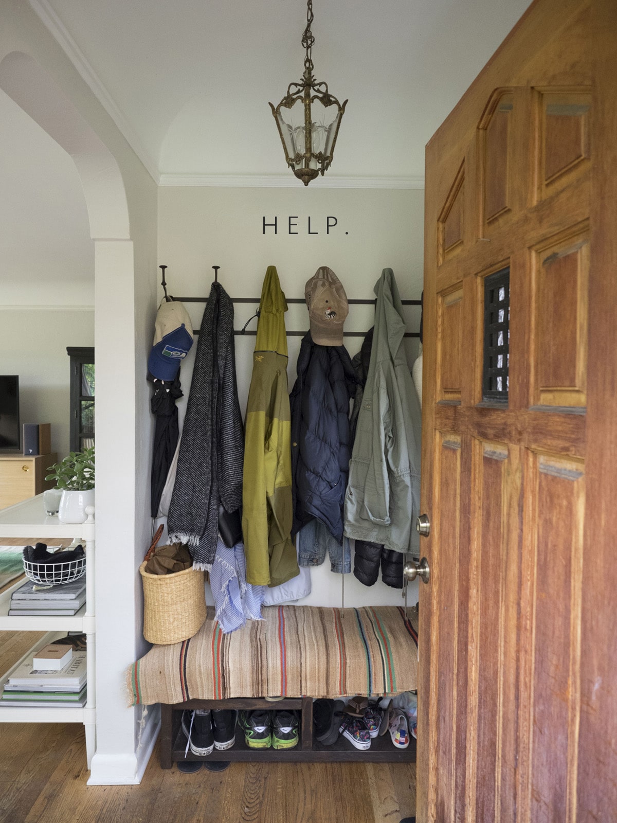
Hello. Welcome to my mess.
Yep, this is the first thing you see when you open the door. A coat rack filled to the brim with our jackets. There is no coat closet and no great spot for a wardrobe (although I do have one idea for that) so here our coats sit from September through June. And before you ask, no, it’s not deep enough to build a closet into. The hangers wouldn’t even fit. Sooooo… problem number one. We gotta make this entryway more functional!
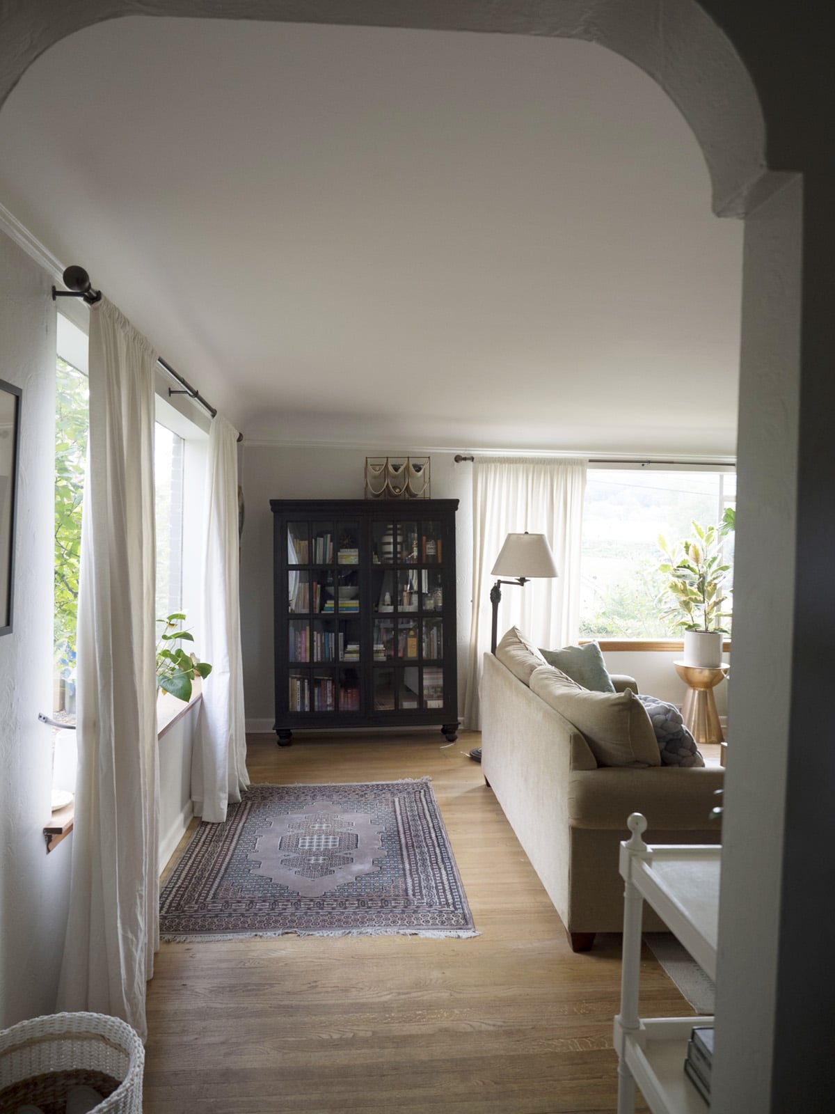
To the left of the entryway, we walk into the living room, and into problem #2 – what to do with these black chests?
Here’s the deal: they were here when I moved in, and I probably wouldn’t have chose them (If you have doors on a piece it’s to hide the clutter not to show it off), but I actually do like them. They’re classic. And I don’t mind the black. But as I ask all my design clients: Are they properly serving their function in this room? Not so sure about that.
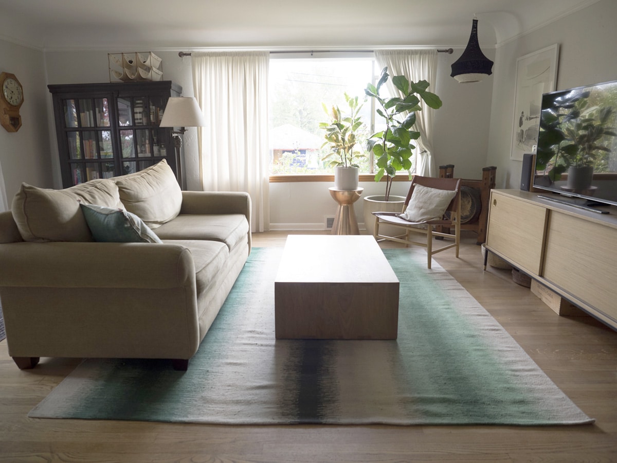
And here’s a decent wide shot of the space so you can see what kind of room we have here. The sofa could move back a bit if necessary – this is probably as close as I’d ever want it to the TV. Speaking of which – that media console is the one piece I invested in for this room, and I love it. We had it custom made by Hedgehouse, and it’s not going anywhere anytime soon. The leather sling chair is from West Elm and also a favorite, so will probably stay or get relocated to my office.
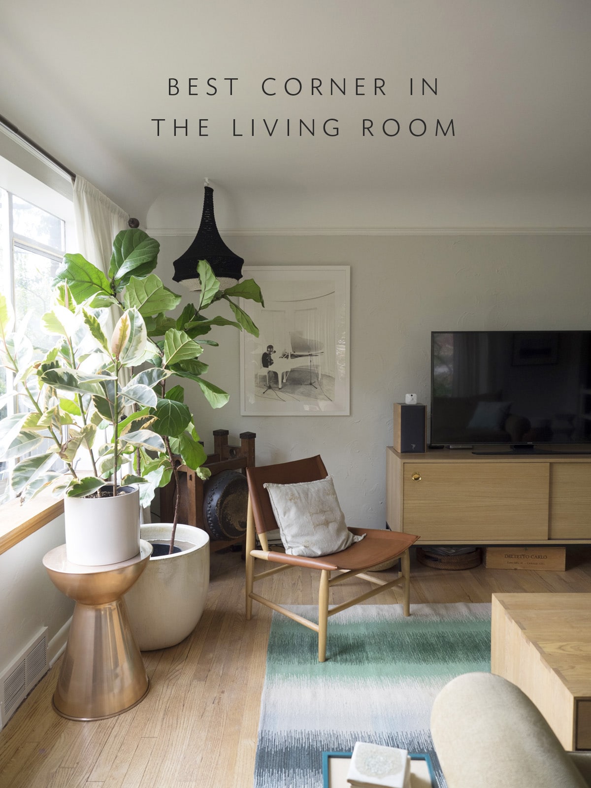
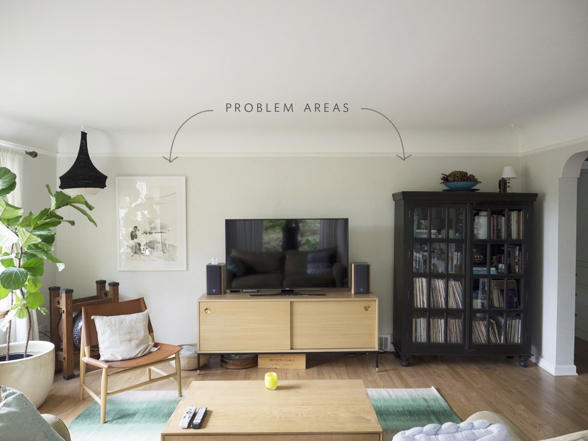
My love for that sunny corner of the room knows no bounds. In fact, I plan to put a big cozy chair right there in order to enjoy it more! The problem with this space though is that we ordered that console to sit right between the two black bookshelves. Then it felt too heavy, so we moved the other one to a different corner. Now things feel disproportioned.
My ultimate goal is to move one or both of those black chests downstairs and open up those areas on each side of the console. Now, of course, I wish the media console were actually taking up a bit more room! When I show you my layout plans we’ll take a closer look at this area – it’s totally stumping me.
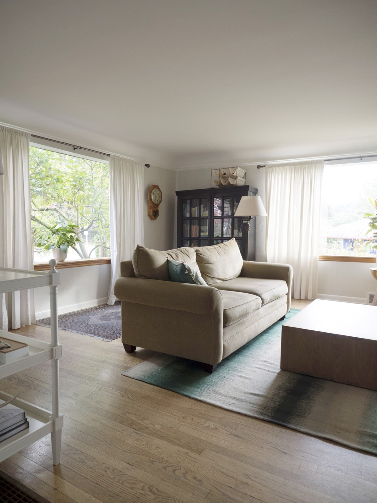
Here’s a look at the rest of the space from other angles. That rug behind the sofa is not staying, by the way. It’s destined for the kitchen but living here for now while we finish up the last of that renovation.
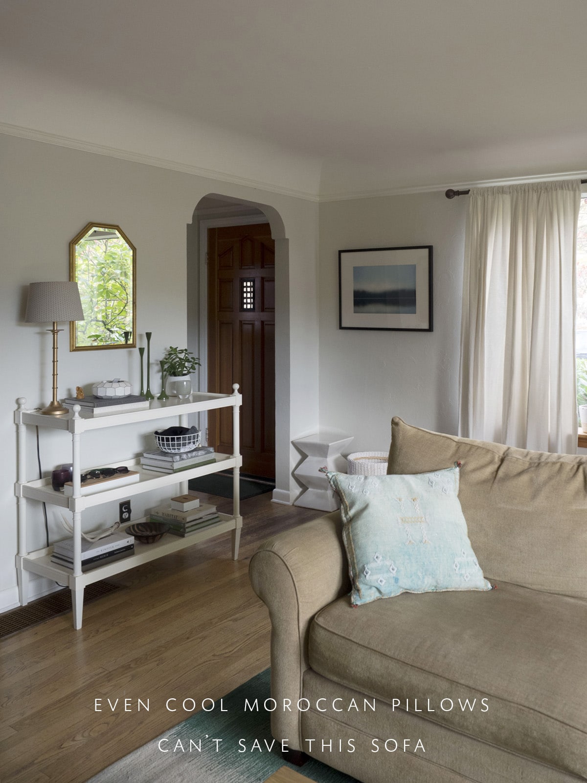
God help me, I can’t wait for that sofa to go out the door. But the point of this shot is really to show you two areas in which we might be using the space better. To the left of the big window, we have a basket for shoes and a stool that I plop my bag down on. Not really great or imaginative, huh? We’ve been using that white console to the left to plop down keys, mail, etc when we walk through the door. We definitely need to keep a place for that, but not sure that it needs to be this piece.
Ok. So, now – PLANS. Real ones.
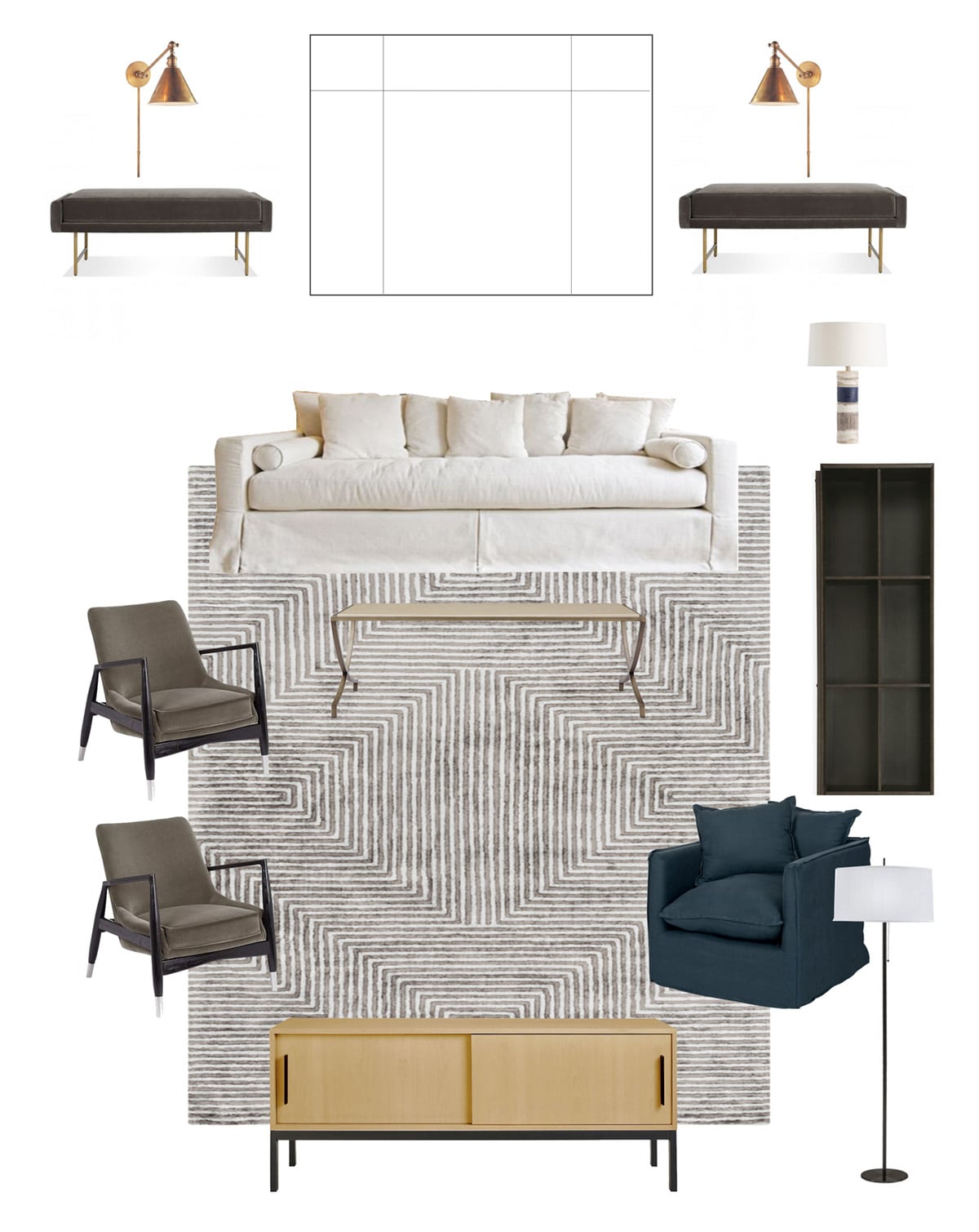
This is a little awkward because it’s laid out like a birds-eye-view, but I think it’s the most helpful in showing where all the furniture will go. I my mind, this is a perfect mix of comfortable pieces that will please our more practical family members and guests, combined with some high style! And yes, if you’re following along from last week’s post, we ordered that white sofa. While I loved the velvet one, we decided that this is just more cozy and well suited for our aesthetic.
What I do like about this layout is that it offers up ideal TV viewing conditions, provides a cozy chair in my favorite corner, and I know it basically works because it’s similar to what we have now. What I don’t like is I still have no idea what to do with the empty corners on either side of the media console, and those benches in the back two corners are pretty, but useless other than filling corners. (For the record, I would be adding artwork under the sconces!) Perhaps the benches go on either side of the console…?
Which leads us to option #2:
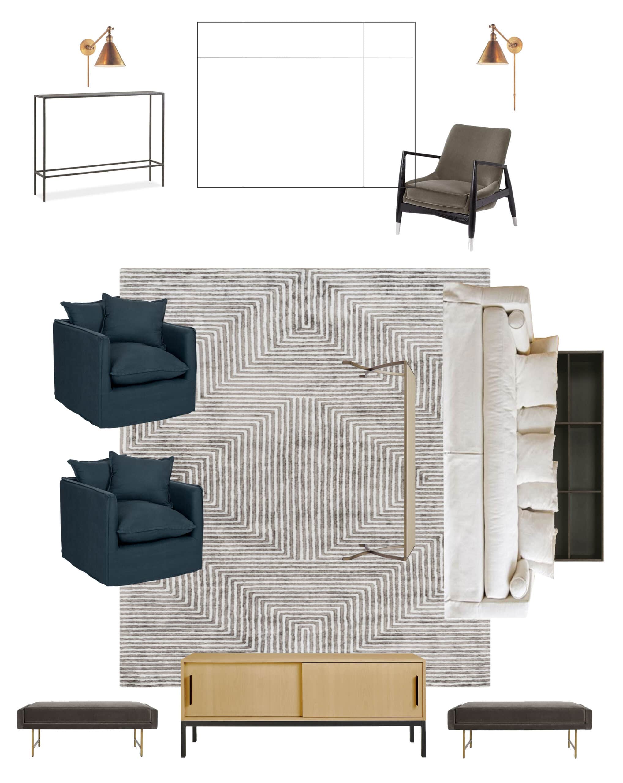
Again, sorry, weird sideways sofa layout moment going on here.
So, here’s what the benches look like moved to either side of the media console. They can be easily pulled out for additional seating when needed, filling awkward corner spaces when not. Perhaps this leaves opens wall space for some floating shelves or artwork?
What I do like about this layout is that it opens the whole room up to the entryway. So, when you’re walking in, you’re not running right into the back of a sofa. What I don’t like is that I hate watching TV from this angle. It’s so awkward. But creating a space that feels more conducive to conversation rather than the habitual flipping on of the telly might not be a bad idea.
In this scenario, we do two comfy chairs instead of two sassy chairs, and we put the smaller sassy chair in the corner – probably with a floor lamp and some other small vintage chest or side table to create a little nook of its own. Again, the chair could easily be pulled into the conversation area if needed.
Thoughts? Feelings? Ideas? I’ll take them all!
My ultimate goal for this space is to bring some sophistication to the practical way we use this room on an everyday basis. Yes, we’re gonna have a huge ass TV. Because we watch TV. Yes we want a big floppy, comfy sofa, because COMFY. But when friends come over and walk into this space I want it to feel like me – the real version of me. And I think we’re getting there!
Check out what my other ORC’ers are up to this week and see how far they’ve gotten on their plans, too!
Jana Bek | Chris Loves Julia | Shannon Claire | Coco.Kelley | The Curated House
Driven by Decor | The English Room | From the Right Bank | Sherry Hart
Hi Sugarplum | House of Jade | Hunted Interior | The Makerista | Making it Lovely
Marcus Design | Pencil & Paper Co. | Megan Pflug | Place of My Taste | Suburban B’s
Waiting on Martha Media Partner House Beautiful | TM by CIH