
Since I knew I’d be traveling the first two weeks of the One Room Challenge, I kinda had a panic attack about it and decided to get as much done before I left as humanly possible. So I started where anyone would. With paint!
Of course, my initial thought was white. So fresh and clean and the perfect backdrop to an organized closet. But then when I really took a look at the attic space, I realized that would feel rather cold up there. And a bit too modern, to be honest.
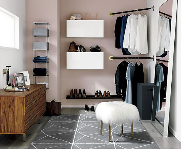
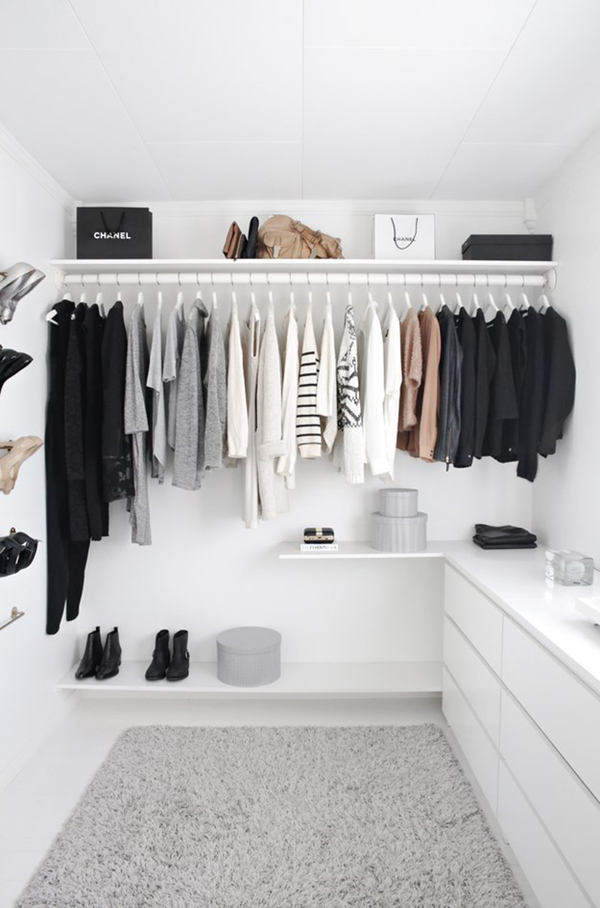
Then I became obsessed with the idea of mauve/dusty pink walls, and found this inspiration room that felt very close to what I was going for. Glamorous, feminine and soft…
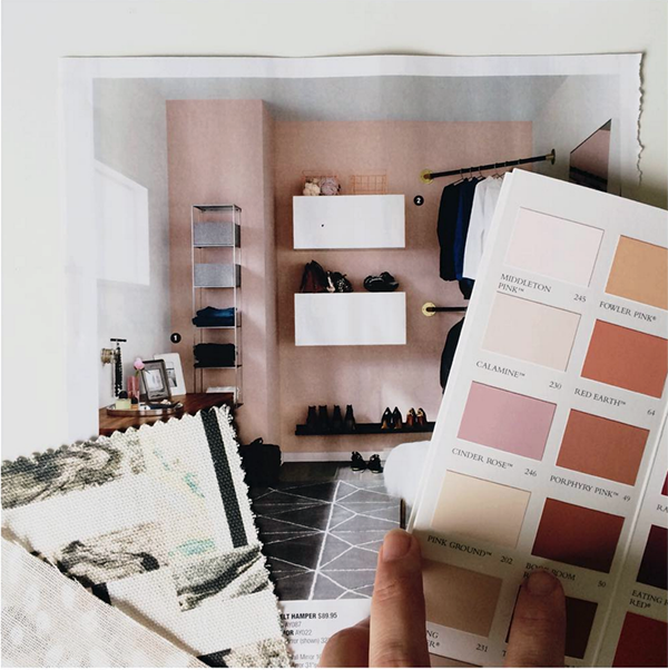
I was *this close* to going with Calamine from Farrow & Ball (as evidenced in this instagram), when I had the wallpaper epiphany. After that all paint bets were off. I had to get the wallpaper first!
So, I got the sample and started matching it to paint options, and decided that Farrow & Ball’s ‘Dimity’ was the best choice. It comes across more yellow online, but it’s actually a beautiful cream with a faint hint of pink. So… I still got a little of my pink infatuation satiated and it perfectly complimented the wallpaper.
And here’s how it looks as of today!
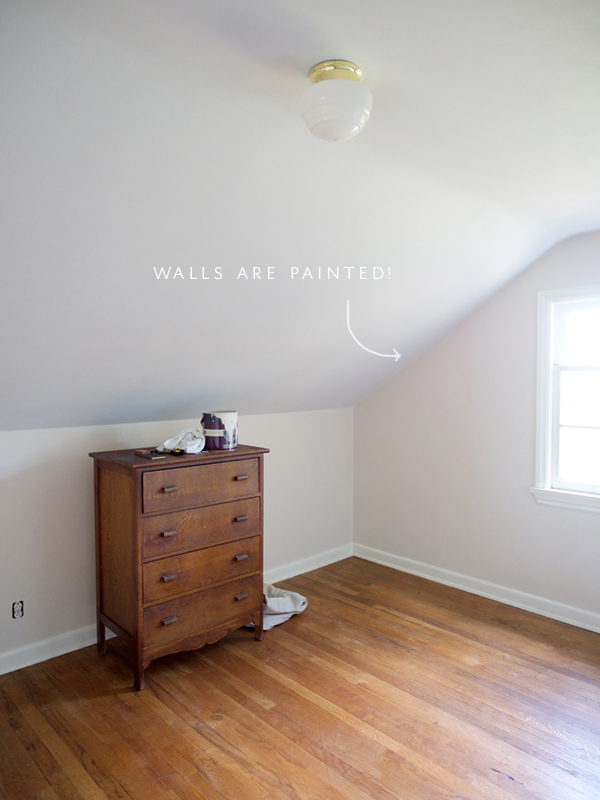
If you’ve never used Farrow & Ball paint, all I can say is WOW. I’ve painted with a lot of brands, and this is definitely the best I’ve used. The color is perfect, it goes on smooth, dries fast… everything you want in a paint. I also really appreciated their color descriptions online, it helped me determine that Dimity was going to be the best choice, knowing what the undertones would be. And the room feels SO much bigger and lighter! I love it.
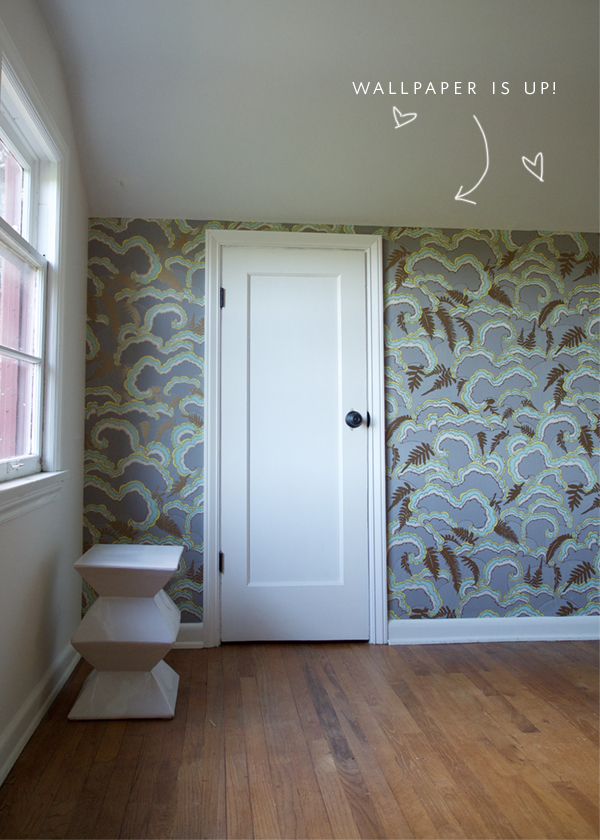
Lucky for me, the team at Makelike is the BEST BEST BEST and they sent me the 2.5 rolls straight away so I could get that paper up! The wall is installed and I’m in love.
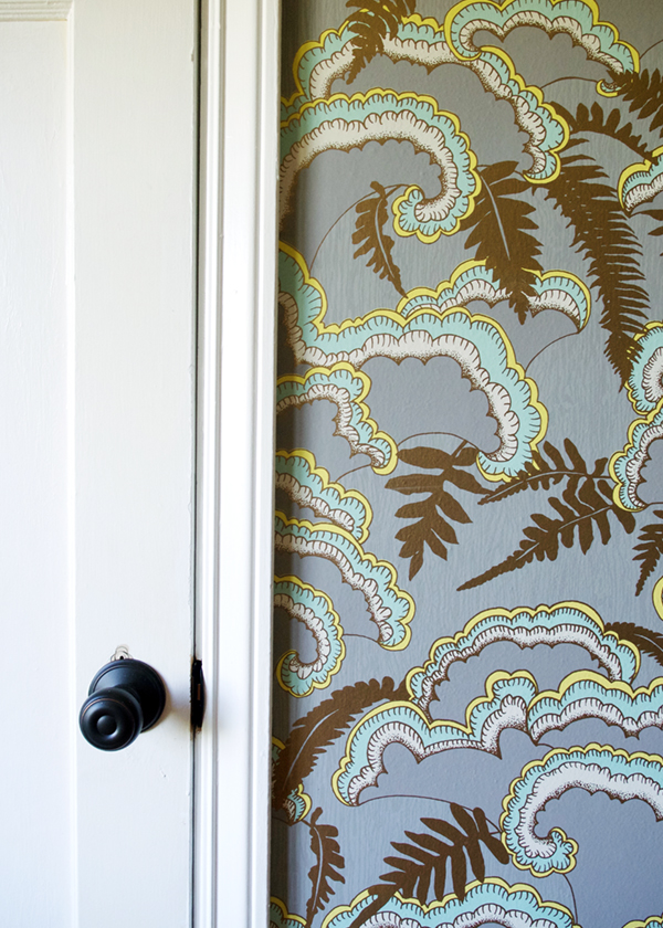
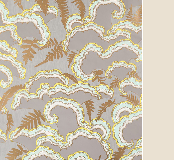
Here’s a close-up shot. I love that the gold in it is very matte – it’s a perfect match for brass accents. Also, you can see just from this shot how it changes in the light. The ‘lush’ pattern appealed to me for a few reasons.
First off – I love how it feels playful yet classic at the same time. It has elements of both. I wanted a neutral, so the grey is perfect, but I’m so glad it has a hit of color – that’s not overwhelming – in it. And finally, if you haven’t guessed what the pattern is based off of, it’s meant to mimic the pattern of the lichen, moss and ferns that grow off the side of trees here in the Pacific Northwest. A glamorous take on nature? I mean, that couldn’t be more up my alley.
So what’s next? Lighting! And storage! And a whole lot of accessories, of course! I get back from my trip tonight which means this weekend will be full of lots of updates, I hope! Can’t wait to see what the other gals have dug into in their projects too…
Apartment 34 | Arianna Belle | Because It’s Awesome | Design Darling | Design Indulgence |Design Manifest | Christine Dovey | The English Room | Vanessa Francis | Hi Sugarplum | Honey We’re Home | Jojotastic | The Pink Clutch | The Pink Pagoda | Simplified Bee | Style Your Senses | A Thoughtful Place | Kimberly Whitman | The Zhush | TM by CIH
Until next week!!
Thanks to sponsors farrow & ball for the beautiful paint and makelike for the most amazing wallpaper!