
Like most bloggers, I get a lot of questions about my own home from you guys. So, I’ve been working hard behind the scenes around here on some updates to the site that will make it easier to find all those resources, starting with this post! One of the questions we get a lot is about paint colors in our home. So I decided to create a quick chart that shows you every paint color we’ve used in our home with a breakdown of why they work in those rooms.
As you can see… I like neutral paint colors. No big surprise there! But there are subtle differences between these that make these colors tie together while also working in each room.
One of the biggest things to consider when choosing a paint color is where you live. Being in the Pacific Northwest, with lots of dreary grey weather, I prefer paints with a hint of warmth to them. Anything too cool feels – well – cold during our dreary winters. Colors that work well here may not work as well (and definitely won’t appear the same) as they might in say… Texas.
Another thing to consider when choosing a paint color is the amount of light in the room, and the direction it’s coming from. Using this general knowledge is meant to help guide you in a direction for your paint color selection. Knowing when to go saturated or softer, as well as having a better idea of when to go warmer or cooler may help you figure out which shade of blue or gray or white you should lean towards. Know that anytime you paint a room, you should absolutely do test swatches on the walls. I like to start with the color I think is closest to what I want, then go one step lighter and darker, or warmer and cooler, to see what actually translates on my walls. Every room’s light is different, which is why, while all these colors are great starting points, they will never look the same in your room as they do in mine.
All that said, here is a general guide to understanding the light in your space and how it might affect your paint choices.
North: Indirect, cooler light throughout the day. To offset this subtle light that can dull colors, try going warmer in paint tone. Saturated colors will appear even darker, and lighter tone will be softened and slightly dulled.
South: Direct, warmer light throughout the day. This room probably has plenty of light that changes a lot throughout the day. Consider that whatever color you choose for this room will need to be dynamic. Dark colors will appear brighter, and bright whites may be too intense.
For both east and west facing rooms, you’re going to want to think about the space in relation to when you’re using it. Because the sun rises in the east and sets in the west, it makes the light more direct, but also more dramatically different throughout the day.
East: Bright in morning, cooler at night. East facing rooms will be a bit warmer in the mornings, but mostly cool the rest of the day. Because of this, saturated colors will do well in these spaces as they transition from day to night. If you go lighter, warmer undertones will bring a nice balance.
West: Darker in the morning, warm at night. West facing rooms skew very warm in the afternoons and evenings (when the sun is out), which means that whatever paint color you choose is going to to intensify. Staying away from saturated colors is a good idea here. Go for hues that are bit lighter and still translate under a warm glow.


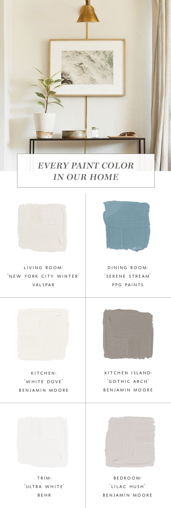
Room: Living Room | Color: Valspar ‘New York City Winter’ | Direction: South and east facing light
This might be my favorite ‘color’ in our home, and yet it was probably the one that I stressed over the least. Our large living room gets a ton of light, so I knew I wanted to keep it bright, but soft. This paint color is the lightest shade of warm gray I could find, very similar to some Benjamin Moore colors, but I had partnered with Valspar on this project and was really happy with the final result. If I had to paint my entire home one color, this would be it! It’s dynamic enough to handle the strong warm light we get from the south-facing window, but doesn’t skew to cold in the mornings or winters. We also used this in our entry and hallway.

Room: Dining Room | Color: PPG Paints ‘Serene Stream‘ | Direction: East facing light
This is the room I’ve struggled with the most when it comes to paint colors. The room is naturally darker thanks to slightly smaller windows. But also naturally darker because it’s east facing, which means while it gets lovely morning light, by the time we use it for dinner in the evenings, it’s especially dark. When I chose this blue, I loved the idea of doing a more saturated color in here (and still do!) that can play more dramatic in the evening but is happy during the day.
Because it’s a smaller pass-through type of space – with lots of neutral furnishings – doing color in here worked for me not only from a logical standpoint, but a design standpoint as well. Lately, however, I’ve been considering changing it up again to a more olive green… I’m sure that if and when that happens, you all will know (and I’ll update this post!). I’ve been staring at paint chips for months now but haven’t had the motivation to get any swatches up. I do still love the blue, but am itching for a little change…


Room: Kitchen & Breakfast Nook | Paint Colors: Benjamin Moore ‘White Dove’ and Benjamin Moore ‘Gothic Arch’ | Direction: Mostly north-facing light, with some east and west.
Choosing a warmer white for our kitchen was a no-brainer. I didn’t want something overly creamy, just subtle. Benjamin Moore’s ‘White Dove’ is possibly the most perfect warm white I’ve ever encountered. I’ve used it in many client projects and obviously my own home as well. (We’ve also got it in the basement!)
Because we chose a warmer white, I also chose a grey with a little warmth to it for the island. ‘Gothic Arch’ is a lovely mid-tone grey that feels very neutral. Funny enough, the island changes color the most as it gets more east and west facing light! If this had been a south-facing kitchen I may have gone with something a little more creamy and toned down. But with the diffused north light, this white is just right. It rarely looks as bright as it does in these photos!

Room: Master Bedroom Paint Color: Benjamin Moore ‘Lilac Hush’ Direction: South and west facing light.
My husband actually gave me the inspiration for this very calming gray in our bedroom. He kept saying he wanted something more ‘indigo’ or ‘violet’. Those colors in their most intense forms would give me a heart attack. (We’ve established that I’m not into saturated color, right?). But as an undertone to a gray? This was definitely doable.
I actually tried several swatches that were a bit more saturated than this color, but I knew the second that I put them up that a whole room filled with that tone wouldn’t work. They felt unsophisticated, and too obvious. This color looked completely gray at first, but when I painted a larger swatch with a few coats, the quiet lilac came through and I knew it would be perfect. The cooler color works well with a Southwest facing room that gets lots of warm, natural light!
If you have any color questions, ask away!! And if you’re looking for more info on these rooms, try our new ‘My Home‘ category in the Interiors dropdown menu to quickly access all posts about our house!!