This stunning home in Melbourne has been on the must-feature list for awhile now. It’s the best example of how to combine the architecture of a home with your personal aesthetic- even if they’re very different. Who would’ve guessed that a curated modern interior looks like it was meant to belong in a hundred year old Victorian Terrace?! Designed by architect duo Annick Houle and Stephen O’Connor, this family home is serene, calm, and beautifully layered with texture.

In the entryway, you immediately recognize the Scandinavian and modern design influences throughout the home. The majority of the furnishings are contemporary, but so many textiles have been added to soften the space. Two of my favorite collections throughout this home are the simple, textural rugs, as well as the impressive, curated art collection! Keep an eye out for both throughout the tour.


The kitchen boasts an impressive, extended marble backsplash that contrasts perfectly with heavy, dark cabinetry. The high contrast, black and white palette is warmed by the blonde hardwood floor for added balance. Notice the beautiful vintage rug? I told you they were good! Can we also take a minute to talk about that gas range? It’s so beautiful! I could get used to cooking on a stove that looks like a pretty piece of furniture.

The copper cookware collection and vintage ceramic dishes help bring personality to an otherwise stark space. That’s my favorite aspect of floating shelves… showing off your prized possessions.

The dining room is certainly the most minimal space in the home. I love the graphic punch the black curved dining chairs add in contrast with the rustic oversized table. I’m definitely making note of the simple greenery arrangement and art installation. What an interesting way to install monochromatic, modern artwork! It subtly leads your eye across the room, lengthening the table and eluding to a longer vignette.

The living room is definitely the most layered space in the tour. I could dive right into that linen slipcovered sofa- it’s so inviting! The floor plan is perfectly executed to promote conversation. A sofa and two arm chairs (I’m willing to bet the one on the right is a swivel) flanking a fireplace, anchored by a large scale ottoman… it’s a trick as old as time.


The closer you study these images, the more oddities and layers you’ll find. The books and curated objects really help to make this space feel personal and warm. Isn’t the ameba tray on the ottoman interesting? I also have to point out the cool sculptural pieces adorning the mantle.


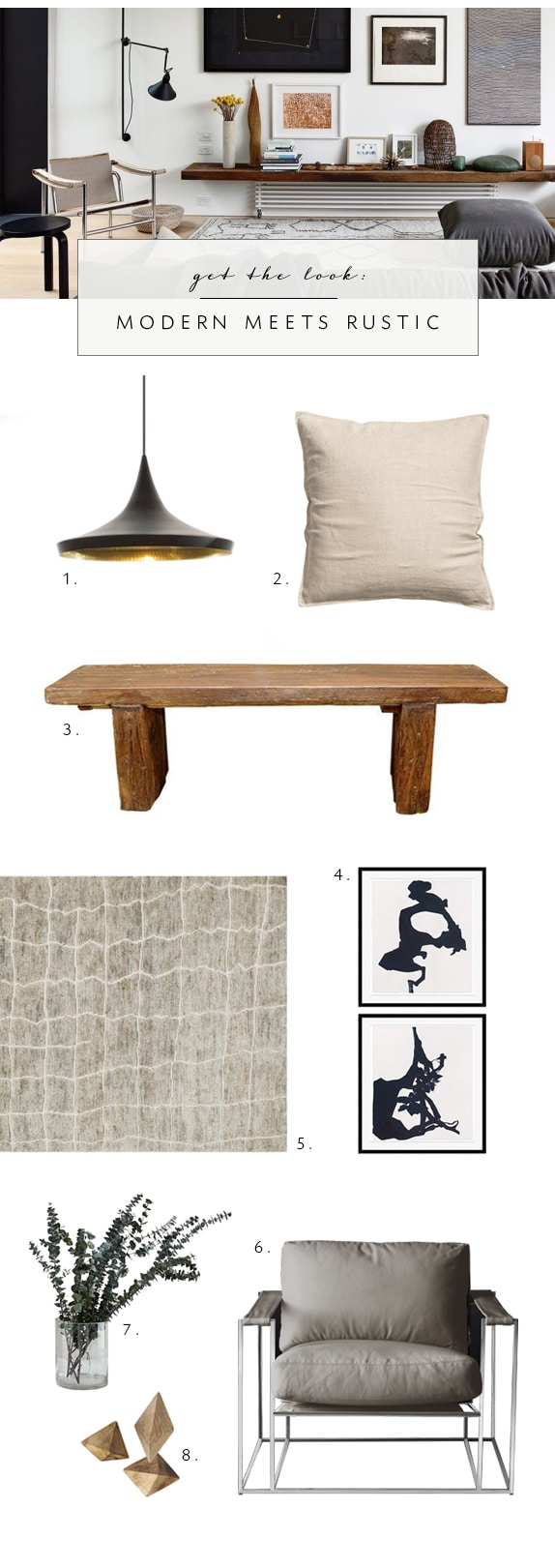
As if one cozy living room wasn’t enough… there’s another one! Differing from the main living room, the above space seems more formal. How do you guys feel about the floating shelf mounted really low? It certainly helps to anchor the impressive gallery wall, but it also takes on the appearance of a bench rather than an art ledge. I actually think it works well in this space since the hanging fireplace draws your eye in a downward direction. This room opens to a fun and modern outdoor sitting area, complete with a pair of butterfly chairs.


This bathroom may be my favorite room in the entire house. Holy marble!! From the free standing soaking tub, the wrought iron terrace, and the modern floating sink… I’m pretty much in love. I am really happy to see the addition of warm, beige colored linens to warm up the scene. It could easily feel cold without the towels and soft shower curtain, that almost takes on the appearance of drapery because of the height. One other thing I’d like to point out is the mixing of metals. Did you notice the brass shower trim in combination with the nickel tub filler and sink plumbing? It totally works.

The study is a close second favorite. The placement of the mid century desk in front of the nero marquina fireplace is brilliant. I’m also mentally noting the Tom Dixon hanging pendant that contrasts so well with the Victorian architecture.
Whatever your favorite aspects, the more I look at this tour the more takeaways I’d love to incorporate into my own house. Here’s how I’d get the look…