Happy New Year all!! I’ve been easing myself back into all forms of reality around here after feeling like I took an actual break from the daily grind these past two weeks. I gotta say – it felt GOOD. And while I may be behind on things like making resolutions and answering emails, I have to say that a slower pace is just what I’ve been needing. (More on that soon.)
In the meantime, I thought we’d start 2017 off with one of my favorite homes from last year that didn’t get quite enough attention, in my opinion. In many ways, it’s my ideal home. Full of simple design choices and neutrals, lots of white walls and warm woods… you know. VERY ME.
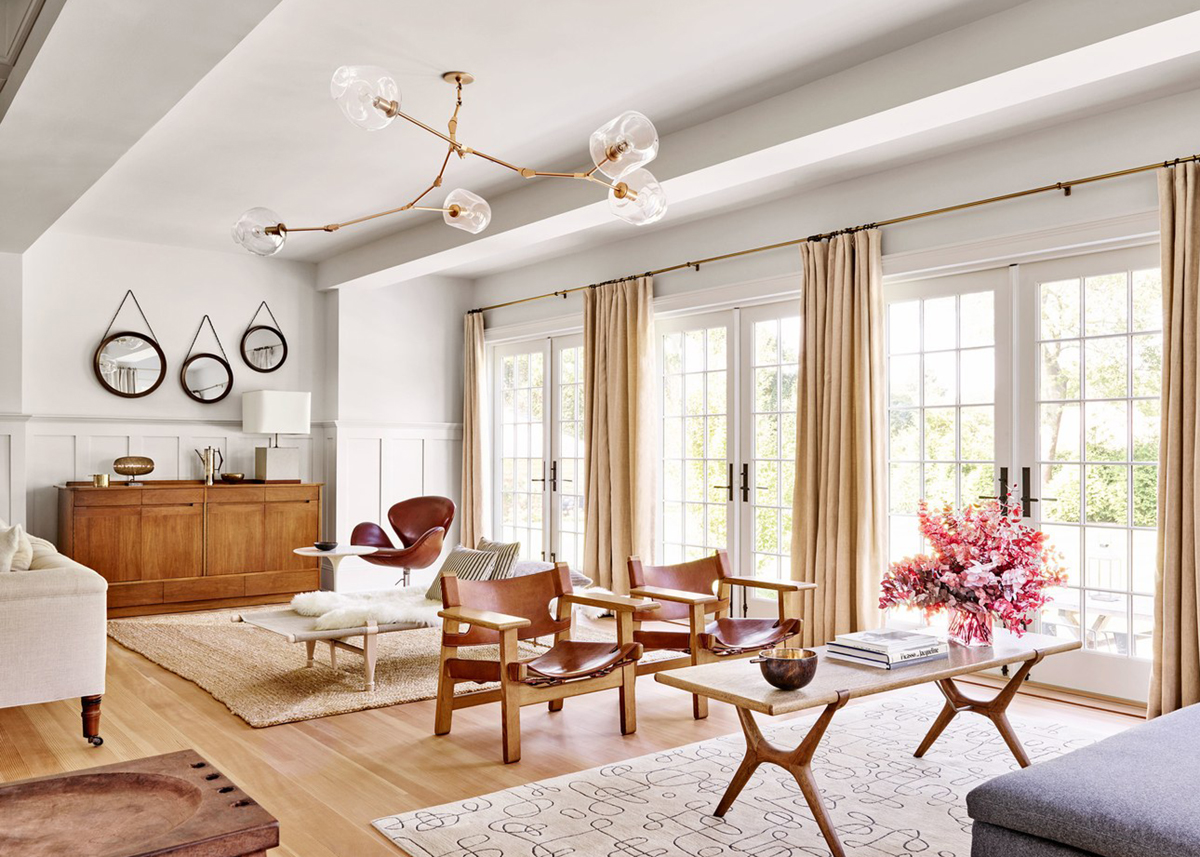
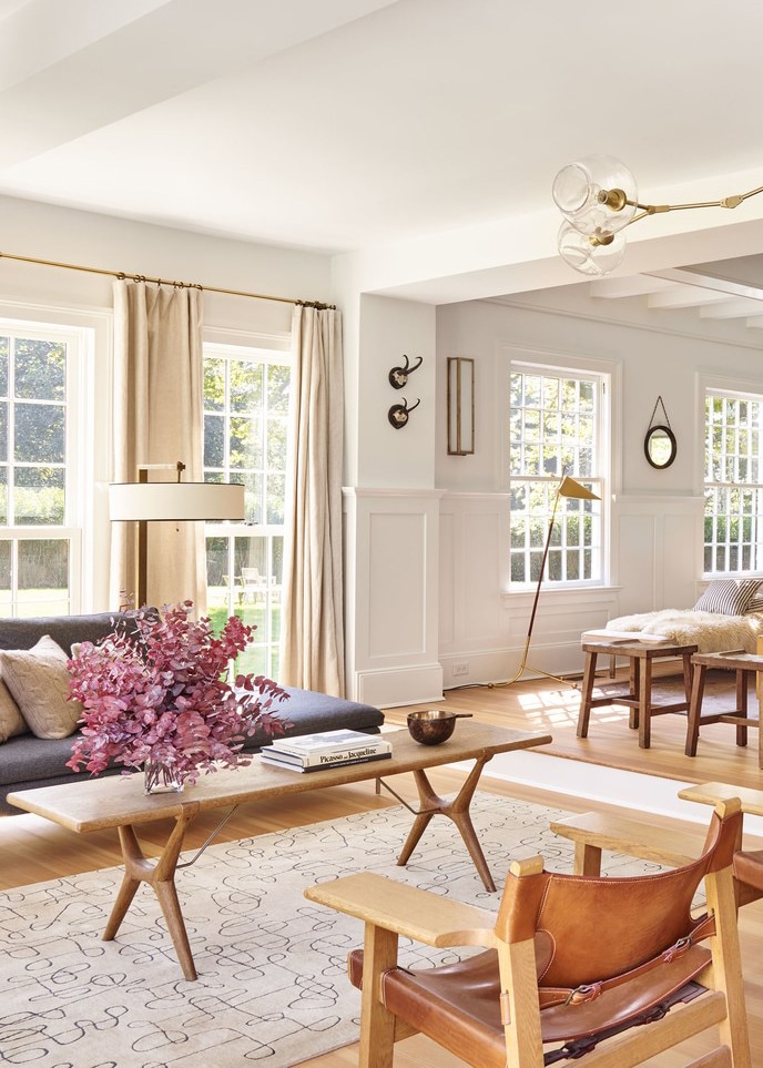 The home belongs to Pilar Guzmán (editor of Condé Nast Traveler) and her husband Chris Mitchell (publisher at Vanity Fair). Needless to say, the two have impeccable taste. You may remember their Brooklyn Brownstone from Martha Stewart quite a few years back… it’s always fun to take a look at past homes and see which furnishings have migrated or how styles evolve and transform depending on the space!
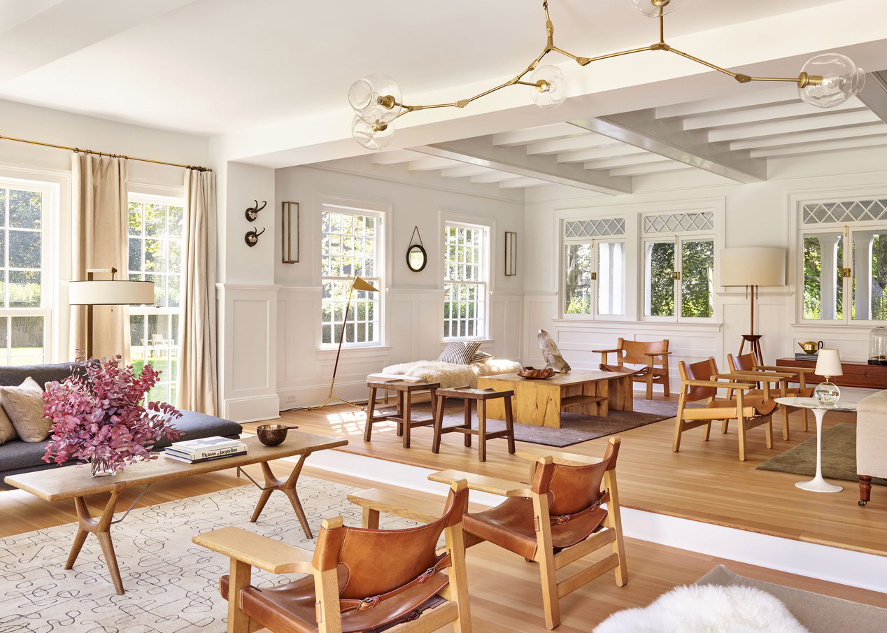
And what a huge space it is. The expansive living room is divided into four (yes four) seating areas. One end was opened up with a wall of french doors the lead out to the lawn and let it in tons of beautiful light…
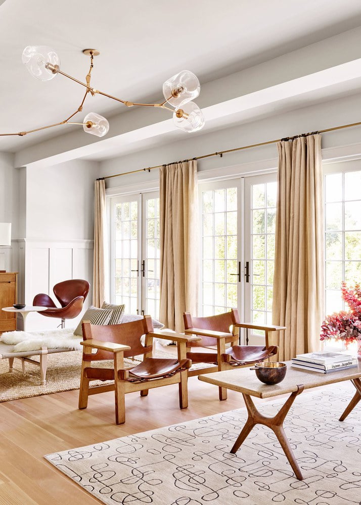
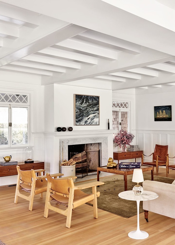
The other is anchored by the fireplace and what I’d deem to be the ‘main’ living rooms space amongst the four. One can only assume that this house was made for entertaining with seats for so many guests!
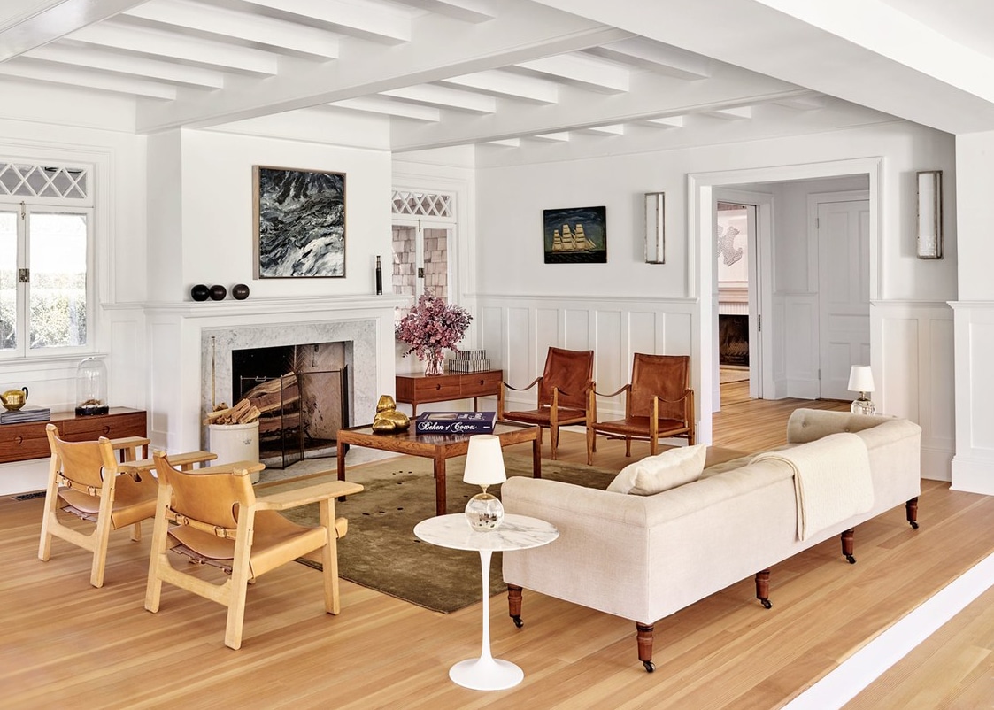
If you peek into the hall you’ll see that it leads into a simple modern dining area…
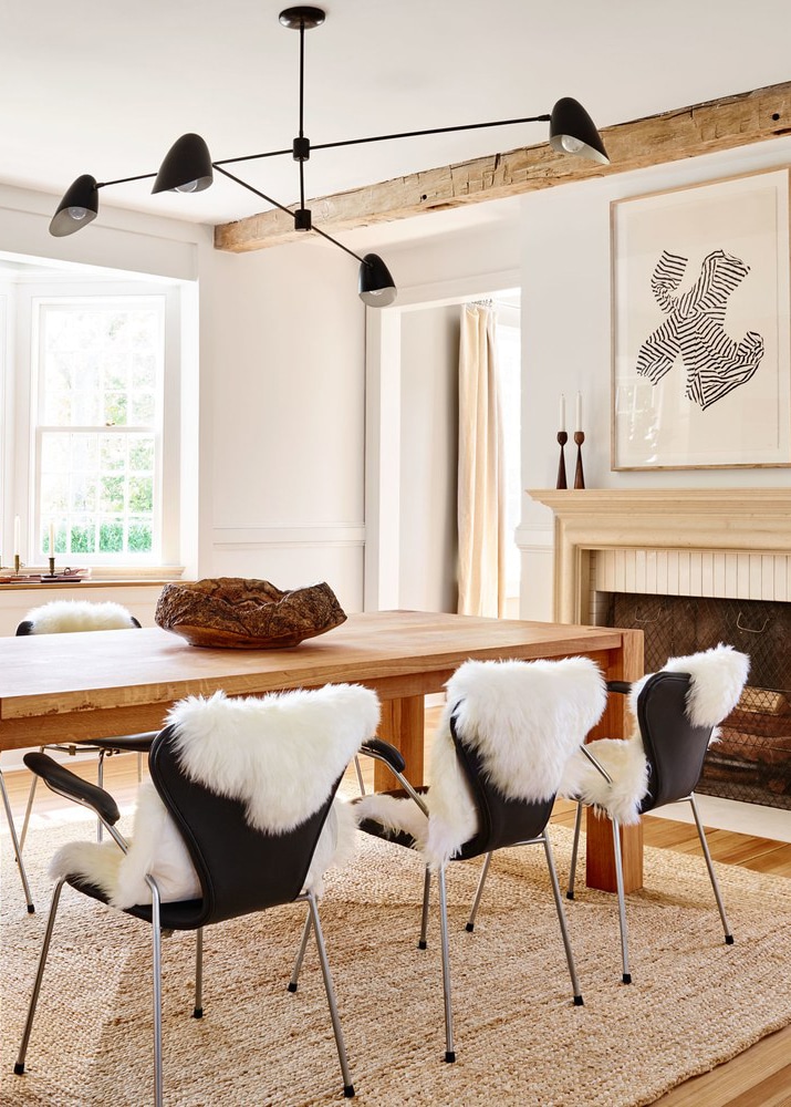
Complete with fireplace (dream!) and more neutrals. I love all the texture in this space, but what I really love is how unpretentious it is for a formal dining room. There is nothing precious about this home, and I dig that.
And now for my favorite…
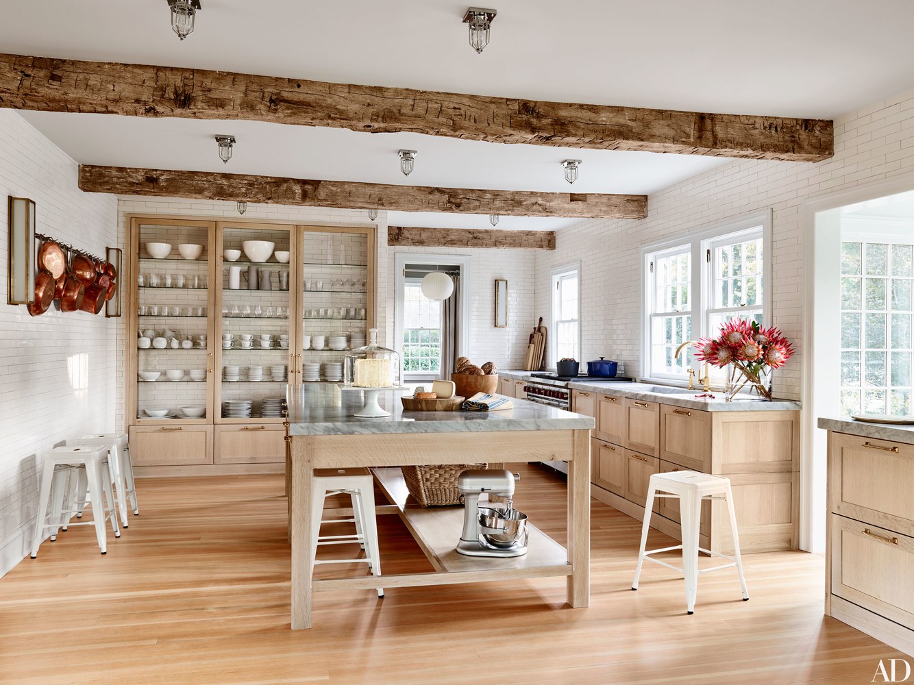
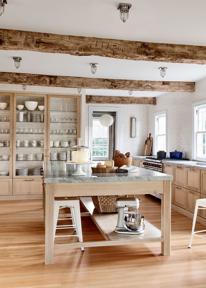
The kitchen! Confession: when we were debating the finishes in our own kitchen remodel, there was a huge part of me that really really wanted to go with raw oak for the cabinets. Seeing it here makes me wish I had, but our kitchen probably wouldn’t have looked as stunning as this. I love how they carried the subway tile behind the cabinet shelves. It looks so fresh!
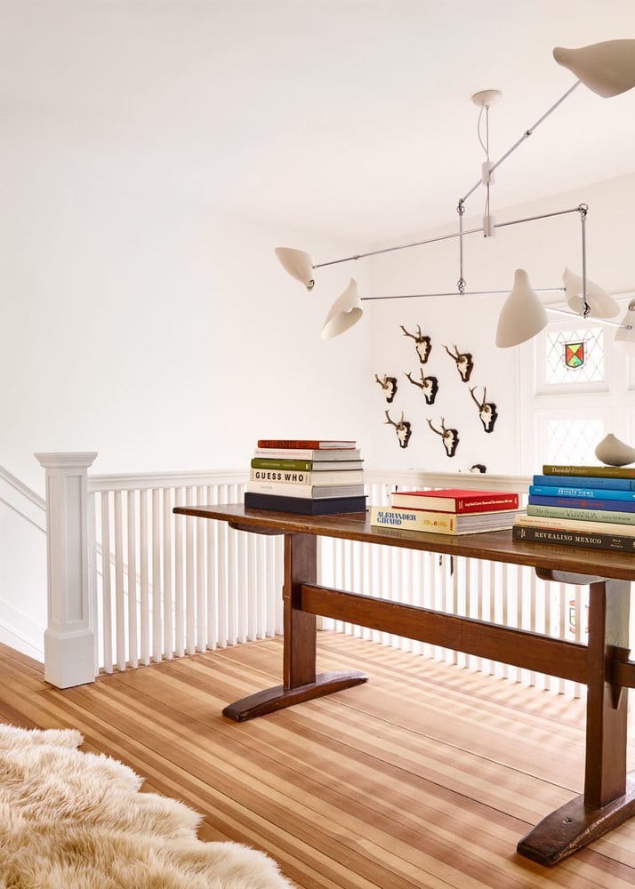
Upstairs, the light continues to permeate the rooms, and the bedrooms maintain that simple, but cozy modern feel.
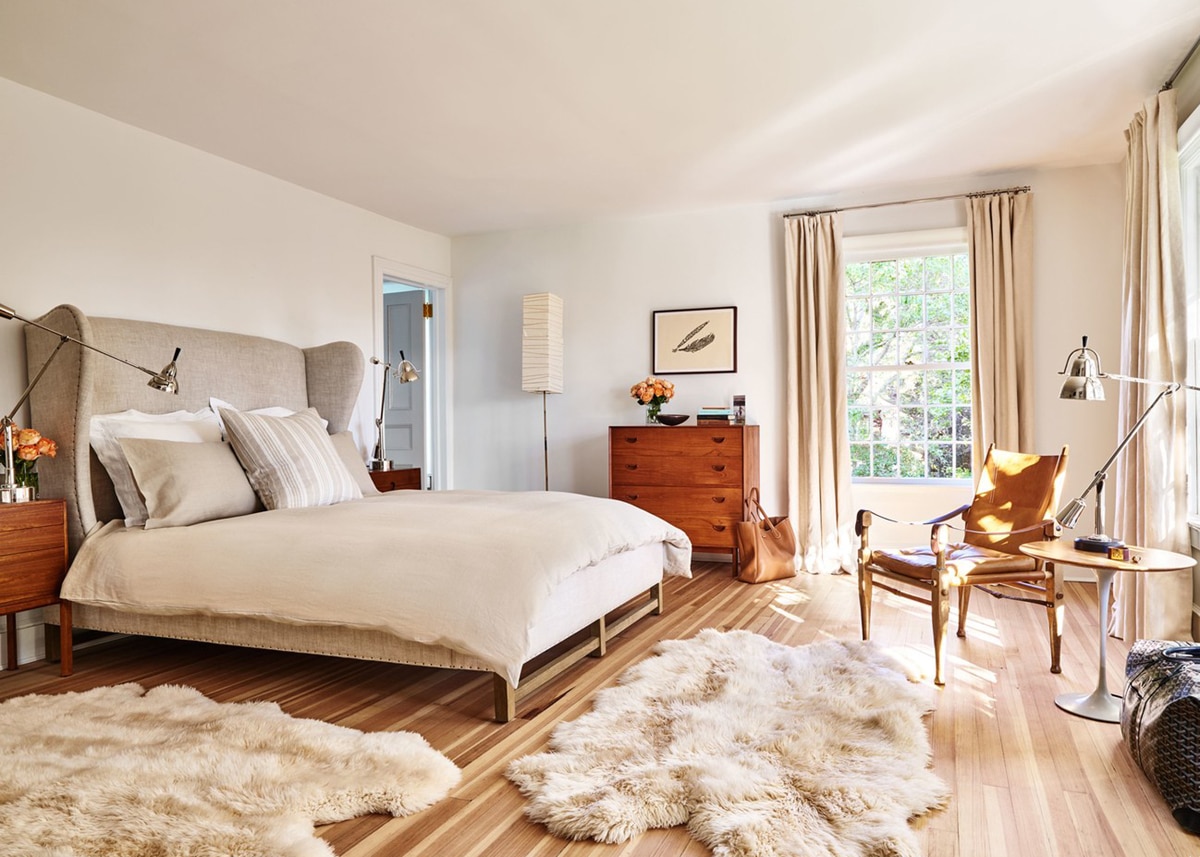
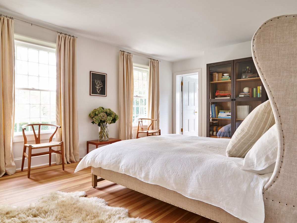
I have to give a shoutout to my girl Jennifer Ament whose art is throughout the home. One of her encaustics sits above the fireplace in the main room, and the two prints here in the bedroom are hers as well. I remember when she told me that Pilar had asked her to do a piece for her home, and we both squealed like schoolgirls at the thought of one of her pieces living in this stunning space!
And last but so not least…
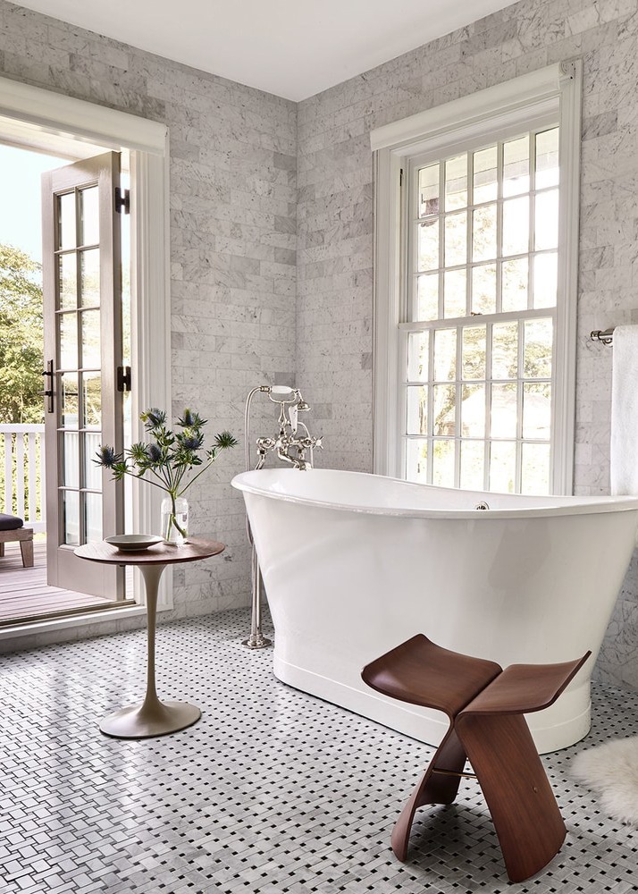
The place where I would definitely spend the good part of an hour with the doors flung open on a hot summer day – the master bath. The classic basketweave tile floors and huge modern soaking tub are divine.
And, despite the fact that many of these furniture pieces are vintage collectors items, getting a similar look actually isn’t too hard if you’re willing to splurge, hunt and get creative!
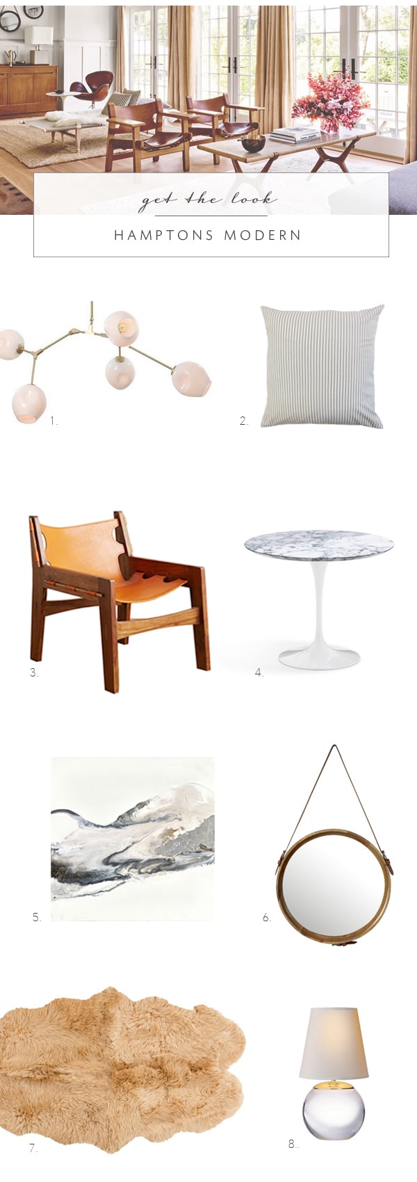
1. orb chandelier | 2. grey ticking pillows | 3. leather chair | 4. marble tulip side table | 5. jennifer ament encaustic painting | 6. captains mirror | 7. sheepskin rugs | 8. small crystal table lamp
What are your favorite details in the home? What would you change? I loved reading Pilar’s recap of their renovation of this home AD, so be sure to pop over for the whole story.