If the title of the post wasn’t enough to tip you off, this is my kinda house. Beyond the graphic tile and green paint used in several spaces, there are so many other great moments. Designer Chelsea Hing is a fun one to follow, and I really love the simplified palette she used in this home while paying attention to so many great details.
Let’s start with the kitchen and dining nook… 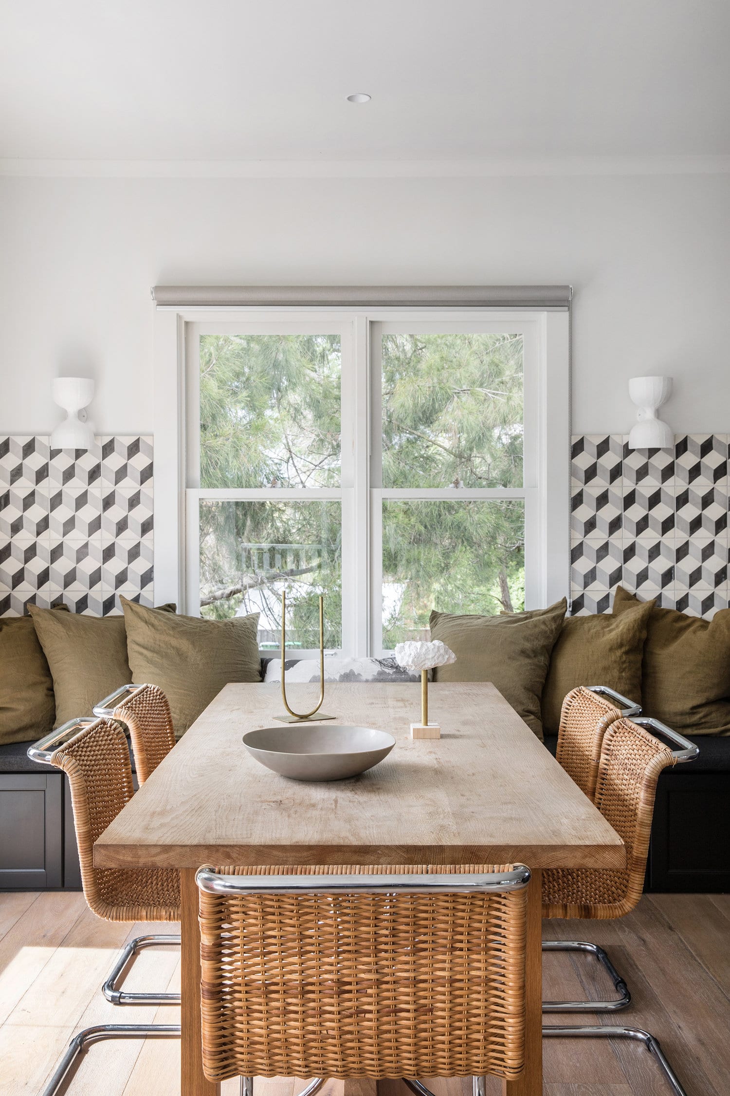
This was the room that first grabbed my attention in this house. There are so many elements to love in here! The raw wood of the dining table, those classic mid-century chairs, and the fact that the table runs up to the banquette at the head of the table, not the side, is so interesting!
If you look at the layout of the room, though, it makes sense as to why that’s the case. Knowing all the decisions that go into building a space like this, I kinda love that they went for it with the banquette. AND that they tiled the other side. Basically they chose to keep things really symmetrical so that the table could be centered to the window. 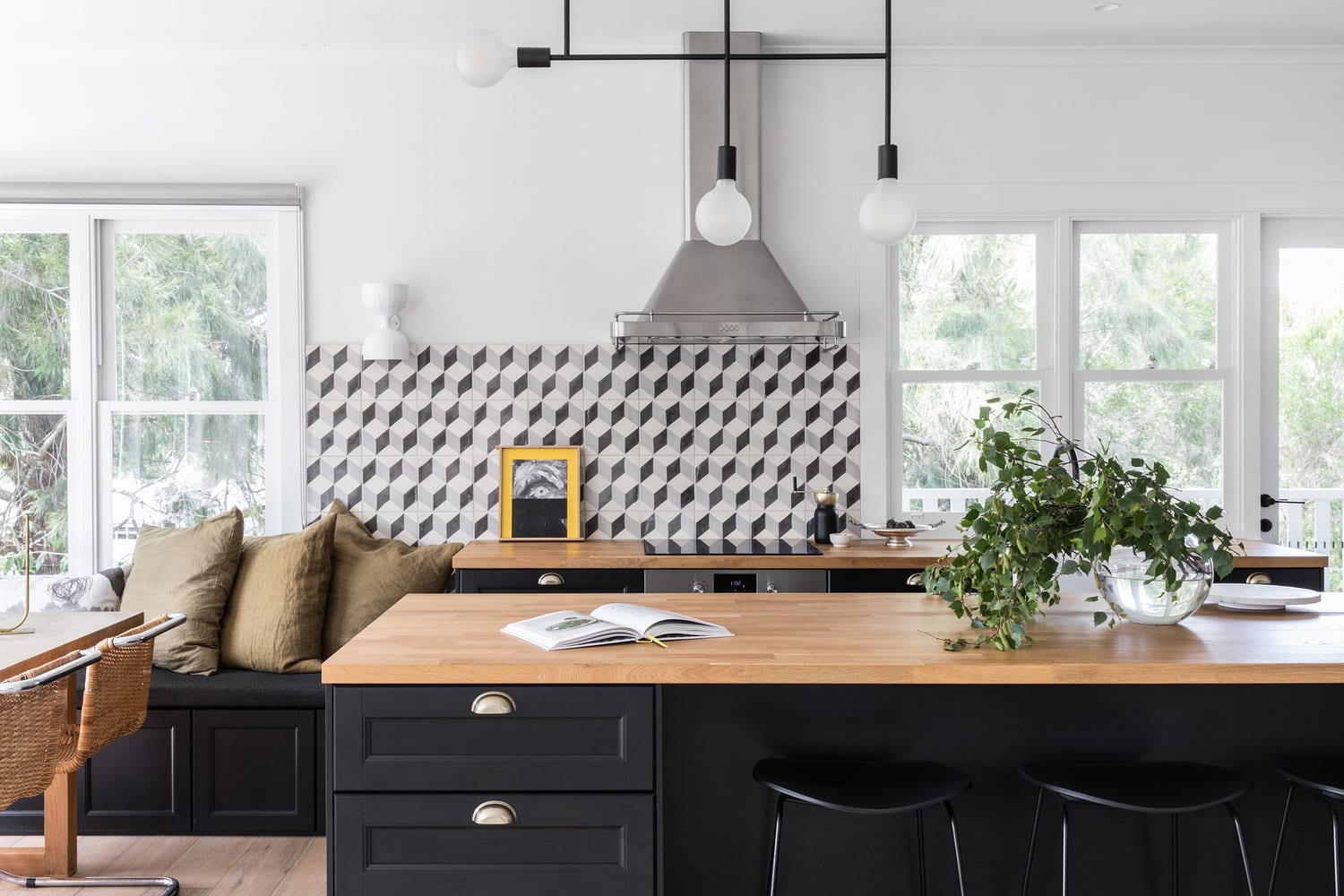
The other option would have been to run that countertop to the end of the tiled wall, and had the table be a bit more cozy to the corner . Which would you have done?? I might have opted for more counter space, but I like that this layout provides some breathing room around the table! 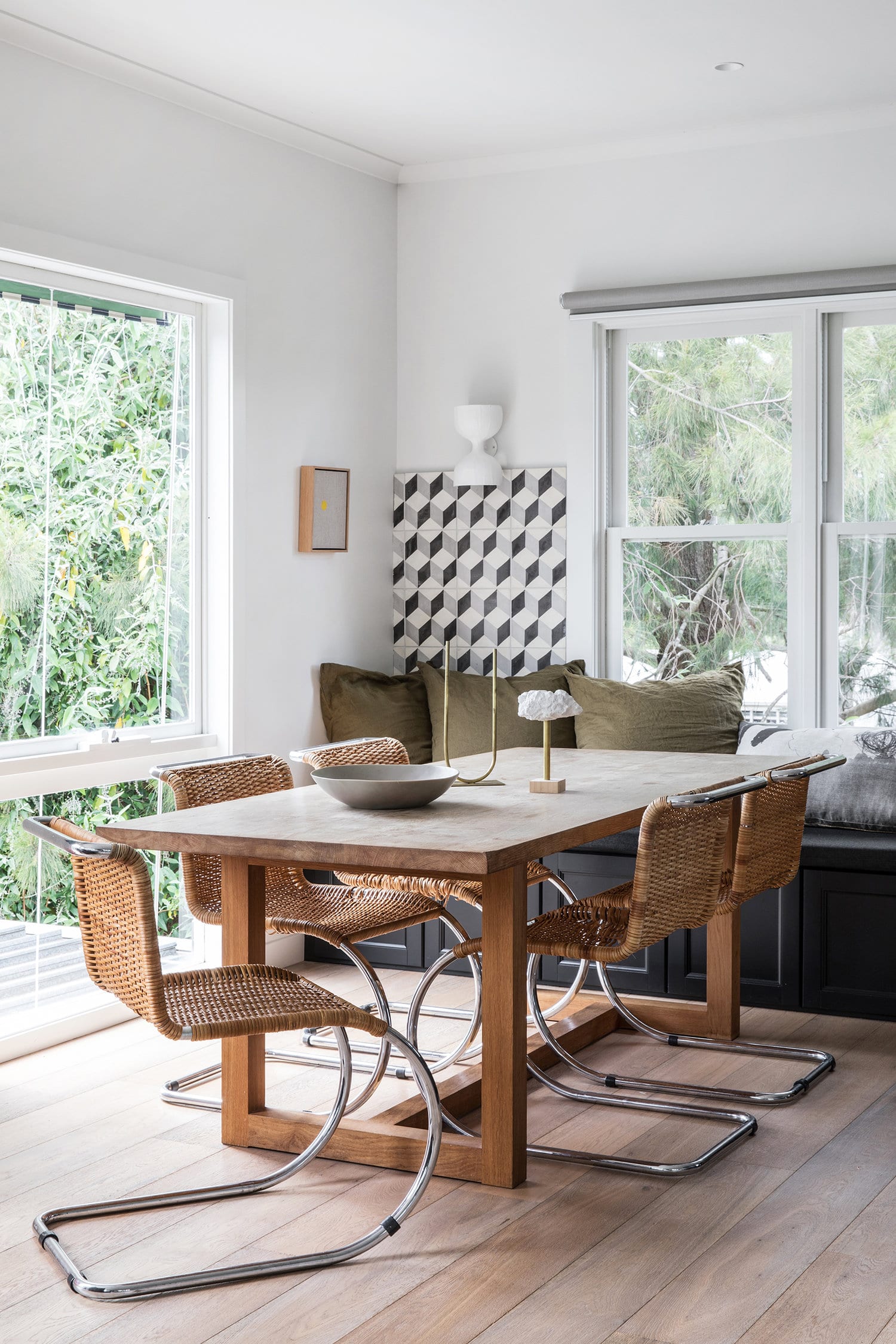
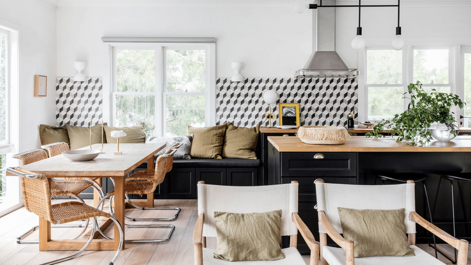
Despite the fact that this image alludes to there being a living room that extends from the kitchen and dining room, this is the only shot I could find that includes a seating area. So strange – and kind of disappointing because I’m sure it’s lovely, whatever it looks like! 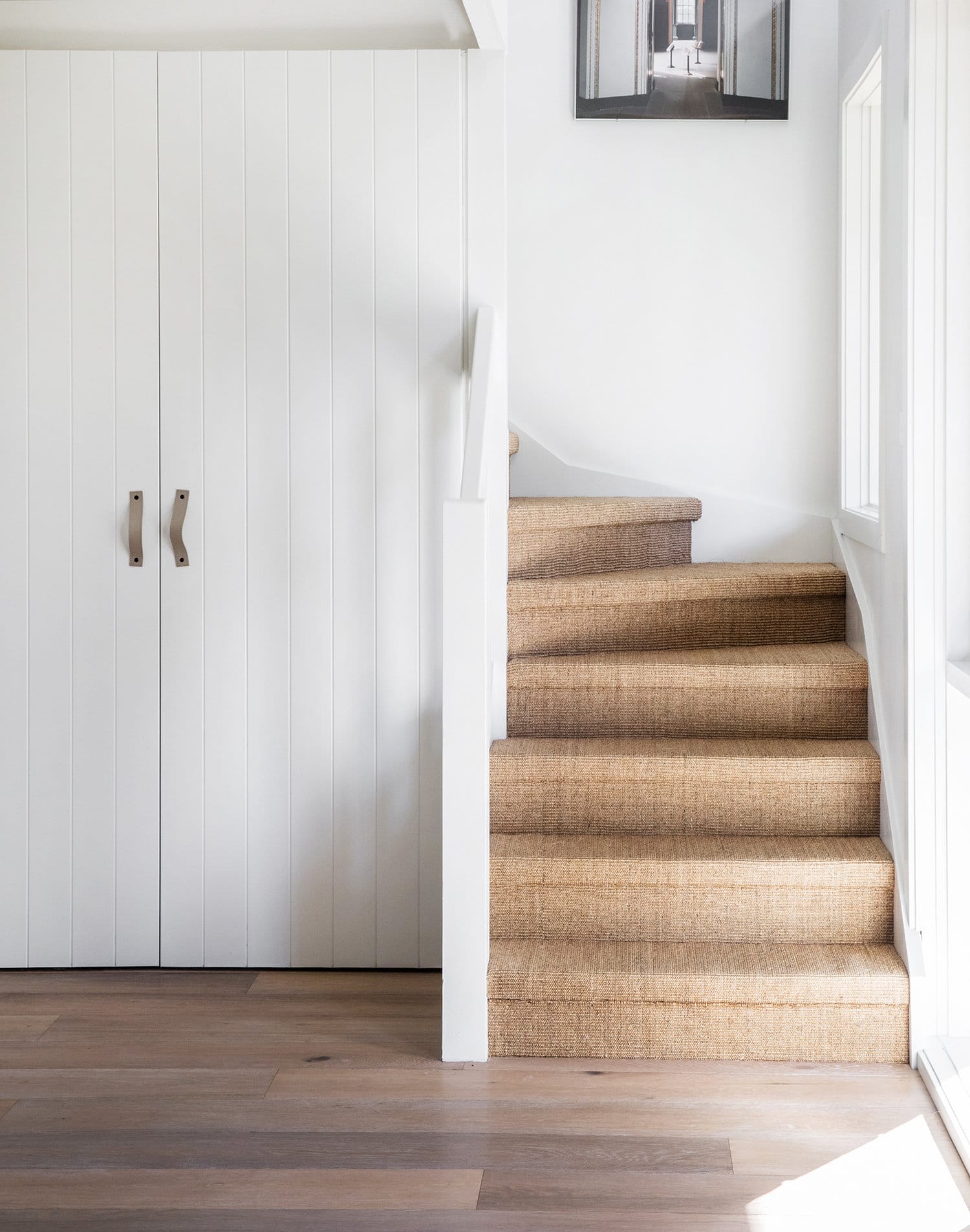
If I had a beach house I would absolutely be demanding these sisal wrapped stairs. I love the look! Perhaps we’ll employ this somewhere in our house eventually. We have both an upstairs and basement stair that could use a little help! I’m also into that little built-in storage situation.
In this home, the upstairs is actually the kitchen and living areas, with the bedrooms downstairs, along with this gorgeous library display!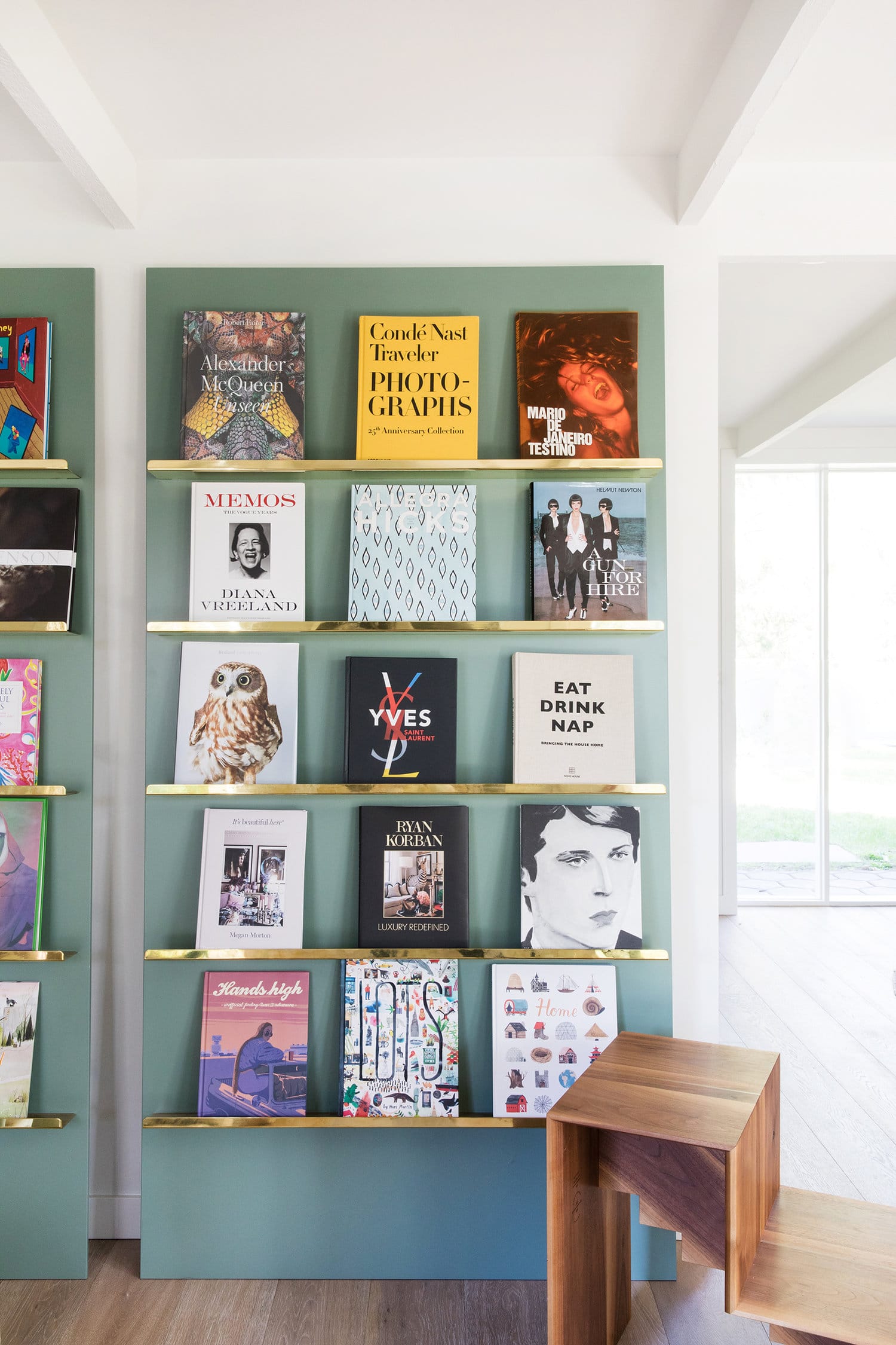
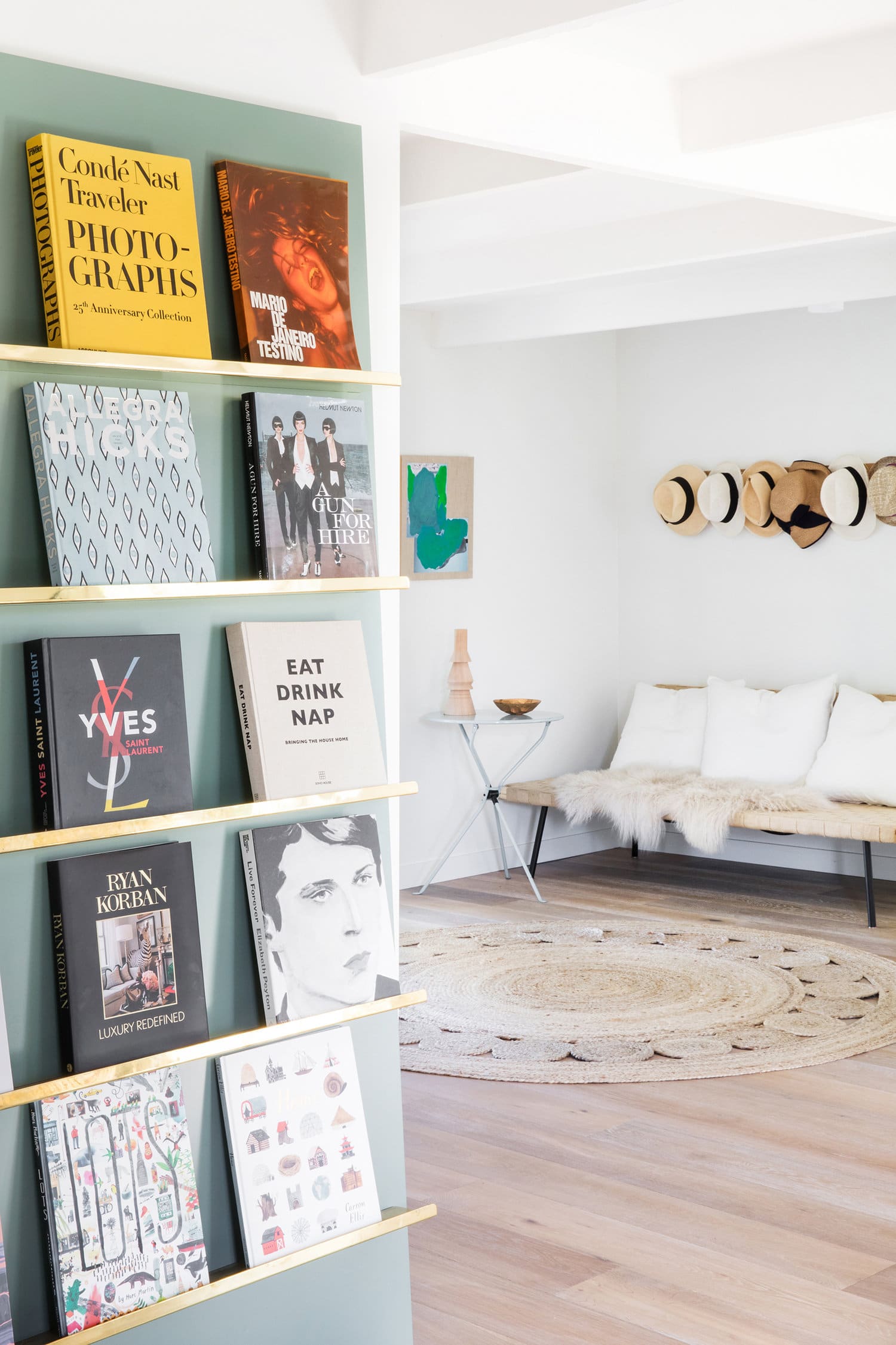
At first glance, they looked built into the wall to me, but you can actually see that they are leaning panels, which I love even more because that means they’re flexible to move to anywhere in the house (or with the owners if they move!). It also makes them visually a bit more interesting. This is a DIY just waiting to happen. I could see this in our studio space!!
Across the hall, a little lounging area with a hat rack for interest – always a favorite trick of mine when trying to fill a space on the cheap, or mix things up! Not that there is a lack of art in this home. In fact, the owner is quite the collector!
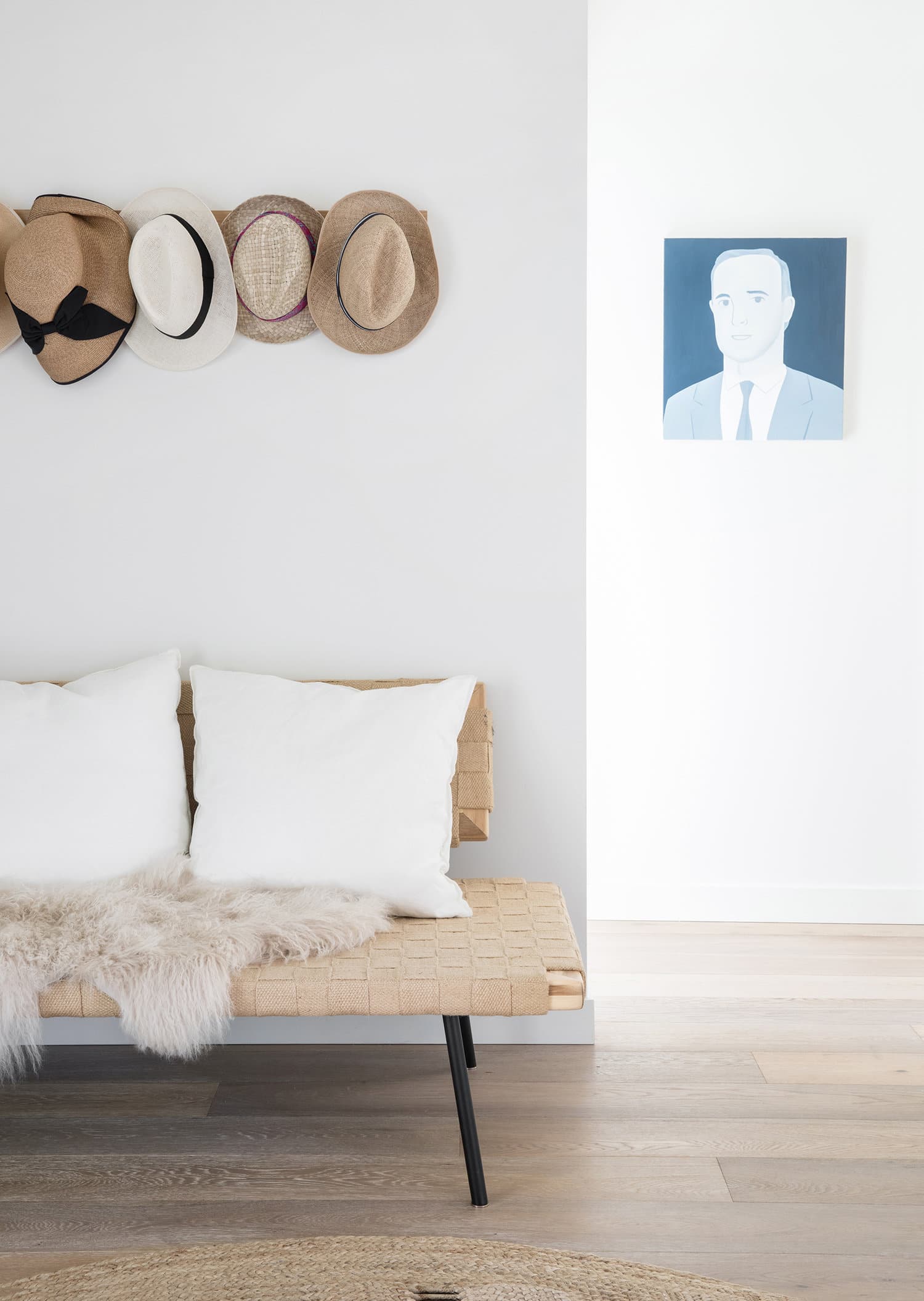
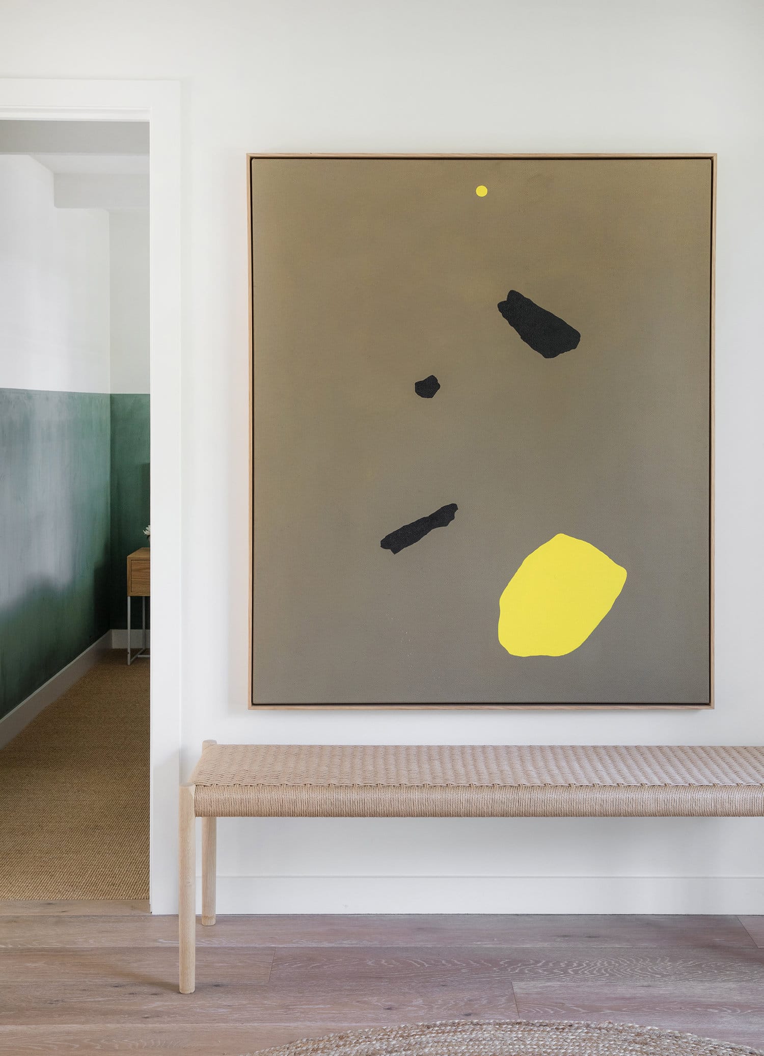
On the other side of the hall an oversized piece of art by Eleanor Louise Butt proves my point (PS, the art in the dining room is also hers!). With a lovely bench to boot. I love all the natural textures in this home! Peeking around the corner is the first bedroom…
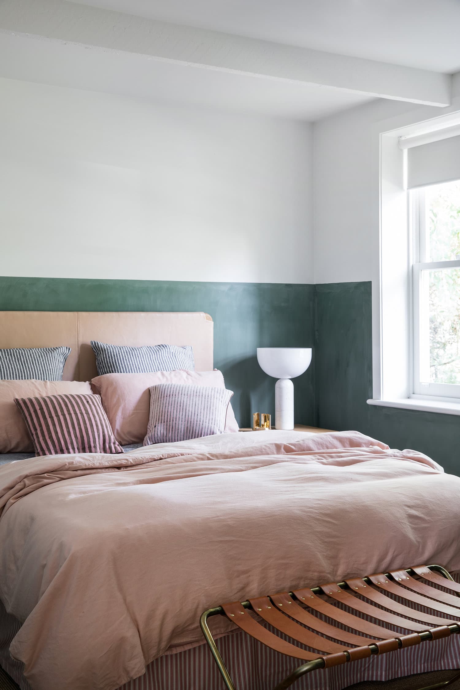
This green half-wall makes its way into most of the rest of the rooms in this house! The plaster texture is so lovely in this tone. It’s unusual to see one color continued throughout an entire floor like this, but I kind of like it. Think of how much easier it is to extend one look to multiple spaces! And it works!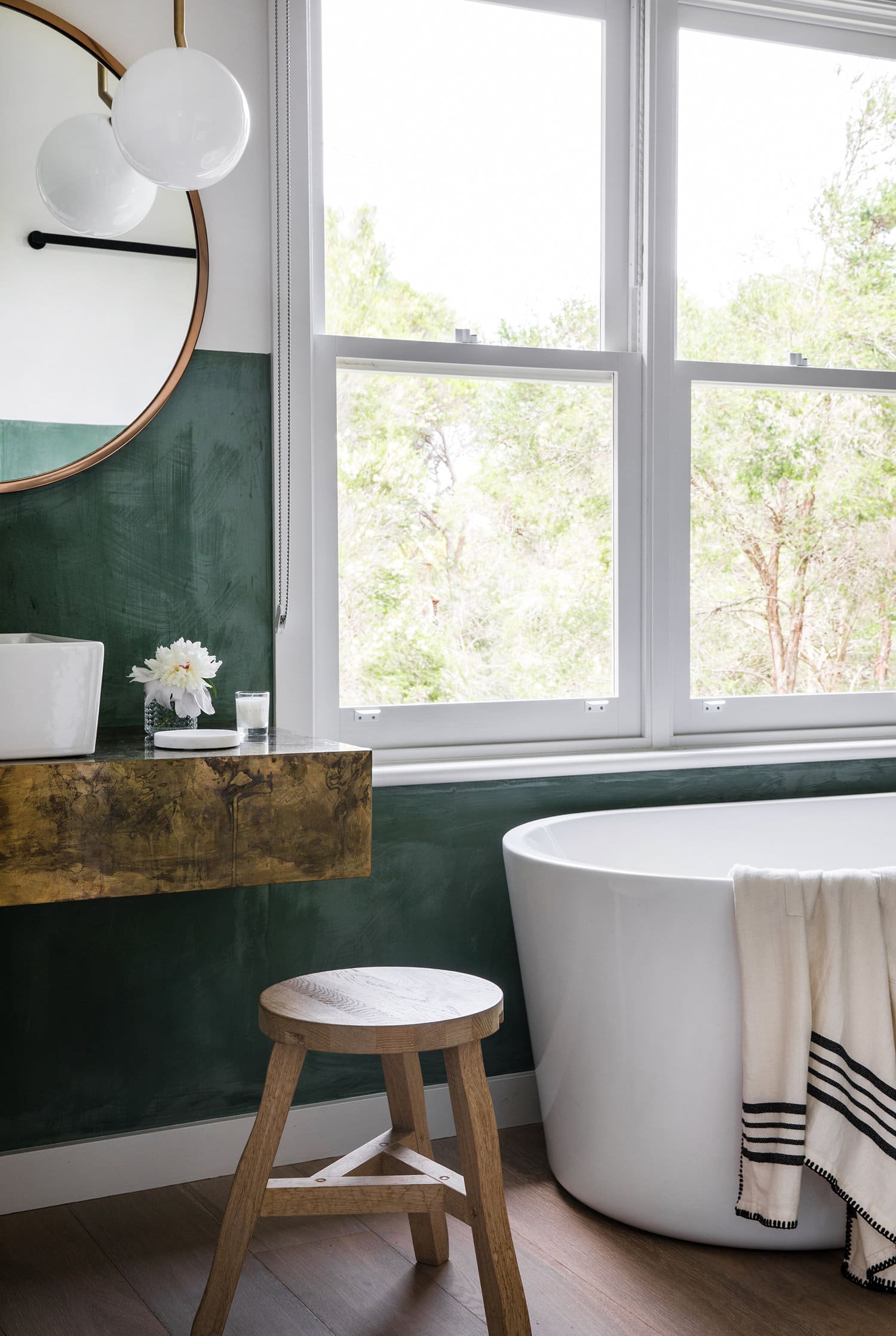
I love this master bath with its major soaking tub and aged brass. But the shower kinda steals the show!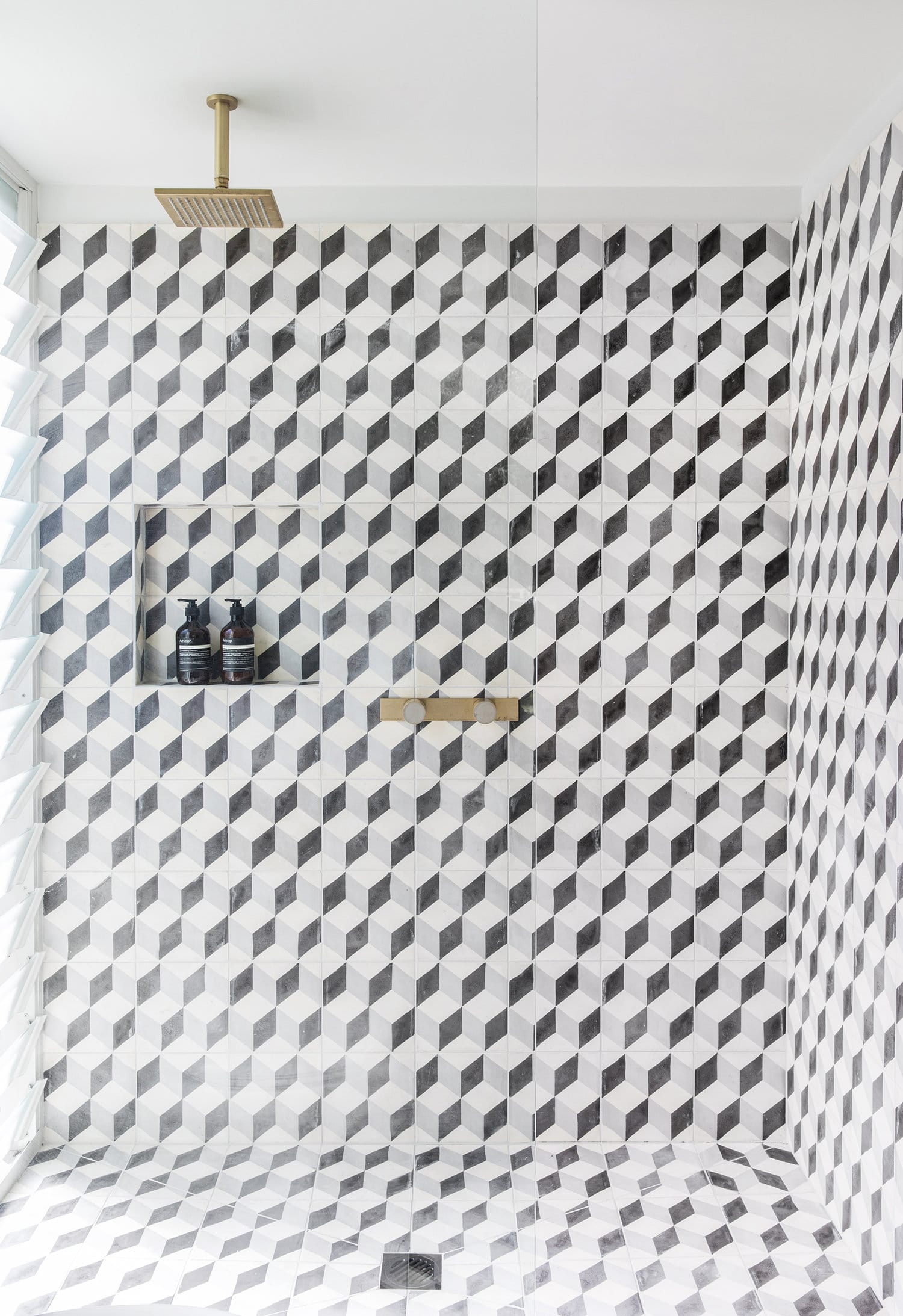
And yes that’s the same tile from the kitchen! Again, a repeat of materials, and I don’t even mind! In fact, my husband and I were just chatting about the possibility of renovating our downstairs bath, and I definitely am thinking about using the leftover tile from our kitchen backsplash as a possibility for the flooring! How do you feel about reusing materials like that in one home? Big no no? Or why not!? 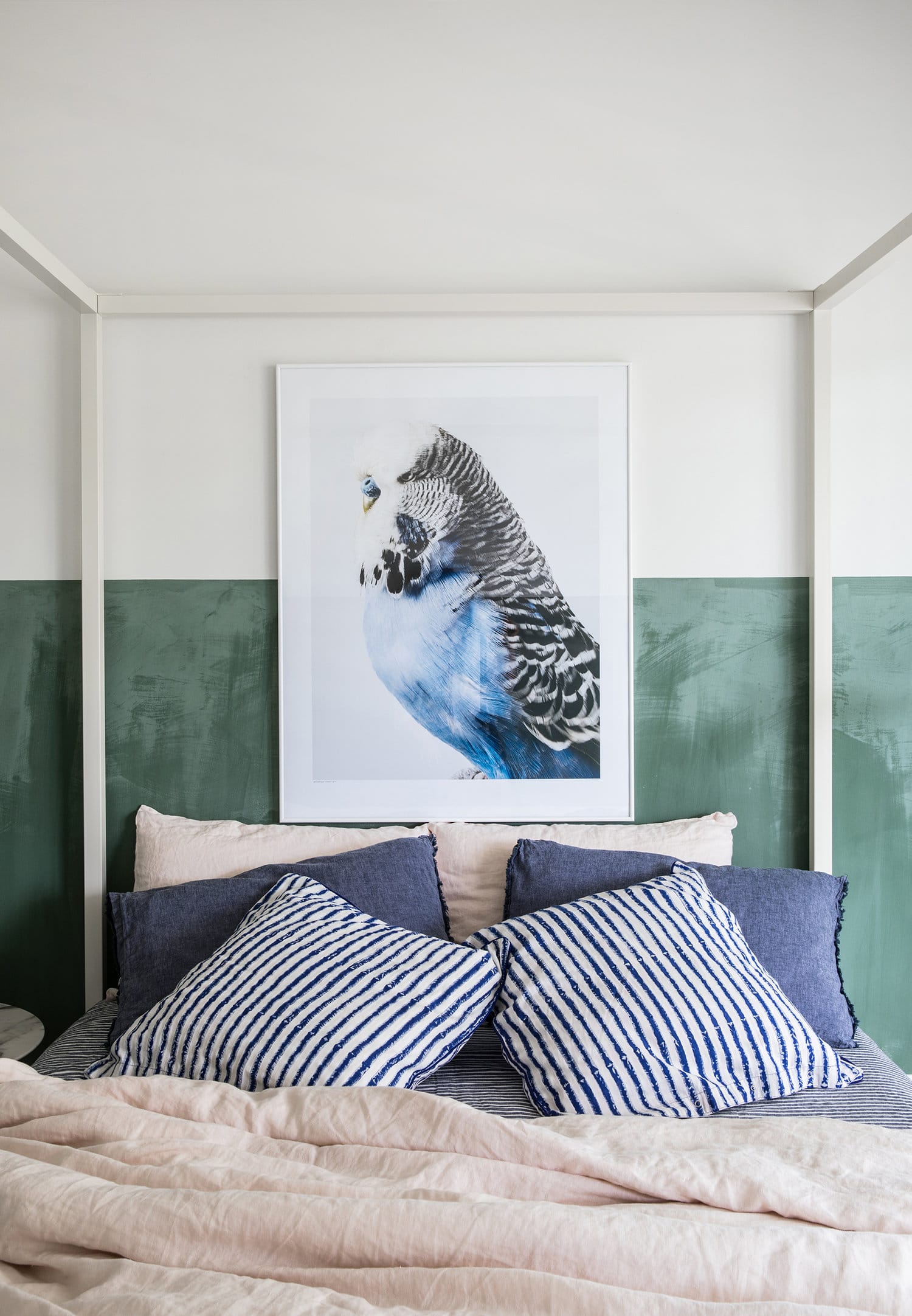
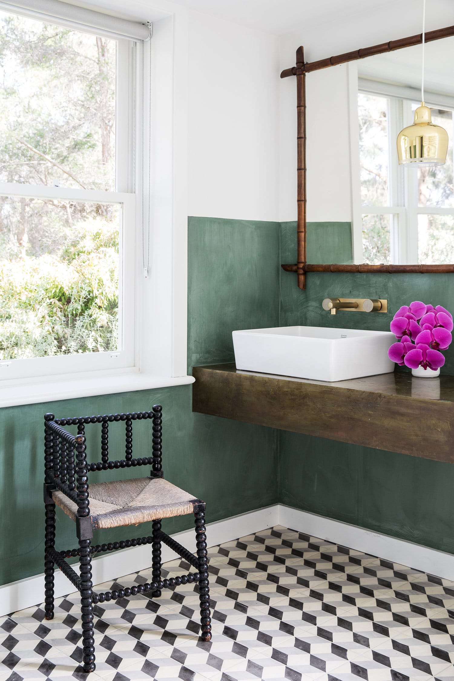
The second bedroom and bath employ the same green and tile as well. Is this getting a little repetitive? For a beach house… does it matter? If you’re not living with it every day, maybe not! And it’s nice to not have to reinvent every space as a designer too. This bathroom also has the same thick brass vanity, but has switched up the mirror and furnishings for some more vintage pieces.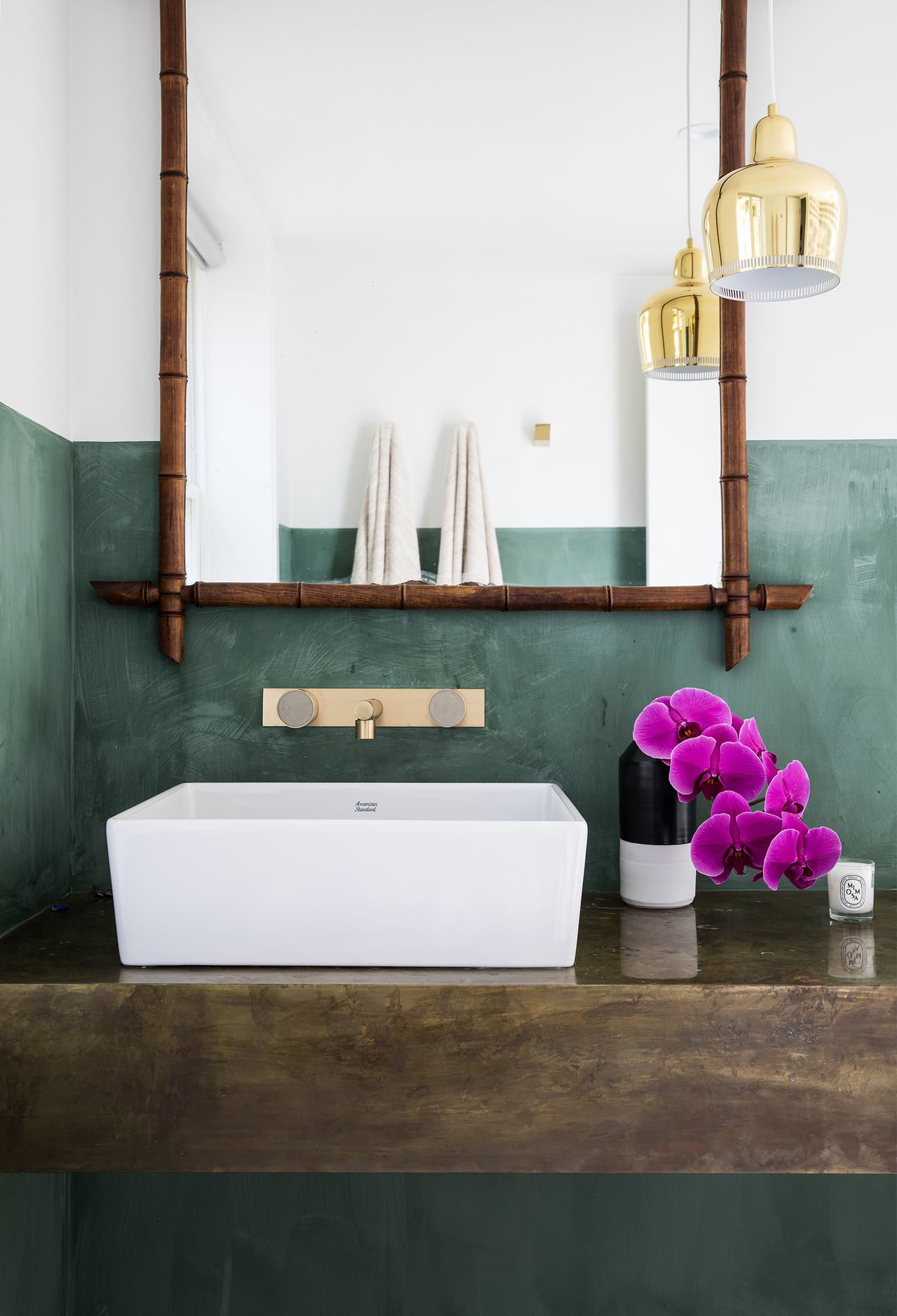
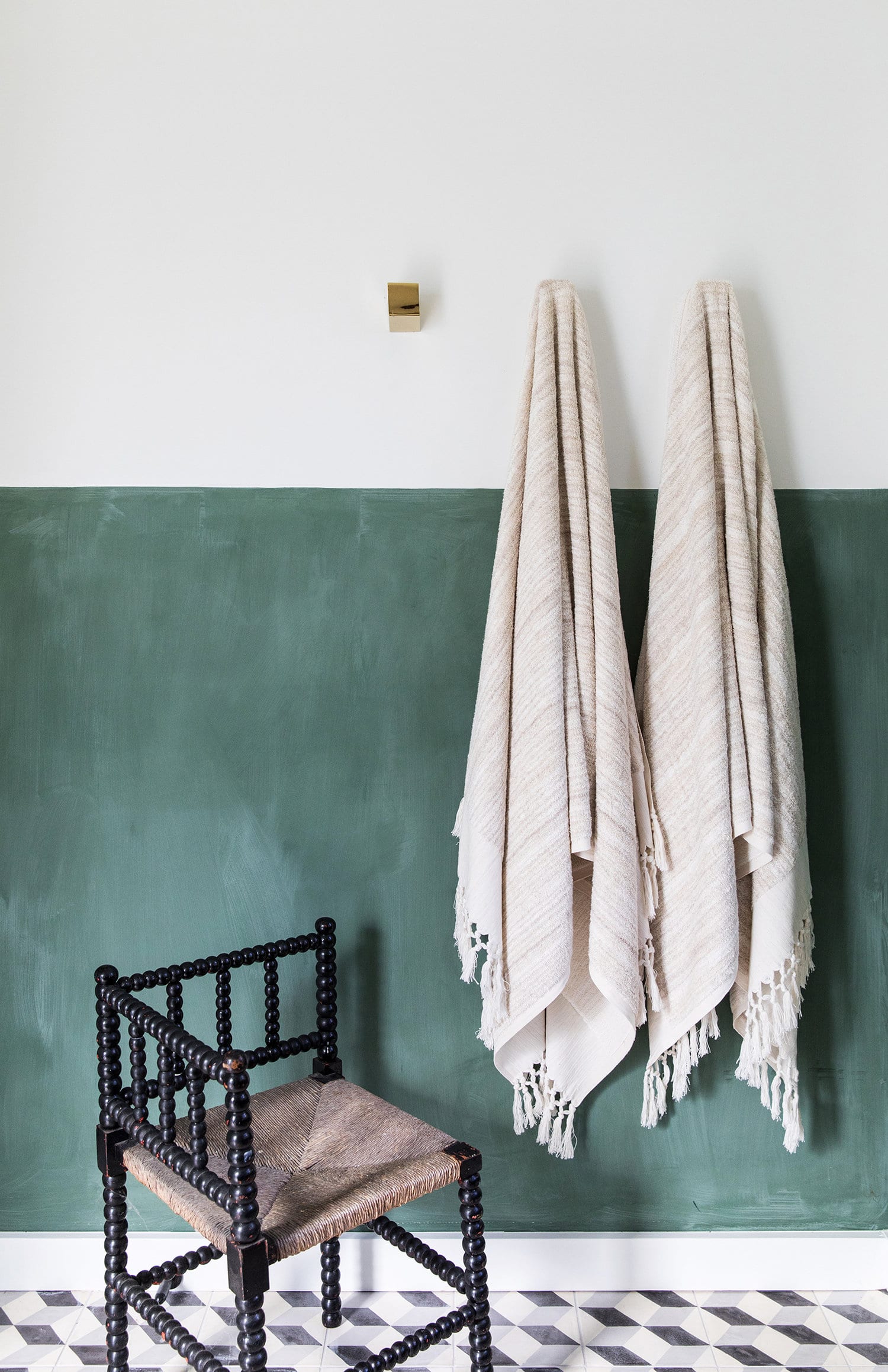
And if all of those showers aren’t enough? Well, there’s one outside too for rinsing off sandy feet from the beach, which is just a short walk away. 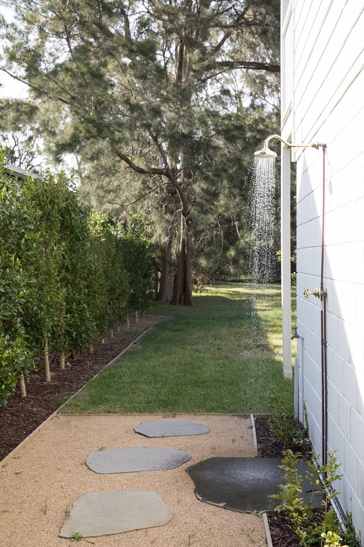
How do I know? Well, this lovely beach house happens to be available for some lucky Aussies to rent on Airbnb! As if I didn’t have enough design envy.
But if you’re stateside, like me, then here’s how to get the look for your own abode:

1. cane & chrome dining chair | 2. ‘the standard’ table lamp | 3. cement tile | 4. blush linen bedding set | 5. woven oak bench | 6. ‘u’ candleholder | 7. framed graphic art | 8. olive green pillow cases | 9. sandstone bowl
If you’re looking for the exact dining chairs here, you’ll have to invest for these vintage beauties in good condition. You can even see here that the set shown is a bit worn. I happened to find the exact set on Chairish though, and they’re currently on sale for quite a steal! So if you’re into ’em, grab em! Otherwise, there are plenty of places to find a version of this chair in cane and chrome.
You can’t go wrong with graphic art and loads of linen, and that’s what this home does best. So, if you’re going to invest in this look – start there! I love this piece of art by Jason Trotter who did the piece that we have in our dining room! Kinda wishing I could get this version too! And don’t undervalue the impact of a well-placed accent bowl. Pretty sure I’ll be getting this one from Cb2.