
I always get inspired when I run across a post from Cortney Bishop Design in my instagram feed, so I’m not sure why it’s taken me so long to post about her design here on the blog! But when I saw the super fun use of print, pattern, wallpaper and overall fresh feel of the rooms in this house tour, I knew it was time.

The entryway sets the stage with its clean open style, use of color and a mix of pattern that draws you right in. PS – for the record – the trim color in this house is what originally drew me to it because I’m working on a whole other post on that topic (!!!) and have been considering doing a bit of this in my own home! More on that soon.
But back to the use of pattern in this home…

This was the shot that made me take a closer look at this house. I love this walk-through butler’s pantry for pretty much every detail it’s offering up. Obviously, the wallpaper being reason number one. But also some unexpected choices – like dark countertops and black hardware – that feel counterintuitive to the space but absolutely work.
From there, the whole home just opens up…


There is such a softness to this space, but it’s so edgy at the same time. I’m kind of dying to see how this all looks in person! The tile pattern in the kitchen feels so Southwest inspired, it’s a surprising choice for a home in upstate New York… but that’s kinda the point, right? And I love the minty green pop in the chairs!
I also love that the floating shelves in the kitchen are a tonal grey instead of white. They keep things feeling dreamy and seamless.


I could go on and on about the use of pattern in this house but I’ll stop now. Basically, it’s the perfect dose for me.
Now can we talk about the lighting selections here?? SUCH good stuff. Lighting is so so so important to a home. I actually think I’m more likely to throw down some serious cash for a good lighting fixture over many other items in the home. That rope-wrapped chandelier above the breakfast table is epic.

Another detail I’m loving? All the custom (patterned, of course) drapery. I’ve been itching to do some patterned drapes in our bedroom and I just haven’t been able to decide what direction to go in. Now I’m thinking I should go with something custom!

Again, great lighting, great color, fun pattern, and a peek at what might be my favorite room at the end of the hall…

Yeaaaaah! Ok, I’m not one to usually gush over kids’ spaces in homes, but the ones in this home, I would gladly take for my own! In fact, this bedroom is giving me so much inspo for my own space…


It feels appropriately playful for a kid, but grown up at the same time. Would you sleep here? I know I would! Same for this more feminine version… (psssst, the wallpaper on the ceiling in both rooms is my favorite detail!).


A little pink in the bathroom never hurt! I love it pared with a walnut wood. Such a retro vibe in such a good way.
And finally? The masterpiece that is the master bedroom..

Soooooo perfectly tonal. It’s dreamy, right? I love that instead of wallpaper, there’s a gorgeous rich teal green that recedes with the ceiling. And such beautiful textures!
While most of the items in this home were likely customized in some way, you can still easily get the overall look by choosing bits of color over neturals and getting a little more brave with pattern while not having to go over the top!
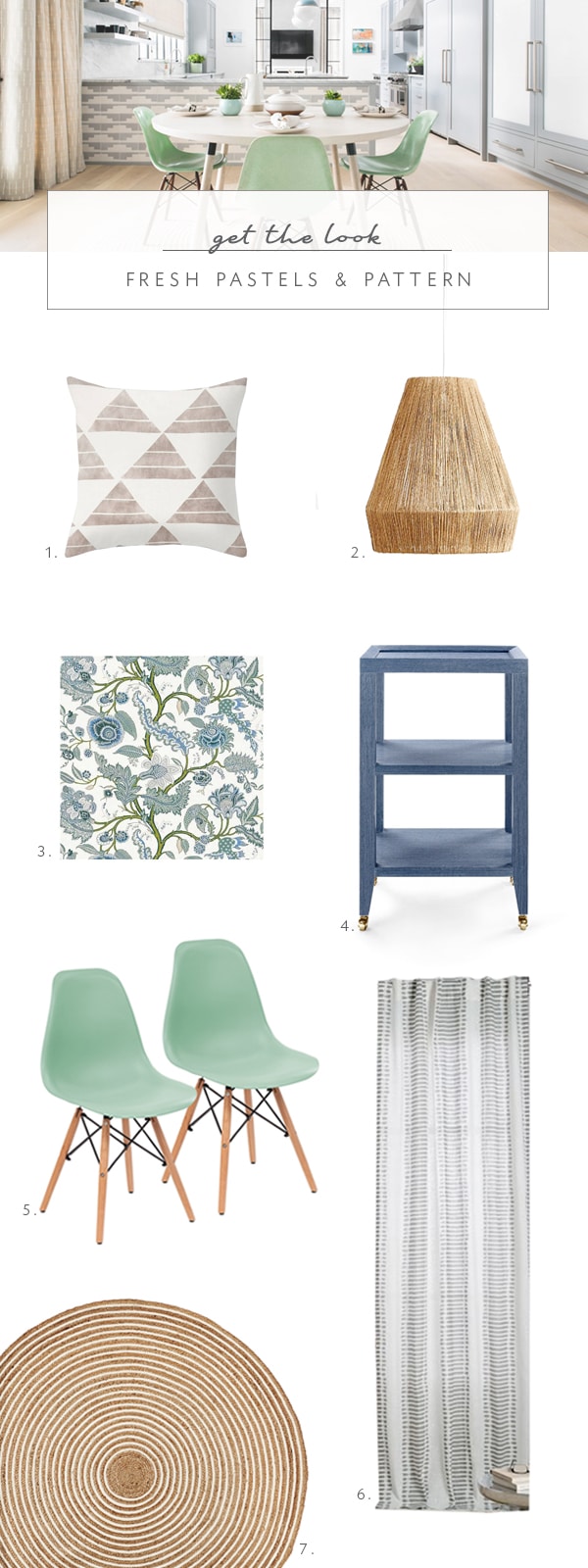
1. zak + fox pillow | 2. jute pendant light | 3. schumacher wallpaper | 4. linen blue side table | 5. mint green mid-century dining chairs | 6. ikat striped curtains | 7. cotton & jute round rug