
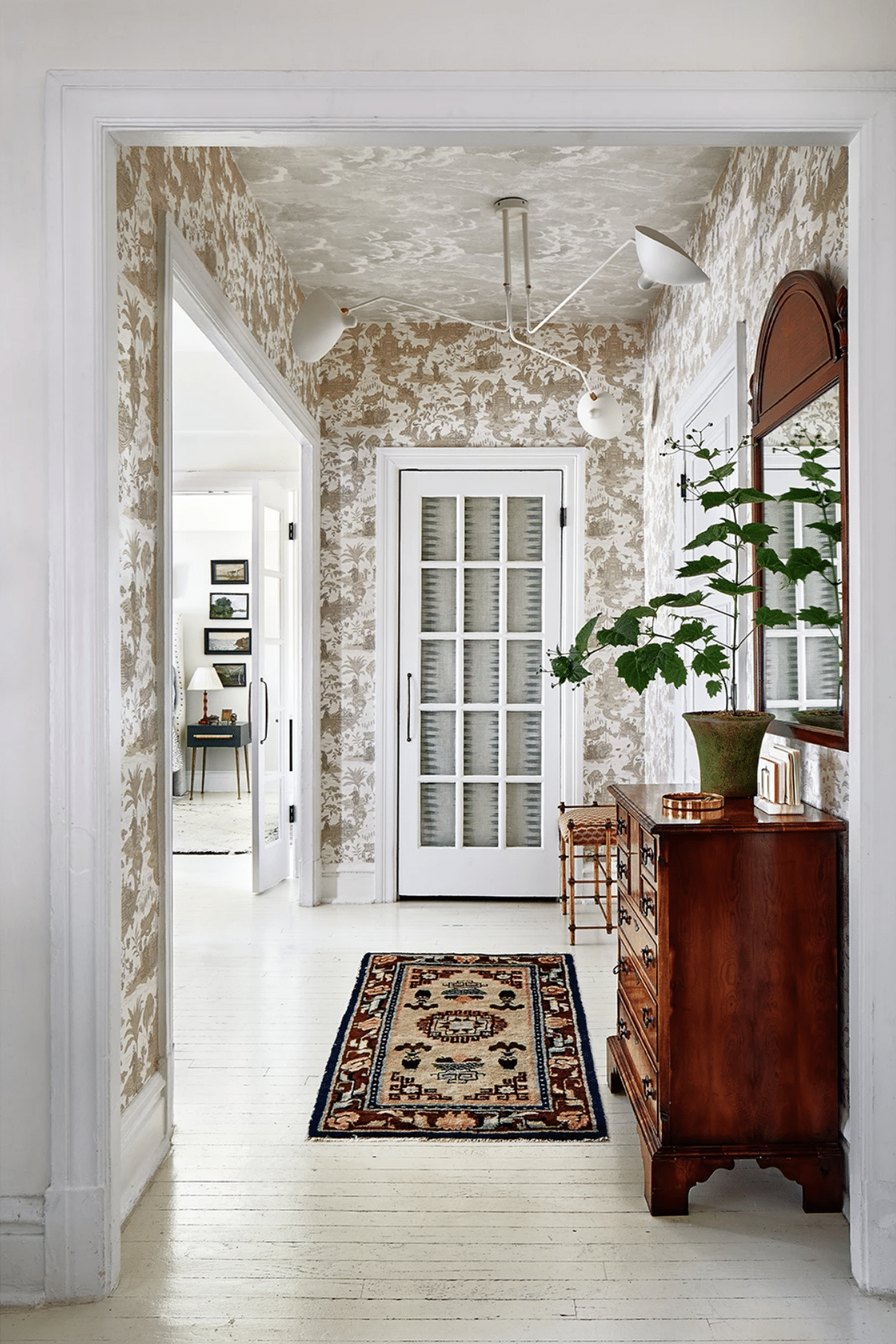
As someone who is working on getting more bold with pattern choices, it was the hallway of Melissa Colgan‘s apartment that stopped me mid-scroll on instagram. The expert combination of toile and those classic clouds gave me pause and I instantly bookmarked the image as a reminder to share this entire house tour with you! This small apartment with loads of charm and pattern was first featured in the last issue of Domino, but it wasn’t until I saw the hallway that I remembered how much I loved the whole space for its expert mix of textiles, antiques, and modern accents.

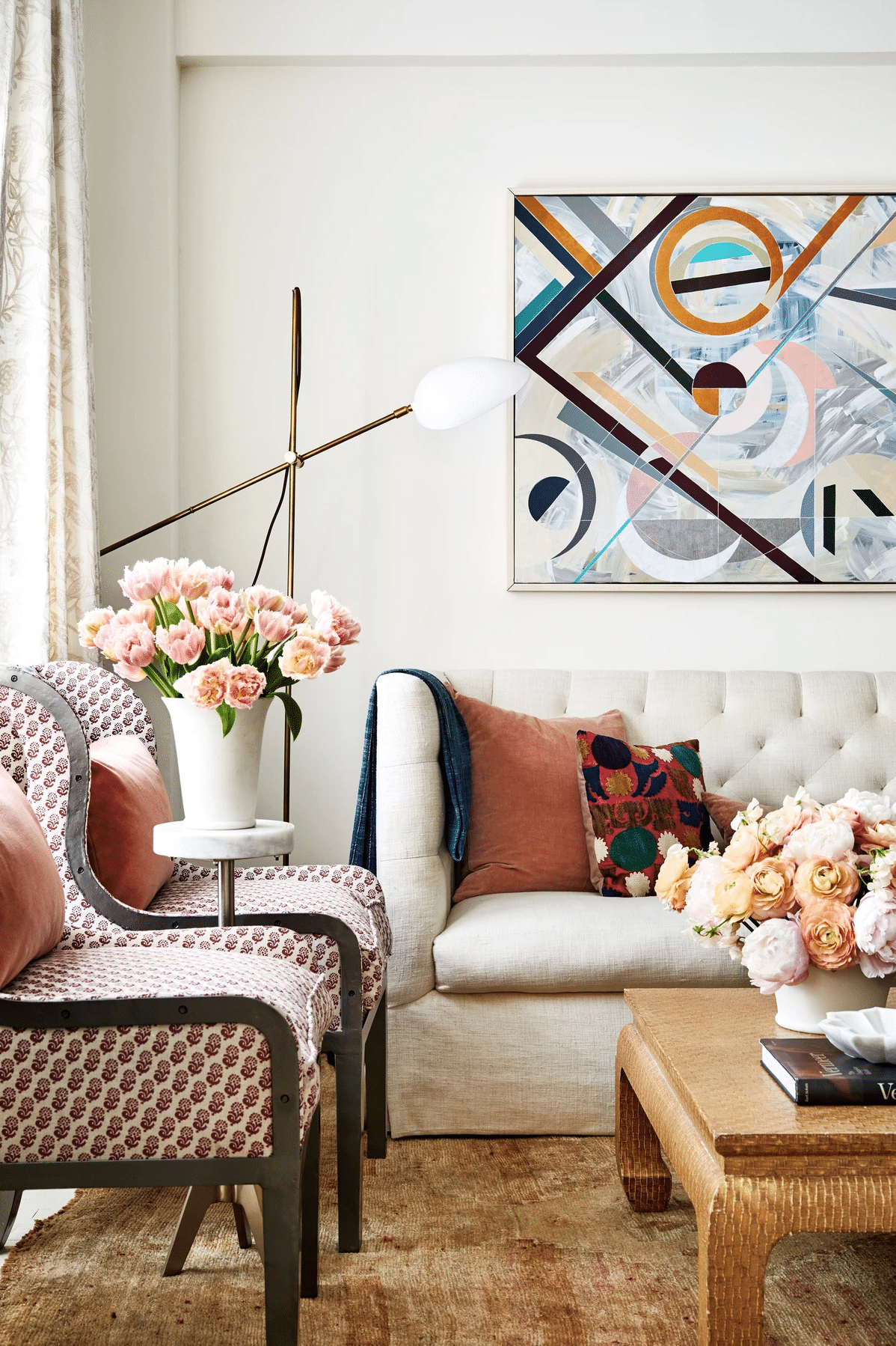
I love a room layout that maximizes small spaces, and you guys, this is it. This tiny living room could easily cram in seven or eight people, and that’s more than mine can comfortably sit! The use of petite accent chairs obviously helps, but it’s genius the way the slipper chairs are pushed up against the open bookshelf as a way to not only layer the space, but save on room.
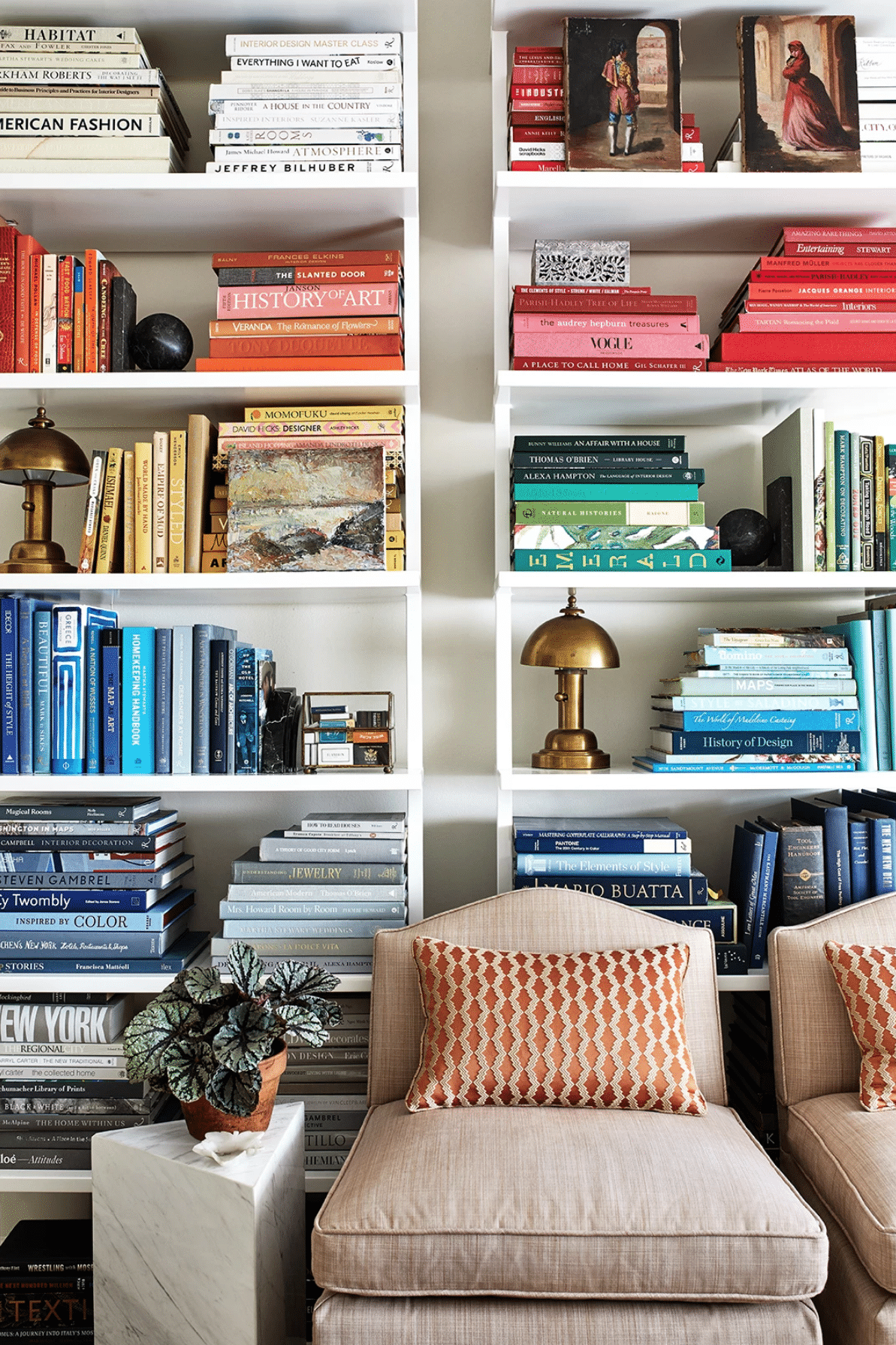
If you’re going to do open shelving in a small space, I think color-coding the books is a great way to help minimize the visual clutter. It really controls the backdrop. Here, I like how Colgan opted for the greys and blues to contrast behind the chairs.
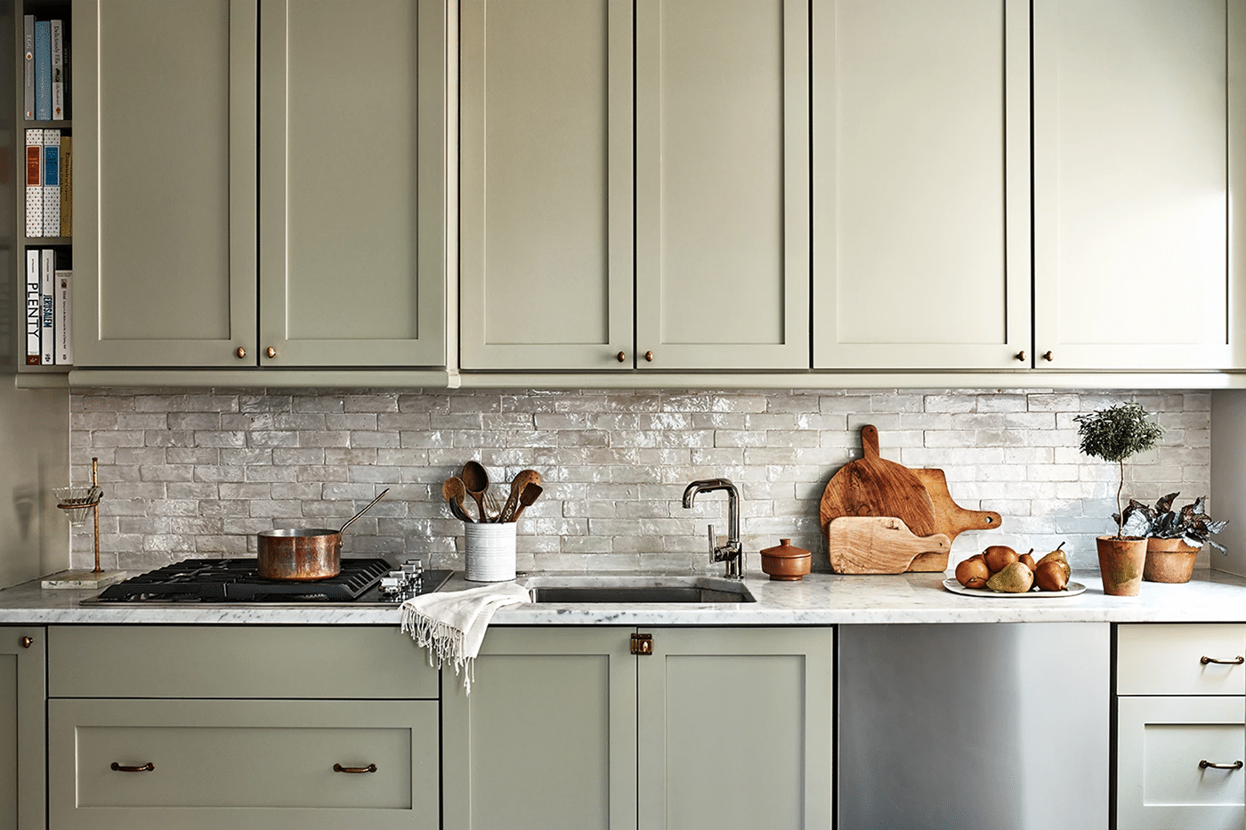
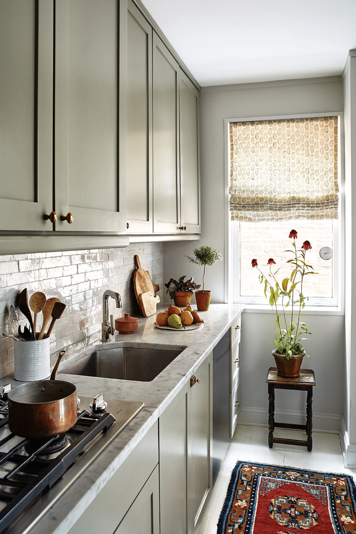
Confession: I sort of love the coziness of a galley kitchen. In small apartments, they just make sense. To be able to tuck it all away in a corner of the home rather than have dishes and messes overflowing into your living space is sort of a luxury in a way. Some of you may disagree, and I get it. An open kitchen is lovely in a house. But I always loved my little galley kitchens in my apartments. Maybe it’s a nostalgia thing. Anyway, this one – which has obviously been renovated – is fantastic. I love the color and the way it looks with the marble counters and zellige tile. Such old world charm!
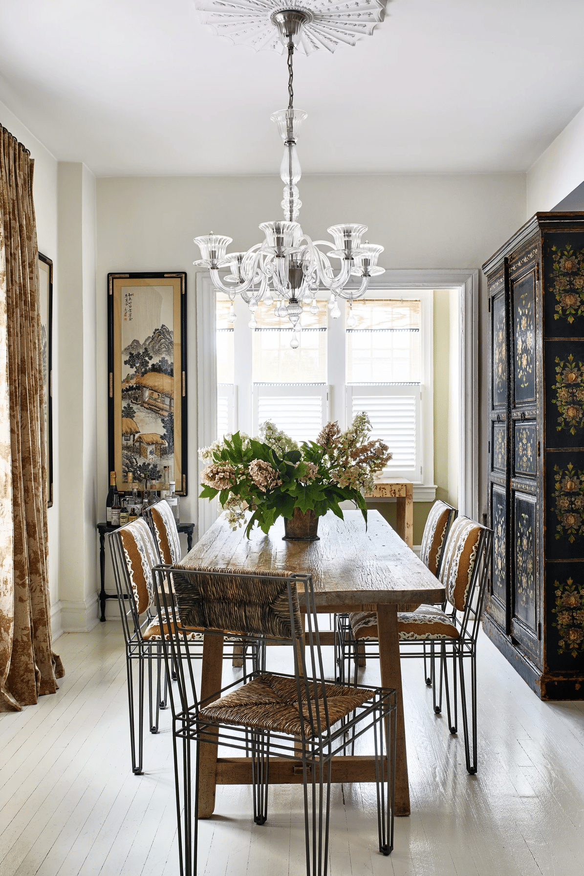
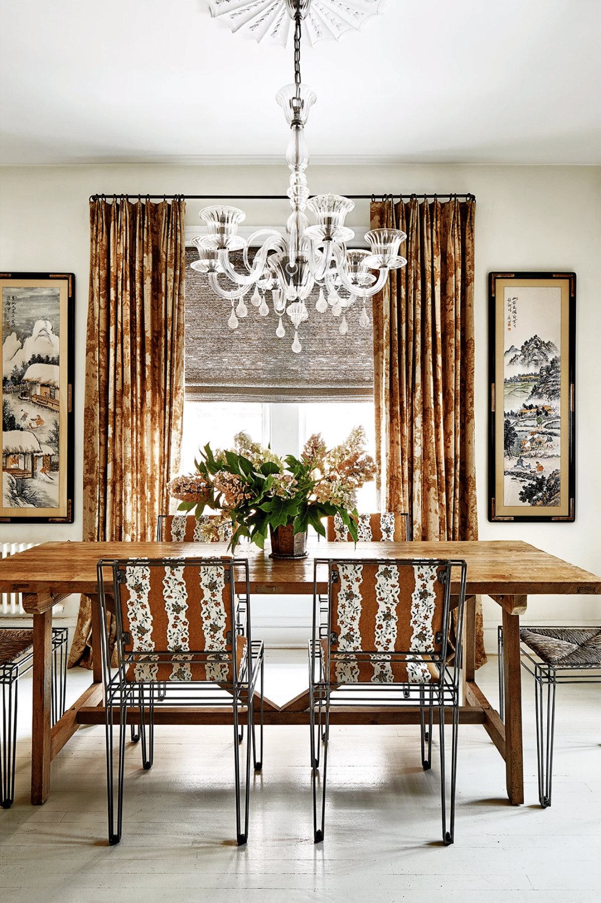
The dining room is the ‘riskiest’ room for me. Those chairs are intense and I never would have picked them out of a crowd (not sure if I would now either, to be honest!) but the sweet pattern in the upholstery softens them so much I almost like them. They definitely work in the room, which I find totally intriguing because – since we’re being honest here – other than the table most of the elements in here aren’t my style. But I can definitely still appreciate it all as good design.
Just on the other side of the dining room is this lovely little desk area, my favorite part of which might be the articulating pendant lamp. Also digging the burl desk.
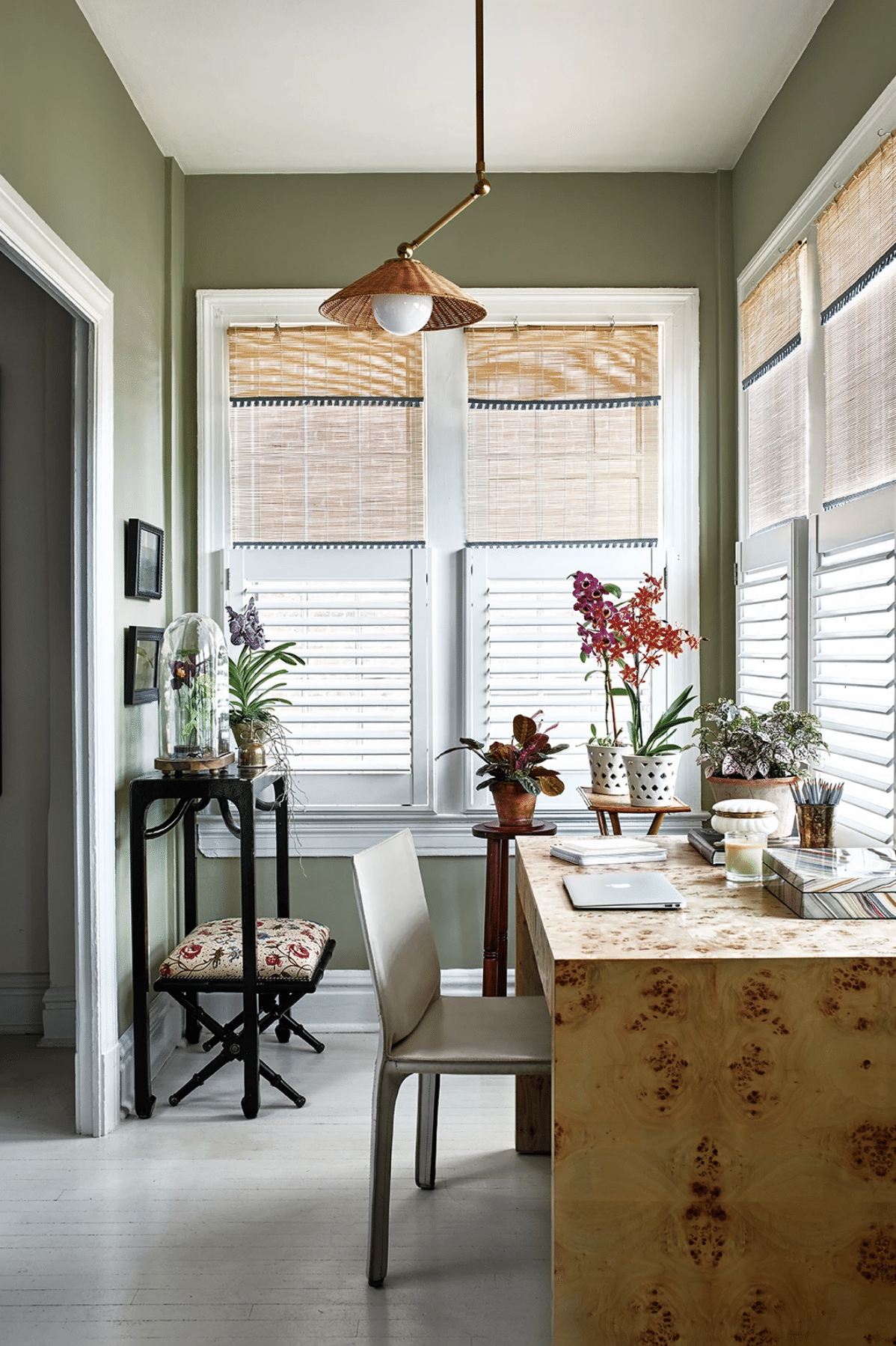
I can’t tell if this green is the same as the kitchen, but it feels a little different to me. Again, I love the luxury of this type of space in a small apartment! Such a great sunny spot to sit in while working.
In the bedroom, a soothing shade of grey (so much good paint inspiration in this home!) covers the walls, as does a sweet collection of vintage and antique art.
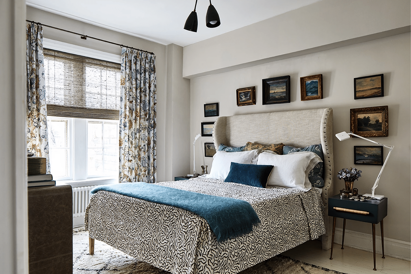
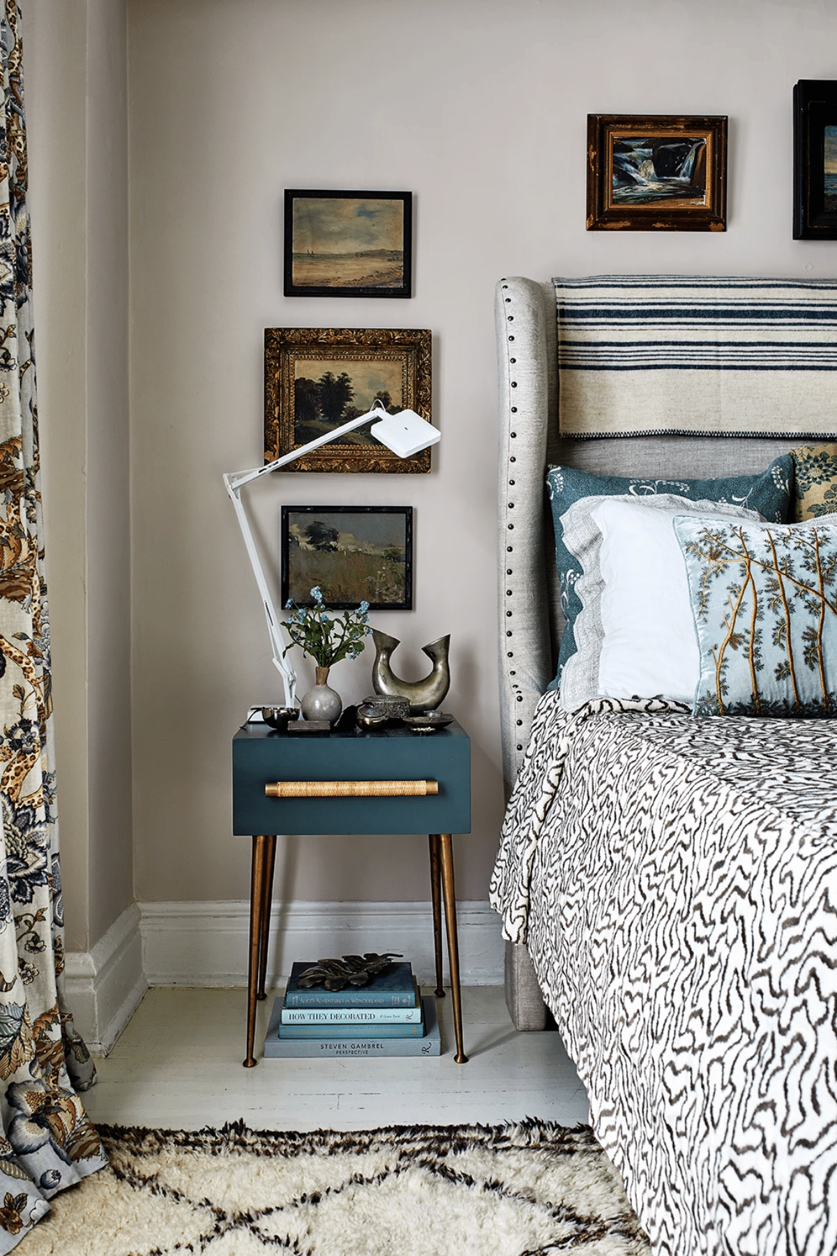
Again, the layers of texture and pattern in this space are so fantastic!! I mentioned this in the beginning of the post, but I also really appreciate the use of modern accents – mostly in the lighting – throughout the home to keep things from getting too traditional.
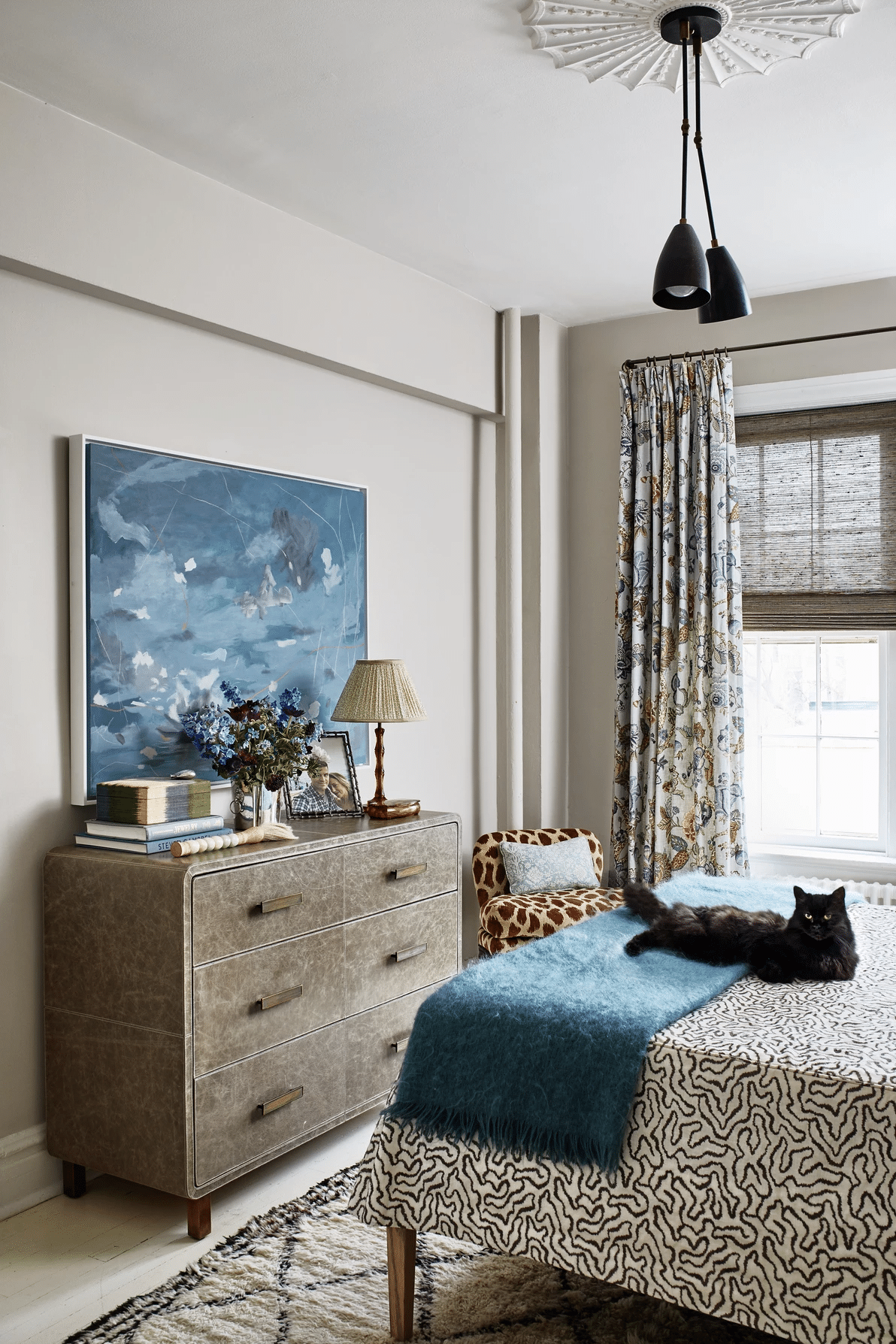
The tiny chair in the corner is such a fun bonus to to this space! And the gorgeous texture of that leather dresser too. This room is a master class in how to combine a lot of elements and still have things feel calm. I know I’m taking notes.