
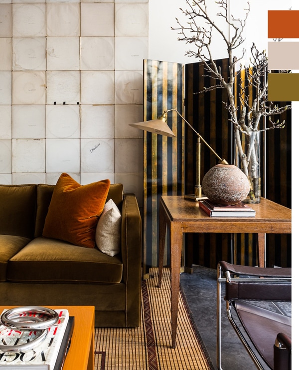
There’s something about fall that always makes me want to take stock of color trends and where they’re going. Perhaps it’s the combination of the urge to nest, the constant fashion weeks, the release of color trends from paint companies, and a new year just around the corner? Whatever it is, now is the time to start thinking about where color is going, and how you can bring it into your own home.
So I’ve rounded up some of my favorite interiors showcasing the Fall 2018 color trends we’re loving right now. Some are bold, and some are quiet, but each shows how to combine at least two of them into a beautiful environment.
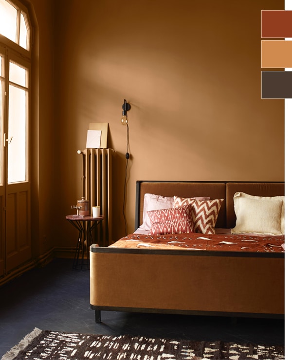
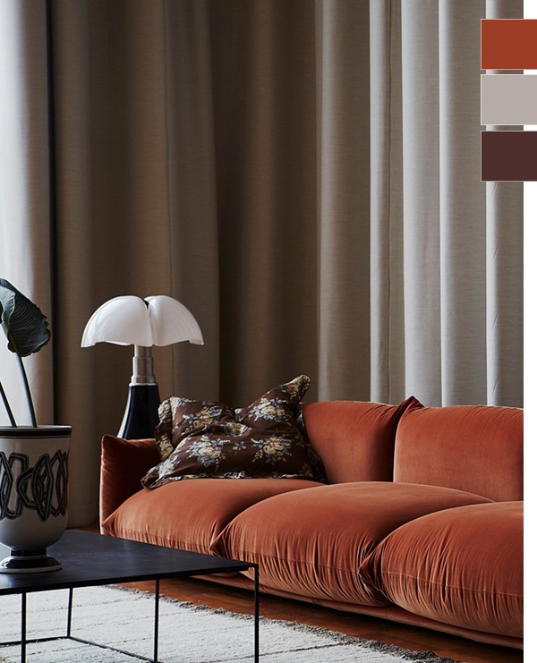
Rust tones are at the top of my list for Fall 2018, as is a color that I think is most accurately described as dark chocolate or black plum. Deep, rich brown that has a hint of burgundy to it and it’s delicious. Above, we see two ways to bring both of these tones into a room. One is super warm, using a backdrop of a rich peanut tone, and the other much cooler with a backdrop of a beautiful putty that is on-trend with Benjamin Moore’s color of the year for 2019.
I have to say I think I really love it with that oyster/putty tone best! And so gorgeous with a hit of olive too.
If bold is your thing, however, take a peek at this home that was painted to capture the current trending colors from Pure Original…
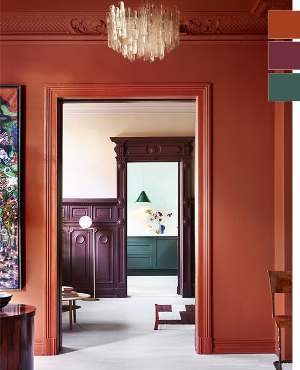
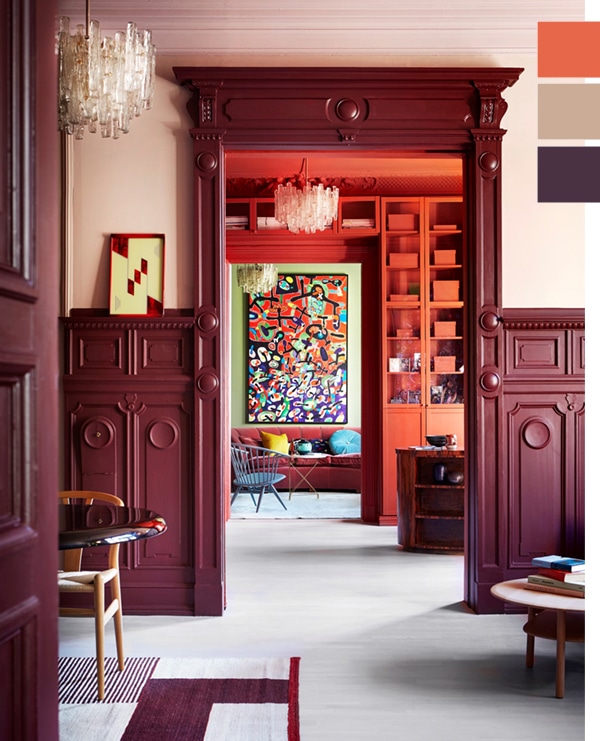
The two rooms above peek into each other, and offer different views of how these colors not only interact, but change with the light! That plum tone returns here, but more bold. And the surprise trend of 2018 for me? The return of orange! I don’t mind it when it takes on a bit more of a rust tone.
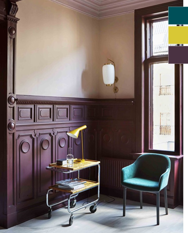
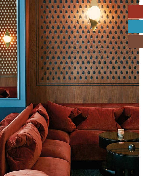
Below, the plum room shows off how to pair some of these darker tones with pops of bold color. Yellow is still a favorite of mine for now! And that teal doesn’t seem to be going anywhere these days. It has been on the trending spectrum for some time now.
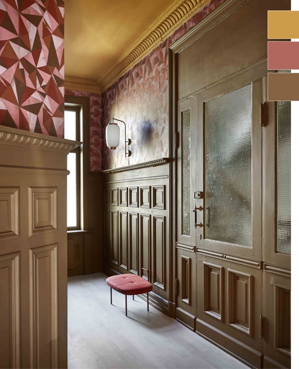
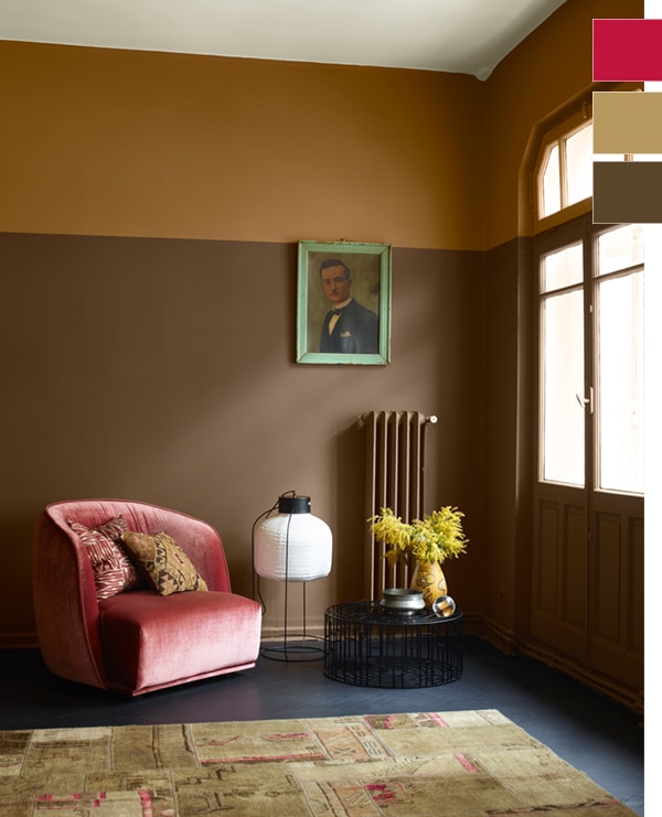
The last area of this home goes in a very different direction with the introduction of a very olive brown tone that I really love. I feel like you can only get away with painting beautiful detailed architecture or spaces that are very broken up with this color. And it’s fantastic paired with shades of pink, and that mustard yellow!
And speaking of pink… if you’re SO over it, then I’m so sorry, but this color is here to stay! However – there are plenty of hues to choose from, so if you’re over the Millennial Pink, think blush, mauve or a bold raspberry…
Here we see that dark plum/burgundy color coming through again, paired with a nude blush that happens to be one of my very favorite color combinations! This definitely has me thinking I may need to source a dark burgundy rug for our bedroom so I can add some blush bedding in a way that doesn’t feel overly feminine.
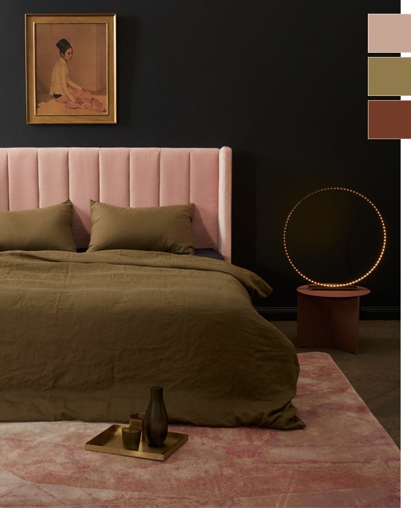
Even when pink isn’t trending, I will always, always love it with a good olive green. And these two rooms show how you can do pink with a more moody vibe! It feels 100% less girly (and generic) when paired with these darker tones.
Last but not least – inserting pops of blue into this darker palette can also be fun, and very much on trend!
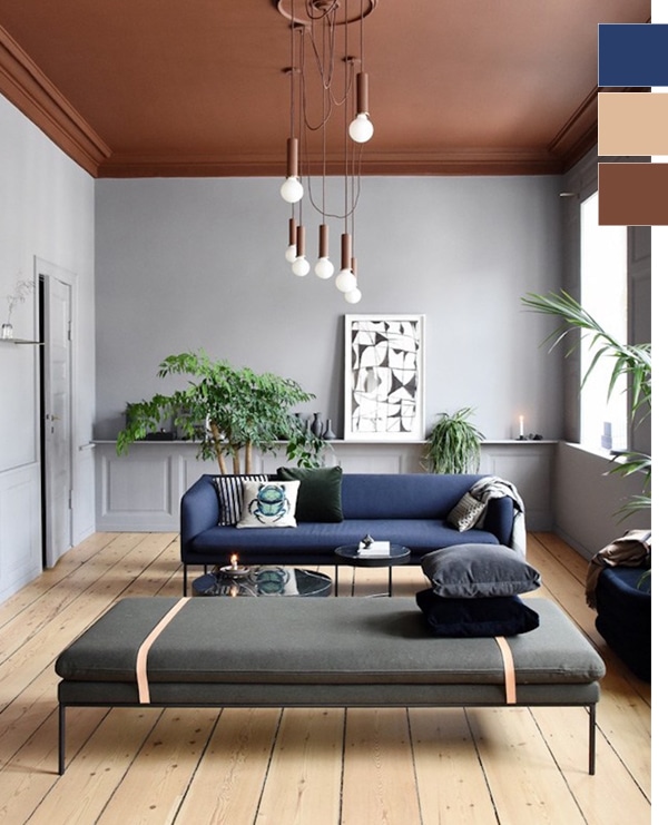
These two rooms show very different ways to do it, but I have to say I like an even-more-saturated blue paired with that rusty red than the sofa shows here. Think of Majorelle blue.
And in case you were wondering how our picks stacked up with the Pantone forecast for 2018, here is what they have listed.

I’m definitely more drawn to the muted tones of the bunch, but as I mentioned above, I do love the punchy color paired with a darker one. Pink Peacock or Russet Orange would be so fun with Martini Olive. Or Nebulas Blue with Red Pear. If you’ve never done it before, I highly recommend doing a little color therapy by looking at the colors you’re comfortable with and then seeing how you can incorporate the ones you’re not (orange and purple for me!). It may just lead you to add some unexpected accents to your home!