
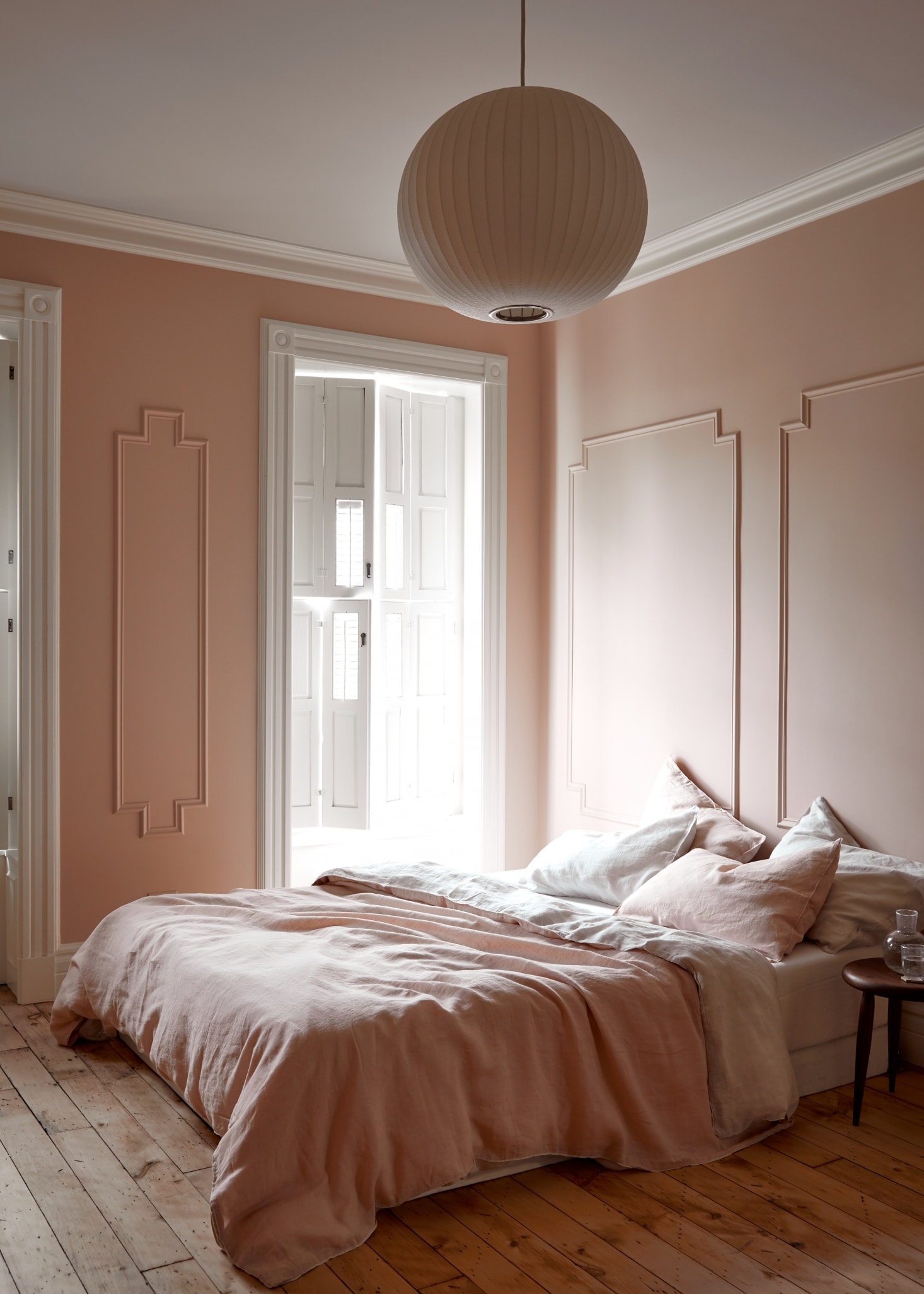
I know some of you out there are probably asking why on earth is she still talking about pink walls? Yes, I know. We’re all getting sick of pink. But when it comes to walls and those yummy earthy pink paint colors that offer up peach, brown and beige undertones, I can’t get enough.
This color also happens to be on my mind because I’ve been working on nailing down some final paint colors for the house. Some people swap pillows, I seem to paint walls seasonally. But as I creep closer to the final version of decorating in each of our rooms, I’m reconsidering everything and that means paint too. And where might this color be going? Most likely, upstairs in my dressing room. Ready for some inspiration images? Good, me too. .
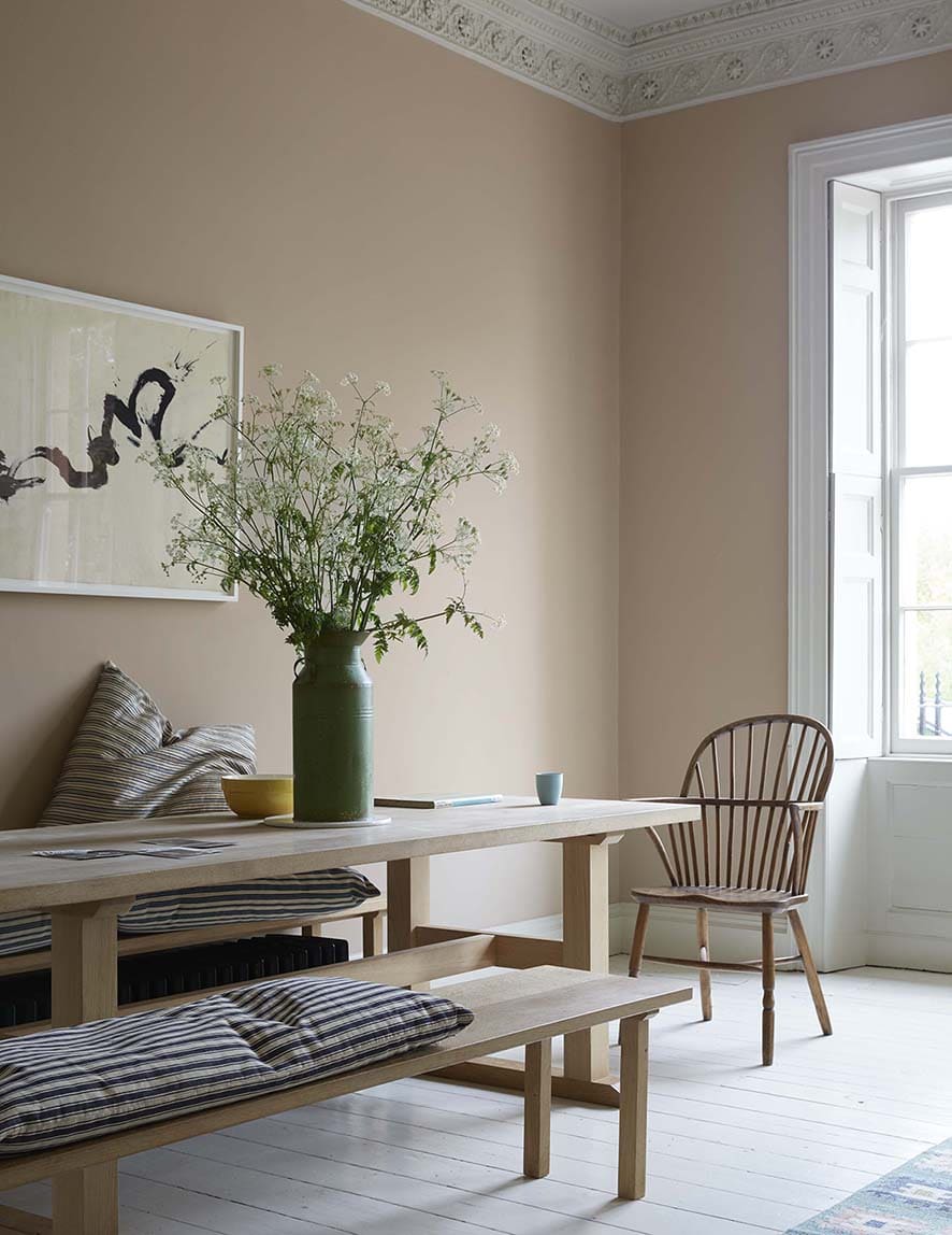
In a more pared down look, this dining room shows how well pale oak finishes work with this peachy pink. Unfortunately for us, with our floors also being wood, I have to be careful of overloading on all these warm tones together. A big white rug might help take care of that.

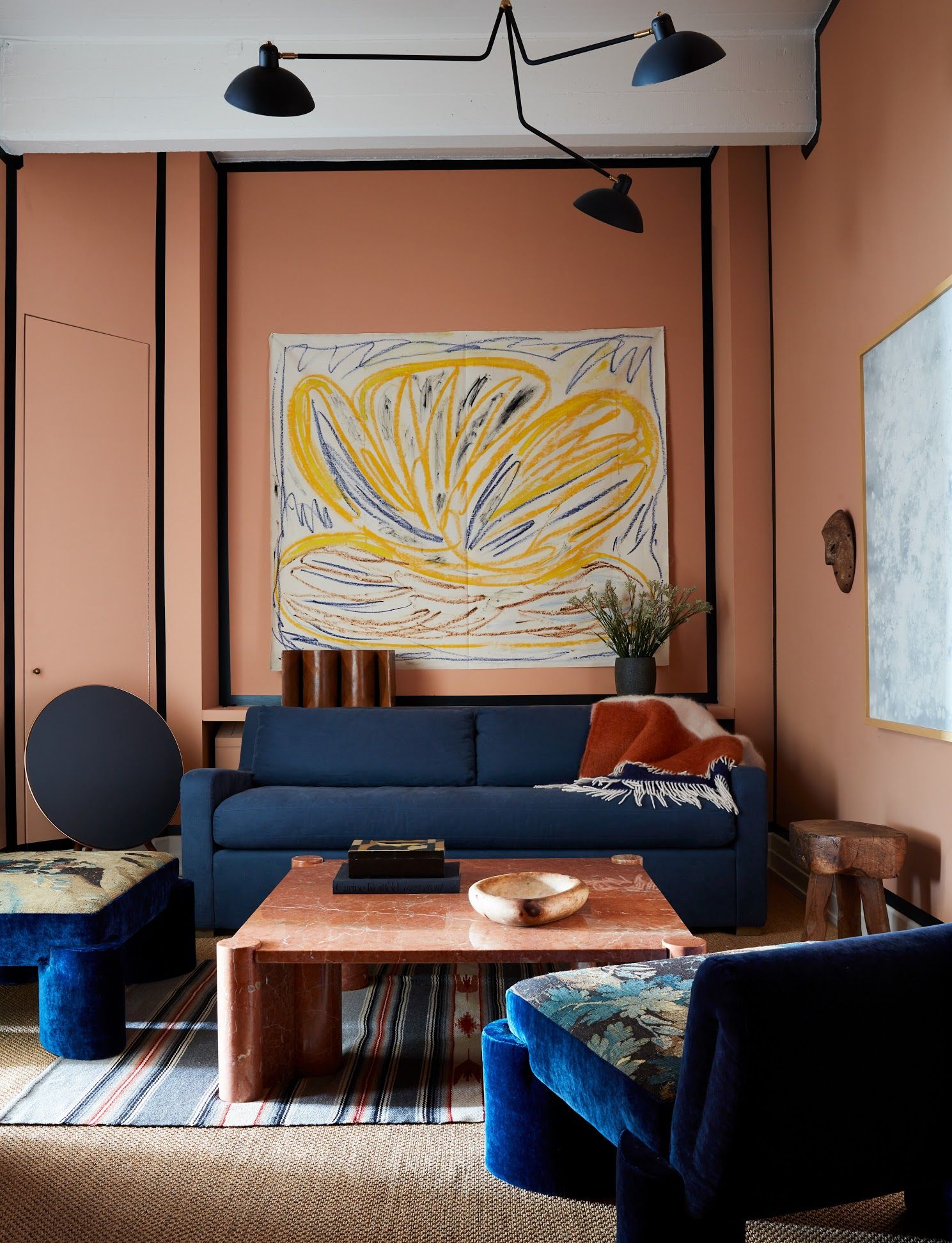
It’s fun to take these colors and start to saturate them to see how far you’re willing to go. If you’re looking for something a little more punchy, this living room by Giancarlo Valle features walls saturated in Dead Salmon by Farrow & Ball (a color I didn’t include below because it went bit richer than I wanted to, but it’s quite fantastic).
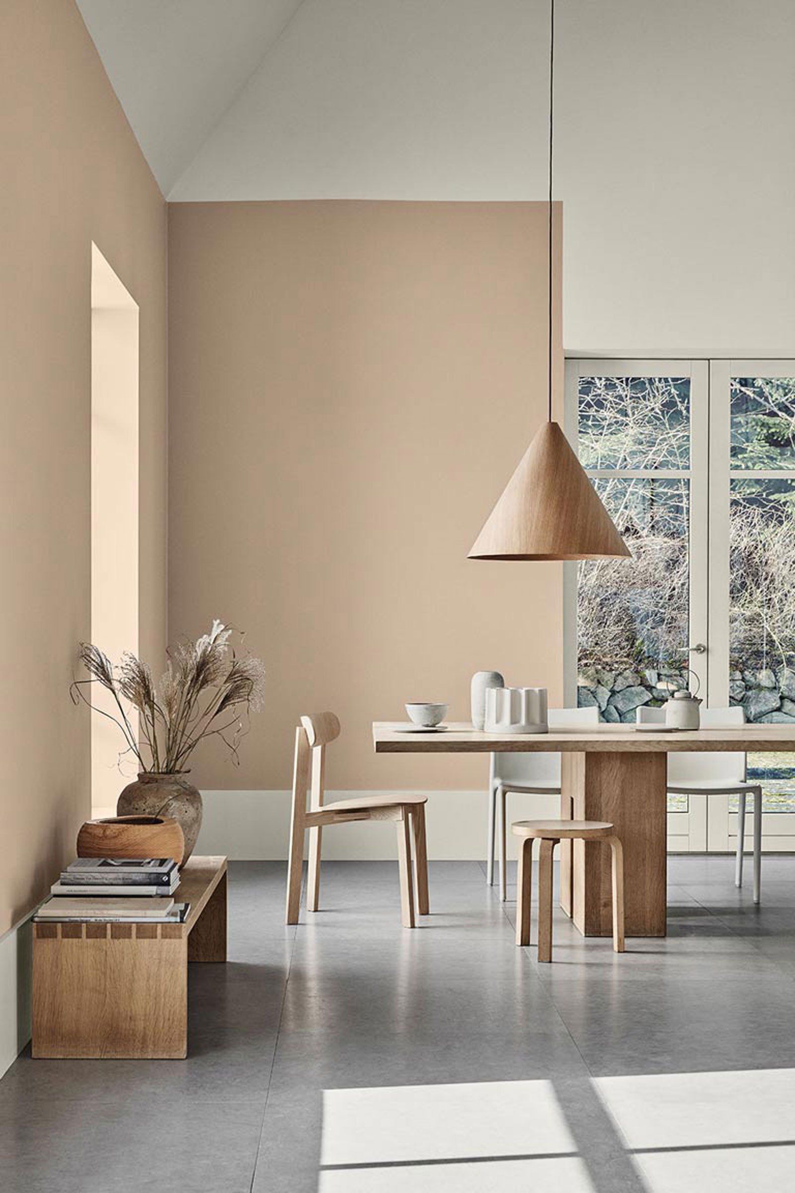
If ‘muddy’ tones were where colors were skewing the past few years, the new trend is definitely ‘earthy’. Think orange, red and brown undertones in any warm colors, while greens and blues are feeling more nature driven than preppy.
Are you ready for my final contenders? Here they are!

1. Dusty Trail by Benjamin Moore | 2. Coastal Cottage by Benjamin Moore | 3. Finesse by Pratt & Lambert | 4. Setting Plaster by Farrow & Ball | 5. Odessa Pink by Benjamin Moore | 6. Pink Beige by Pratt & Lambert | 7. Alamar by Pratt & Lambert | 8. Malted by Pratt & Lambert
Now before you go telling me that these all look the same, yes it’s true that some of them do! So I’ll save you the trouble of gathering all the swatches and comparing them side by side with a few notes on these hues.
Dusty Trail is about as light as you can get while still having a vague pink tone. If you’re easing into color, start here. If you really want the color to appear like color, skip this and head to the next few.
In the lighter tones, Coastal Cottage and Finesse look awfully similar on a screen, but Finesse is a bit sandier where Coastal Cottage can skew more pink. If you want a truer pink with less brown in it, then Odessa is your best bet! If you want the opposite (more muddy), then try Setting Plaster.
In the richer tones, Alamar is closer to a pink, while Malted is a much warmer peach. Want something in the middle? Go for Pink Beige as your starting point.
Now I’m going to clue you in on the best trick yet for paint – it’s going to save you a lot of time if you know what you’re looking for! If any of these colors catch you fancy, but you want to try others in similar tones, try punching the brand and the paint color into Encycolorpedia for a quick matchup of similar paints.
For example, if you really love Farrow & Ball Setting Plaster, but want to find some similar colors in other brands, punch it in and you’ll see that Valspar’s ‘Vanilla Steam’ is a 72% match. Also – nearly any paint store can do a color match to other brands. The most important thing to remember is that no matter how it looks on your screen or in someone else’s house, you must must must put samples up on your own walls to see how it’s really going to look in your own home. It will never look the same as it does anywhere else!
Now go forth and paint my friends! I’ll let you know what color I land on!!