
Well, this is it guys. Our final installment in the kitchen remodel saga! You know what that means. The big reveal is gonna happen SOON! I promise. Obviously our kitchen has been done for a while now but we’ve been patiently waiting to see if a certain magazine is going to be picking it up soooo… you’ll have to wait just a little longer!
So, on to the very last topic, which is one that could easily get overlooked but is actually super important to any remodel, in my opinion. WINDOWS.

Windows that are beautiful, architectural, and totally make the space, like these.
To refresh your memory on the before of our space, here’s a quick ugly reminder of what we were dealing with…

Really old aluminum. These windows were as bad as they look, guys. The sliders stuck, they were totally drafty, and obviously outdated. My solo attempt to make these better was painting them black at one point (which you can see here) and it helped ease the visual pain, but let’s be honest. They had to go. (You can see the full before of the space here, btw).

In my dream scenario, these would be my windows. However. We made the decision early on not to change the location or size of any of the windows. From a budget perspective, it was just too much, and our brick exterior makes doing that even harder.
I would have liked to raise the one low window in the breakfast nook, or add height to it like in the above room because it’s at such a strange spot. But, that was also part of the reason we created the nook the way we did in the first place. To make the low window make more sense. Now when you sit on the bench it’s right at the same height and I have to say, it’s pretty lovely.

But before we decided on design, we had to decide on a manufacturer! After a quick bout of research, we landed on Milgard. They’re a large company, but they happen to be located here in the Seattle area, which was a draw for us.
Because staying true to the period of our house and the current windows was important to us, I figure it might also be important some of you. I love Milgard’s Architecture Guide which is a good place to start when trying to figure out what style windows to get. Our home is closest to a Tudor which is what I used to get started, in addition to all our personal requirements.

My husband has this thing about dividing up windows. He likes them all big and simple and with the fewest number of panes as possible. As you can see, I knew what I wanted. We compromised. And while we definitely had a hot second of considering a variety of hues for the windows – mostly black or grey – ultimately we went with white to match the trim.
Here’s what we ended up with!
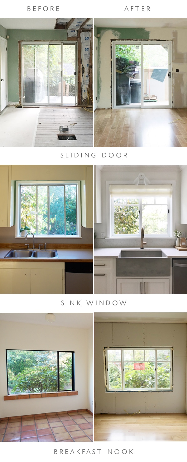
Just a quick breakdown of what we actually purchased. For the sliding door, we went with the Tuscany Style Double Sliding Door in White. The windows are all Ultra Series, which we customized to our needs. It was SO simple. Like, way more simple than I thought it would be considering how much I agonized over most of the decisions in the kitchen.
The windows in our house are a mix of styles – they’ve obviously been replaced at different times throughout the years. We have one original left in the dining room. They’ve informed the design of the rest of the windows in the house and we followed suit here. The sliding door we kept simple, but for the sink and breakfast nook windows, we took my craving for a bit more architectural detail combined with Jason’s request for viewing window space and created a nice look that felt true to the home. And we did it all in like, 15 minutes with the help of the Home Depot dude who quickly rendered it all up and gave us a quote for every piece.

I don’t think I need to preach the benefits of new windows as we head into the colder seasons, but guys, what a game changer. We used way less heat over the winter this past year than in previous years, and there’s also a huge difference in blocking out sound. But more importantly to my visually driven mind, I love the consistency in style and the easy way these babies glide. No more sticky aluminum windows from the 70’s! WINNING.

Here’s an exterior shot to give you an idea of how they look from the outside too! This was before the final trim went in. (Next challenge, painting that brick. Oy.) We could’ve chosen a different exterior color, but (shockingly) Jason actually liked the idea of white and it will no doubt go with whatever we eventually choose to paint as the exterior so, white it was.

And now, finally, a little sneak peek of the whole completed thing. I love the way the windows look softened by the sheer romans from The Shade Store too. If you guys have any questions about the window choosing process (or anything else!) fire away!