This post was created in partnership with Capitol Lighting.
Before I show off the big reveal of this little space, let’s review the plan for a sec. What I wanted to create with this mini bathroom makeover was a bright oasis that felt bigger and way more fresh than the current situation. (Here’s the ‘before’ post to refresh your memory!). I also wanted to bring a few tiny updates to our hallway in the form of new lighting, a pretty runner, and the start of a gallery wall.
The goal of all this was, of course, to tie the spaces together. And, I don’t think there’s any peek that more perfectly sums up what I mean than this one!
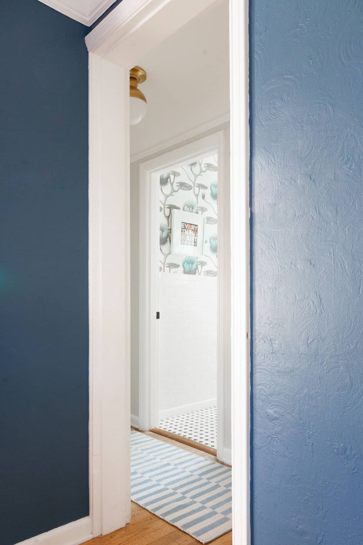
I love how all the blues and patterns are playing together! But maybe one of the most important selections in this process was the first one – it all started with the lighting. We partnered with Capitol Lighting to select both the vanity light and the hallway flush mount at the same time. I love the antique brass finish on these pieces. They are incredibly classic and fit right in with our 1920’s home.
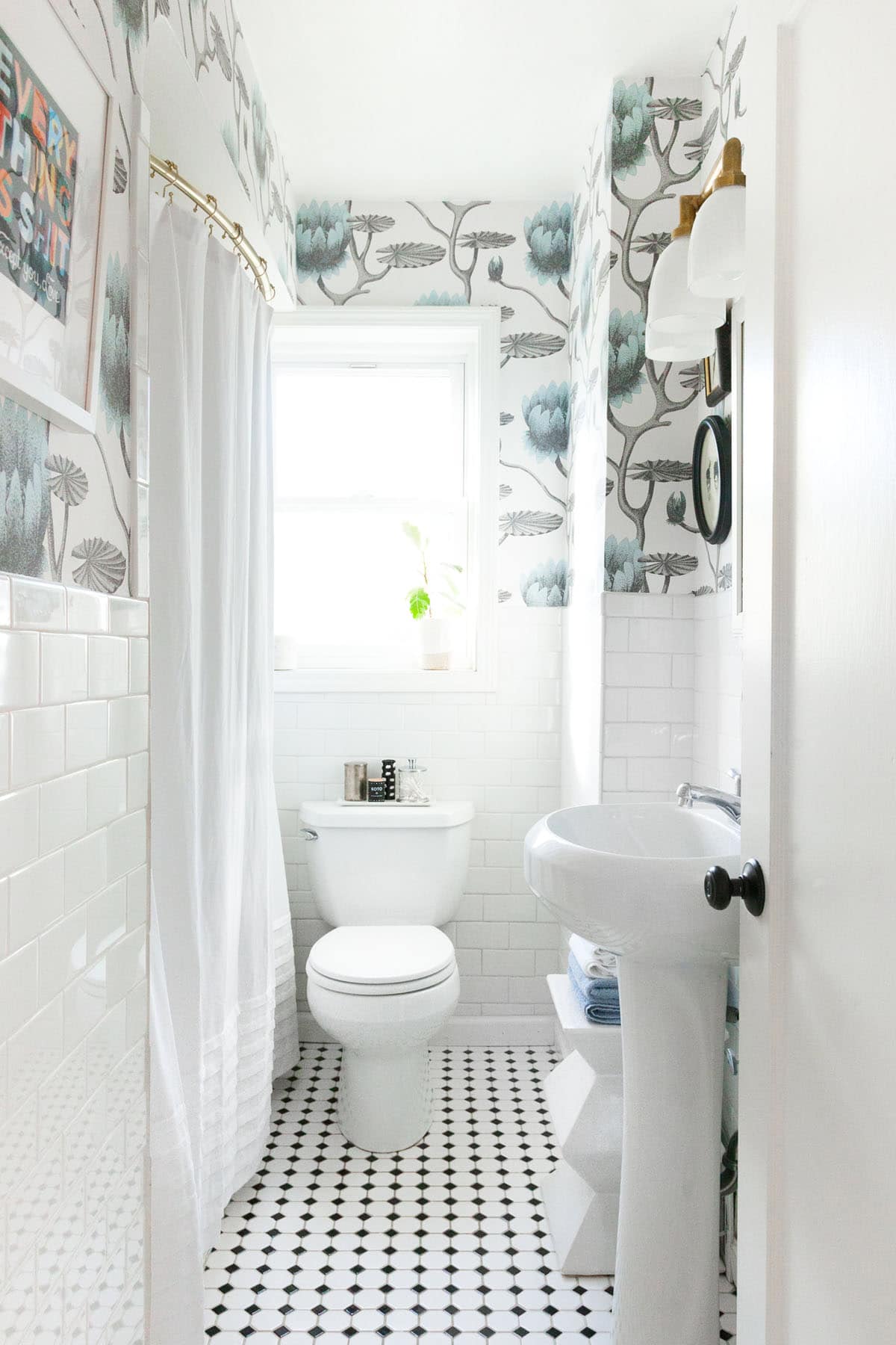
And here’s how it looks today!! Holy REFRESH! The three items that had the biggest impact, I think were the lighting, the wallpaper and (surprisingly) the shower curtain. When our 9-year-old walked into the new space she literally said “our bathroom is bigger!” I wish it were actually bigger, but turning it into a larger space visually is definitely the next best thing.
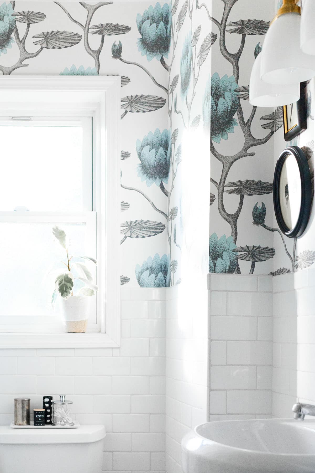
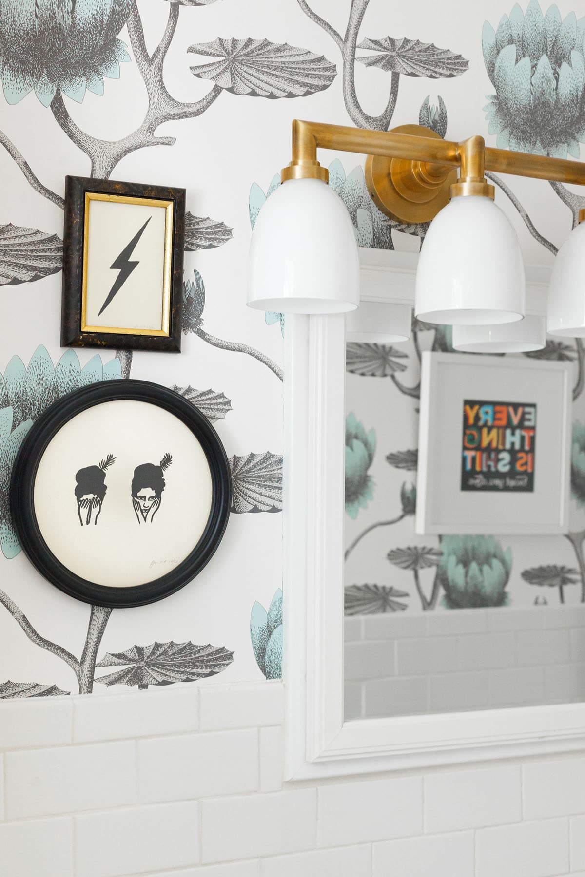
I cannot tell you how happy I am with every decision we made in here. But I do have a confession to make. As it turns out – I didn’t plan this as well as I thought I did. When we took off the previous light – the day the drywaller showed up – we found out that not only was our source off center from the bathroom cupboard and mirror, but the wall was plaster. Which meant that moving it was going to be a whole other thing. So, I did what any designer would do. Made it work.
The lighting is now off-center of the mirror and makes the cabinet inaccessible, but I managed to make it look somewhat natural by adding artwork to the left of the mirror in pieces that perfectly match the whimsy of the space and add to the black and brass touches! If you remember this post, you remember how much I love layering art on wallpaper, so I was pretty stoked about this, actually.
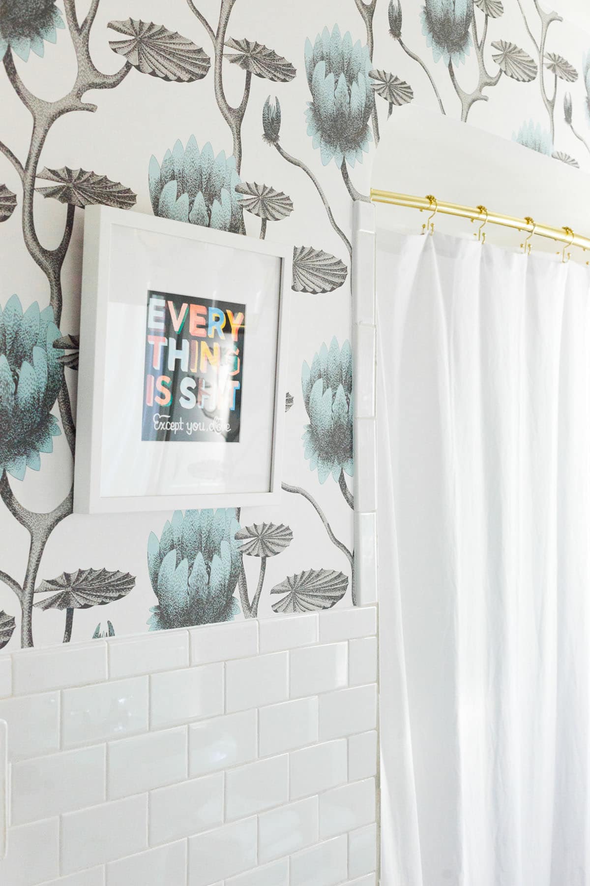
Now … let’s talk details and decision-making! The biggest decision was the wallpaper, and I’m so happy with the way it turned out! The large scale in this small space is kind of magical. The pattern is Cole & Son Summer Lily in Aqua. It’s a pattern I always liked, but honestly had never considered for our house. But the black and white in the design was too perfect with the black and white floors in the bathroom, and I loved the touch of pale blue!
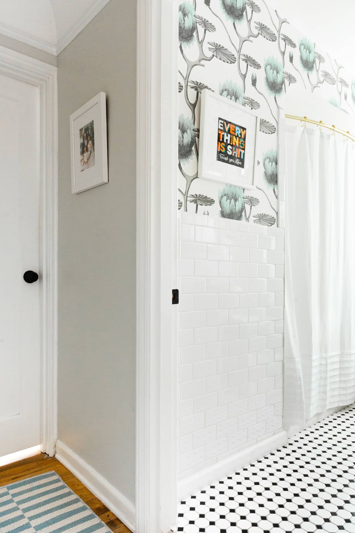
In fact, the blue inspired the tones of the runner in the hallway too. I love the way these patterns all mix together!
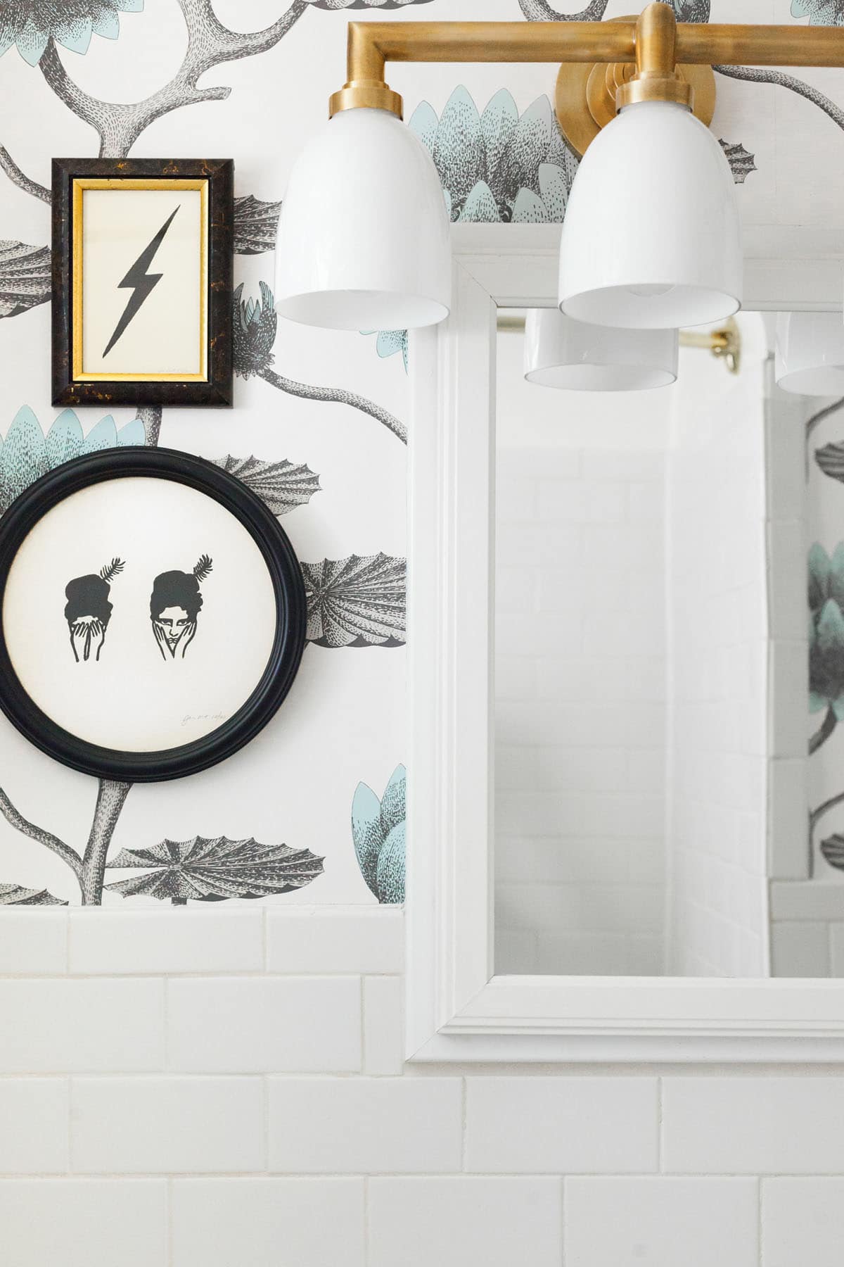
As for finishes – we have antique brass and oil-rubbed bronze throughout our house, so we stuck with that here too. If you haven’t already noticed… I’ve avoided photos of the sink here because we still haven’t swapped it out. Turns out, I’m no plumber, and I didn’t have the exact tools I needed to make this happen on my own, so we are going to hire someone to do this in the next week or so. This is the faucet we ordered, so I sure hope it works!
My favorite part about the artwork is that it helps draw in the black and brass tones even more, but in a different way!
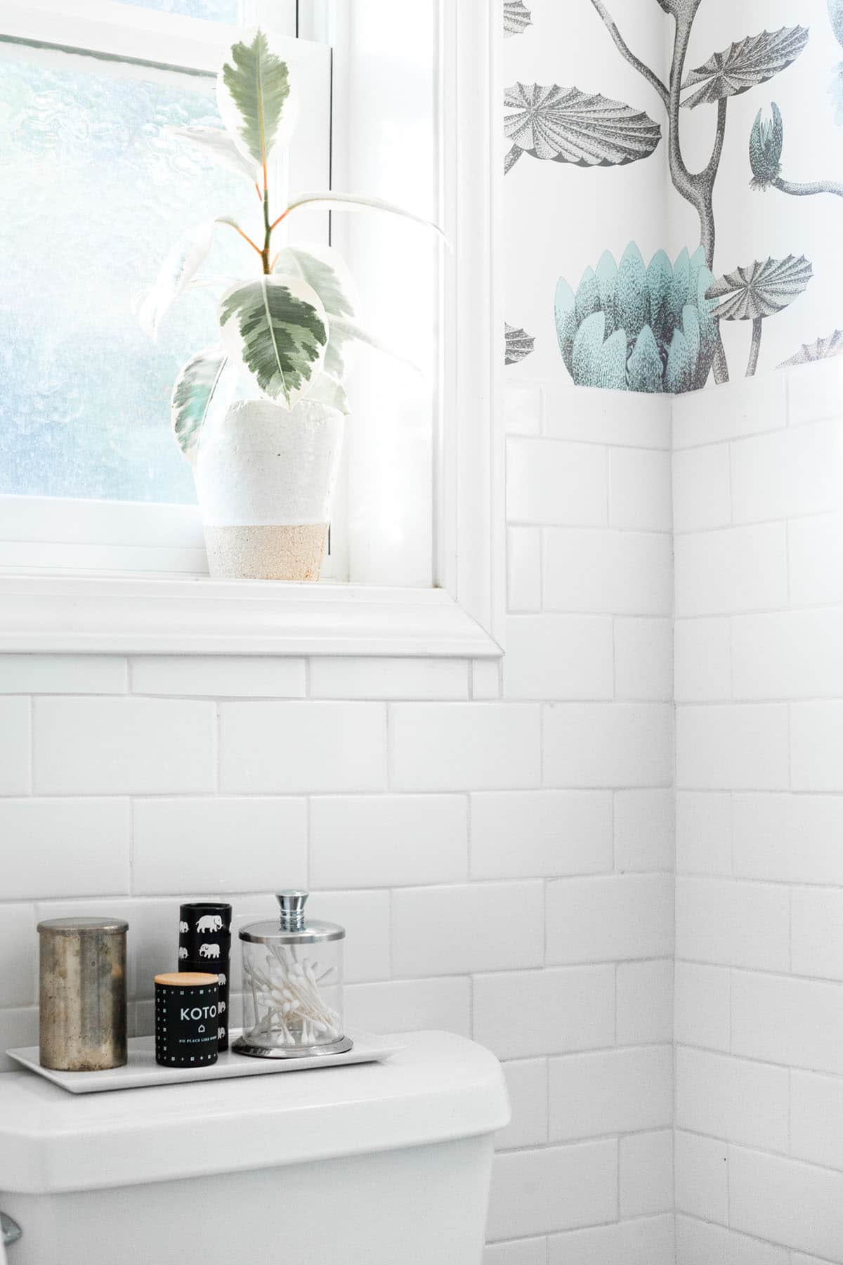
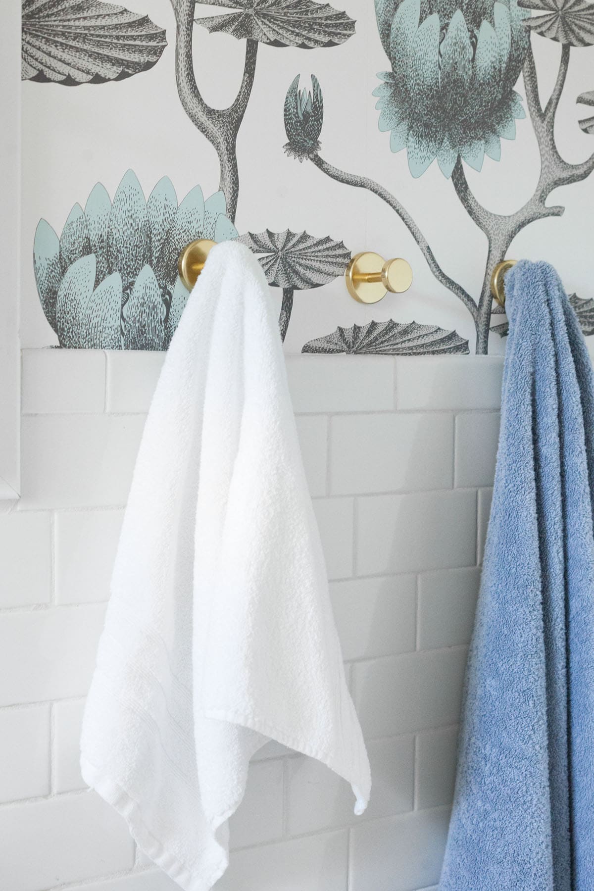
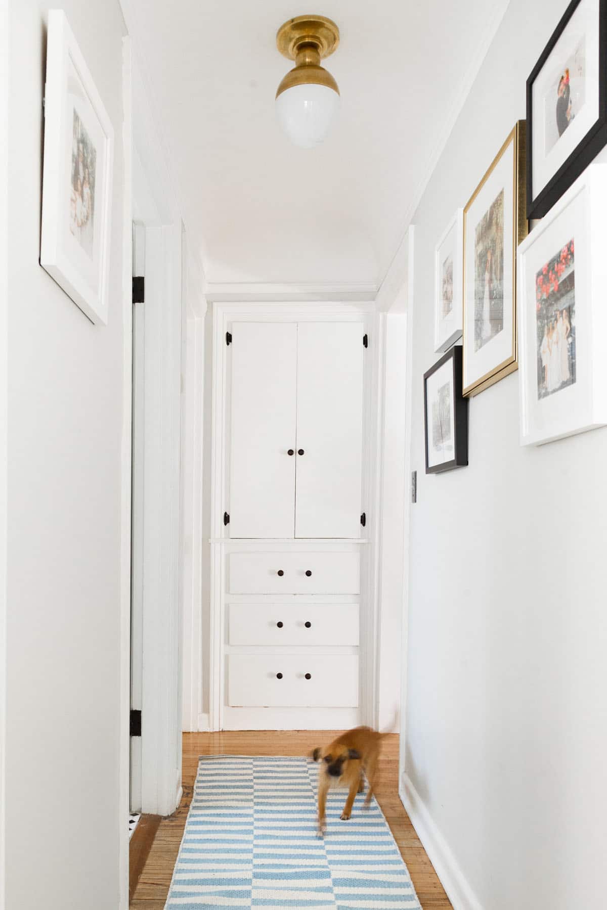
You can see how this theme carries over, even into the tiny hallway! Brass in the lighting, antique bronze in the cabinet hardware, and a little bit of blue to tie it all together. Here’s how you can get the look!

- visual comfort brass vanity light | 2. cole & son summer lily wallpaper | 3. white shower curtain | 4. koto candle | 5. white tray | 6. blue & white stripe runner | 7. visual comfort brass flush mount | 8. jennifer ament lightning bolt print
Despite the hiccups, I have to say I’m pretty thrilled with how it all turned out, and can’t wait to really finish this space off! What do you think of it so far?