Let’s face it: paint colors are one of the toughest decisions to make in a home! And, judging by how many times the spring guide to our favorite paint colors was pinned, I think you guys are in agreement. So, I thought we’d one-up ourselves with a guide to our favorite Fall paint colors with even more recommendations and details on what we like about them, how to pick em, and what colors they pair with well.
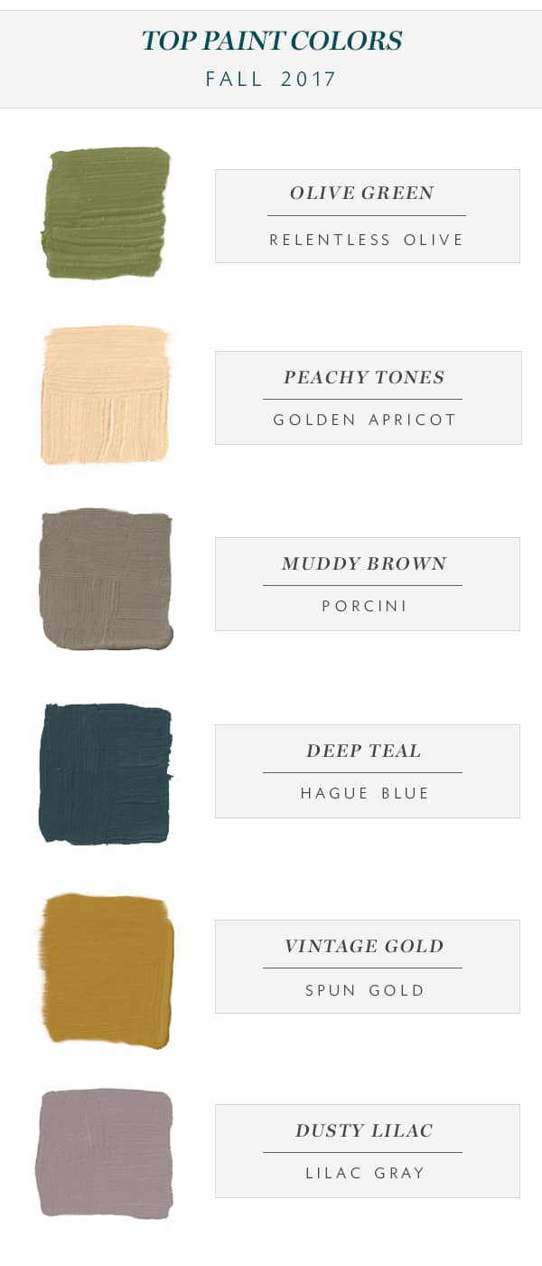
I spent hours scouring my color trends for 2017 and 2018, and consulting my many paint fan decks to come up with this list. So, before you dive in, a few things to note.
- If you love a color we’ve picked, but it’s too dark (or too light!) for you, try looking the shades above and below it on the spectrum and you’re bound to find your perfect hue.
- Remember that when it comes to paint colors every room looks different. Always, always test your paint colors before doing an entire room. If your room is north or east facing, it’s going to be cooler. If your room is south or west facing colors will appear warmer. And obviously the amount of light your room gets will have an impact too. Unless it’s a color I’ve used before, I usually test around 3-5 colors before deciding on the final winner.
- If a color is too adventurous for you to use on your walls, think of other ways you could incorporate it through accessories!
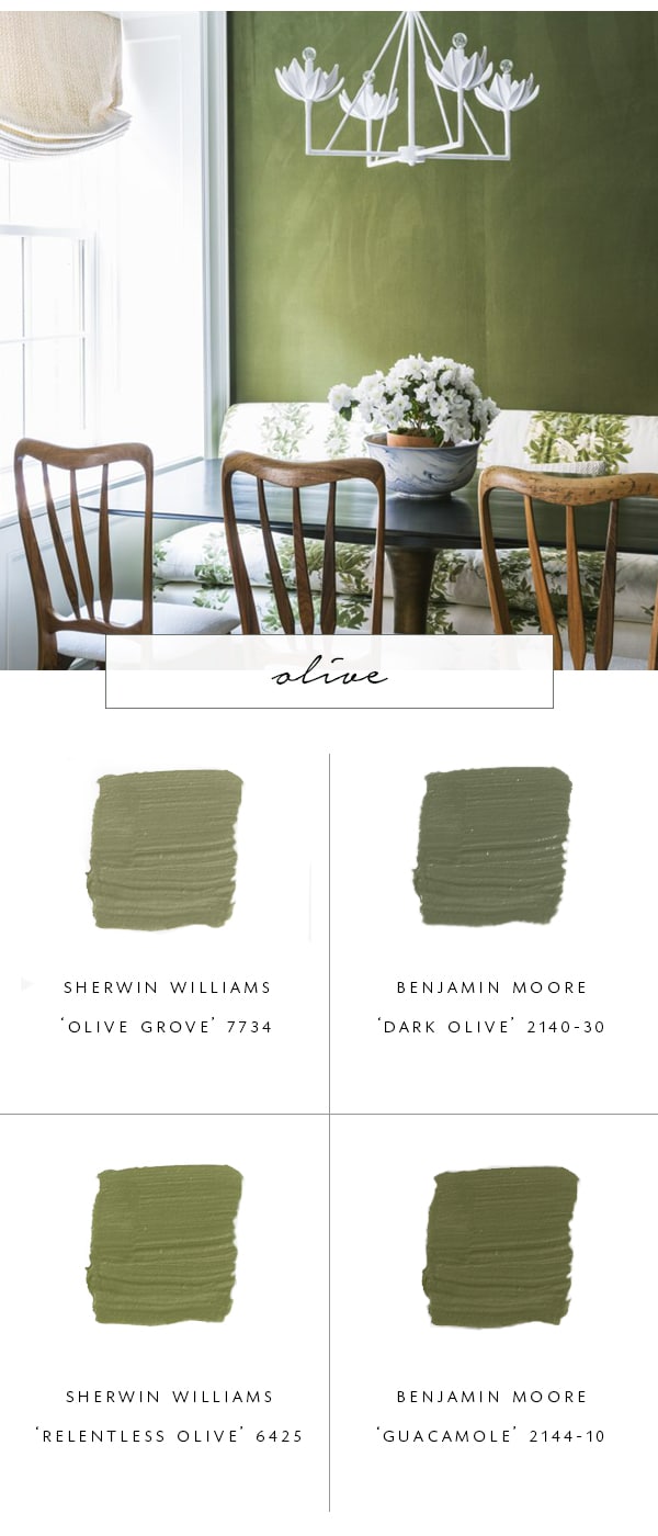
olive grove | dark olive | relentless olive | guacamole
Probably my favorite on the list, olive green is a color that I have long adored. For more long-term commitment, I prefer my olive with more of a grey to it, like the top two colors. In a room with lots of natural light, that’s all you need! If your room is darker though, or you’re going for drama, a more saturated olive is going to satisfy your needs.
Color Notes: One shade darker to Sherwin Williams ‘Relentless’ is called ‘Basque Green’ and it’s also gorgeous. This color is most popular in studies and kitchens!
Pair it With: The it color of the moment – Millennial Pink, a bold red, putty grays and pale blues.
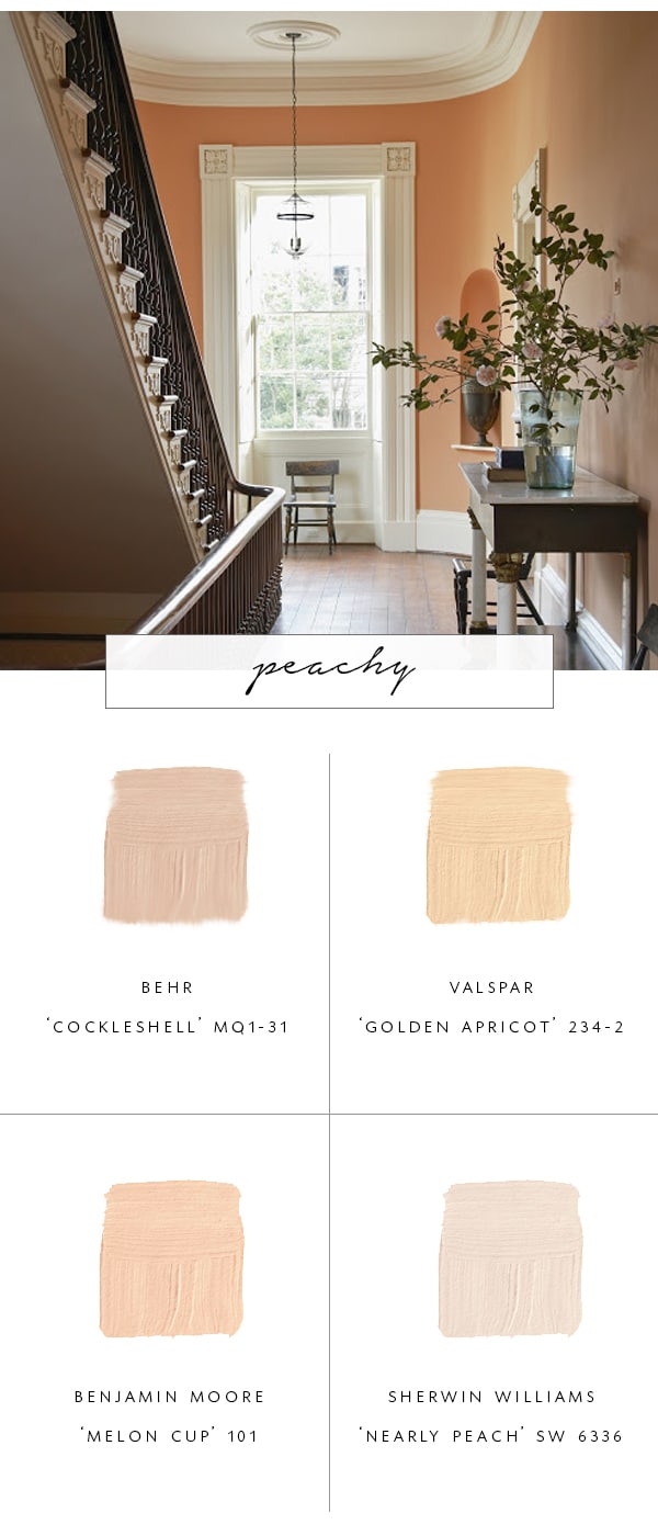
cockleshell | golden apricot | melon cup | nearly peach
When I moved in with my husband, there was one room in the whole house whose paint color didn’t offend me, and it’s this one. A peachy apricot is always a winner in my book! Not to be confused with the current millennial pinks and mauves out there, these colors contain a bit more orange to them that lend to a natural happy glow. You can play it safe with a super light tint, or really go for with a bit more intensity in smaller rooms.
Color Notes: Peach tones are extremely flattering to most skin tones, making it perfect for bathrooms and entryways – places you and your guests want to look good!
Pair it With: Crisp whites and dark pure grays, fresh greens and teals.
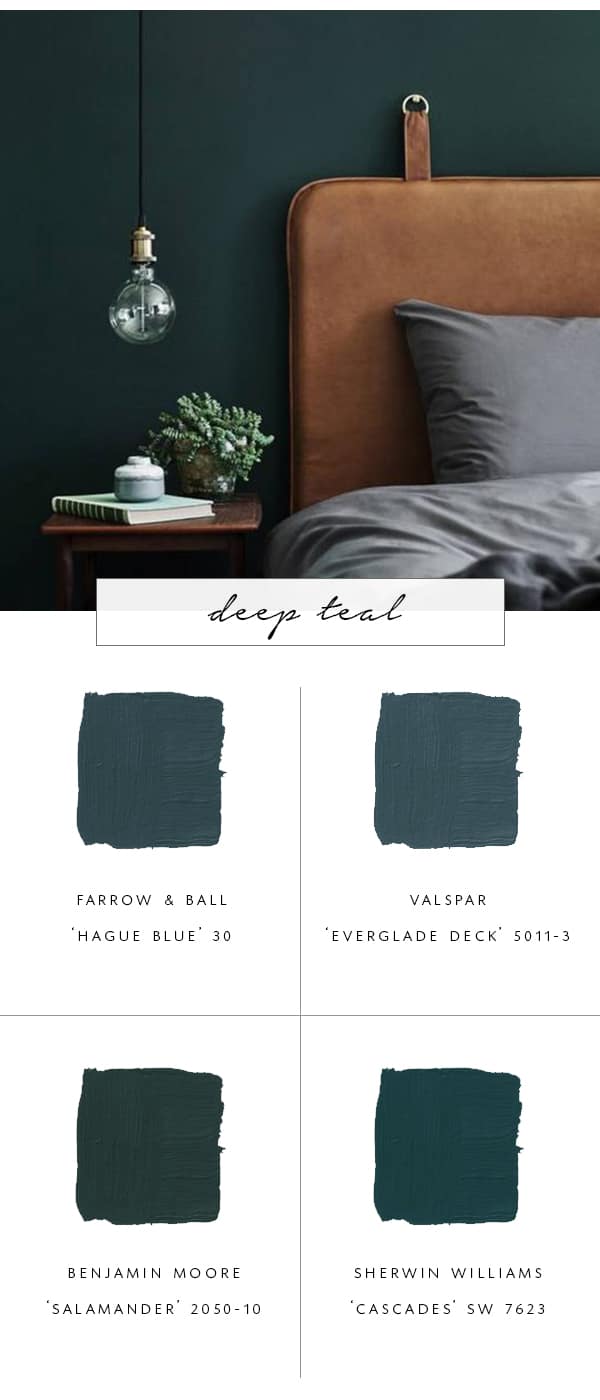
hague blue | everglade deck | salamander | cascades
This deep teal-green hue should be no surprise as an addition to our list. Probably one of most popular colors this year, the key is to go with a green that has a hint of blue or vice versa. Both ‘Hague Blue’ and ‘Salamander’ can look almost black or gray in some lights, while Cascades and Everglade Deck pack a bit more punch.
Color Notes: For rooms with little light, go for a more saturated color or you’ll end up with walls that look black!
Pair it With: Warm wood and leathers, muted pinks, bold blues, ochre.
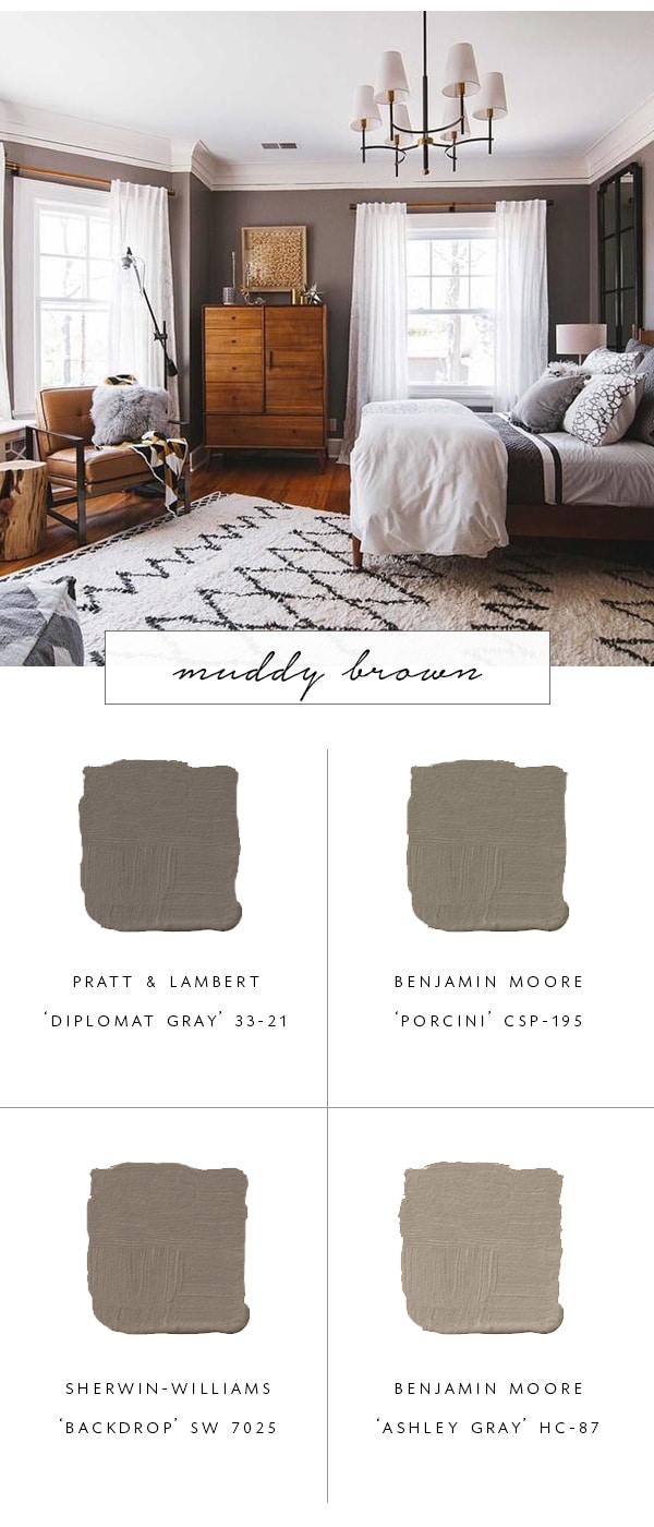
diplomat gray | porcini | backdrop | ashley gray
Browns are back, baby! For those withe a more traditional style, richer chocolate tones might be for you, but for me, I prefer a nice muddy brown that skews more gray (it’s a reoccurring theme in my colors, to be honest!). I especially love this shade in the bedroom where it creates a cozy sense of calm, but it also looks fantastic in the kitchen to bring out marble veining.
Color Notes: To ensure you don’t end up with a taupey purple hue, go for browns that have a bit of green or yellow to them.
Pair it With: This neutral looks good with just about anything!
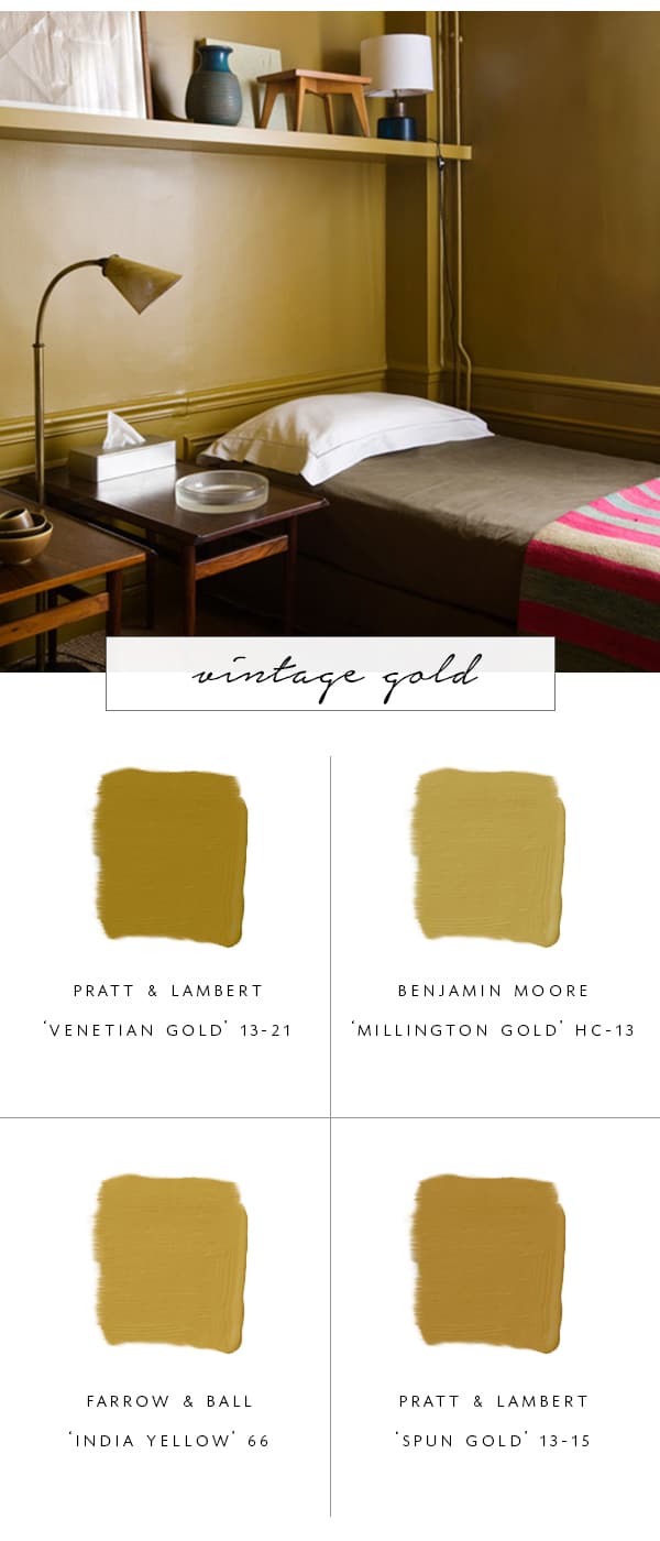
venetian gold | millington gold | india yellow | spun gold
You might call it mustard or ochre, but this color reminds me of vintage gold jewelry and hardware! I have a feeling this one might be the most challenging on the list for many of us who are a bit too shy to incorporate such bold beauty. I’d be most likely to try this in a mud room or smaller area of the house first before going for anything larger, but when I see rooms that do it right, it’s absolutely stunning.
Color Notes: I like this color best with a bit of green in it, like the Venetian Gold. If you’re wanting to try this color but need to tone it down a bit, you can always ask a color specialist to mix a bit more grey into it to muddy it up.
Pair it With: Lighter greys, rich dark wood, and jewel tones.
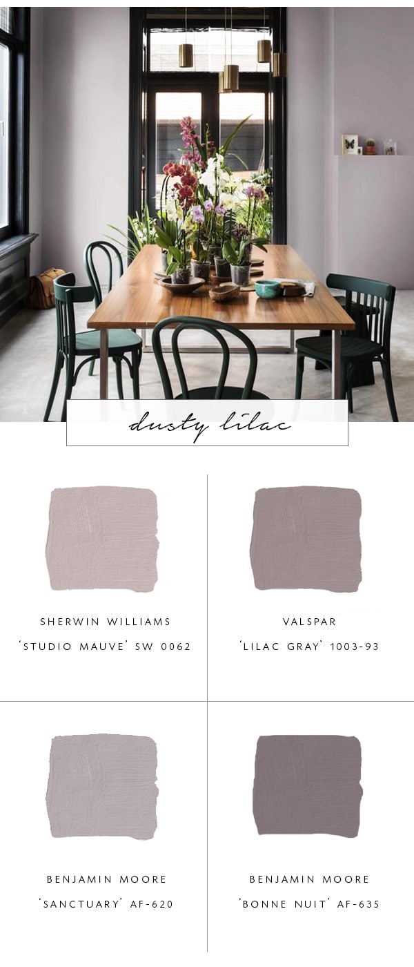
studio mauve | lilac gray | sanctuary | bonne nuit
Distinguishing itself from its taupe sisters with a bit more purple, dusty lilacs have been hanging around in various versions for a while, and they seem to be getting more and more prominent. Purple is not normally a color I gravitate to, but here it feels more digestible and in the right light is downright gorgeous!
Color Notes: If you’re going for this cooler shade of purple, make sure you’re shopping in the ‘gray’ category and not brown or you’ll end up with raisin and plum tones.
Pair it With: Dark charcoal, teal green, orange.
You’ll notice that actually these colors all go quite well together, which was no mistake. Pick a few and pair them up! Have any of you used similar tones in your own home? I’d love to know which ones you’ve found work best for you!