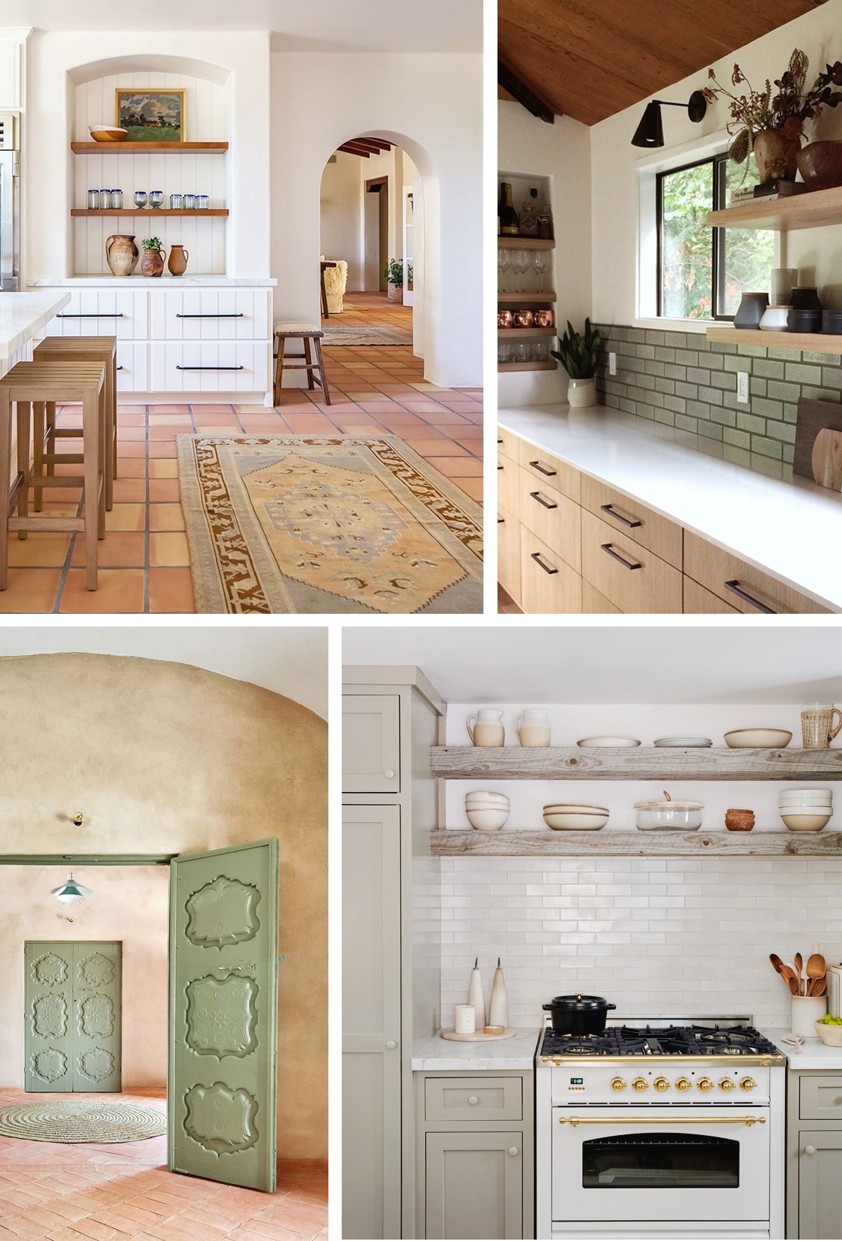
If you needed further proof that everything takes longer to happen this year, let our cellar kitchen remodel provide yet another example of a project that seemed to take forever to get off the ground. I wrote about our initial direction back in August, and here we are in November, and I’ve yet to give you all an update! Distractions abound, and motivation can be hard to come by, but here we are and I’ve got a lot to share, so let’s get to it!

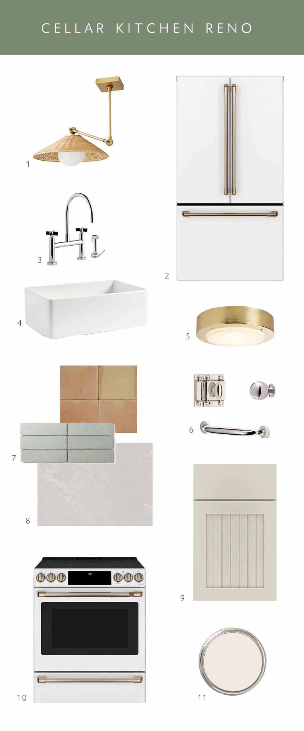
First off, there are quite a few changes from the original plan, so I pulled together a new moodboard to better convey a bit of the palette, and where we’re at. Here’s what’s new:
- While I really wanted to use antique cabinets to create an ‘old world’ vibe, it became clear after a month or so of searching that that wasn’t going to happen. Nothing popped up locally, and every piece I found elsewhere was so pricey – on top of shipping – that I just couldn’t justify it. Plan B? I reached out to Master Brand Cabinets who we worked with for our main kitchen to see if they’d be interested in partnering! We had such a great experience with them the first time around, so I figured… why mess with a good thing? They said yes, and I’m thrilled. More details on that in a sec.
- You all voted for us to keep the saltillo tile floors as is. Some of you actually begged. In my previous post I mentioned that we were planning on painting them, BUT. We’ve changed our mind! Some of that had to do with budget (there is a very lengthy process to prepping and painting tile!), and some had to do with aesthetic, but you all are getting your wish. The terra cotta tile floors are staying as is.
Those two decisions were the biggest game changers, so now you’ll see how they affected the plan! Here’s a quick look at alllll the decisions I’ve made since August.

1. padma basket light | 2. café appliances refrigerator | 3. rejuvenation ‘west slope’ kitchen faucet | 4. fireclay sink | 5. rejuvenation ‘adriatic’ flush mount | 6. cabinet hardware in polished nickel | 7. fireclay tile ‘san gabriel’ | 8. caesarstone cloudburst concrete | 9. diamond cabinets in ‘liberty’ | 10. café electric range | 11. sherwin-williams ‘marshmallow’ paint
As you can see from the moodboard above, I’m sticking with my Mediterranean Cottage vibe but with a bit lighter palette. Once we started making decisions about the cabinet and appliance colors, even my white-hating husband was like… I think we should go lighter! And I agreed. The kitchen has one small window, and a window in the front door and the directional light is pretty minimal.
Once we decided that we would be doing new cabinetry, I landed on the Diamond Cabinets line (from Master Brand) because I loved the ‘Liberty’ style. That quickly narrowed down the color options for us. I was immediately drawn to ‘Limestone’ as the perfect color to balance out the warm tones in the floor, and bring in just the smallest hint of a green undertone. We will also be using shelves in a natural wood tone, which I love!
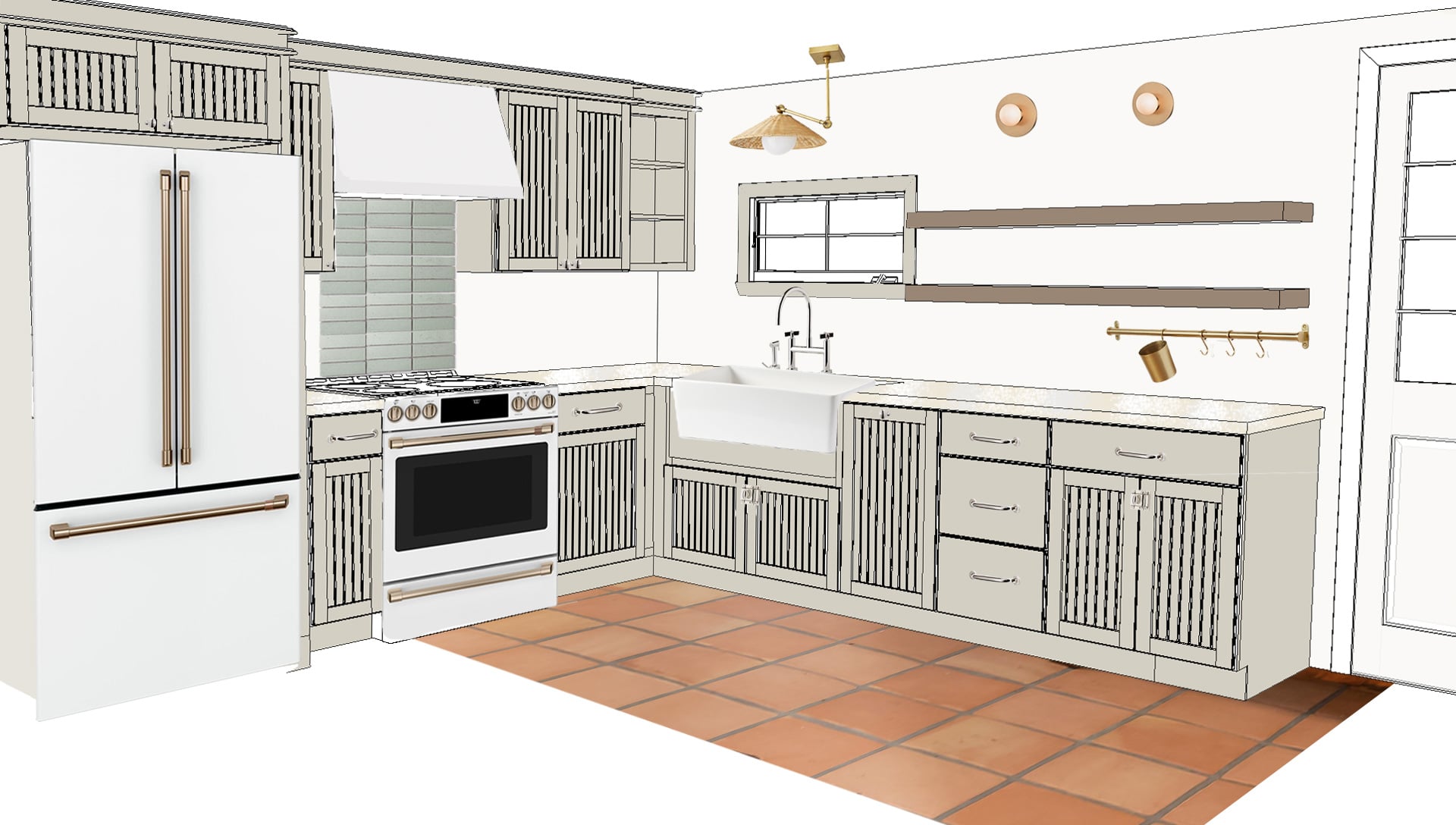
Here’s as little rendering of how it’s looking pulled all together…

Once we had the cabinets chosen, everything else started falling into place, so let me highlight some of the partnerships we’ve created for this project! As items start to arrive and get installed, I’ll be giving each of them a more in-depth highlight on here, but here’s a quick roundup.
Once we chose a mid-tone gray for the cabinets, I quickly realized that the stainless steel appliances that we already had were going to make things a bit muddy. So, I’m really thrilled that we get to partner with Café Appliances to give this space a visual lift! Going with white should really help keep things lighter in here. We chose a counter depth fridge (hallelujah!), electric range, and matching hood. No dishwasher here as it truly is a secondary kitchen, and they take up so much space! Let’s hope that if we ever have renters down the road, they’ll forgive us.
We will be topping the cabinets with some gorgeous stone from Caesarstone. Specifically their Cloudburst Concrete which has the most dreamy texture. Visually it reminds me of worn limestone, and I love that for this space so much! I also love that it’s very tonal with creamy variations.
Another major sponsor will be Rejuvenation! I’m extra excited to be working with this PNW company. Their quality is always exceptional! They are providing all the beautiful hardware (of course!) that I selected in a polished nickel finish. I love nickel because it’s a bit warmer than chrome, and I think it pairs so nicely with brass. You’ll notice that we’re mixing our metals a bit in here, and I’m excited about it! They are also providing the fireclay sink, faucet, and overhead lighting. I can’t wait to get some of these in my hot little hands so I can show you how gorgeous they are.
Fireclay Tile is providing the beautiful backsplash tile. After so much deliberation I chose the ‘San Gabriel’ color in their brick line. This imperfect style really suits that old world look that we’re going for, while also bringing in that beautiful sage green that this kitchen needs! I’m hoping to bring more of this accent color in other places as well.
Last but not least (but always the finishing touch!), paint! No big surprise that picking out a white for the walls was an entire process in itself! Especially since Sherwin-Williams has so many good ones! I’m 99.9% sure that we are going with ‘Marshmallow‘ for the walls, and I’m still debating the trim. (This definitely deserves an entire post, so stay tuned for that!)
Questions? Comments? Leave ’em down below! Though it will be slow going, we hope for this project to be finished juuuuuust before Christmas, so keep your fingers crossed that we’ll be sharing the final reveal in January!! With many updates along the way.