Well, friends… here we go! Our basement remodel will start September 1st, and I’m busy making allllll the plans. The biggest piece of which is our kitchen remodel! I’m so excited about transforming this space into our dream cellar/garden kitchen. While working on this design, we are keeping in mind that we may want to rent this space out eventually. For now, however, we are planning on using it for harvesting food from the garden, and drying herbs and flowers. A space for extra kitchen projects that will now have their own home. But first… let’s start with what it looks like now!
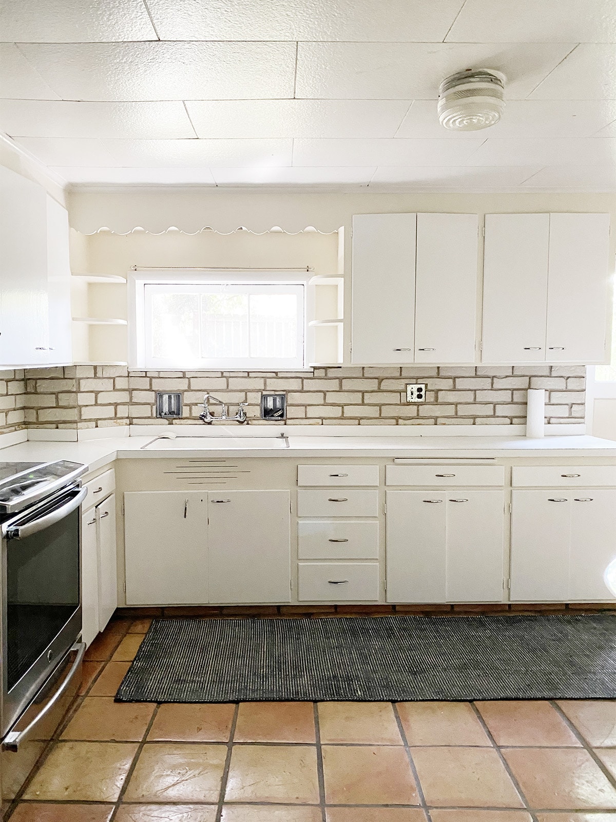
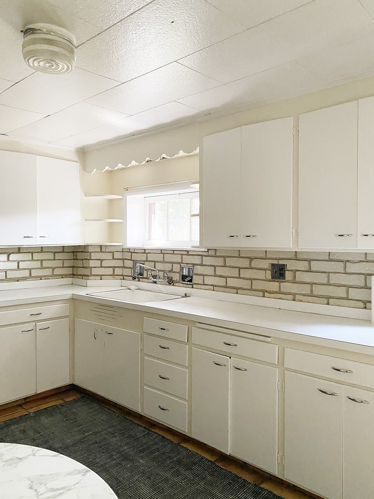
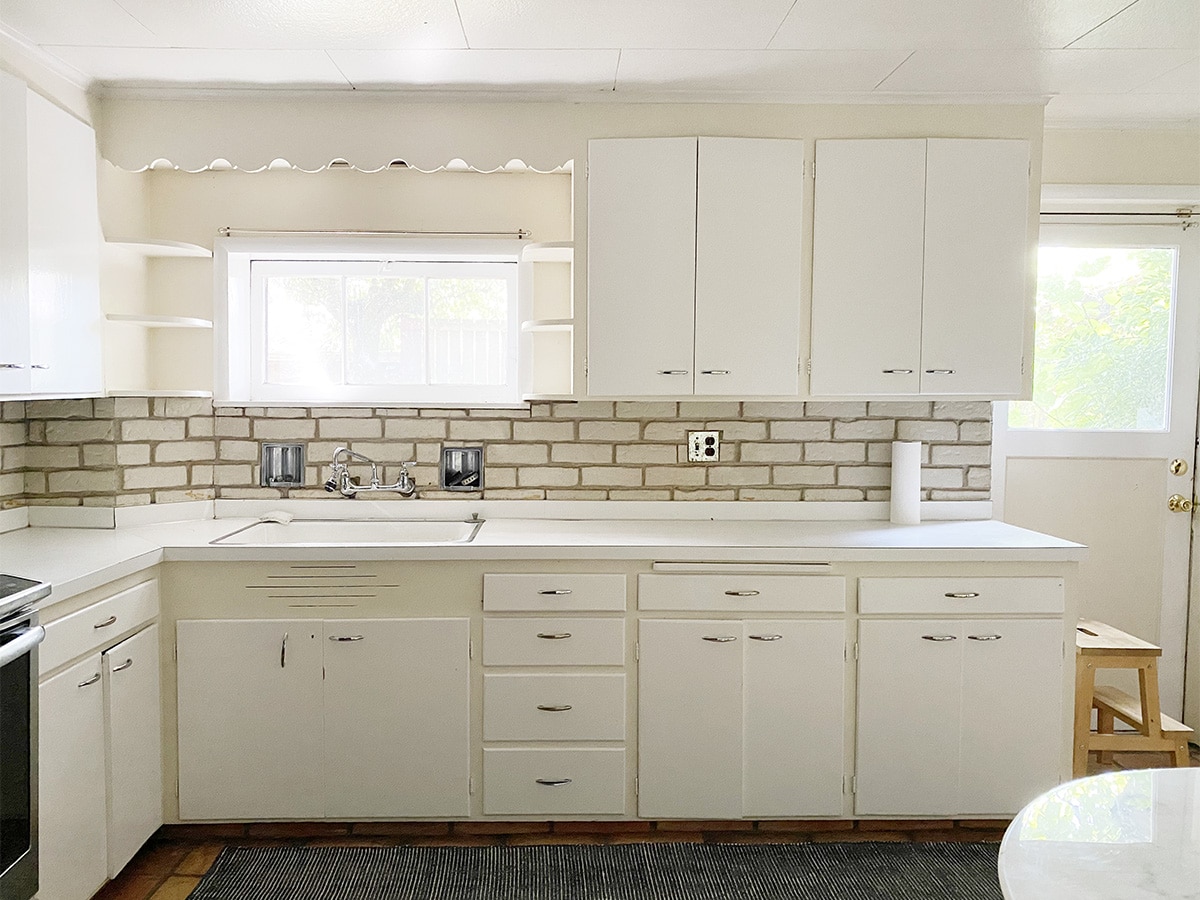
As basements go… this one certainly isn’t the worst. The ceilings are low, but the light is decent (this is the best light it gets… late afternoon sunshine!). As you can tell, the kitchen has seen better days. The electrical is old, the plumbing is old in need of a Water line repair, the cabinets are falling apart, and a lot of the remodeling that happened down here over the years has been shoddy work, to say the least. So we’re tearing it all out.
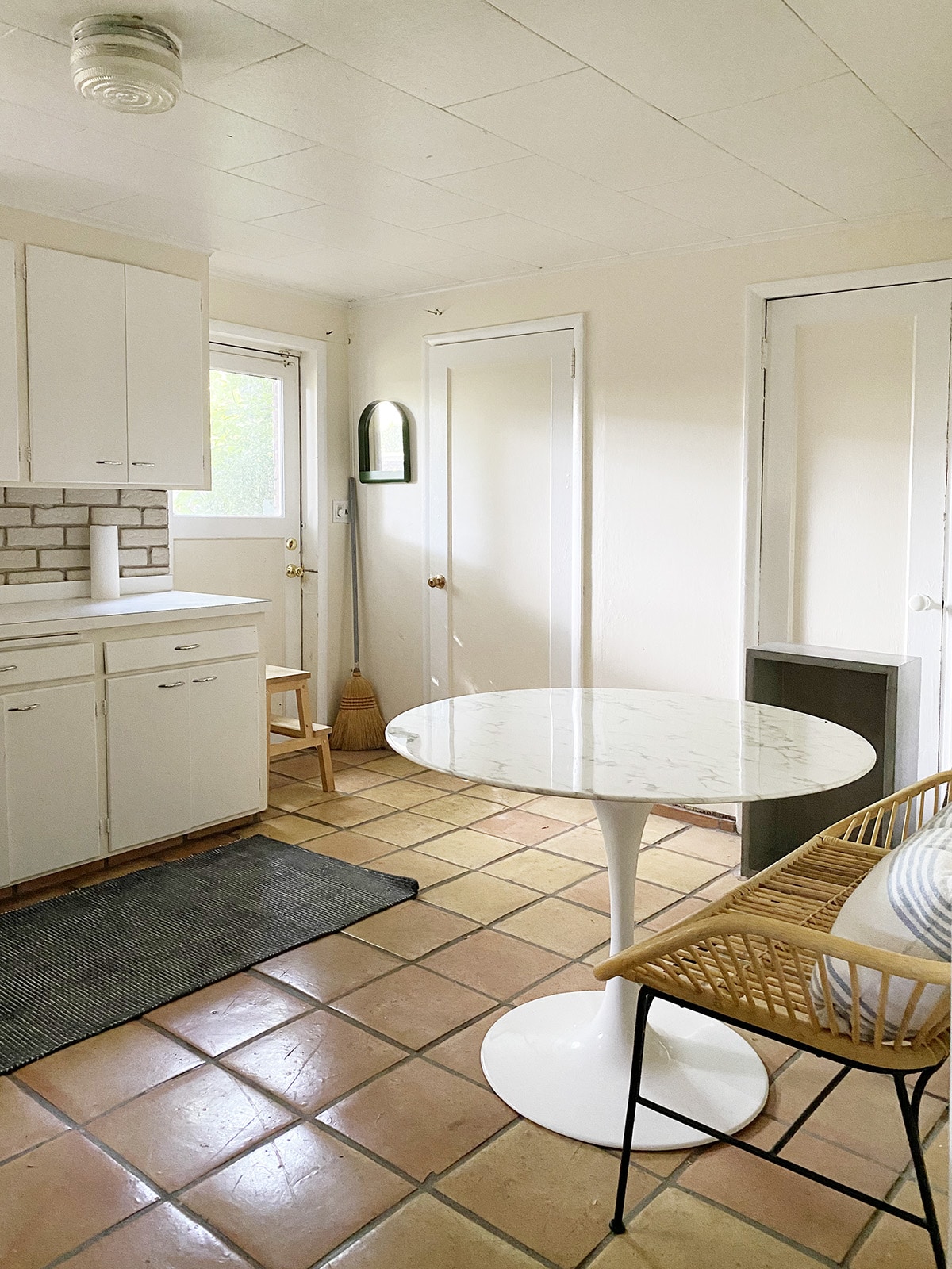
Let’s get the lay of the land, shall we?
The back door that you see here leads to the garden. The door immediately to the right of it enters into our laundry room and the stairs to go up to the main floor. A note on the floors: After going round and round about tearing them out and replacing them or keeping them, we’ve decided that we’re keeping them. They’re in decent shape, we don’t actually mind the tile (keeps things very cool down there in the summer!) and we want to create as little waste as possible.
To the left of the sink you can see that there is an awkward bump-out in the wall… that’s where our major plumbing (and shut-off valve) is in the house. This will be one of the things we’ll need to work around and make more accessible. For the most part, though, we are keeping this layout the same for the sake of budget.
Oh, and that hideous drop ceiling is absolutely coming out and getting drywall. YAY.
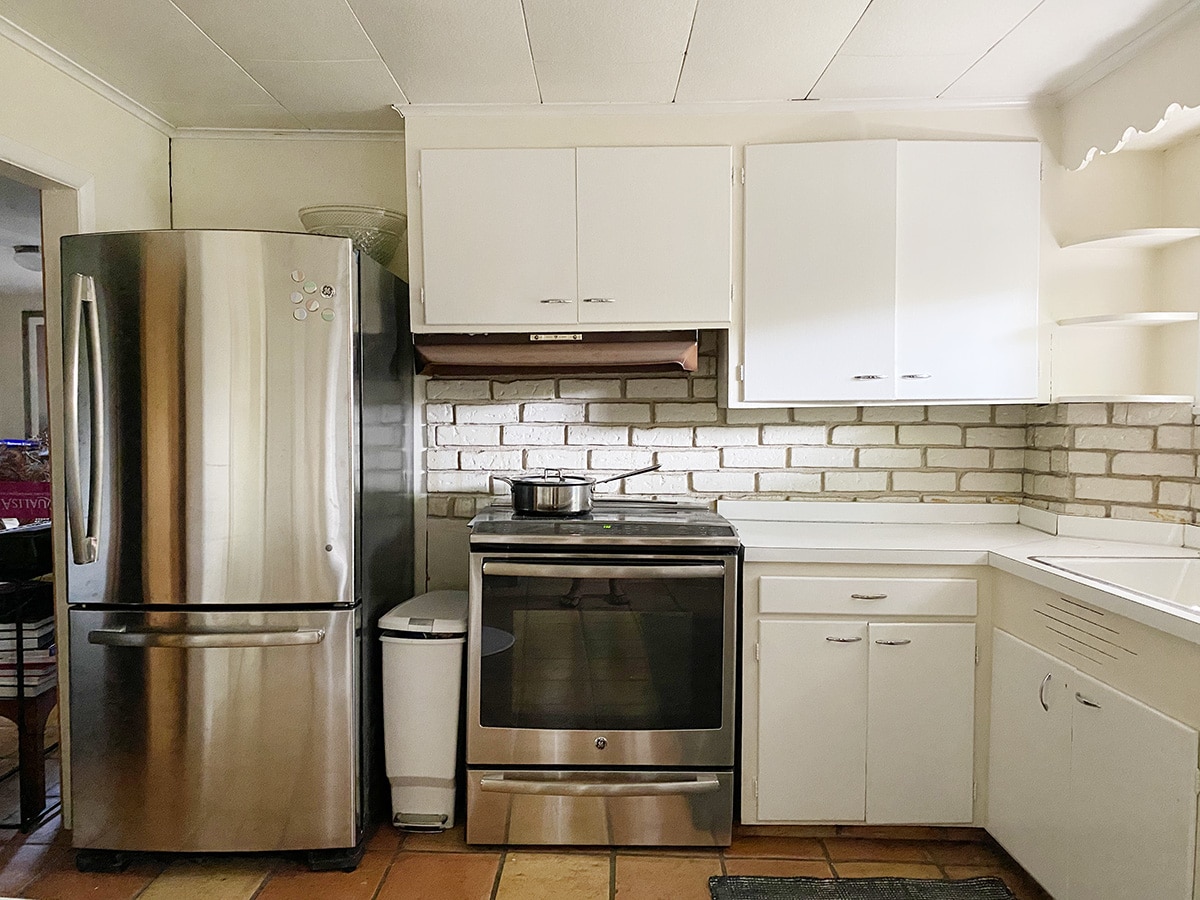
This area is where things get awkward. I hate having appliances so close together (feels so heavy!) and the fridge feels way too large in this space. Although we love having extra food storage down here, I don’t think it needs to be this massive. Ideally, I’ll be replacing this refrigerator with something counter-depth and more appropriate to the room. The range will probably stay unless we can get one sponsored, for the sake of budget. These are both GE appliances, only 5 years old or so, and they work perfectly well, so it’s hard to justify getting rid of either of them, but the perfectionist in me feels like it would make a big difference!
Ready to see the plans for our update?
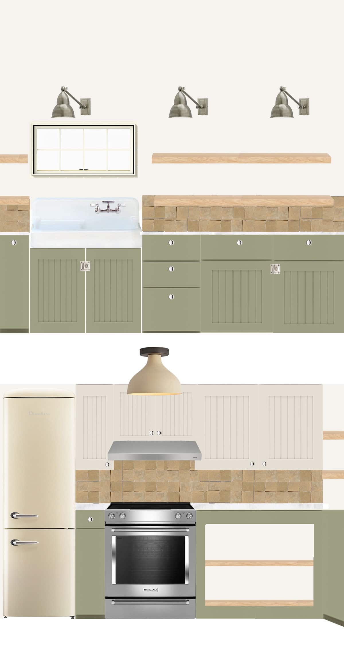 Here are a few decisions I’ve already made:
- We’ll be ditching the brass hardware style that we have on the main floor for a polished nickel. I love that it feels a little lighter and gives the space its own look!
- We’ll definitely replace the upper cabinets by the sink with floating shelves to open the space up more (style TBD!). I can’t wait to put all our jars of canned goods, dried flowers, etc up there!
- The tile backsplash is a zellige that I found at our local re-use store, so we’re committed to using that in here.
- I’d love to stay away from white or cream on the lower cabinets and go with color! Right now I’m experimenting with an earthy green, but am also considering blues which may pair better with the backsplash (not so muddy!). I’d love feedback on what color you’d like to see or have been inspired by lately!
- I’m 99% sure we will be painting the saltillo tile floors with a creamy white (more on that below!)
- We are also trying to use a lot of salvage material in here to not only save on cost but be conscious of waste! I’ve had a lot of fun visiting the reuse stores around here and hunting for treasures. Hoping to find a cool element to use as an island/workstation!
- We will be replacing the current door to the garden with something a bit more sturdy, but hoping to still have a window to let in as much light as possible! Maybe paint it the same color as the cabinets?
Here are a few things we’re still working on:
- Layout. For the most part, I want to stick with how things are here, but if there is a way to separate the fridge from the range, I would also love to consider that! I’m working on some ideas for how it could happen.
- Paint colors are all TBD at this point. Because it’s a basement, I don’t want anything to feel to heavy or dark! Luckily the kitchen gets decent light, but during the winter it’s nowhere near this bright. Again, not totally sold on the green for the cabinets… but it was a good starting point!
- Details! Obviously so many little elements to think about in here that I haven’t landed on yet, since we’ve just started planning. I can’t wait to see how we can create special moments, even on a budget, in this space.
About those floors… So, in our little poll on Instagram a shocking 67% of you said we should keep the floors as is. (!!!). Ok guys, here’s the deal. I know that terracotta and brick floors are trending right now, but I’m worried about how we’re going to feel about them in another 3-5 years. While I love the idea of a beautiful worn stone floor in here, these tiles are not that. They haven’t been well maintained (so dirty!), so we’d have to strip them, clean them and reseal them. Is it worth it? I’m not totally convinced.
From an aesthetic standpoint, I really don’t mind them, but they’ve always felt a bit out of place in our 1920’s Craftsman home. I picture them more as a Mediterranean Farmhouse element than a Pacific Northwest Farmhouse element. (Have I mentioned that these are the floors throughout the entire basement? Not just the kitchen!) My hope is that painting the floors white is going to help reflect more light back into all of the rooms.
Now here’s a closer look at some of the elements above!

1. chambers cream refrigerator | 2. clay flush mount | 3. antiqued nickel sconce | 4. floating wood shelf | 5. zellige tile | 6. carrera marble countertops (reused!) | 7. cabinet | 8. vintage style drainboard sink | 9. painted saltillo tile | 10. polished nickel knobs | 11. polished nickel cabinet latch
When I start planning the design for a space, I always start big, then chip away at things based on reality. This space is no different! I’m still exploring all the possibilities (Can we move a wall a little bit? Should we really buy a ridiculously expensive refrigerator?) and then check myself based on how important it is to the overall aesthetic, the budget, and the practicality. So what you see here is certainly not the exact elements we’ll be using – just inspiration.
As I mentioned above, we’ll be aiming for vintage pieces vs new. We’ll probably have our contractor build the floating shelves from salvage wood, try and find a vintage sink, and maybe even re-use some of the hardware we have in the kitchen now!
While I have so many more ideas and inspiration for the space, I’m leaving you with this basic start today, and you know I’ll be documenting and polling you all more as we continue in the process. Can’t wait to hear your feedback!