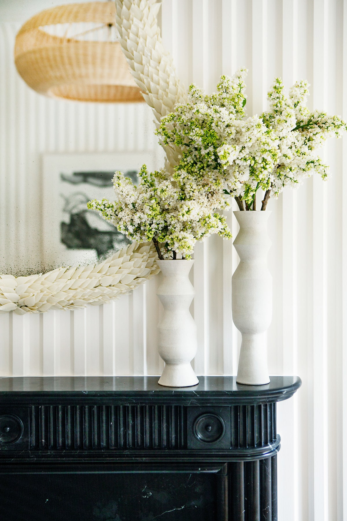
I was already in love the second I saw this room, designed by Sarah Bartholomew, for the Kips Bay Showhouse this year. But, I had to do a double take when I saw the ‘stripes’ on the walls… was that… plaster!? What originally came off as some an extremely well done tromp l’oeil effect was, in fact, the most beautiful fluted plaster wall treatment I have ever seen. 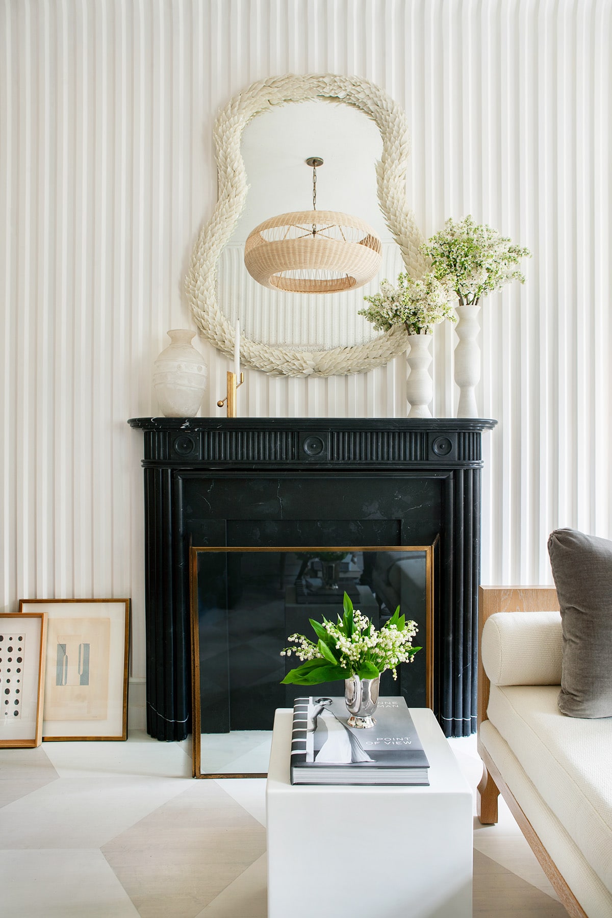
The effect is that of a tent, or a dreamy white cocoon. Either way, it envelops the space so dramatically, yet softly, that it’s hard to define. Certainly this interior would have been worth mentioning before the walls, but with it? Perfection. 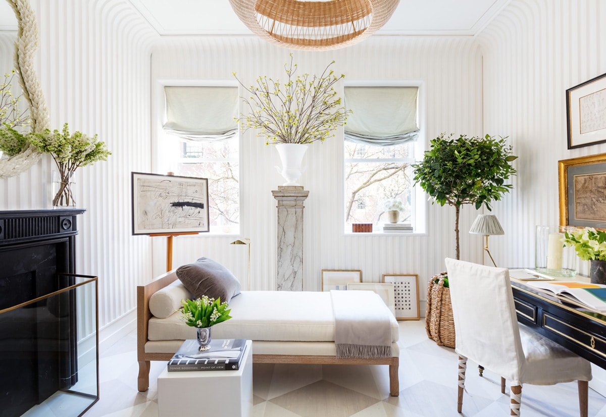
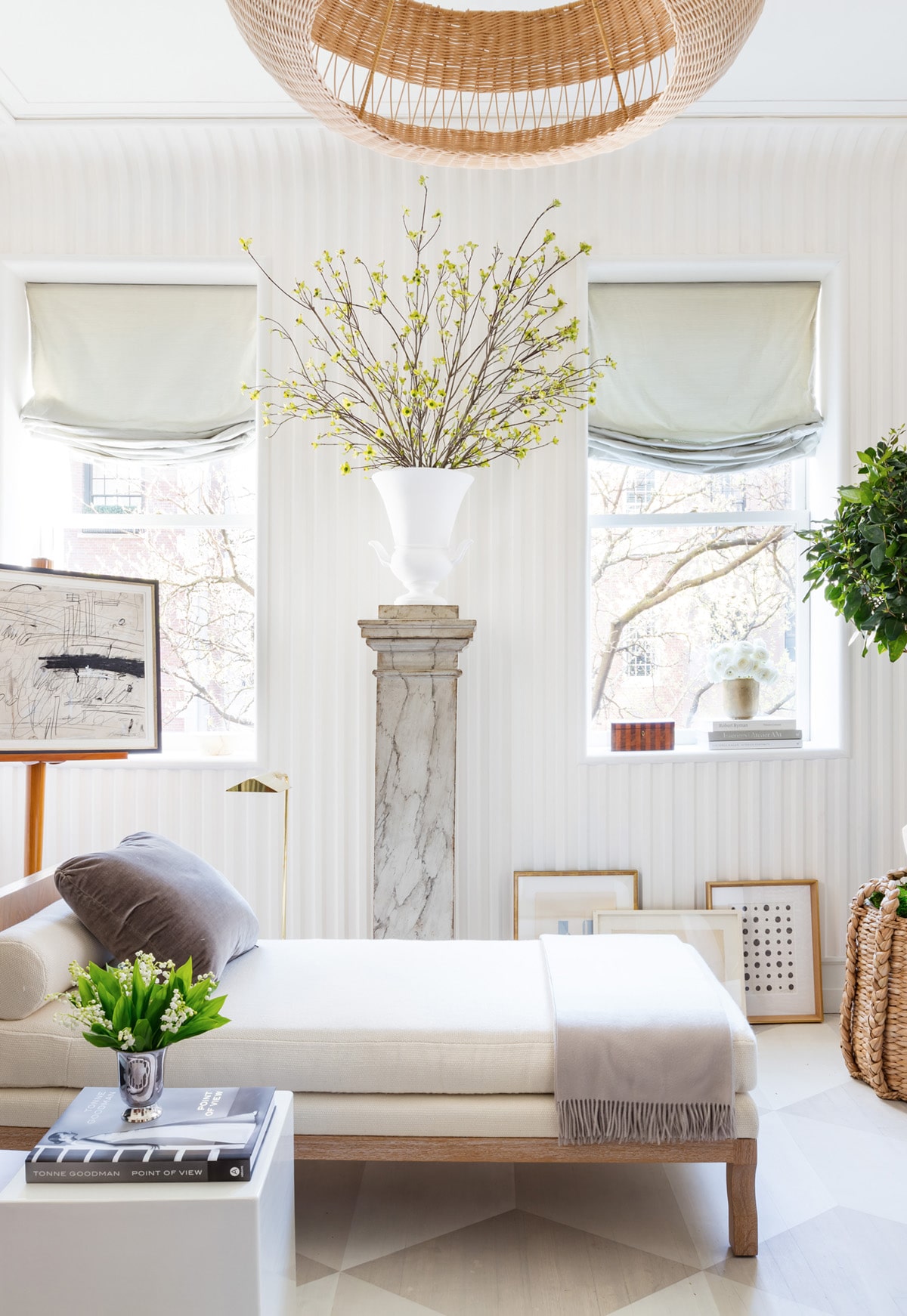
The combination of the materials, the furnishings, the contrast of black and white, organic and sophisticated… It’s exactly my cup of tea. Also, I keep meaning to write a post on the topic of pedestals, but while we’re here: PEDISTALS. Is it strange to say that I think they’re making a ‘comeback’ even though in classic interiors, they’ve obviously never left?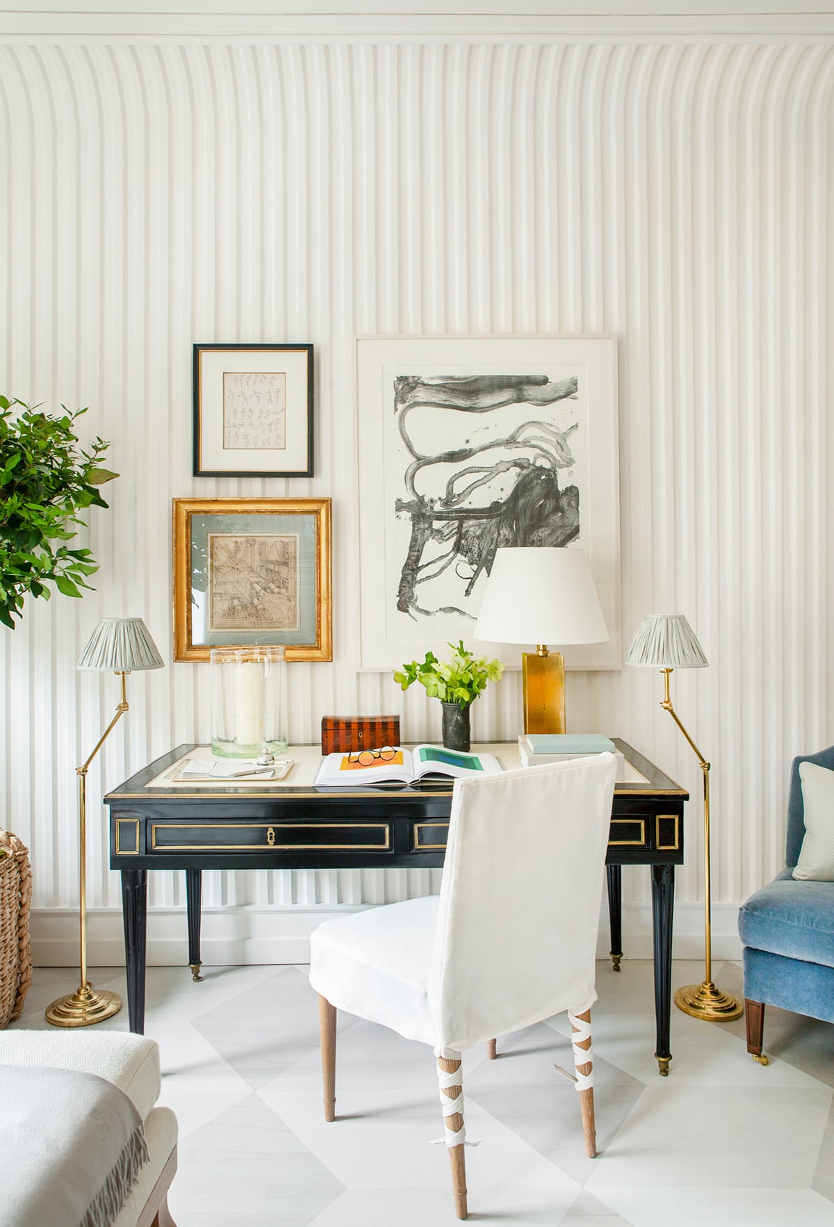
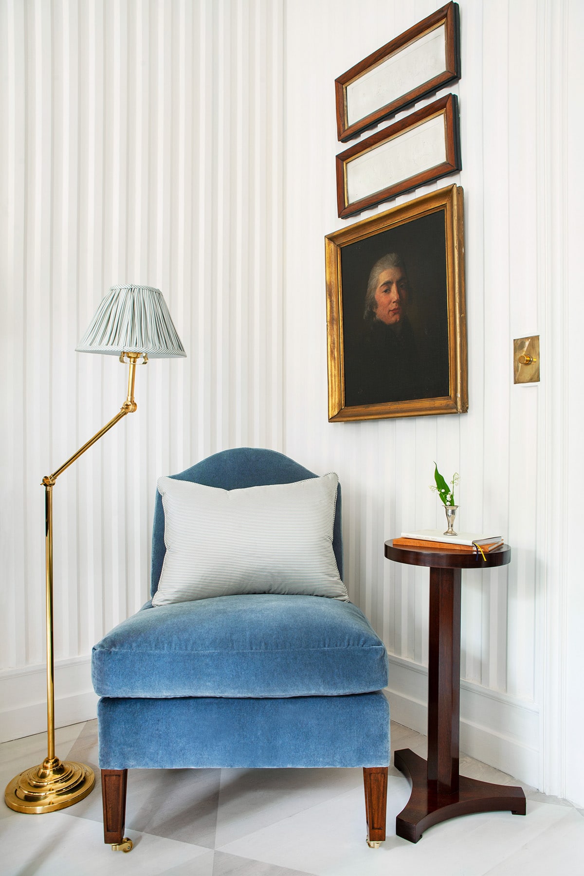
I love the use of high contrast in this room. The black desk and fireplace at exact opposite of each other balance the space perfectly, while a happy pop of blue in this corner chair adds just the right amount of color. Also, I’m coveting the adorable pair of floor lamps flanking the desk with their striped pleated shades. Yes please!!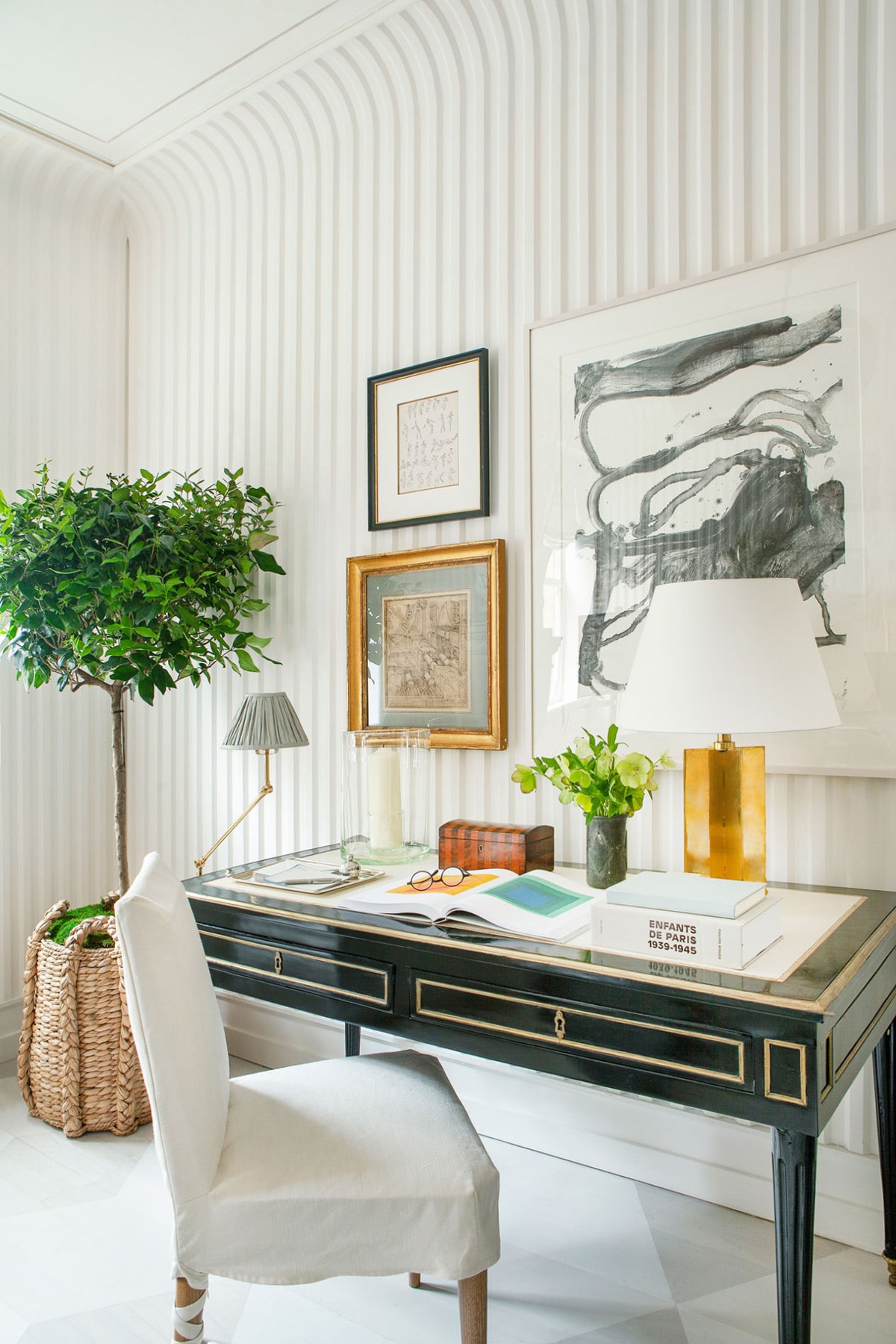
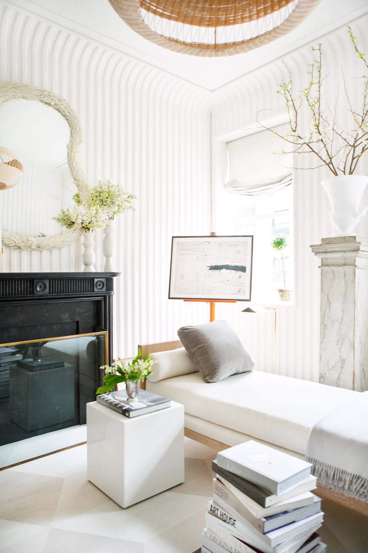
This space feels divinely feminine to me, and I’m going to go ahead and just throw out there that I was very happy to see not a single dose of pink here. This is my kind of palette!
