When I began my hunt for the perfect blue paint color for our dining room, I knew I was in for a challenge. The space is small, the light changes dramatically throughout the day, and – perhaps the most challenging part of all – I am not a color person. But, this is the one room on the main floor that can really handle some saturation.
The previous paint color was also blue – a darker tone that sucked all the light from the space. And I couldn’t handle it anymore. But, I loved the blue. So, I decided to lighten things up and change up the tone a bit to create a more casual Scandinavian-meets-California vibe…
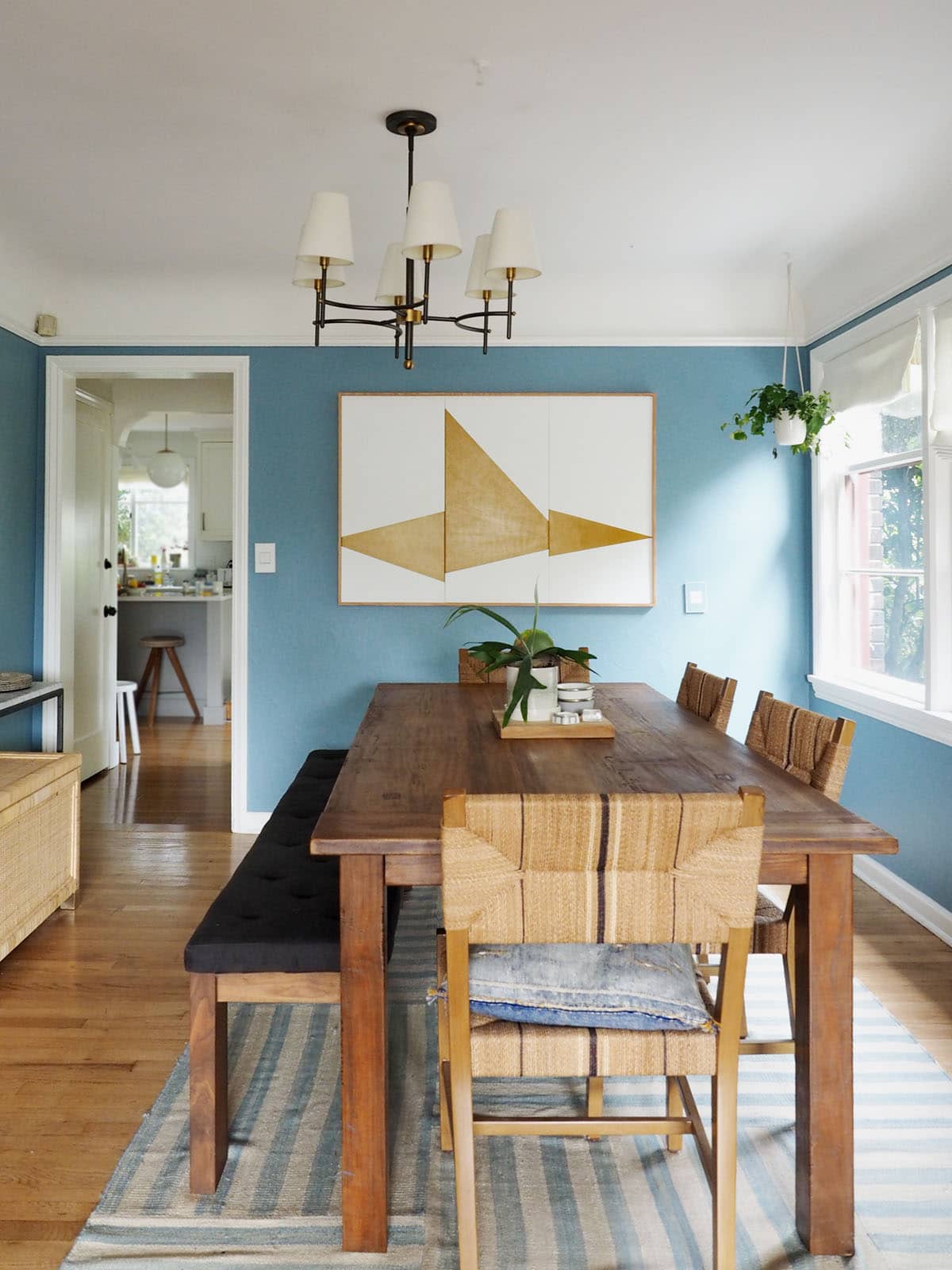
There are still a few details that need tweaking in here (I need a new light fixture, I think, and I’d like to get rid of the bench and add some chairs!) but overall, I’m really happy where where things are at in here now!
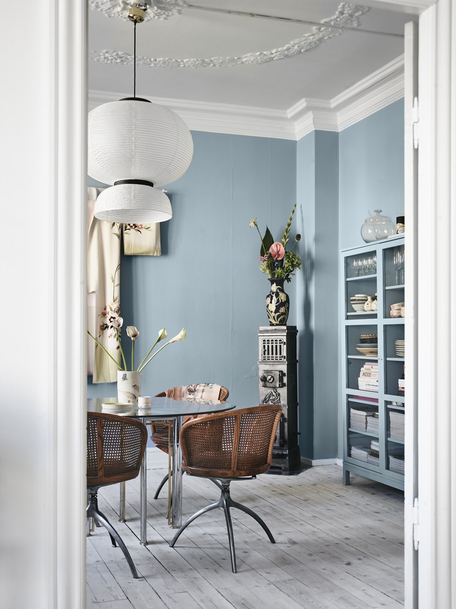
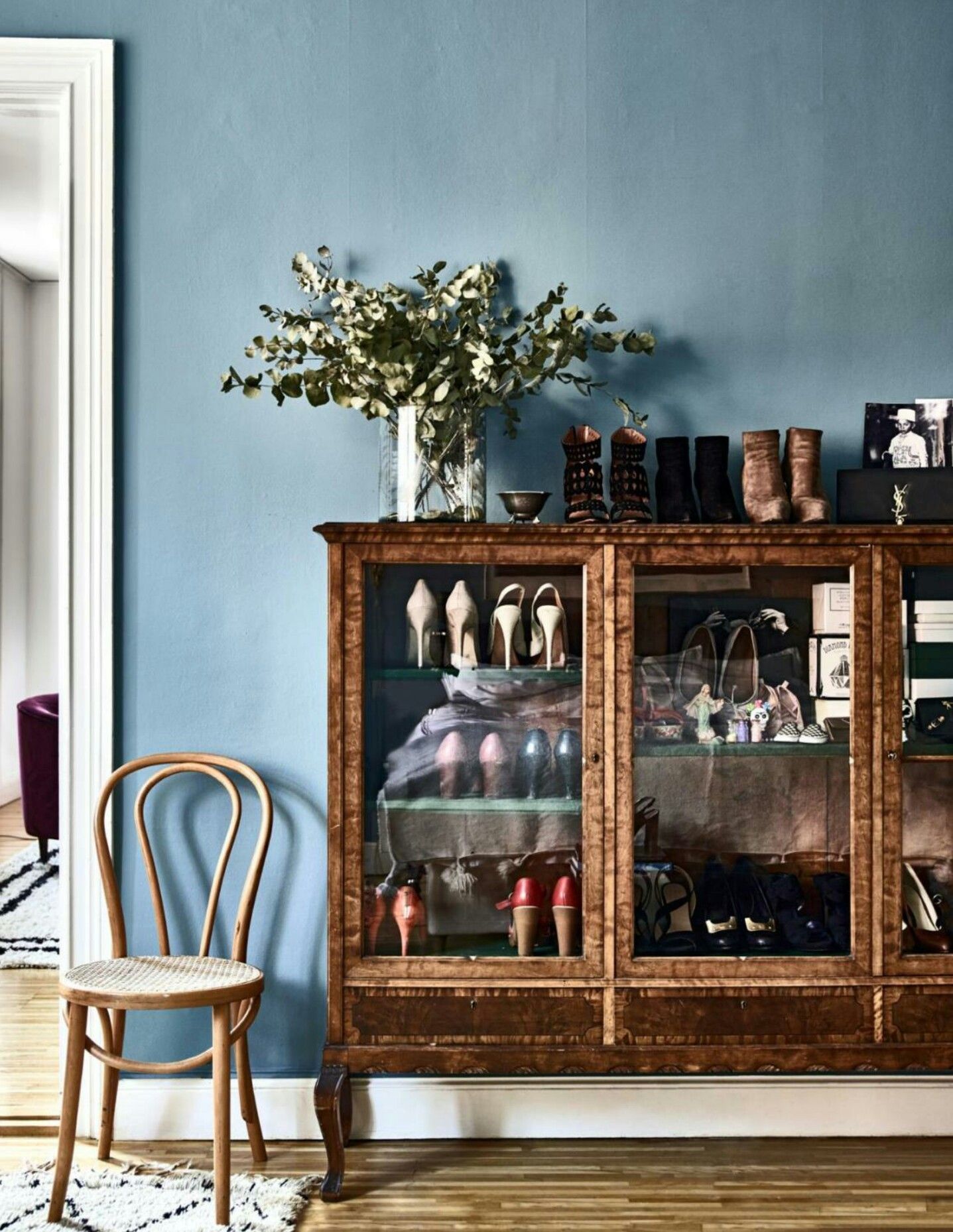
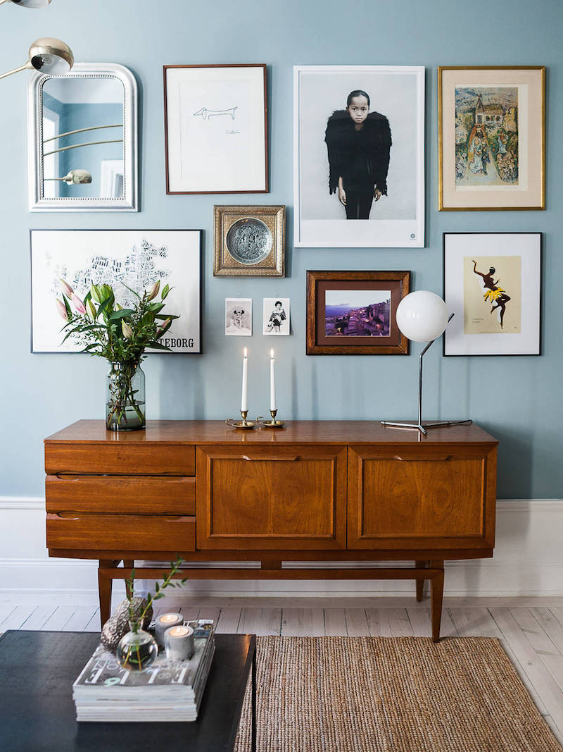
This tone was one of the inspirations for the space, because I loved how the blue paint contrasted so well with the darker, warm wood tones. Our dining table is similar, and I really wanted something to counter the heaviness of it while complimenting it at the same time.
Of course, I considered so many options in this family – mostly lighter. Originally I thought I wanted something with a bit more green it it, but once I got the paint samples up on the wall, I realized that this Scandinavian blue was really what I was going for. What makes this blue ‘Scandinavian’ by the way? I believe that certain tones work best in certain regions. If you think about the light in France compared to the light in Morocco compared to the light in Sweden… well, it’s definitely different.
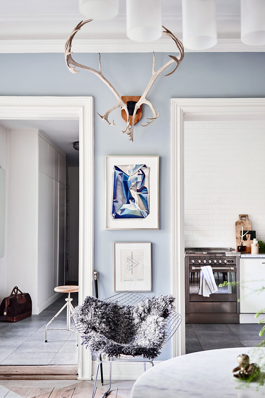
And since I’ve done all the work for you, obviously a roundup of the best blue paint colors was in order! These are my favorites, and all are beautiful, it just depends on how saturated you want to go! No matter what, though, they all evoke that perfect blue you see in so many Scandinavian or French interiors!
The color we used in our own dining room was Pittsburgh Paints ‘Serene Stream’. I liked it the most because it felt super saturated, but not too dark. Plus – you can see – it has the tiniest hint of green to it, and I thought that helped it feel a little more sophisticated, and it worked out well for the tones in our room. My runner up was Dresden Blue, which is perfect if you’re looking for something with a little more grey in it! Have any of you used these paint colors or something similar? I’d love to hear!