It’s not every day that you get to write an article about dear friends who also happen to be some seriously talented human beings. Today, I’m excited to introduce you to Homer: A cozy neighborhood restaurant in Beacon Hill which happens to belong to my former design partner, Sara Knowles, and her talented husband, Logan Cox.
Where Logan is head chef and the driving force behind the menu, Sara is the mastermind behind this beautifully designed space. With plenty of whimsical touches, and details that make you feel right at home, it’s become one of our go-to spots for a fantastic but not-too-fussy dinner. ![]()
![]()
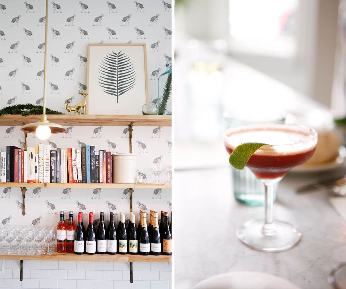
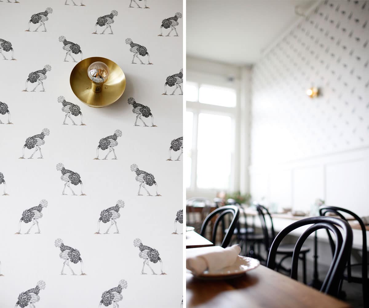
When Sara first started in on designing the space, one of the first decisions they made was the wallpaper: an ostrich with its head in the sand which held no hidden meanings or connections to the concept. Sara just loved that it was completely unconventional and playful. And that sort of describes her approach to design: thoughtful, but fun. ![]()
![]()

![]()
Speaking of fun: not only does the bar have some amazing cocktails on hand, but it also has a walk-up soft-serve window that has so far churned out flavors like Fig Leaf, Rhubarb Vanilla, and Winter Pine. I can hardly wait for summer to come so I can stroll right up to order some! For now, I’ve been enjoying them all as dessert after stuffing myself at dinner. (PS – the bar paint color is Stained Glass by Benjamin Moore, because I know ya’ll are going to ask!) ![]()

![]()
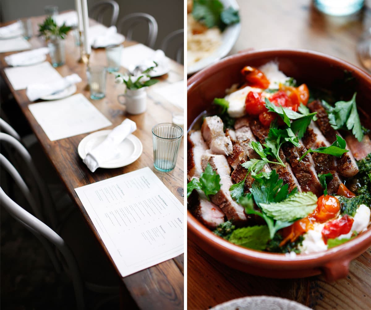
Dinner – in case you’re wondering – is a menagerie of small dishes inspired by Mediterranean and Middle Eastern cuisine, with fresh Pacific Northwest ingredients. And, als0, what might be the most perfect pita in the city – Logan has indeed mastered the craft on this one. And did I mention it’s all cooked in a wood-fired stove which you can crowd around at the kitchen bar? Incredibly cozy during the winter! ![]()

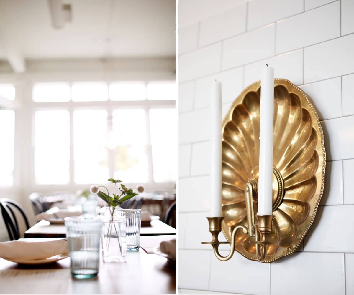
Ahem. My most favorite design element that Sara found at a vintage store. The golden candelabra sconce that looks like it’s mounted to a platter suitable for serving – well – dinner. How perfect can you get!?
And now, a run down of my favorite design moments… ![]()

We’ve already mentioned the wallpaper, but I also love the simplicity of the Cedar & Moss sconces she used on the walls (paint color is White Dove by Benjamin Moore. The same color we used in our kitchen!). ![]()
I love the inventiveness of this partition that does double-duty at providing a little walkway between the kitchen and bar, hiding the doors to the bathroom, and allowing for guests who are waiting for a table (which is a common occurrence) to perch and sip a cocktail.![]()
The antique communal dining table adds to the feel of being right at home in the space, and the statement chandelier from Schoolhouse Electric is the perfect modern, but organic, touch.
The lights above the bar are also Schoolhouse (satellite pendant here), as are the modern ceiling fans that are SO GOOD, I didn’t even notice them. How often can you say that about a ceiling fan? ![]()
One of the elements I’m most proud of is the logo… because my husband and I designed it together for them! Logan knew that he really wanted this element: a hand-written font in neon that would shine bright above the dark exterior. A beacon (pun intended) for neighbors and foodies across Seattle. We love the way it turned out. ![]()
If you’re in Seattle, or visiting, I hope you’ll consider swinging by Homer for a cocktail or dinner in support of these two who have put their heart and soul into this space. And don’t forget to order the pita!