I’ve always been a little obsessed with color palettes, so when I see a good one I can’t help but call it out! The retro fabulous combination of mint, burgundy, pink and buttercup at Fisher in the Palihotel San Francisco is bringing the happy spring vibes we all need right now.
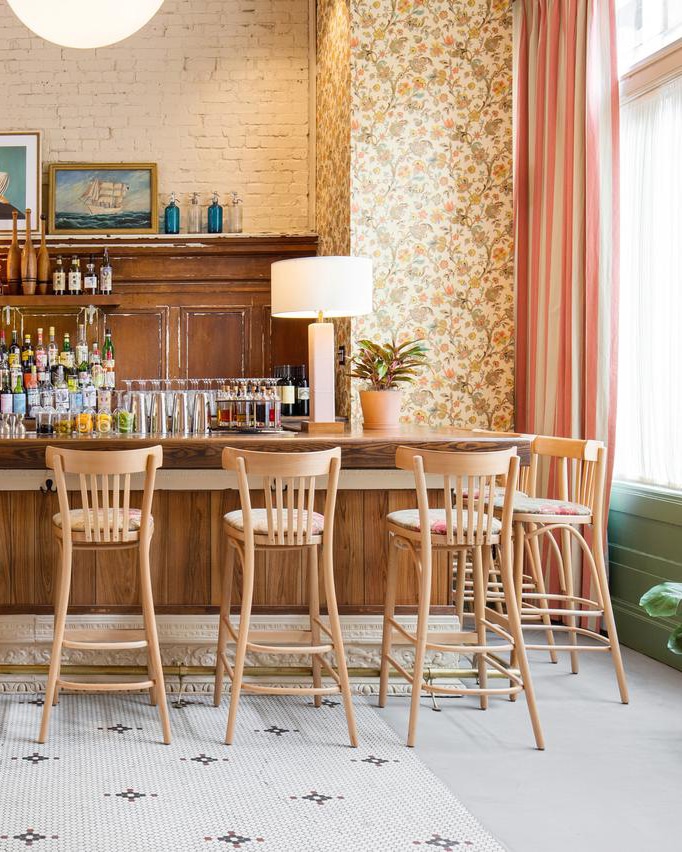
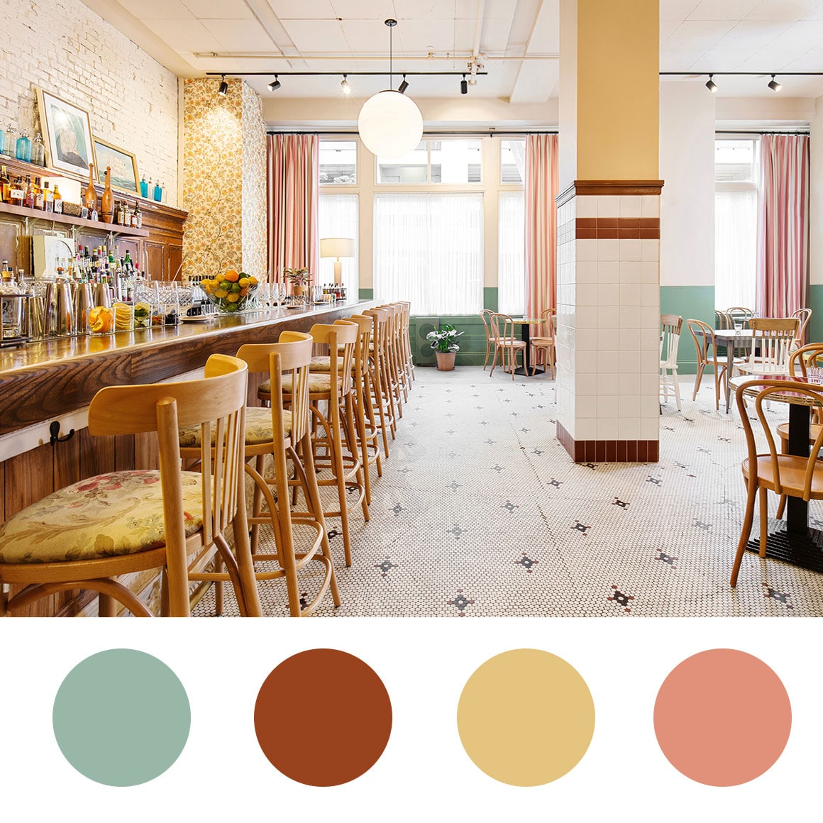
While the color is definitely there, I like the way it’s brought in through accents. Nobody needs to be swimming in mint green or buttercup walls. In fact, the placement – in tiles and stripes – makes it much more fun, fresh and quirky!
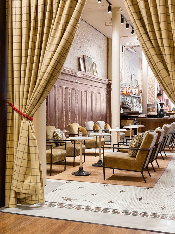
I also respect that not every moment in the restaurant is hitting you over the head with this color. There is a level of sophistication mixed in with diner that makes it a unique contrast of elements!
This is also a great case study in mixing prints. A bold thick stripe with floral wallpaper and vintage tile? No problem. Not to mention the texture in the brick, the old wood paneling, and the decorative molding! The floral pattern from the wallpaper is echoed in the bar stools too.
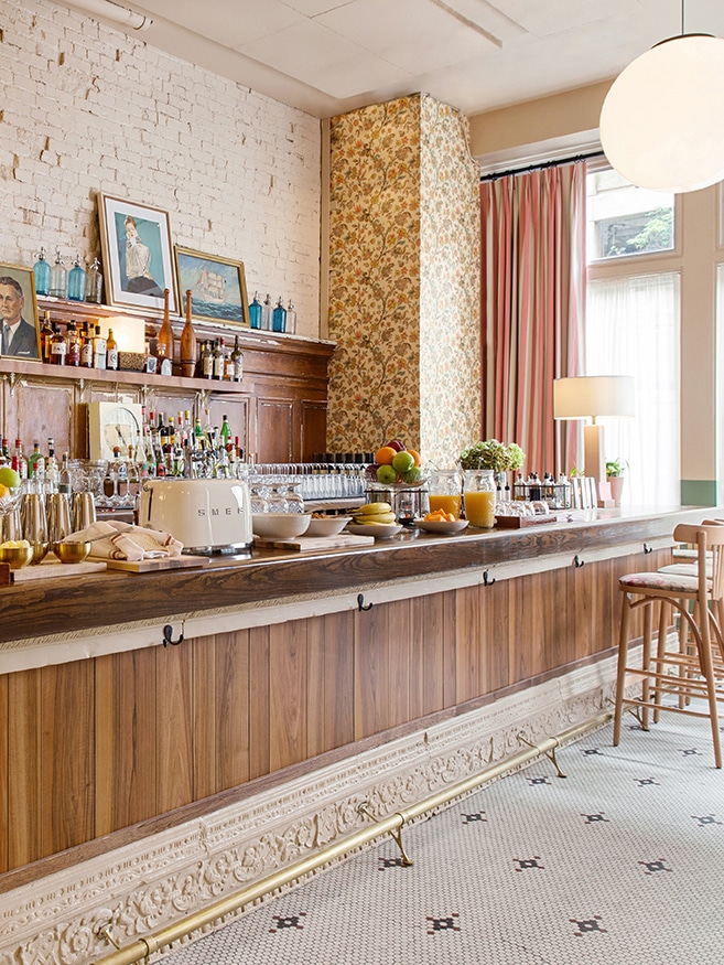
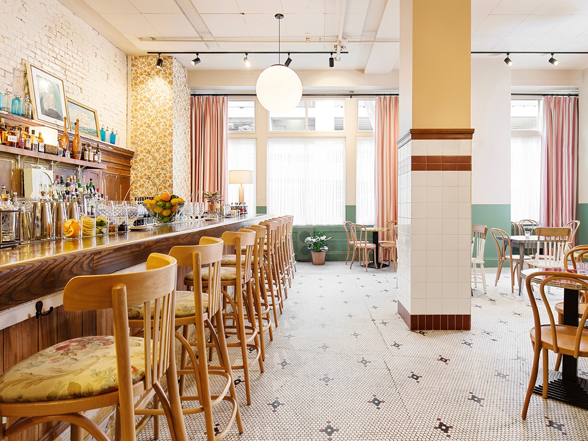
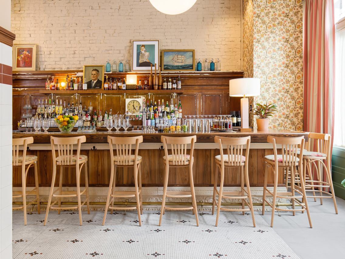
Such a fun combo right?? The curtains make me think of this home tour we featured too. Maybe I need some bold pink stripe curtains in my life?? I have no idea where they’d go but I’m obviously drawn to them.
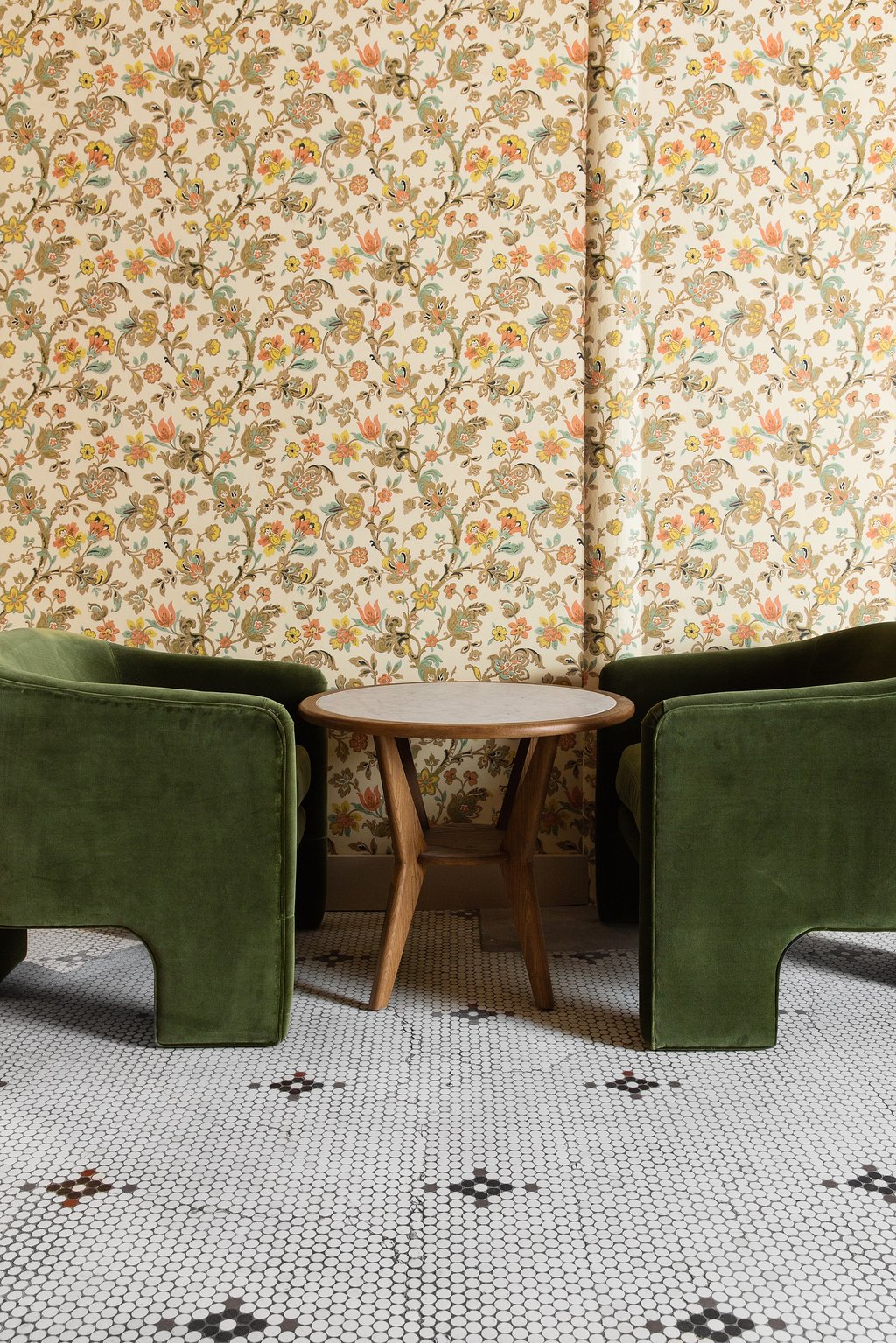
What’s your favorite element in this space?? Anything inspiring your future design plans?